For some reason, the old interface was more subtle, while the new one seems to be more in-your-face. Now that YouTube tests a white background for video pages, the new player stands out more.
Here's the experimental player:

... and the player from the standard interface:

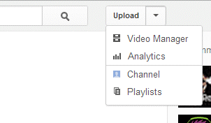
To try the new player, change your YouTube cookies using the instructions from this post. There are some other changes: new options in the "upload" drop-down, "now playing" is replaced by "what to watch", YouTube now shows the number of subscribers and there's a new way to display the number of likes and dislikes.


still have no idea why the background is white. its should be grey or black to be more focus on the video...
ReplyDeleteOld was better.
ReplyDelete