
Google Notebook has a new UI that uses AJAX a lot (here's the old one, for reference). "After a long slog, our sexy new version of Google Notebook is out. There are still bugs and things missing, but I think this version is a lot more fun than the old one," says Kushal Dave on his blog.
You can see all your notebooks in the sidebar, ordered alphabetically or by modified date. It's easier to add notes: just click in the space between any existing notes. Google Notebook borrowed the layout of messages from Gmail and placed the editing buttons at the top of the page so you don't feel any disruptive interface change when you edit a note. You can now add comments to notebooks and remove the title and the URL of a clipped note. Google auto-saves each note, so you don't have to press a "Save" button.
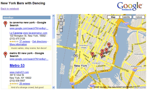
If you add notes from Google Maps and publish the notebook, you'll have an option to see the places on a map.
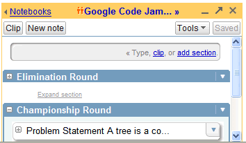
The mini-notebook, available as an add-on/extension, has a similar look:
The option to search public notebooks has been removed (but you can use Google search to do that), Google Notebook looks faster because of the heavy AJAX usage, and the product graduated from Google Labs. Overall, a nice face-lifting, even though users were expecting to see other features like tags or file attachments.
{ Thanks, C. I. R. E. }

Google Notebook would be so great if they just added labels/tags. So often I want one note to be categorized in multiple ways or notebooks. I hope that makes the next upgrade.
ReplyDeleteI second the tag request. It is so convenient and useful the way it works in Google Reader.
ReplyDeleteAlso I wish I could see the indented section headings when the notebooks are listed on the left. Looks like they took that away. I could jump to the section quickly. Now I have to scroll down till I find the section.
I noticed that when I scroll down there is a delay, as the system fetches more notes!
For me the GUI is blue and not yellow... ;)
ReplyDeleteBut yes, I think its a good addition...
And tags would be nice, of course.
For me the GUI is blue and not yellow... ;)
ReplyDeleteIt's blue for private notebooks and orange for public/shared notebooks.
It's also not labeled as a Labs product anymore. Must be being 'launched' any time now.
ReplyDeleteFor personal notes, I found TiddlyWiki to work much better.
ReplyDeleteIt's offline so it can be put on a USB stick or online using the server plugin or by placing it on a personal CVS/SVN repository.
Wiki syntax comes in very handy. I wish Google went that way, and especially supported offline editing, because that's where one ends up "naked".
My only wish is a notebook with mobile acces, tags can come afterwards :)
ReplyDeleteUseless rounded boxes which takes three more space than before... OMG :(
ReplyDeleteThey also changed the way that the notebooks look when published.
ReplyDeleteLooks pretty neat (but now i need to change the code i used to "scrape" content for my dynamic-blog thing i was making.
Aesthetically, I hate the new design. It is so bulky and unclean. Totally non-Google style. I liked the design better before.
ReplyDeleteBut like I said. Aesthetically... I like the new functionality and redesign.
I like it :) looks kinda like reader
ReplyDeletecould do with being able to export an individual note (or selected list?) to docs, all is just a bit too long
putting my vote in for tagging too, tags are so nice
nice work :D
Now that the "Search Public Notebooks" function is gone, how can I do the same thing from normal Google (and search ONLY the public notebooks)?
ReplyDeleteOh, and yes, I also vote for tags and the the subsequent removal of the notebooks!
How to find public notebooks?
ReplyDeleteAdd site:google.com/notebook/public to your query. Something like this.
Much needed features.
ReplyDeleteTags - Yes
Email - Yes
Blogger - Yes
Mobile Access - Yes
Offline Support - Yes (Can this be done using Apollo?)
Javascript - Yes
RSS Support - Yes (for shared Notebook)
Old Design - No (Please!)
Notebook is emerging as a good tool for the users.
seems like a resounding yes to TAGS. Organizing the notes was something that was pretty difficult before. I like that the major notebooks don't scroll with the rest of the page anymore. I love being able to easily add notes between notes.
ReplyDeleteError in your post: his first name is Kushal, not the other way around. Yes, it's confusing.
ReplyDeleteI miss the link that allowed me to delete the note with one click.
ReplyDeleteThat was so much more convenient for using Google Notebook as a to do list...
Put the delete link back!
I would also like to suggest possibly allowing some form of colour coding and maybe creation of columns. Sometimes I have small notes that don't need to expand my whole screen.
ReplyDeleteI would like to see GOOGLE come up with same way to tag a file and allow it to be opened when yuo are off line or no internet avaible.
ReplyDeleteI guess I am think off something intergrated in to the google desktop or in gmail its self.
ReplyDeleteI think this is cool because it allows you to search through the google notebook without loading it.
ReplyDeleteMy vote is for:
ReplyDeleteHierarchical Tags
Custom Fields which can be displayed as columns.
I think google should look into unifying search/access inferface for email/chat/notes/docs/cal
ReplyDelete. Lets hope it will come soon.
I would use this app more if they fixed the printing. It does not wrap lines down and they end up being cut off the paper.
ReplyDeleteI would also like to see labels/tags, and the removal of the notebook concept.
ReplyDeleteAntoher thing I would like are attachments, e.g. a PDF file that I want to save in a notebook, and perhaps add a few tags. The search feature could search not just my notes, but the PDF too.
it was great man, i really like notebook.
ReplyDeletewww.computersolution.be
Sometimes the information is also relative to any files on my computer.
ReplyDeleteHowever the links operation in google notebook can only deal with the web URL and email. So can you maybe also adapt this operation to let the people also makes links to the files? thanks :)
Ditto on the mobile version. Google rules all when notebook, calendar, gmail, docs works on the small screen.
ReplyDeleteLOVE IT! JUST go mobile with this notebook and I will be clicking to my hearts content on my Moto Q
ReplyDeleteI miss the link that allowed me to delete the note with one click.
ReplyDeleteThat was so much more convenient for using Google Notebook as a to do list...
Put the delete link back!
Another product from Google that is pretty superior to its competition. It amazes me how google just continues to come up with products that seem to be superior to the competition whether its software or hardware google just keeps finding a way.
ReplyDelete