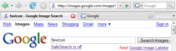
Google's favicon is hosted at google.com/favicon.ico and it's a 16x16 pixels image, a standard size for favicons. Google replaced the upper-case "G" in blue border, green and red borders with a lower-case purple "g" in a rounded corner rectangle.

The first time when I saw the new favicon at Google Image Search, I thought there was something wrong with my browser's cache or I typed an incorrect address. Google's new favicon is less cheerful and comforting, but it makes a lot of sense: the small g is a symbol for infinity (∞). A googol (10100) is just a poor approximation for the huge amount of information that needs to be indexed, organized and made useful by Google.
{ Thanks for the tip, Louis, John and Aleksandr. }
Update: If you want the old favicon back, try this Greasemonkey script (requires Greasemonkey for Firefox, Opera or a userscript plug-in for other browsers).
Update 2: Search Engine Land has an official position from Google. "We recognized there was a need for a Google icon that would better work across multiple applications including web, mobile and client applications. We felt the small 'g' had many of the characteristics that best represent our brand: it's simple, playful, and unique. We will be looking to improve and enhance this icon as we move forward."
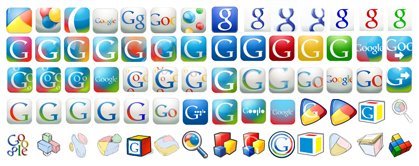
Update 3: Google says this is not the final favicon. "We tried in total more than 300 permutations [some of them are displayed below]. It was much harder than we thought at first. We wanted something distinctive and noticeable, so we aimed toward transparency or semi-transparency, so the image would have a more distinctive noticeable shape than just a block. We wanted something that embraced the colorfulness of the logo, yet wouldn't date itself." If you have some suggestions for Google's favicon, send them here.
Update: The favicon was updated in January 2009.

I liked the old one better.
ReplyDeleteBut then again, that is often my reaction to a logo redesign and some days or weeks later I think exactly the opposite.
Time will tell...
perhaps its just one of the things they do with the google or orkut homepage, they keep changing the look of the image to suit the season, holiday etc.
ReplyDeleteNot cool, why would Google mess with their favicon?
ReplyDeleteI just noticed it today and I don't like it. The other "G" favicon was much better, and easily recognizable as the "G" in Google.
ReplyDeleteI like the new favicon. I was surprised when I first saw it this morning, but I believe it is much easier on the eyes.
ReplyDeletePersonally i thought the old G one looked pretty boring. I for one welcome our new g favicon overlords!
ReplyDeletereally having a hard time getting used to this icon. I think this is going to confuse my mom (and yours!)
ReplyDeleteCan you overule a favicon on the system side?
ReplyDeleteThe new logo is less recognisable but I like it because it is more subtle and (@Aaron) much easier on the eyes...
ReplyDeleteI also like the old google favicon. But in the next fewdays, I think I will like the new favicon and forget about the old favicon :D
ReplyDeleteOld one was MUCH better! :(
ReplyDeleteWhy Google, why?
Google New Favicon precursor too new revolutionary interface update? Why change something as inconspicuous (too normal end user – but obvious to web techies) as a favicon but so OFF standard of the current branding. They’ve (big 3) all had similar interfaces forever, great time since the MSN/Yahoo distraction to make an in your face, one up move. I can only hope, change rules!
ReplyDeleteI am no expert on the subject but I heard a hand writing expert on TV once say people who signed their name with the beginning letters huge were arrogant.
ReplyDeletePeople who signed their names with letters of the same size were humble. If it was hard to tell if the letter was upper or lowercase, even humbler.
I have been signing my name with lowercase for awhile since hearing this.
Maybe this is Googles way of reminding the user and themselves that we all need to stay humble?
Their new favicon looks a lot like the ghostscript icon...
ReplyDeletehttp://pages.cs.wisc.edu/~ghost/
or
http://pages.cs.wisc.edu/~ghost/images/ghost64.gif
I like the older one better also. I thought maybe my browser had been hijacked. Im relieved to know that wasnt the case but the new g just looks cheesy. I guess we will all eventually get used to it.
ReplyDeleteI can't say that I like this. In fact, I really dislike the new favicon. Of course, it's just a favicon, so I guess it doesn't matter.
ReplyDeleteBut, the old one was much more recognizable (and, by extension, better from a branding point of view).
What Google actually has done is to re-rotate(turn back) the symbol to earlier version, so "∞" to "8" as it was. Beyond this, the "8" interprets the lower-case favicon "g".
ReplyDeletegoogillion
It does seem very strange for such a strongly branded company to suddenly change its favicon. Definitely, wise eyes will be keeping an eye out for further, more significant changes. But perhaps, on the other hand, as all of us do from time to time, Google just felt the need to freshen up?
ReplyDeleteIf you're a Firefox user there's already a Greasemonkey script for it ... http://userscripts.org/scripts/show/27548
ReplyDelete@eichorsmith: "looks like the ghostscript icon..". Not really. They are both lowecase "g", but that's it.
ReplyDeleteI noticed it too today. I thought something wrong...
ReplyDeleteThe old G is better in that it is immediately recognizable and "prominent". The new "g" is more humble and it doesn't stand out even as an icon.
ReplyDeleteGiven that the lowercase g is in the middle of their current logotype, I'm wondering if this heralds a new corporate brand, in which initial-cap Google becomes all-lowercase google. Perhaps a last-ditch attempt to save their brand name from the reality of having become a generic term.
ReplyDeleteI predict that Garth Brooks is going to sue.
ReplyDeleteThe new google favicon it's not just a lowercase "G", it's also the "android" icon, if you carefully look at it, you could see the chest+neck+head+hair (sort of msn one) and this means they are pushing the company and project to a more popular and massive one, putting them to the same level of us, good hit
ReplyDeleteis it smaller in bytes than the former one? the new one, the little g, is 1150 bytes. Anyone know how many bytes the former one was?
ReplyDeleteI like this one better actually.
ReplyDeleteThe previous one looks egotistical and ugly while this one is small-minded and
less fanciful. The latter represents google better.
I couldn't figure out where my iGoogle tab was this morning when I first noticed it's a new favicon.
ReplyDeleteI must say, I think the old one was better. It screamed Google!
The new one, although not terrible, looks too "common" in my opinion.
I wish they would use the original and recognizable capital G from the first icon, but have no border like the new icon.
ReplyDeleteI like the new one.
ReplyDeleteI think people will get used to the small "g" soon and gradually forget how the old one would look.
The lowercase g looks good, but the capital G mimics the start of Google's logo and I think that is more recognizable to people as Google instead of the lowercase g from the 2nd g in Google. That is the only reason I think they should do the same new style, but with a G instead of g.
ReplyDeleteSmall, but nice change...
ReplyDeleteWelcome to the GoogleIcon Beta. A GoogleIcon Beta account allows you to store favicons for all your sites. Choose favicons from the GoogleIcon library or uploade your own.
ReplyDeletethe new one _is_ smaller: 1150 bytes vs. 1406. With the volume of traffic google gets, that change probably saves google money in bandwidth.
ReplyDeleteIt confuses me! The new icon shows up when I am on a google search, but the old icon appears on the side where I can type in a google search before being in google. (Firefox user)
ReplyDelete@Chantelle:
ReplyDeleteThe icon you see next to Firefox's search box is hardcoded in a configuration file, so it's not loaded from Google. You can edit this file:
C:\Program Files\Mozilla Firefox\searchplugins\google.xml
and replace the value of the Image tag with the base64 encoding of the new favicon. This site should help.
(... continuing the previous comment)
ReplyDeleteHere's a screenshot that shows the new favicon next to Firefox's search box.
I also posted the code you need to use in the config file:
C:\Program Files\Mozilla Firefox\searchplugins\google.xml
I don't know. I cleared my cache and I'm still seeing the capital G.
ReplyDelete@Anonymous:
ReplyDeleteThe favicon hasn't been updated at all data centers, so it depends which data center handles your request. You might other services (image search, Google News) or direct addresses like: http://66.102.9.104/favicon.ico.
There is no head, neck, etc... it's an exact copy of the blue 2nd g in the main google logo, just smaller. Only difference from size, is that it doesn't have a drop shadow and has a slightly gradient backdrop. But nothing else has been done to the "g".
ReplyDeleteI DEMAND YOU CHANGE THE GOOGLE FAVICON BACK TO THE OLD ONE.
ReplyDeleteTHE NEW LOWERCASE G FAVICON IS HIDEOUS, IT IS DISTRACTING ME FROM MY NORMAL WEB BROWSING EXPERIENCE. CHANGE IS GOOD, BUT CHANGE IT TO SOMETHING THAT IS NOT GODAWFUL HIDEOUS. I CAN NOT SUPPORT A COMPANY WHO USES SUCH A DISGUSTING FAVICON. IF THIS ABOMINATION IS NOT REVERTED OR CHANGED TO A MORE PLEASANT ALTERNATIVE I WILL BE FORCED TO SELL ALL OF MY GOOGLE STOCK.
-RUSTY SHACKLEFORD
That post might have been mildly funny if it wasn't in ALL CAPS. Guess they like caps so much they can't read lowercase words. So my comments should be shrouded by all the lowercase letters I am using. :) I don't like the lowercase g. But at the end of the day, I don't really care.
ReplyDeleteI prefer the new one...
ReplyDeleteI noticed this earlier and I must say I don't like it. Since when is purple a Google colour? I thought that was Yahoo? Plus the old icon is very recognisable as Google.
ReplyDeleteTo Margret Li, iGoogle appears, if you type www.google.com, rather than pressing enter in firefox's search field.
ReplyDeleteYou are right, it's pretty purple if you enlarge it. Checked the RGB values with photoshop. The new g has more red. I don't really notice it when it's so tiny.
ReplyDeleteBRING IT BACK! BRING IT BACK! The original favicon was sooo much better then this ugly thing. Please tell me this isn't permanent.
ReplyDeleteNick, www.google.com goes to either www.google.com or www.google.com/ig depending on if you are logged in or not and depending on if you have iGoogle set to classic mode or not. It has been this way for a super long time and has nothing to do with the changes from today. Since I use classic mode, then www.google.com stays www.google.com and does not redirect to www.google.com/ig
ReplyDeleteLooks fine to me. I'm surprised people are caring enough to switch back by their own methods.
ReplyDeleteI like it, very simple but looks professional!
ReplyDeleteIf you want the old one back:
ReplyDeletehttp://userscripts.org/scripts/show/27548
Google, bring back old favicon!
ReplyDeleteI don't like the new favicon
ReplyDeleteI like the old one better, A. it matched the G in Google, B. the new one's lowercase, and C. it matched the default colors of Google (blue, red,green)f
ReplyDeletePlease change this icon back..
ReplyDeleteI dont like it :(
What is this world COMING TO????
ReplyDeleteold one was much better. this is ugly and hard to find on a busy tab bar...
ReplyDeleteIf you use a CRT monitor and have set it for a high pixel density for viewing photographs or for viewing text fonts in print quality, the favicon can be incredibly small. The old favicon with a relative large white space within the upper case "G" could be recognized by the large white space. The new one has smaller white spaces and can be unrecognizable when too small.
ReplyDeleteI opened the new favicon in XnView and zoomed in and out to and from tiny sizes. I discovered range in which the old upper case "G" remains recognizable but the lower case one disappears into a blob before both disappear.
This could also affect people with vision problems.
The older one is better because it remains more functional when scaled down.
The new one is barely visible in Firefox 3 RC1 on Mac OS X, where the default gray is darker.
ReplyDeleteMaybe adding a white background would help.
I'm glad to see I'm not the only one who thinks the new Google favicon should be shift+deleted. I'm sure there must be things behind that we can't understand right now because we don't have a clear picture of everything.
ReplyDeleteAnd I mean far beyond the symbolic layer of it all.
I think I haven't been so disapproving of something Google did in a long time.
i thought i was going nuts.
ReplyDeleteGoogle is being Google. Everyone else revamps their entire interface. Google changes a tiny little letter and the whole world notices. It's KISS at its finest.
ReplyDeleteI WANT THE OLD ONE BACK
ReplyDeleteD:
the old one is better
ReplyDeleteOld one needed to be changed. However, this new favicon... I hate.
ReplyDeleteThought my browser was hijacked at first!
Please google, bring back the old one!
ReplyDeleteThis new favi icon makes sad.
ReplyDeleteThis is going to turn out like the New Coke thing and will be changed back because of the uproar (I hope)
ReplyDeleteGoogle, give me back the old one :(
ReplyDeleteThis is a worse decision than calling their personalized homepage "iGoogle."
ReplyDeleteAs soon as GreaseMonkey works with FF3, I'll be installing that script to bring back the original logo. (Although on this computer it's still displaying the old logo.)
I saw that "g" and thought it was BabyCenter or something. Looks to me like a pregnant woman with a bun hairstyle.
The previous one was much better. The new favicon doesn't have the typical, cool "google" look!
ReplyDeleteI tried going to a few different Google sub-sites, and I think this is a way for Google to distinguish their main portal (Google home or iGoogle) from their other specialized searches.
ReplyDeleteTheir other services already have different icons. I don't think this is any uglier, and it makes sense. Goggle's smaller, more specific searches show a smaller "g".
I thought it was a spyware until i checked this website. I had a spyware attack before and many of my favourites links favicon including google and gmail changed to the spy's favicon.
ReplyDeleteTHIS STYLE IS GAY STYLE :@
ReplyDeleteGoogle starts with "G", not "g".
ReplyDeletethe new really sucks, wanna old one
ReplyDeleteI like the new icon. The red, green and blue borders on the old one looked really bad. The new one looks more professional and less like something made in Microsoft Paint
ReplyDeleteI think the other way round. Simplicity isn't always a sign of Paint. The new one reminds me of a kid playing with photoshop. What do you think is better?
ReplyDeletethe old one was just great... now i can't even find it among other tabs especially in Opera where the tab background is also blue... the only pardon would be if a new google logo would contain the "g" or "8" as the first letter
ReplyDeleteI can see the new favicon, but in my favourites i still have the old one. ^_^
ReplyDeleteGoogle is smart to keep its identity fresh. Their brand is perhaps the most recognizable one in the world. It is certainly on the way to being so. With such a recognizable brand and one that we interact with each day a fresh look can be good (look at all the posts on the topic).
ReplyDeleteIt would not be a good idea for everyone to change their favicon. However, if you do I'm sure that there will be a huge database (searchable, through Google) of Favicons. Quick trademark yours!
Argghh. Its soo Web 1.0
ReplyDeleteI need a Firefox extension now for displaying the old favicon instead of the new one.
ReplyDeleteI noticed this a few days ago I think. Also, the other logo was better. :\
ReplyDeleteg is also equal to 9.8 m/s^2, which renders the new icon meaningless.
ReplyDeleteI think there will be a big relaunch this year (g--> 8 --> 2008) We will get surprised again I think!
ReplyDeleteAlso, it's good commercial. Just count how often the brand "Google" (or should I better write "google" ;)) was called! So this could be anonther sign for a big change: they want google get talked, maybe for a big relaunch??!
I dislike the new favicon, sorry.
ReplyDeleteNew icon is terrible, switch back!
ReplyDeletePlease change it back. I hate the new one :(
ReplyDeleteI've found the new favicon to be quite annoying...
ReplyDeleteits reverted back now for me
ReplyDeleteIt's uggly
ReplyDeletei dislike the new one and want the original one back. Google please bring back the old G icon.
ReplyDeleteDoesn't look as nice as the old one.
ReplyDeleteI can't stand the new icon. Why, Google, why?
ReplyDeleteI think the new one is amazing!
ReplyDeleteThe new icon is barely visible on a dark themed bookmarks bar,could you lighten the background or go back to the old one
ReplyDeleteyou people don't have anyhing to do?
ReplyDeleteSeriously, who cares really? It's just an icon. Get over yourselves
ReplyDeleteConsidering the amount of time the average person spends on Google searches for every inquiry imaginable, this unsightly new impostor icon does have some relevance besides from just another nit pick to complain about. Its counter intuitive stylistic idiocy,why change something that people know and like? makes me want to close any Google tabs i have open.
ReplyDeletefor all those that are perturbed or annoyed i suggest letting Google know however you see fit
https://survey.google.com/wix/p1455463.aspx/ts3?l=9&t=21:34:32&k=1757017872&cb=0&v=0&i=0
Just figure out this morning why Google have such a weird favicon. Then thanks to this site explain about it.
ReplyDeleteCheers,
http://cpap-mask.blogspot.com/
http://asiacar.blogspot.com/
I too Like the older favicon 'G'.
ReplyDeleteGoogle sites can be easily recognized by google. It exactly fits 16 x 16 size. I think new google favicon 'g' looking odd. I prefer 'G'.
OK - is this the start of something MUCH BIGGER?
ReplyDeleteHehe it's funny how everyone reacts to minor changes made by Google :-)
ReplyDeletei hate it, its makes me feel sad and makes my browser window look cheap and nasty.
ReplyDeleteI don't like it as much...
ReplyDeleteIt's the wrong colour too; too purple.
I don't think this is minor. It's incredibly scary and ugly, and does not reflect the positive image I've known Google to have... It does look ghostly and ghastly. It's hideous. I disabled favicon settings in about:config in firefox but I miss gmail's icon, so I guess I will have to find a way to change the fav icon. It's important because people who have many tabs open at once (I have ten open right now) can find search results pages (for example) and Gmail easier. That's why they were created in the first place. Seriously google, what the hell?
ReplyDeleteNew fav icon looks like an amateur's work. Google needs to hire a real graphics artist. Less programmer art please!
ReplyDeleteWhat exactly is this new squiggly thing? Okay, I do know what it is, but what is it doing on my open tabs... I don't want to use Greasemonkey to bring the old one back, and I sure hope Google reacts to user feedback on the icon... The old one was so much more practical... I wish they'd just stay practical.. that's what they're know for.. I don't feel a need for artistic little favicon understatements right now...
ReplyDeleteOhh...its really cool......i liked the new one as it looks ROYAL...
ReplyDeleteHands off to GOOGLE... also please add some CSS styles to the homepage too....
I would prefer old one too.
ReplyDeleteOhh...its really cool......i liked the new one as it looks ROYAL...
ReplyDeleteHands off to GOOGLE... also please add some CSS styles to the homepage too....
Actually, it reminds me of the gdiapers (dipes for yuppies who don't want the mess of cloth but still want to look "green")
ReplyDeletehttp://www.gdiapers.com/
the light blue is maybe what bothers me most.
I don't like it too, it's a tiny icon but a huge change!
ReplyDeletehttp://edi.budimilic.com/2008/06/01/new-google-favicon/
new is maybe chic but i liked the old better
ReplyDeleteI remembered some time ago (few months ago actually) personally visiting a supposedly Google's hidden experimental website (forget where I saw it, the founder proved that the experimental website comes from Google by proving that the IP address is the same as Google's IP address), guess what their theme color is... purple.
ReplyDeleteIf (and only if) that website is an official Google project (instead of some Google's employees who have some spare time for their personal projects and host its site on a google server), I think this might be the beginning of the migration to the Google interface (which is an extremely radical change).
FYI (don't rely on this): The experimental site is heavy on Javascript, Web 2.0 experience, and some very unique features are: 1) user-sortable searches, potentially they might collect data on how user sort their search result to improve search result in the future or for other people, 2) a never ending page, when you reached the bottom-most result, it'll fetch some more result right below it, so no more paging (if you used Gmail mail program on your mobile phone, not the one from a web browser like Opera Mini or the internal browser, that looks like it, a never ending page)
I disclaim that any of what I have said must be true.
I think the mistake here is to not be literal enough. The new thing is better than the old thing but by what degree of seperation? Based on facts alone one can see that the popularity of Google is based on this icon but also on other logos as well.
ReplyDeleteI think this whole thing is just a matter of time.
the new google favicon is bad bad bad. does not look like Google Brand, me no like!
ReplyDeletewhy did google waste their time developing a new favicon but did not fix the gmail signature float crisis (a much requested feature!)?
ReplyDeleteand, how is 16x16pixel lowercase g with serifs easier on the eyes than a capitol g in primary colors, come on people!
so ugly!
My whole world is coming apart.
ReplyDeleteThe new "infinity" is terrible, even if there is some idea behind.
ReplyDeleteI've yet to get used to it.
ReplyDeletedont like it, no one thinks little g for google... only big G
ReplyDeleteplease change the favicon back, if i install greasemonkey to restore it i'll be blocking ads and analytics too
ReplyDeleteI thought it was just me who notice the change. Personally I found the change rather awkward.
ReplyDeleteI have to agree with the majority of comments - please change it back.
ReplyDeleteThe old fav looked much better with this one. I think it's a huge mistake on their part.
ReplyDeleteI'm using so many of their services (docs,analytics,image search,trends..) that it just does seem right. I also don't understand what is the added value they have doing this.
Looks ok, we'll get used to it.
ReplyDeleteThough the old one was more recognizable and google browser tabs were easier to spot.
Putting the "g" on a grey background makes it almost vanish on a standard windows UI. Unfortunate choice.
Liked the old one much better. I believe there was no need to change the logo so radically: even if it was obsolete. It was a part of Google's face too.
ReplyDeleteI'm going to have to cast a vote for not liking the new icon. It just doesn't look Google-y to me.
ReplyDeleteSucky! I was thinking since the change happened about how much I don't like the new favicon, and I like how there are so many comments against the new "g" when I did a search for "new google favicon"
ReplyDeleteThis is only one of two bad moves Google has ever done, the other was to take away the various "sort by" functionality of Youtube. People didn't like that, either... and Google changed it back!
I prefer the former favicon. Dnt fancy the new one.
ReplyDeleteThe new favicon is weak, wimpy, and just plain boring. Why violate your brand?
ReplyDeleteThe fact that so many people, including myself, searched "new google favicon" > came to this post > and posted their dislike should mean something.
I hate looking at it, makes me sick and strangely uncomfortable.
The new one is worse. The explanation of "it's the symbol for infinity" - with design being smart and clever doesn't make it look better.
ReplyDeletethe new g doesn't have anything you can trace to google, the old favicon had to colours of google but this is just a blue g, noone will think about google when they see it
ReplyDeleteThey just switched back to the old one...
ReplyDeleteI saw thiswhen i was in firefox and thought thats wierd am i even on google lived with it for about 2 hours tried again and relised they did chnage it why though it just look like them.
ReplyDeletehttp://creamersrealm.com/blog/?p=212
Google maybe trying to have trade mark or brand change and testing it with favicon.
ReplyDeleteI annoys me at first, but I think I'll get used to it after few days.
every time the firefox starts, google is the default browser -- love this part. but the google favicon just throws me off... why would they change what so many people got used to....
ReplyDeleteOk, it's ugly and it looks like a toilet seat. But I don't care! What I care is that it has nothing to do with Google visual identity whatsoever and I really didn't know how come all my Google related browser tabs just disappeared. I just couldn't recognize it as something Google. Did they hire an Art Director from Microsoft (laughing)?
ReplyDeletethe older one look good..
ReplyDeletei dont like this one..
this one looks as its made by a very beginner designer :)
Though the old favicon was not that good, the new one sucks even more.
ReplyDeleteIt makes me feel uncomfortable. Can't adjust to it.
Maybe i'm addicted, but the new favicon is less noticeable, i usually work with 10-20 open web pages, and many of them ar G pages, its hard to identify G tab, because the new favicon is blurred. Its not the problem of G or g, it should be more flashy, because its important, it should be visible even when you are not even looking at it. Google, maybe your designer is on drugs?
ReplyDeleteSince years now google havent made any bad decisions, all the tools are great and people meet then with hands open. This decision is first that i dont like. And as i can see - i am not the only one. Maybe G stopped testing their stuff before release?
ReplyDeleteIt reminds me of a government, even though masses are protesting, team is to shamed to roll back its decision.
The old favicon is far better, indeed!
ReplyDeleteGoogle made a terrible choice!
On windows 2k / ie6 favicon is black on the bottom half,we can only see a strange "o" on the top..
ReplyDeleteewww.. wth the new one looks horrid!
ReplyDeleteI've never known a corporation to mess about with their brand so much. The new favicon is pants and their logo isn't any better. The Google brand reminds me of the internet in general... useful but by no means perfect.
ReplyDeleteNot cool
ReplyDeletePeople, get a grip. It's a favicon. Worry about something more important, like dying kids in Africa.
ReplyDeleteNew Icon Sucks
ReplyDeleteI prefer the old favicon because it was more distinctive. Easier to see, easier to recognize which tab in the multitude was Google's. I open lots of tabs and the older one made it easier to find my search engine. Not everyone uses a white browser theme, so this new one pretty much disappears into the background. On the original favicon, the capital G echoed the design of the logo...again making it easily identifiable. Also making it easier to see: the white background and color bars. It also looks like the "g" for ghostscript or Getty photo images website, so nothing original here. No, it doesn't make them look humble. Was that the point? Going for the Uriah Heep look?
ReplyDeleteMy world has changed, the way I search on google has forever changed with this new lowercase g.
ReplyDeleteWill you listen to how dramatic people are in their comments.
Change is good, try driving to work using diffrent roads, have lunch with someone you haven't before. Have something diffrent for lunch, and vote for Obama!
I DO NOT LIKE IT. When having lots of tabs open, I have to search twice for the search results, which costs my time and attention. In addition, purple on gray looks crap and has low contrast.
ReplyDeleteChange is good. Try driving on a different side of the road. Try...oh, wait a minute... Maybe use some judgment first?
ReplyDeleteOkay, let's judge this by Google's stated goal: "We felt the small 'g' had many of the characteristics that best represent our brand: it's simple, playful, and unique. "
New Favicon: (1) Simple? Try blurry and shadowed. (2) Playful? How about boring. Using the faded blue favored by over-stressed executive types? (3) Unique? Clearly not. There are lots of examples of the "g" favicon already in use. And at 16x16 the font differences are way to subtle to make a difference to people's perceptions.
Old Favicon: (1) Simple. Clear and easy to see. Printed (not cursive) without excessive shadowing. (2) Playful. Yes, white with primary color bars on the sides makes the icon represent a child's building block. Something to play and build with...Google's previous image. (3) Unique. No doubt about this. No others constructed like this, unless there are some copy-cats out there that haven't shown themselves.
I'm writing this because some days after the release of this new favicon I am finding it more and more irritating to reference Google pages in my browser.
tis a quite disgusting new logo...
ReplyDeletelooks like a 2002 online games site called gamesonline or something. (not a real site, i mean it's old and unoriginal)
old one was better
ReplyDeleteOk change is good. In fact if an entire new look for Google came out I would probably feel better about it... But this is a week later and I am still not feeling it. It just blends in too much and doesn't scream Google enough for me to spot it in my tabs. Perhaps a stronger frame for the new icon? But still they need to make the rest of their site match the stylistic change. Most websites, I really, really, really don't care about the favicon.... but this is Google and I use/need to use it a lot.
ReplyDeleteI think its just some kind of test from google to see how much comotion they can stir up by changing one little thing like this.
ReplyDeleteAt least i hope it is since the new favicon doesn't cut it for me... Its indistinct, blend in to much and plain ugly.
So! :)
Lets see how long it takes before google "reveals their prank" ;)
loveeee it :) and you guys all love google for caring :)
ReplyDeletelil g so cute and significant!
dear effing lord... this much talk over the icon? It looks better....and does it really matter? Google has some of the worst, most childish styling ever...its a designer's nightmare and there have been several articles published by their brand / design team that they hate their logo and wish to change it.... probably the beginning of that process. If you hate the little g, just wait...
ReplyDeleteChange it back. I looks like a toilet seat with the lid up.
ReplyDeleteIt's like messing with CocaCola.
CHANGE IT BACK!
ReplyDeleteI kept opening multiple tabs in Firefox and then I could not find the Google page that I had open because of the icon. Then I remembered they changed the icon. Yes I agree the new icon is annoying, the constant daily logo changing is also annoying. Can't we just keep Google simple just like most people like it or at least have an option to change it back.
ReplyDeleteAre they getting bored or something. Change it back. PLEASEEEEEEEEEE!!!!!!!!
ReplyDeleteSimple? Yeah, but it's 16x16 - it has to be simple.
ReplyDeleteUnique? Definitely.
Playful? Nope. More like weird and a bit confusing. Maybe that's why it's unique.
It hurts to look at my tabs now. Maybe I'll get used to it.
Very ugly favicon, it's like purple fat demon with singel horn, please change it back, google,I hate
ReplyDeleteit!!!!!
AAAA.071329Z JUNE 2008 Well I downloaded Realplayer basic 7 for No.11...Guess what I have now on my screen `IE` whereas before there was a nice capital `G`...not only that my service provider cannot help because the `W` Wanadoo old name its now Orange !!! That cost me 50p a minute this morning for them to say `Sorry cannot help`..£129 to change before March next year...I tried Systems Restore...If I was not living 6 floors up it would have gone out the window !!! All for now..........AR.
ReplyDeletenew favicon = cognitive dissonance
ReplyDeleteThat might be a little too strong, but it's not far off. Keep brand constancy - not only from the search/company classic "Google" but even to the favicon used for the search toolbar in Firefox.
Go back to the G.
I hate the new favicon. There is no consistency between the new lowercase "g" and what you see on Google.com.
ReplyDeleteThe current favicon does not display correctly on the Blackberry browser. The background gradient is clipped to black in the bottom half of the image. It really looks terrible. :(
ReplyDeleteI just submitted what I feel will be the winning Google Favicon. It is a simple little remix of the current one. I just added the other 3 colors.
ReplyDeleteActually I have two versions. The only difference between them is that little horn that pops off the top of the "g" is red in one and yellow in the other. I think the red one is stronger.
Check them out here:
CAEIOUS's Google Favicon Red Horn
&
CAEIOUS's Google Favicon Yella'Horn
Its cool how they load as Favicons in the browser tabs :)! Anyways, I just felt compelled to do this even though I really need to get my blog PSD design finished. Anyways, I had a pretty fun time doing it. Take care Google heads!
PS My blog aint ready so dont trash me just yet!! :)
About this new Favicon. I tried evey desktop picture and I still couldn't see the dam thing. Let's have the BIG "G" back
ReplyDeleteDefinitely not a big fan, please change this one!
ReplyDeletei also liked the old one better - but having read your explanation, i do like the meaning behind it... still I expect to see better icons from google in the future heh
ReplyDeleteewww, im sorry i really do not like this new favicon. please bring the old one back, it was just perfect the way it was! :)
ReplyDeleteAn other vote for the old one :)
ReplyDeletePlease put back the old icon or something with the upper case G like some of the samples shown. This lower case g looks like an 8, which is definitely not identifiable with Google. I thought it was something temporary for Google's 8th anniversary or so.
ReplyDeletePlease, bring the old favicon back. With the new favicon up, I feel like I'm looking at a phishing site or something differnt. Change is good, but Google has achieved "utility" status, as in... Google is not just a service, but an essential part of life for many. To change something that is so central to that service, is very troubling.
ReplyDeleteThe new small 'g' is toooo bad...
ReplyDeleteThey dont have good GUI resources!?
Its visibility is too low & the shape itself is confusing........
Plz change it asap!!
DeNeXe.
I liked the old one too..
ReplyDeleteThe fact that Google thinks that this icon is OK.. tells that there is something wrong some where..
May be the ascent of the descent started already..
:)
Huh. I could’ve sworn I posted here the day they changed the favicon. Maybe my post didn’t submit properly.
ReplyDeleteRegardless, I by far prefer the old favicon. It was one of the best I've ever seen.
Please bring it back, Google.
Google's official logo is still the same so when I see the fancy 'g' I don't think Google, I think mistake.
ReplyDeleteI do not like this new icon at all. It is so bland, the color is not appealing. I notice tabs with no favicon more than the g, something about it makes me want to look away from it.
ReplyDeleteIt has been around a month since they changed it and I expected I would get used to the change and like it, but this isn't the case, this is a very bad icon.
Check the length of this thread hopefully G realized they made mistake, let head(s) roll , sell the XXX guy to M$.
ReplyDeleteStill this would be to embarrassing for G.
The "thing" is as cool and catchy as the logo of mid fourty women soap. uagh!
I'll try the grease monkey script but i don't know if it's able to change my FF search bar icon. If not we might do an extension.
Cheers folks.
The new icon is the most terrible among those shown...I preferred the old one!!!
ReplyDelete+ 1 on the old one... new one sucks
ReplyDeleteI too was originally worried that something had hijacked my browser. I finally did a google search to findout if it was responsible for this change. Thing is, while relieved that malware is not the case the new favicon reminds me of an old pair of bent goggles or eyewear....
ReplyDeleteThey should use an ANIMATED favicon.
ReplyDeleteNot a fast blinking one, but unobtrusive color changes in the border.
The old G had a colored border, so the new g could have a colored border that slowly changes colors.
This would be cool.
I prefer the old one, but what really gets me is the fact that Google has been spending all this time stewing over what favicon to use ("We tried in total more than 300 permutations...It was much harder than we thought at first.")instead of putting their time and effort into responding to repeated requests from users to add a task/to-do list feature to their products (see Google Groups: Petition for a Todo List).
ReplyDeleteGoogle's new favicon does not have adequate contrast between the "g" and its background, especially when the background is about the same color as the "g", as it is on my screen. We need the old "G" favicon, or a way to make the new background a solid color that contrasts with the "g".
ReplyDeleteWHAT THE @!&($&( GOOGLE! I've thought your company was brilliant until NOW! What's with this unrecognizable, barely visible, pathetic g? Where is my capital G with the nice white, square background!?
ReplyDeleteI think this new icon is clever. It softens the hard edges of a bullying capital 'G'. The 2 circular swirls of this Times Romanesque lower case 'g' make it look more like an unthreatening ant. These swirls also hint at the double 'o's in the company's name. Turn it a bit on its side, and the icon also looks like reading glasses (which to a middle-aged user such as myself, is suggestive of one of the first things I need to find before I can find other things).
ReplyDeleteswitch back to old favicon or change Google to google
ReplyDeleteWhy would you want to keep G-oogle instead of google in the main page?..either change G to g or switch back to our old favicon!...
ReplyDeleteChanges suck!
I dont like "g"
ReplyDeleteIts even not visible clearly!
I have found the old google favicon file! It is hosted at http://code.google.com/favicon.ico
ReplyDeleteFine, I like more than old.
ReplyDeleteI *love* the new favicon. The lowercase "g" is typographically far more elegant. I'm trying to figure out how they got the edge to anti-alias so well in the .ico format. Google, what's your secret?
ReplyDeleteI really don't understand Google's need to change its flavicon. Why must everything be changed so frequently in this cyber world? The old one was better anyway. JMHO
ReplyDelete