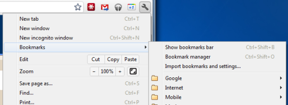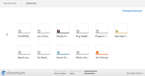
The new tab page no longer includes the bookmarks bar if this feature is disabled. The main reason for removing the bar is that the new tab page now includes a special section for bookmarks, next to the sections for apps and frequently visited pages. Bookmarks are displayed just like apps, but the thumbnails are much smaller and they seem to be blank, at least for now. You can now drag bookmarks to the list of apps, reorder them or remove them without using the bookmark manager.

While there are many advantages to the new interface for browsing and managing bookmarks, the thumbnail view is not very useful if you have a lot of bookmarks in a folder. Page titles are truncated to the first 10-15 characters and it's not always easy to find a bookmark. A list view is more space-efficient.

Dear GOS,
ReplyDeletePlease proofread your articles and try to see if they make any fucking sense.
Sincerely, fan.
But what is happening to Google Bookmarks? It seems Google has now abandonen the page www.google.com/bookmarks leaving it with the old style template. Google also appears to be pulling out of the Google Toolbar business (which sported the Google Bookmarks feature) in favour of +1 buttons in Chrome etc.
ReplyDeleteI don't really mind +1 but I wish Google would provide some direction as to the future of the two similar systems. In the mean time I have gone off to Delicious.
Does this mean now is the perfect time to turn off the "Auto Update" feature of Google Chrome? to keep it at v13? since it seems v14 onwards has ruined bookmarks?
ReplyDeleteBookmarks management has been one of Chrome's weakest marks.
ReplyDeleteBookmarks are kind of hidden if you don't have the bookmarks bar enabled. Folders retract when you middle-click or CTRL click on a bookmark. Now this.
I wonder if Chrome is going for an IE9-like New Tab Page for bookmarks? I like how IE9 shows just the favicon and title of a page.
Right now I'm accessing my bookmarks from the right-click menu [Link] 'cause the default in Chrome isn't that great.
still can use ctrl+shift+b to open the bookmark bar?
ReplyDeleteI agree, I hate the new bookmark system. I can't find anything I need. The new version of Chrome runs noticeably slower on the CR-48. So it has to run slower on other computers.
ReplyDeleteI experienced a slower google chrome the last few weeks. Does the new bookmark-option cause it? Maybe. Thanks for sharing the news.
ReplyDeletewell I was not liking old bookmark UI of chrome
ReplyDeleteLoved this change.
ReplyDeleteOhhh, I am loving the interface.
ReplyDeleteI personally don't like removing the bookmarks bar from the new tab page.
ReplyDeleteI have the bookmarks bar not shown by default - to save screen space - but when I want to quick access a bookmark I click new tab and select the bookmark.
This new change has introduced more steps to the process which used to be so quick.
Another annoying change is moving 'recently closed tabs' to a menu item.
ReplyDeleteThis along with the bookmarks change has introduced an extra click to each of these common actions.
This is SO slowing down my computer. How do I get rid of it?
ReplyDeleteThe only thing that I do not like among Google's product is its Chrome browser. It always is complicated to me.
ReplyDeleteWhy do programmers and execs think every one wants their computer to act like a freakin phone that can't make phone calls? I am sick of it. I have been using the web since ncsa mosaic and now IE is starting to look good (ack!) since it will run google bookmarks. Why is it that chrome doesn't use google bookmarks?
ReplyDeleteIt's as if gmail required you to install Eudora.
Note the same week chrome gets a new bookmark makeover, even older firefox browsers suddenly cannot use bookmarks. Slime is getting deeper.
I have tried chrome 6 times starting with it's first beta and always the lack of useful features turns me away. Lack of features does NOT equal ease of use but apparently some decision maker thinks it does. If I want a mac I will build one. If I want everything I use to look like the iphone I buy one.
Ctrl+Shift+B. OMG! its fixed!
ReplyDeleteThe easiest way to acces Bookmarks was (in MAC & LINUX) Finderbar & Global Menu respectively, but in most recent versions of Chrome the "Bookmarks" context menu has been removed :/
ReplyDeleteA year after. I'm searching for this "mobile version bookmark page" in New Tab. Is there a way to get this back into V22? Or is there any extension to simulate it in the right way?
ReplyDelete