An unofficial blog that watches Google's attempts to move your operating system online since 2005. Not affiliated with Google.

Send your tips to gostips@gmail.com.

June 29, 2015

Earth View Update

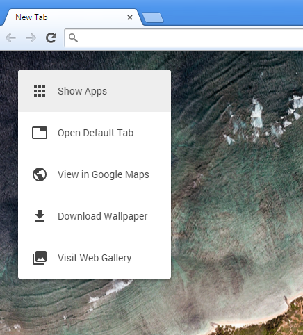
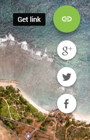
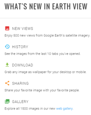
Google has a cool Chrome extension called Earth View, which replaces the new tab page with a stunning satellite image from Google Earth. The latest release brings a lot of new features: there are 500 new images, you can see the images from the last 10 tabs you've opened, there's a download feature in the menu and a sharing button. You can share images on Google+, Facebook, Twitter or copy the URL and paste it somewhere else.


How to see the images from the last 10 tabs you've opened? Just mouse over the bottom of the new tab page and click "recent imagery". You should see a list of 10 clickable thumbnails.
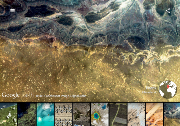

If you don't want to install the extension or you use a different browser, there's a web gallery that shows all the 1500 images. Click the arrow button or use the left/right keyboard shortcuts to navigate between images. There's also a slideshow feature called "leanback mode".
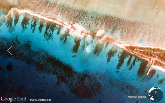

"Earth View is a collection of the most striking and enigmatic landscapes available in Google Earth. The colors, shapes, textures and patterns all contribute to the strange beauty of our planet, reminding us of nature’s uncanny geometry and bewildering simplicity. Each of the 1500 images featured in this collection was hand curated and available for download as wallpaper for your desktop or mobile," informs Google.

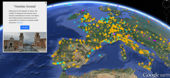
Google Earth celebrates its 10th birthday and the desktop software adds a new layer called Voyager, which integrates Earth View, Street View highlights, 3D cities, a map of recently published satellite images and a tour that shows a few of the thousands of Voyager locations to choose from.
June 25, 2015

Listen Again in Google Translate

Emanuele Bartolomucci, a reader of this blog, noticed an interesting feature in Google Translate. If you click the "listen" button next to the text you want to translate or the translation, Google converts the text into speech. Click "listen" again and the speed decreases, probably because Google assumes that you are listening again to better get the correct pronunciation. It's like asking Google: "Could you speak more slowly, please?"


If you click "listen" the third time, Google goes back to the normal speed. Click again and the speed decreases. The two text-to-speech versions alternate.

I've checked Google Translate's URLs and the second version has the following parameter: "ttsspeed=0.24", which changes the text-to-speech speed.

{ Thanks, Emanuele. }

Classic Google Maps, No Longer Available

Classic Google Maps has been replaced by Google Maps Lite back in April, but there were a few URLs you could use to access it. Now they no longer work, so you'll have to get used to the new interface or switch to a different service like Bing Maps or Here.com. There are still various sites that use features from the Classic Maps, including Google's own Map Maker.


Last week, I had to print some directions in Google Maps and I realized that the classic Google Maps had a much better printing feature. You could include a map for each step or add Street View imagery. The new Google Maps offers two options: print text only or print including maps. There are fewer maps included since directions are now grouped and you can no longer customize each step.

Google's Updated Privacy Policy

Google has recently changed its privacy policy and there's a page that shows the differences. It's not clear if there are actual changes or the updated privacy policy only clarifies some existing features.


The new privacy policy states that information like your name, email address, phone number or credit card could be stored with your Google account, which is not something new. Another change is that the "cookies and anonymous identifiers" section is now called "cookies and similar technologies", which is a broader title.

The following text:
We and our partners use various technologies to collect and store information when you visit a Google service, and this may include sending one or more cookies or anonymous identifiers to your device.
... has been replaced with:
We and our partners use various technologies to collect and store information when you visit a Google service, and this may include using cookies or similar technologies to identify your browser or device.
Basically, Google removed all the references to "anonymous identifiers" from the privacy policy and replaced them with "similar technologies", which includes anonymous identifiers, but also HTML5 Local Storage, local shared objects (Flash cookies), Web beacons and more. The privacy policy clearly states that Google can use cookies and similar technologies to identify your browser or device. Google says that it uses "these technologies to collect and store information when you interact with services we offer to our partners, such as advertising services or Google features that may appear on other sites."

There's also a new paragraph:
Information we collect when you are signed in to Google may be associated with your Google Account. When information is associated with your Google Account, we treat it as personal information. For more information about how you can access, manage or delete information that is associated with your Google Account, visit the Transparency and choice section of this policy.

June 24, 2015

Undo Send Graduates From Gmail Labs

After spending 6 years in Gmail Labs, "undo send" is now a regular Gmail feature. You can find it in the settings, bellow "send and archive". The feature is disabled by default, but it's enabled if you've already used the Gmail Labs feature.

So what's so great about "undo send"? Gmail doesn't send email immediately and there's a short delay that lets you undo sending the message, just in case you changed your mind, you noticed a mistake or you picked the wrong sender. There are 4 options for the cancellation period: 5 seconds, 10 seconds, 20 seconds and 30 seconds.


After sending a message, you'll get an "Undo" link next to "Your message has been sent". If you click the "Undo" link, you can edit the message, save it as a draft or delete it.


"Undo send" has been recently added to Google Inbox for desktop and mobile. Mashable reports that Gmail's mobile apps will also add this feature: "Google said it will roll out the feature to mobile in the future but didn't elaborate on the timeline."

Add Google Drive Files to Google Calendar Events

The latest version of the Google Calendar app for iOS brings a few useful features, catching up with the Android app.

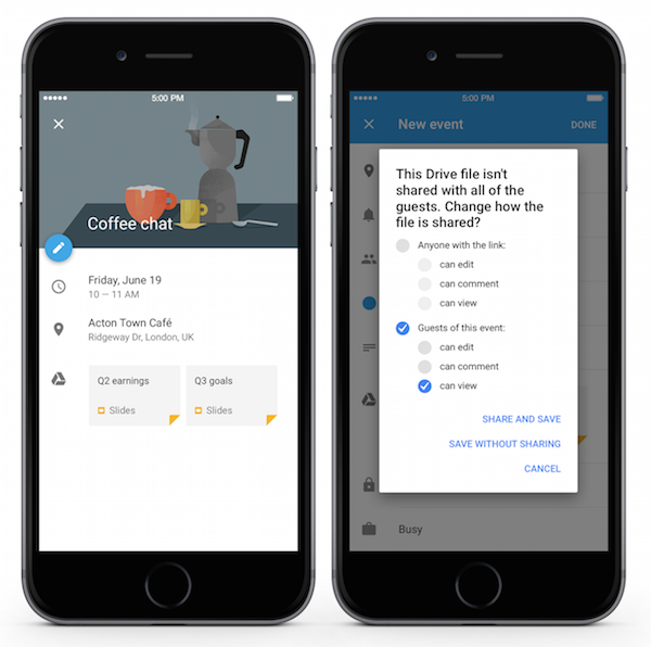
You can now add Google Drive files to calendar events in the iOS app, as well as the desktop Google Calendar site. This feature was already available in the Android app since February and in Google Calendar Labs since 2009. "Event attachments" graduated from Labs and it's now available for everyone (including developers).

If a Drive file isn't shared with all the guests, you'll see a prompt and you can change how the file is shared.


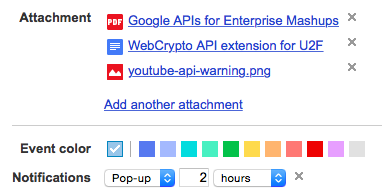
Here's a screenshot from the desktop site (the feature may not seem new if you've used the Event Attachments feature from Google Calendar Labs):


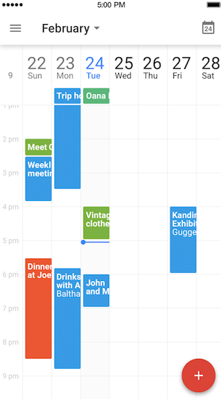
Another feature already available in the Android app is the 7-day view, which lets you see more events at a glance. You can now switch to the 7-day view in the iOS app and customize your calendar with week numbers in the settings.


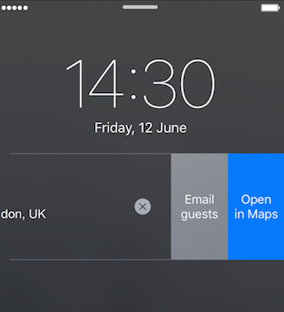
Google takes advantages of the improved notification features from iOS8 and adds interactive notifications for events, so you can email guests or view the map without having to open Google Calendar first.

June 23, 2015

Picasa Web Albums, Back to the Future

Picasa Web Albums is fully functional again. The site no longer redirects to Google+ Photos and the search feature works, at least for personal photos and videos. The search feature was removed in 2013.


I thought that Google will discontinue the service and replace it with Google Photos, since Google+ is no longer required. For now, Picasa Web Albums is here to stay and that's surprising.

Google+: Then and Now

Here are 2 screenshots that show the importance of Google+ today and a few years ago. Back in 2013, Google changed the navigation bar and added an app launcher: the first shortcut was for Google+.


Google has recently tweaked the app launcher. The first shortcut is now for "My Account", followed by Search, Maps, YouTube, Play, News, Gmail, Drive and Calendar. Google+ is now the 10th shortcut, right next to Google Translate and Google Photos. This is the default app launcher for new users and those that haven't customized it:


Here's the 2013 app launcher for logged-in users:


And the same app launcher today:

Google Wallet, Rebranded as Google Payments?

A few weeks ago, I posted about Google Payments, a service that could replace Google Wallet. If you open Google Wallet's site, you'll notice that the name of the service is now Payments. There are still references to the Wallet Card and Wallet Balance.

Another change is that payments.google.com no longer redirects to wallet.google.com, but shows the same site.

Google says that "the Services offered by Google Payments are covered by the Google Wallet Privacy Notice. The Google Wallet Privacy Notice will be updated effective June 30, 2015." The link sends users to this page, which is the Google Payments Privacy Notice.

Update: Android Police asked Google about this. "Google has confirmed to us that Wallet will be re-branded primarily as a money transfer service, and will no longer process in-app or online payments, and that Google Payments will pick up the management and overview aspects of Wallet's functionality. It was also implied that Android Pay will replace Wallet on Android devices for tap & pay and other purchase functionality."

{ Thanks, Kevin. }

Free Google Play Music Radio

Google Play Music is a great music streaming service, especially if you pay for the All Access subscription. If you're not a subscriber, you can only listen to the music you uploaded/matched using Music Manager or the Chrome app and the music you bought or got for free from Google Play.

When Apple launched iTunes Radio in 2013, it seemed ironic that Apple offered a free ad-supported service, while Google had a paid subscription service. Now that Apple Music is ready for launch, it's time for Google to offer the missing free radio feature.


"Google Play Music now has a free, ad-supported version in the U.S., giving you a new way to find just the right music and giving artists another way to earn revenue. Our team of music experts, including the folks who created Songza, crafts each station song by song so you don't have to. If you’re looking for something specific, you can browse our curated stations by genre, mood, decade or activity, or you can search for your favorite artist, album or song to instantly create a station of similar music."


The free radio feature is already available if you're using the Play Music website and it's rolling out this week to the mobile apps for Android and iOS. It's US-only, for now.

You can skip video ads, just like on YouTube:


Here's the message you see after 6 skips in an hour or less: "you're out of skips, get on-demand and offline access to millions of songs for $9.99 per month". You can always start a new radio and you'll get your 6 skips back.


The main limitation is that you can't play a certain song. If you click a song from the new "top charts" or "new releases" sections, Play Music will start a radio with similar songs.

Whether you're using the free Google Play Music in the US or you're an All Access subscriber, you get thousands of new radio stations grouped by genre, activity, mood, decade, and more. Music for sleeping, dark music, 1950s music, world music, car ride music for kids - these are only a few examples.


Mobile Google Search Tests Oversized Header

I'm not sure if this is a bug or a new Google experiment, but I've noticed a different mobile search interface that uses more space for the header. There's a Google logo, a search box and a list of specialized search engines below the search box. It's based on the experimental interface I've mentioned in a previous post.


If you enable the search tools and restrict results to a certain date range, the new header uses even more screen real estate.


For some reason, this experimental interface is only used when searching from Google's homepage. Chrome's search box sent me to the compact UI.

Google Promotes Privacy Checkup

There's a new promotional message that's displayed when you sign in to a Google account. Google encourages you to use the Privacy Checkup feature from the new My Account page and "take control of your Google privacy settings".


The page lets you "review and adjust what data Google uses to personalize your experience, and update what information you share with friends or make public."


You can choose what Google+ profile information you share with others, manage what you share on YouTube, personalize your Google experience by enabling or disabling features like Web & App Activity, Location History, YouTube Search and Watch History. You can also manage ad settings and opt out of ads based on your interests.


All of these features were previously available, but this is a simplified step-by-step guide, just like the Security Checkup. Google wants to make sure you are "always in control of your data and information".

Google Apps Menu

When you mouse over your name in Google's navigation bar, there's a tooltip that says: "Looking for Google+? Click the Google Apps icon to the right."


Mouse over the grid icon and there's a new tooltip: "Google Apps".


This used to be called Google App Launcher, since it was similar to Chrome's App Launcher. Google's help center articles still use this name: "To switch between Google products, click the App launcher icon and select the one you'd like to use."

Google Apps is the name of a suite of productivity tools for business, education, nonprofit organizations and more, so it's a bit confusing to use the same name for the launcher feature.

June 22, 2015

Google Notifications Settings

Google's notifications box from the navigation bar has a new settings button. For now, it shows only 2 services (Google+, Google Photos) and it lets you enable or disable notifications from Google+ and Google Photos.


Here's a screenshot that shows the option that's currently available: "allow notifications here from Google+". For the first time since Google+ was launched, you can now disable Google+ notifications from the navigation bar.


Google Photos was also added to the settings section. When I first checked the settings, Google+ was the only service available, but Google Photos was added after a few hours. If you enable "Suggest new creations" in Google Photos settings, the Assistant feature will automatically create animations, collages and videos from your library and will trigger notifications.


Maybe in the future Google will show notifications from other Google services: Gmail, Google Calendar, Google Drive, YouTube. The title is now "Google Notifications" instead of "Google+ Notifications".

{ Thanks, Mukil Elango. }

June 20, 2015

A YouTube Survey

Google's services show various surveys, but they're usually discreet. This time, YouTube placed a satisfaction survey at the top of the homepage, above the list of videos from the "what to watch" section. Here's the only question: "How would you rate the picture quality of professional videos (e.g. music videos or TV clips) on YouTube?"

June 19, 2015

New Interface for Google Cache

Google Cache pages have an updated header and now allow you to check the source code of the cached page. Google uses a different background color and more spacing.

The message is the same. Here's an example: "This is Google's cache of http://en.wikipedia.org/wiki/Test. It is a snapshot of the page as it appeared on Jun 17, 2015 19:01:59 GMT. The current page could have changed in the meantime."

Google lets you switch between:

* the "full version", which is displayed by default
* the "text-only version", which doesn't load images, scripts and other resources
* the page source - a new feature that shows the source code of the HTML page.

Full version:


Text-only version:


Source code:


Google adds the following URL parameter to show the HTML code: vwsrc=1. Example: http://webcache.googleusercontent.com/search?q=cache:dxrXMu4BMrYJ:en.wikipedia.org/wiki/Test&hl=en&gl=us&strip=0&vwsrc=1.

Here's a screenshot of the old Google Cache. It's a screenshot from 2013, back when Google still highlighted search terms.

Google+ Link in Google Translate

While other Google services remove integration with Google+, Google Translate added a prominent link to its own Google+ page. The Google+ icon is placed next to the Phrasebook icon, at the top of of the page. It will be interesting to see how long it will last.


{ Thanks, Alireza Eskandarpour Shoferi. }

Google Mobile Search Tests More Dividing Lines

Google tests a slightly different mobile search interface that adds dividing lines between search results URLs and snippets, while decreasing font size for titles. Another change is that the names of the specialized search engines are written in uppercase letters (WEB, NEWS, IMAGES, SHOPPING, etc.)


Google already used dividing lines that separate search results, so the new lines are a bit confusing. Some users might associate a snippet with the URL of the next search results.

Here's the regular mobile search UI:


Update: Barry Schwartz posted about this experiment back in April.