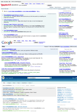
 Search Engine Land compared how the most popular 3 search engines treat the user experience.
Yahoo
"Yahoo was by far the most aggressive both in terms of how often top sponsored ads were shown, and how much really it was devoted to them. The majority of the Golden triangle real estate was reserved for monetization opportunities. Relevance, at least in terms of the user's expectation, was pushed down the page."
"At Google, the approach to this balance was completely different. There was no talk about balancing user experience against monetization opportunities. There was no discussion about the ecosystem that included both advertisers and users. It was all about relevance, defined on the user's terms. Whatever appeared at the top of the page had to be the result most relevant to the user. (...) Algorithmic relevance remains sacred from the highest levels of Google right down to the frontline engineers, because the founders have remained actively engaged in the day-to-day operations."
Microsoft
"The religion that is relevance at Google is not found to the same extent at Microsoft. Microsoft is a huge and diverse corporation with many strategic objectives, one of which is search. Relevance does not define the core purpose of Microsoft, as it does at Google. Microsoft approaches the user experience as one of a number of best practices. The single-minded devotion and dedication to the relevancy of the user experience that typifies Google's approach to search is not found to the same extent at Microsoft. It's not that relevance isn't important at Microsoft. It's just that it's treated more as a business objective than a sacred cow."
Despite the fact that Google has more visitors than Yahoo and Microsoft combined, they try much harder to provide a good user interface, because a happy user is much likely to return and to trust you in the future. Google was very proud to say a couple of weeks ago that it displays less ads than ever at Google.com, because it managed to target them better and to filter non-commercial queries.
Greg Linden thinks the roots are responsible for these user interfaces: "Google has never had a portal. Google has always focused on getting people the information they need quickly and then sending them off to other sites to do whatever they need to get done. Microsoft, AOL, and Yahoo have large websites with a lot of content. They traditionally have wanted to capture people on their properties and keep them there. Because of this history, I suspect Microsoft and Yahoo may still be conflicted about whether their goal in search is helping people get what they need quickly or capturing audiences for their sites."
SEL managed to get some insights about the future of Yahoo, Google and Live Search: Yahoo is all about social search and will try to get the community involved more in search, Google tries to find better algorithms for personalization, to guess user's intent by using the search history and information from other services, Microsoft could try something new.
It's important, as you push more information in the search results, to keep everything simple and not to overwhelm users with choices, links and irrelevant answers.

Great material. And that's why I use Google so much: relevancy. I don't care about anything else; if I need information I turn to Google because I trust them and I know I'll get what I need quickly. Carry on!
ReplyDeletewell.. a nice post.. but the reason I use google totally is the content of my search result.. its NOT the ads or commercials or whatever you call it.. maybe I have never clicked on any ads so far during the whole past years.. maybe one or two times...
ReplyDeleteI wanna assert that had this been yahoo or live.com that provides me with the best SEARCH results given their authoritarian ads systems, I would prefer them.. but google is heading the way.. bringing me what I really want..
I use Google 'cause it's cooler than Yahoo! or Live. Seriously, who wants to tell their friends that they use MSN Search? Google is clean while the others are just cluttered and made for the most ignorant elements of society. You can tell that someone is stupid when you see them performing a search from their browser's homepage live.com. Google is like Coca-Cola : a classic that will never be beaten. I would never date a girl that used Yahoo, even if she was super hot.
ReplyDelete@john: Well, I don't know about the dating bit... ;)
ReplyDelete... but I definitely feel the same way about Google vs. the competition. Keep up the good work, Googlers! :)
An excellent article on how Google approaches its product development process is present at:
ReplyDeletehttp://www.goodexperience.com/blog/archives/000066.php
This indicates that "users" are put at the forefront while designing. Intention is fairly clear in the mission statement of the firm, which is: to organize the world's information and make it universally accessible and useful.
Source: http://www.google.com/corporate/