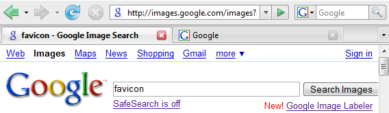
Google's favicon is hosted at google.com/favicon.ico and it's a 16x16 pixels image, a standard size for favicons. Google replaced the upper-case "G" in blue border, green and red borders with a lower-case purple "g" in a rounded corner rectangle.

The first time when I saw the new favicon at Google Image Search, I thought there was something wrong with my browser's cache or I typed an incorrect address. Google's new favicon is less cheerful and comforting, but it makes a lot of sense: the small g is a symbol for infinity (∞). A googol (10100) is just a poor approximation for the huge amount of information that needs to be indexed, organized and made useful by Google.
{ Thanks for the tip, Louis, John and Aleksandr. }
Update: If you want the old favicon back, try this Greasemonkey script (requires Greasemonkey for Firefox, Opera or a userscript plug-in for other browsers).
Update 2: Search Engine Land has an official position from Google. "We recognized there was a need for a Google icon that would better work across multiple applications including web, mobile and client applications. We felt the small 'g' had many of the characteristics that best represent our brand: it's simple, playful, and unique. We will be looking to improve and enhance this icon as we move forward."
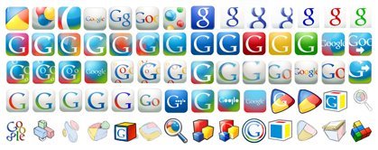
Update 3: Google says this is not the final favicon. "We tried in total more than 300 permutations [some of them are displayed below]. It was much harder than we thought at first. We wanted something distinctive and noticeable, so we aimed toward transparency or semi-transparency, so the image would have a more distinctive noticeable shape than just a block. We wanted something that embraced the colorfulness of the logo, yet wouldn't date itself." If you have some suggestions for Google's favicon, send them here.
Update: The favicon was updated in January 2009.

hey I created my favicon using SM Favicon Generator but can anyone let me know how to add it to blogger?
ReplyDeletefor sure I dont care what favicon is. its just very sad that "google" and "Gmail" has the same, and in my bookmarks toolbar I dont see which is which one. my idea is, leave to "Gmail" old favicon, uppercase "G", and for "google" let it be new one, "g".
ReplyDeletewhat do you think, Google(.inc)?
I can't click into any of my emails anymore. I like to get into them. Now they are dead.
ReplyDeleteWorst favicon ever, it looks really ugly in my bookmarks and the old one looked better. Even the other ones on this page looked good. You picked the wrong one!!!!!!!!!!!
ReplyDeleteYes, the favicon really sucks - if they really wanted the favicon to represent infinity, they could have picked up the number 8 !
ReplyDeleteI absolutely hate this icon....nothing disguinishes it from the flippin internet explorer icon and I'm contantly clicking on the E icon when I meant to click on the G icon.. I hate it!!!
ReplyDeleteI have a favicon that isn't one of the favicons in the image. It's resembles a red octagon with a hand in the middle (like someone holding up his/her hand to say "stop"). Anyone else have this?
ReplyDeleteIt's certainly an improvement and it looks slightly more modern
ReplyDeleteThey just changed it again. The new one is better.
ReplyDeleteNew Google favicon: Looks like Chrome. Check it out.
ReplyDeleteLooks like they're trying the next iteration now...
ReplyDeleteNOT ANOTHER FAVICON!
ReplyDeleteNow there's another new one...
ReplyDeleteHeyy new favicon :)))
ReplyDeletesomeone who was new to google would think its an 8 not a g, its too far to the left, but i like it
ReplyDeletethey changed it again <_< <_> g00gle goez nutz
ReplyDeletei dont think i can see what im supposed to be seeing, it looks like an 8 which is not centered but very far to the left, dusnt look like a g, but looks alrite i guess, people will get used to it
ReplyDeleteOh noes... there is a new one !!! http://www.google.com/favicon.ico
ReplyDeleteGoogle is making waaaaaaaay toooooo much money, which is a good thing. But, somebody has waaaaaaaaay toooooooo much time to change a silly favicon. That is the first time I've heard of that term, favicon. I've heard of emoticon. Anyway, who cares about the rainbow colored doggie foot print. Okay, The 'G' favicon is better. It's meaningful for the site and powerful. Bring the 'G' back Google high rollers! Thank you!
ReplyDeleteby the way, Google has changed again its favicon :)
ReplyDeleteold one is best ;)
ReplyDeleteGoogle's new favicon is cool and good
ReplyDeleteWoah! Another new favicon today!
ReplyDeleteit changed again tonight
ReplyDeleteCongrats for the new colorful favicon !
ReplyDeleteI think it's changed again! Certainly for http://www.google.co.uk/ anyway. It's now a white g on a multicoloured background.
ReplyDeleteDave
Ah, sorry, I did not see all of the other posts begining 9 jan. I wasn't the first person to notice huh.
ReplyDeleteDave
And the latest one is cool @ http://www.google.com/favicon.ico
ReplyDeleteThey should rather give Google Maps it's own favicon first, before playing around.
ReplyDeleteTheir latest favicon uses elements of a four-colour square. It's an exact 90° rotation of Microsoft's Windows logo.
ReplyDeleteuglyyyyy :(
ReplyDeleteThe new favicon is crazy.
ReplyDeleteI don't like it. It's a lot like those warmup jackets from the eighties that had geometric, sectioned colours. I love google but the new favicon is kind of annoying. Sorry.
ReplyDeletedont like i its a yuky
ReplyDeleteCompared to the new colored ugliness... this was wonderful!
ReplyDeleteGoogle, no one likes your new favico. It looks awful.
ReplyDeleteInstructions for setting the latest favicon (the one with the color patches) can be found here:
ReplyDeletehttp://fahdshariff.blogspot.com/2009/01/set-googles-new-icon-in-firefoxs-search.html
Hey guys, thefaviconshomepage.com already hosts the brand new google favicon!
ReplyDeleteI DO NOT LIKE THE NEW GOOGLE FAVICON!OENone1 BRING BACK THE OLD ONE I AM OLD AND THEREFORE RESITANT TO CHANGE! THE INTERNETS HAVE SPOKEN
ReplyDeleteA favicon that attracts attention to the tab bar is not appropriate. The users focus shouldn't shift from the website to the tab bar just because of a favicon.
ReplyDeleteUgly!!
ReplyDeleteI think the old favicon was much better. This one make eye pain.
ReplyDeleteSeriously? This baffles me that people even would care about a favicon at all. I barely even noticed it was changed, let alone cared about it. sad so many people feel affected by this.
ReplyDeleteGoogle's new favicon looks like some crapware/adware website would use to attract attention. Not subtle IMO.
ReplyDeleteI hope they can tell the meaning of their new favicon..
ReplyDeleteim not a fan of the old one but i just got used to it.
i hope they can tell this icon's significant.
The new favicon is an eye-murdering design disaster. Please make it stop. Blood is gushing from my sockets as I type this.
ReplyDeleteAstonishingly hideous.
I feel like my browser address bar is swearing at me. Who on earth approved something so obviously wrong?
A 64 pixel landmine for your retina.
ReplyDeleteIts not good.. not professional... more like "my brother's 2 yr old son did it"...
ReplyDeleteI don't like it either. At first I thought I was getting redirected to a philsing website. The icon doesn't go with the Google branding.
ReplyDeleteIt looks too much like a flag. The icon should be simplistic with minimal use of colour.
Looks like a blob. It will confuse people who are not really into computers, but do use them. If change is needed, please change to something more recognizable (such as one of those logos that has the entire Google name).
ReplyDeleteyeah the colors are too similar to the avg icon or windows logo colours. doesnt have any resemblance to the google name kinda funny you chose this out of 300 others. the previous one's got my vote, why change from something everyone is familiar with.
ReplyDeleteAnybody else notice it looks like the favicon from: http://www.microsoft.com/windows/windows-7/default.aspx just turned one rotation and had a G added to it?
ReplyDeleteOld one please...
ReplyDeleteSimple is beautiful
the colored one is hideous
ReplyDeleteThe old favicon is sooo much better! change it back!
ReplyDeleteI'm not a fan of the new favicon, it looks kind of second rate. Normally google's logos are crisp and look great.
ReplyDeleteI am extremely worried that it looks like the sign in splash on Wintel's Office Suite (altho I use OpenOffice and have forgotten exactly what that looks like.) The μ$ Office_Suite uses a four color splash screen as it loads up (or maybe it's in the image during boot up.)
ReplyDeleteI see a different one now, it's pretty awesome!
ReplyDeleteThe new one is looking Good!
ReplyDeleteBut is it fine to rebrand it every time?
Today, I was really confused to login to my Google Account after seeing this new FAVICON. I browsed then and verified that the favicon is changed officially before logging in to my account.
See, this is the time of spamming guys, a change should be properly notified to the end users.
Regards,
--Kiran Chand Palakkattiri
I liked it!
ReplyDeleteLooks like its in the typical mosaic style of Gaudi the spanish 19th century architect!
-nileshkale@gmail.com
Google's favicon is getting progressively uglier.
ReplyDeletethis one is the most stupid version i liked the initial one. The latest one is crazy.
ReplyDeleteI like the original better. The latest one is not distinct its obnoxious
ReplyDeleteyour trying to hard . its a case of a simple thing being over analyzed. the original worked and was the best. the favicon won't bring the stock up focus google's time on making money.
ReplyDeleteget some sleep google fav people . the new icon prob looked good at 3am after 10 cups of coffee but its really bad. go back the old one
ReplyDeletePlain and simple, it is not good. Does anyone know of a way to change it through a Firefox plug-in or something similar... It has to go.
ReplyDeleteIt's changed again, eh? Now it looks like the old Microsoft Windows logo.
ReplyDeleteBut it's amusing to see Google's quasi-religious status among the masses... people read meaning into it like it's an article of faith, hand down from on high.
It's almost like they're Apple or something...
Ugly new favicon! (The one with blu, yellow, geen and red colors around a white g). I'm even looking for ways to change it.
ReplyDeletein my mind, it stinks of a windows logo. i like linux. as an ex media design student i think its fairly un-imaginative and Google could do far better, even if the service itself is not normally considered eye candy.
ReplyDeleteMy suggestion, GOOGLE! is 7 chars, and there are 7 days in the week, a letter per day, then invite users to submit their favicon letters. this fits similarly to the differing masthead we have come to love.
I gave it a chance, but still hate the new one... :s
ReplyDeleteSo now I am back to the Classic Capital G thanks to 'Firefox' the 'Stylish' Add-on and the 'Google favicon Classic' style from userstyles.org, which loads into the 'Stylish' add-on.
So change it to whatever you want now Google, you're not changing mine any more. Thank goodness for that... :)
if you look at it close up, it resembles the Kellogs "cockerel" on their cornflakes boxes!! when i read about this on the bbc.c.uk thats what i thought it was... kellogs!! oh well.. personally i dont pay any attention to shi favicon thing anyway. it doens;t add to anything...
ReplyDeletethis is repulsively ugly. I am going to switch to other search engines. Anything but this horrible favicon!
ReplyDeleteI hardly notice or take note of the little images in my browser bar to be honest. I wonder how much money was spent developing and researching this considering the current credit crisis?
ReplyDeleteReminds me of the bladder full commercial... brb ntp
ReplyDeleteYou're favicon is banned (blocked) from my browser.
ReplyDelete(Until i've figured out to get old icon back in Opera9.27)
The good thing about google was it had no fluff.
Then began text-ads which bother me very little.
But it's more and more.
Now i block as much google as i can.
nice and simple but looks very professional
ReplyDeleteI recently rated some of the most well-known favicons out there, and Google only came in as the fifth worst.
ReplyDeleteSurprised? Check out my post:
Top 5 Worst Favicons
Although I like the current Google favicon, I think it's a mistake because it is too similar to MSN's favicon. (same colors, similar style) Since Google is soooo superior to MSN, I feel that they should have a more unique favicon.
ReplyDeleteMy google icon has mysteriously changed to a black square with a lower-case, white "n" inside. Does anyone know where this came from?
ReplyDeleteMuch has been discussed about Identity Theft, user ID's and Passwords stolen or hacked, credit cards being used without the owners knowledge and so on. Now there is a safe way of protecting your passwords and identity online from being copied, stolen and hacked by keyboard trojans, using your biometric fingerprint and face recognition, and even voice, to log on to web sites. By simply scanning your finger or face or voice you can log on to a web site, log on to your computer, and even encrypt files and folders. No more worrying about who might hack into your online accounts or even your email. No more remembering passwords or using the same passwords on many sites. This is an exciting new innovation from myBiodentity and they have about fourteen products that are enabled with biometrics including email encryption, password manager, virtual disk, and many more.
ReplyDeleteI cant sleep at night....
ReplyDeleteDont like this new one...its ugly and too bold, it should be subtle and tastefully done...
ReplyDeleteUgly and in your face...dont use the primary colours in such a small pic..
ReplyDeleteI think the latest always better than the older :D
ReplyDeleteI think it's cool! The design links to the google philosophy
ReplyDeleteOH MY GOD. THE NEW GOOGLE NEWS FAVICON IS AMAZING!!!11one. I LOVE IT.
ReplyDelete
ReplyDeleteLove the new favicon....always hated that multi coloured blob!