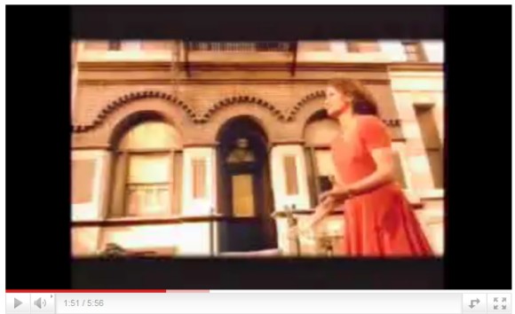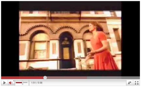

Unfortunately, the new video player has too many moving parts and the animation effects could become annoying. Vimeo's player is even more streamlined and more user-friendly.
Update: The new player is not available for all videos. Here's an example of video that uses the new player.
Update 2: YouTube says that it has "released a new player design for all videos without ads. The goal is for the player to be as subtle as possible so that the video itself shines and doesn't have to compete with the stuff around it. We'll be following this roll-out with player upgrades for videos with ads and then for embedded videos."

"The player recently tested by YouTube is now live for everyone."
ReplyDeleteNot me.
actually looks allot better in my opinion
ReplyDeleteIt's live, but not for all videos. Here's an example of video that uses the new player.
ReplyDeleteI love it.
ReplyDeleteLove it. Its looks SO much better. It was about time to youtube give the player a new look and this is looking great.
Also new language on Youtube is available: Finnish.
ReplyDeleteI like the new design, its shiney
ReplyDeleteHmmm.. The old design was better i think.. Or i have to get used to it :?
ReplyDeleteAnw, it reminds me google video player, back before google bought youtube..
You may find this of interest:
ReplyDeleteWatching YouTube: Extraordinary Videos by Ordinary People (University of Toronto Press, 2010)
Dr. Strangelove
University of Ottawa
dammit, i'm still not getting it
ReplyDeleteI like the new player but it should be matte not glossy.
ReplyDeleteAlex: I'm seeing two type of video players: The one you mentioned and another one similar to the old one, but with the Play/Pause, Volume and and Next buttons on the right.
ReplyDeletehttp://yfrog.com/8520100428230635j
One thing I like about both video players is that the volume and resolution size aren't next to each other, which in HD videos, the "Watch in HD" notice would pop up the video screen size menu if you tried to control the volume will that notice was visible.
What the hell is wrong with the huge progress bar when I hover the mouse? So ugly~!
ReplyDeletePS Also, when you right-click the video, you get a two new options: Report playback issues and Take speed test, besides the other options you previously mentioned.
ReplyDeletehttp://googlesystem.blogspot.com/2010/03/stop-buffering-youtube-video.html
The new video player is irritating. For the last few years the volume control slider has on the right and now its on the left and it is not vertical anymore. The slider bar is so large that I think even blind people can see it. Goddamnit YouTube I wish you would stop changing everything!
ReplyDeleteAll the videos look a lot worse now. 360 to 480 has almost no difference at all now.
ReplyDeleteThere is an incredible amount of wasted space where the progress bar used to be.
ReplyDeleteIronically the new toolbar is almost twice as tall and the text is harder to read, larger font would have been a nice improvement.
ReplyDeleteThe timestamps on the seek bar are gone and it would have been an improvement if it was still the center instead of above wasting all sorts of space.
Youtube keeps breaking things that worked fine. I wonder what's next.
Where Favorites have gone ?
ReplyDeleteI just don't understand why they have to hide the simplest thing in the world such as a volume slider?
ReplyDeleteAre they trying to keep it minimal? Because it just doesn't make any sense that the most frequently used control in the video player has to hide. Not only that, but the respective animation can get annoying over time.
The New Player is attractive but it does not work on some videos and my favorites are also not been shown :(
ReplyDeleteI quite like the new look. Also, regarding Vimeo: they might have an (arguably) nicer player, but I find that their videos slow a computer down much more than YouTube videos. I'm not sure why that is, but it is an important factor for older (ie. ~1Ghz) hardware and also on Linux where the Flash plugin is slower than on windows.
ReplyDeleteI have a fast internet service 5mb/sec but somehow after the introduction of this player, my streaming has gone down the drain. all youtube videos take eons to stream!
ReplyDeleteyay i love the new player it make my videos play FASTER they should implement it faster there is nothing wrong with it.
ReplyDeletethe player sucks big time! Because it just doesn't make any sense that the most frequently used control in the video player has to hide and is above an empty space that is not used. Ridiculous. Also they took down the timeline timecode.
ReplyDeletethe new player sucks. I shouldn't need to click more times or expand things that used to be right there. Once again, adding "features" no one asked for. How about:
ReplyDelete1.) more keyboard shortcuts so I can better use youtube from my harmony remote? at least one for fullscreen?
2.) the ability to search my own favorites? I mean, google owns this site, and google can't whip up a quick search function?!
3.) the ability to put my favorites in folders or categories so I can organize them?! 38 seconds ago
Is it gone? Cause its not showing up anymore
ReplyDeletehow can you get it on your videos?
ReplyDeleteemail me
Alex_Toal96@yahoo.co.uk
This new YouTube player takes away the video quality that is the only reason why I hate it.
ReplyDeleteWHAT THE HELL WAS WRONG WITH THE OLD ONE, IT WAS PERFECTLY FINE.
Now I have to watch videos that are blurry and pixalated because of the damn new player.
I don't understand why half of my videos have the new player, and half have the old...
ReplyDeleteI hate the new youtube player! When I rewind a video, it starts loading all over again! And the loading process is slow too! Stupid youtube!
ReplyDeleteseems pretty lowbudget
ReplyDeleteI hate it if you need to skip to a part in the vid that hasn't streamed yet it just completely freezes instead of pausing for like five second and just re streaming from the middle. I hate it so much.
ReplyDeletethe player sucks
ReplyDeleteyoutube new player sucks... it loads so freaking slowly!!!! i'm so frustrated.
ReplyDeleteNew design of youtube player is more friendly with some good usability
ReplyDeleteThis new YouTube player takes away the video quality that is the only reason why I hate it.
ReplyDeletethe new player is just a moronic design, period. Its not user-friendly, the animation stutters (on a less-than-3-months-old computer), the controls are in the opposite place of where you think they would be, now you have to hover the mouse over the controls to see how far into the video you are.. just stupid.
ReplyDeleteSome videos still have the old player because Youtube can't figure out where to put the orange bar and annotation and closed caption controls on the new player.
ReplyDeleteI like it but some times its slow
ReplyDeleteto me, it's annoying, it doesn't load, per say, it just plays until until it stops, it "loads", then plays again, there's no way to allow the whole video to load up, then watch the whole thing without interruptions, it's a failure in my eyes, I can't watch a whole video without it stopping for a minute to catch up, it's annoying and members should have a choice if they want to use the new player or go back to the other.
ReplyDeletewhen it is emedded, you no longer have the option to view the related videos until the videos are finished.
ReplyDeletesince i often use embedded videos as a personal "kicking off" point to look for things, i find that very discouraging.
It looks nicer, but it works shittier... :/
ReplyDeleteSeriously, It sucks. I had to wait 15 minutes for it to stop buffering like 5 times on the video. Its so slow. I cant even watch videos a lot
ReplyDeleteThe quality is the same even on 720 hd
ReplyDeleteWhy Google why? What was wrong with the old YouTube? :/
ReplyDeleteI just love the new look !
ReplyDeleteI hate it. I like having all that information available at a glance. Now I have to keep moving the cursor around to see the progress and it covers part of the video. It makes it harder use the controls because I have to wait for them to pop up every time. I was happy when they changed to a lighter background color a few years ago which made the time stamps easier to read (I'm color blind), but now they've gone back to a dark background and I can't see the damn time stamps any more. Please at least give the user an option to use the old user interface.
ReplyDeleteI prefer the old player.
ReplyDeleteWhen ads are above the new player they block a third of the screen! It is difficult to stop a video at an exact moment because the player will disappear when I am waiting to press stop. Also, it is hard to stop videos to read subtitles because the player pops up on the video and I can see when I should stop it to read the right text.
The videos don't load for 30-40 seconds and when they do you can't pause them, I don't like this player....sorry engineers, looks like back to the code writing again.
ReplyDeletethe new youtube fakkin sucks! the player with invisible bar is confusing if you got slow broadband like me, and it wont even save my streamed downloads.
ReplyDeleteWHY? and WHAT is this?
if its not broken dont change it. the old player was perfect. except all dem ads n shit
thou shall not eat from the tree of knowledge.-
ReplyDeletefirst gov. bans cannabis
then some corporate fakks RUIN MTV
and now they they changed youtube into shit.
DRRRRRRRRRRRRK DRRRRRRRRRRRRRRRRRRR!!!!
DAME Shame I thought the redesign suppose to make things easier, but it didn't. I freaking HATE the new Player.. cox of the reload everything time when I replay. N its Dame slow..
ReplyDeleteWe should make a new youtube website
the player is good, but why in gods name the player switch in full screen to the biggest resolution? mostly 1080p for me and this loads very slow.
ReplyDeleteWE WANT TO SEE AND CHANGE THE RESOLUTION OUT SELF - thank you
p.s. i did come to the conclusion that i cant see the screen anymore in fullscreen cuz i have to swtich all the time to a low resolution, major bum in tha ass