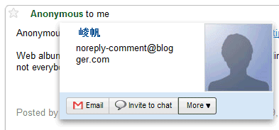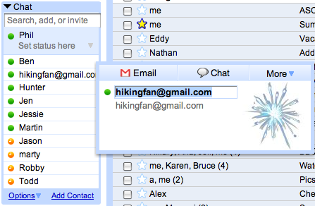
Contacts cards haven't changed too much since 2007, when Google released a major Gmail update.

If you'd like to see how much Gmail has evolved since 2007, open Gmail's old version. It's surprising to see that Gmail still offers the old version, which lacks most of the features released in the past three years.
{ Thanks, Itamar and Angelo. }

I knew it since yesterday morning...
ReplyDeleteIt's a great redesign, looks better
Really nice. I'd love to have also the primary phone number/numbers show up as I use the contact cards a lot for looking them up, currently involves a three-click scenario
ReplyDeleteM Haidar, I'm going to have to one-up you here and say that I blogged about this one on Saturday night. In your face!! :)
ReplyDeleteYou and dabbster say how nice it looks, but, IMHO, I don't notice a huge difference, and now I can't edit my contact names directly. Ah, well.
I'm just hoping against hope this has something to do with the all-signs-point-to Gmail/Google Voice VoIP dawning.
(I'm really looking forward to ditching cell-phone voice plans, coupled with the ability to actually make/receive phone calls inside my brick-fortress apartment.)
Weird, as soon as a contact card pops up, my screen jumps to the bottom (e.g. I can see how much storage I have, account activity, etc).
ReplyDeleteI guess it's being rolled out slowly since my account still has the old card interface.
ReplyDeleteI really miss the inline Edit contact name, they could add an mouseover icon near Name to edit it inline.
ReplyDeleteAlso, I would like to see a button "Recent conversations" and not have to click on "Video&More" and then select it from the menu. (because of it I also too often accidentaly click on invite to video chat :-P )
Ironic how the sample screen-shot looks suspiciously like the blog comment spam we see a lot in a popular blog; were blogspot to do some basic datamining of comments and spam (which languages and links does a site always delete, what poster characteristics can you view as suspicious) there'd be less such comments to filter through.
ReplyDeleteDisappointing that they didn't include any decent extra functionality. Would love to be able to categorize contacts from the card.
ReplyDeleteI am always going to have a little bit of a grudge with gmail until they put phone numbers in the profile badge, it would be so much easier than bringing up the super slow contact manager...
ReplyDeleteI like the button placement, but I actually miss the border around the contact card. I thought it looked nice.
ReplyDeleteGreaaaaaaat of Gmail :)
ReplyDelete>I guess it's being rolled out slowly since
ReplyDelete>my account still has the old card interface.
It's almost 12 hours later, and I still have the old cards.
>It's almost 12 hours later, and I still
ReplyDelete>have the old cards.
Ok, it finally updated.
GMail began to be very annoying in hiding my labels, considering, of course, that I didn't enable that Labs thing to hide them. It just started few days ago to hide them and I hate it. Where can I send an e-mail to them to fix this bug?
ReplyDeleteHiding labels is a standard Gmail feature, it doesn't have anything to do with Gmail Labs.
ReplyDelete@Cougar Abogado
ReplyDeleteWell, IMHO also, I just appreciated other's work.
Yeah, it's not a huge change. Tiny.
Hey, in my face, this post is better than yours. :) Cleaner and Bright
@PicNik
ReplyDeleteThat happens to me a lot when I try to click recent converstaions. It's a browser flaw; the popup menu is often partly out of the window, and when you click on it I think it moves it up and then processes the click, which puts it on 'invite to chat' instead of 'recent conversations. I hope they fix that, it's annoying.