"We were hoping to accomplish three things with it: make it faster, make it more consistent with our siblings (documents and presentations), and give us more room to add features without clutter," explains Google.
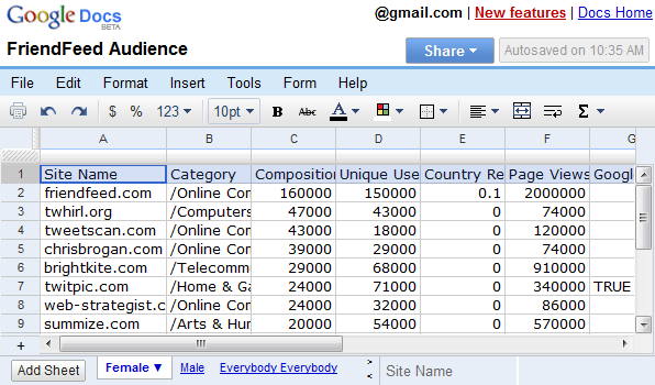
The toolbar includes some of the most frequently used features, but I don't think Google did a job at ordering them: for example, the cell formatting options are too prominent, while pasting and sorting have been neglected. It's great that the formulas can be added without switching to a different tab and you can share the spreadsheet without opening a new page. The most stylish UI element is the chat box that can be loaded by clicking on "(name) is viewing...".
If you don't remember the previous interface, here's a screenshot:
A very cool new feature is the full-screen mode: press Ctrl+Shift+F repeatedly to alternate between two full-screen views and the standard view. The same shortcut lets you switch to the full-screen mode in the word processor, but you need to press Esc to return to the normal mode. Where is the consistency?
{ Thanks, Kevin. }

The redesign looks really cool. I think I will use Google Docs instead of MS Excel for my projects.
ReplyDeletewww.KidTechGuru.blogspot.com
The full screen command doesn't work on a Mac with Firefox. Unless I am doing something wrong. It works fine in Google Docs.
ReplyDeleteActually, I figured it out. I had to click in a cell. Duh!
ReplyDeleteHow do you view formulas within a cell? On the old version I could do this by clicking on the formula tab. Thanks.
ReplyDeleteStill not consistent, the word processor and the spreadsheet application has different font sizes and spacings all along the UI, the order of the menus are different too:
ReplyDeleteFile Edit View Insert Format Table Tools Help (Docs)
File Edit Format Insert Tools Form Help (Spreadsheet)
Why they can't unify theese 3 applications, so that they could look like ONE office application?
I bought a computer in 1997, but only now can I do what I bought that computer for
ReplyDeletePlease make the tool bar change what's displayed based on a combination of: what cell I'm in, popular choices others have made, the weather, and my current mood. Make it fun, like a game.
ReplyDeletereminds me of a Windows 3.11 office suite. Even Zoho is years away from Google...
ReplyDeleteI think it would be nice,
ReplyDeleteThough I have to strongly agree with the post about keeping the 3 applications keep the same interface, Otherwise they will be going away from the thing that kept Microsoft strong.
Just one thing, I've got my Google account set to American so I get all the beta software etc, But I do not get the new spreadsheet interface yet. I also never got the iGoogle interface for a fair while after.
Is there much I can do to speed myself up on the list to updates?
Ah, finally they have gotten around to creating a more universal interface with these office apps.
ReplyDeleteStill got some fixes left (like the order not being right), but this is a great start.
I like the new interface for the cell area too.
Looks much more professional now.
I use Google Docs all the time. I don't care for the interface. I had no problem with the older one. Like any other program if it is clean and simple it won't take a long time for you to learn how to use it.
ReplyDeleteKeep it simple
I have gotten used to the old interface, but I think the new one looks nice, haven't try it yet though. From the look of it, the choices of buttons on the toolbar seems geared towards more advance users, and icon design also is some what different than usual. I might like this better actually, I always have to completely customize the tool bars in Microsoft Office, to remove all the unused icons, copy, paste, bold, underline, very common actions that you already memorized the keyboard shortcut for. I still wish they would start minimizing the real estate the interface takes up, right now chrome takes up 3 rows and spreadsheet take up 4 rows, tab, url, bookmark, logo, file name, menu bar, tool bar.
ReplyDeleteWell, A nice change in Google Spreadsheet now it looks even better. I am a big fan on Google Docs.
ReplyDeletehoe do you do stuff in a cell i think just keep it simple you don't need advanced spreadsheet with cells just keep the tool bars and other things. so that Wat i think about spreadsheets and cells
ReplyDeletewe give you referance in my website yaruki-up.info/google-spreadsheet/ please look there
ReplyDelete