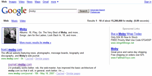
Google's logo has vibrant colors, the search box is bigger and it now includes the search button, the links from the homepage are no longer underlined.

Google's search results pages include a persistent sidebar that suggests specialized search engines, advanced filters and related searches. By default, Google only shows suggestions that are relevant to your query, but you can click on "more" to see other ways to refine the results.

"Today's metamorphosis responds to the increasing richness of the web and the increasing power of search — revealing search tools on the left and updating the visual look and feel throughout. The top section of the new left-hand panel builds on Universal Search by suggesting the most relevant genres of results for your query and letting you seamlessly switch to these different types of results. Our expandable Search Options panel launched last spring brought many rich slice-and-dice tools to search. The new left-hand navigation showcases these tools and enables you to get a different view of your results. In addition to the left-hand side changes, we've updated our look and feel in terms of our color palette and our logo. These changes are slight, keeping our page minimalist and whimsical, but make our overall look more modern," explains Marissa Mayer.
Some of the features aren't completely new: when Google launched Universal Search in 2007, an important new feature was that Google suggested relevant specialized search engines. The suggestion bar has been removed after a couple of months and now it's back as a vertical panel.
Ask.com pioneered the persistent left sidebar in 2007, and now both Bing and Yahoo Search use it. Google adopted a similar layout to make search interfaces more consistent. "I don't like jazz, because you never know what's going to happen next," said Google's Marissa Mayer. "I've been calling this problem 'user interface jazz.' This result looks this way, and that result looks that way [something much different], and it really does slow you down."
When you navigate from web search to Google Books search, from image search to Google News, the interface will be consistent and you may not even realize that you're using a different search engine.

Sometimes, Google's sidebar will also include a list of suggestions that are difficult to define. Google calls them "something different" and used to show this label: "not entirely unlike". They're actually similar queries generated using Google Squared:


i am using chrome and i don't see the new search page, IE works fine but what is the problem of my chrome?
ReplyDeleteYou're sent to a Google data center that doesn't have the new interface yet.
ReplyDeleteHi.
ReplyDeleteI saw google new search interface few weeks back. I noticed it was showing timing in different format like miliseconds and several ways... have a look http://xpressabhi.com/new-avatar-of-google-search/
@abhishek:
ReplyDeleteThat was an April Fools's Day joke.
but my IE works perfectly fine with the new interface, so i wonder it would only be the problem of my chrome...or what settings, extensions,...else...
ReplyDeleteMaybe you must clear cookies.
ReplyDeleteWhen you search, you may have to press on "Show Options" to show the sidebar.
ReplyDeleteI can't see the new interface, even in IE. Maybe because i'm from Latvia.
ReplyDeleteI can't wait to get the new interface! I had it before, twice (one time doing a hack and the other time it popped up on me), and really liked it :-)
ReplyDeleteGreat analysis of the Google redesign. I've shared my thoughts at: http://blog.twigkit.com/google-redesign/
ReplyDeleteIt doesn't display like that in Firefox. It has looked like that for a very long time in Safari, but nothing in Chrome, Firefox, etc. Only Safari displays as the screenshots here demonstrate.
ReplyDeleteActually it doesn't display in IE either.
ReplyDeleteWith all due respect, the persistent left sidebar on the search results page is hideous. PLEASE give us the option to GET RID OF IT! I have to use Google frequently for work and this new layout is messing with my mind and warping my consciousness. I'm going to start foaming at the mouth pretty soon. All that wasted white space! My search results are all squinchy! UGH. What's wrong with you people?!?
ReplyDelete"Ask.com pioneered the persistent left sidebar in 2007, and now both Bing and Yahoo Search use it. Google adopted a similar layout to make search interfaces more consistent."
Gosh, I didn't take you guys for CONFORMISTS. You're following the lead of the LITTLE guys even though you're the market leader? Lame.
In the scope of "user interface jazz" this is Fusion. Hard to enjoy and only a few people truly Love it. For the rest of us, it's just noisy and chromatic.
ReplyDeleteThumbs down on this interface; what a waste of money.
Ive used Google since day 1 and LOVED it. The new sidebar SUCKS! Please give us the ability to disable it. Google became number one because of SIMPLE clean CLUTTER free interface. Please bring it back!
ReplyDeleteI cant believe google is copying microsoft now. Bing is the 1st search engine with the ugly and mostly useless sidebars. I hope that have an option where you can keep the old interface.
ReplyDeleteHello, I don't like the new system. I use google search on many machines and occasionally I was put into the beta test and I hated it. I would clear my cookies and be back at the regular page with regular results and no sidebar and none of that hp crap. Today 05-05-10 I can no longer do this. I hate when companies offer no way to revert their fresh new changes. I can't appreciate why one wouldn't do this and then collect metrics in the process. A simple radio box in the search preferences "go old school" or something would be nice. This bothers me more for other people than it does myself. It's pretty easy for me to use greasemonkey or adblock or something to remove or rearrange elements to the way I want. Other people aren't going to figure this out and obviously for myself I can't do this on most of the machines I use.
ReplyDeleteJust give us the option for regular google ok? A simple, regular, "I prefer the old Google search style"
Thanks...
To get rid of the sidebar...just use pirate google:
ReplyDeletehttp://www.google.com/webhp?hl=xx-pirate
the side bar is annoying as hell. Guess maybe its time to find a new search engine
ReplyDeletePlease make an option to go back to the old search results. This blows.
ReplyDeleteWell, considering that people say Google copied it from Bing and Ask.com, switching to other search engines won't really help... I was kind allergic to it initially, but now I have used it for several hours, I actually like it very much. It is easier to focus on the center of the screen than on the left of screen. In addition, the layout is more consistent and so less distracting.
ReplyDeleteI hate the new interface !!!!
ReplyDeleteCan't get rid of left hand navigation window all of a sudden. No options button anymore. HATE IT!!!!!
ReplyDeleteSame here, don't like the sidebar at all.
ReplyDeleteThere should be an option for getting rid of this annoying thing. I have cleared my cookie 2 times within last 24 hours to avoid this. Doesn't help much. Keeps coming back :(.
Great job, Google. I love the new interface. It's come up once or twice for me over the last month but went away. I'm glad it's here to stay.
ReplyDeleteI dislike the sidebar as well. Interface changes should be accompanied by an option to disable them, as suggest did with "?complete=0".
ReplyDeleteIs there some place I can vote against a change when I'm part of a google experiment? I usually clear my cookies to get out of it, but then there's no feedback.
I hate the new interface. I hate it on Yahoo, I hate it on Bing, I hate it on Ask, I hate it on Google.
ReplyDeleteI HATE THE NEW GOOGLE SEARCH RESULTS LAYOUT. Also, the logo, It looks plastic now, the old icon/logo looked so genuine and sharp. This is crap! It looks like a TOY for crying out loud. *We want Google put back to the way it was.*
ReplyDeleteI think you'll find the guy who said great job works for Google. THIS SUCKS! Please put it back.
ReplyDeleteI hate the new layout - why change something that people liked? At least give them the option of changing it back!
ReplyDeleteThere is an easy way to get rid of the new sidebar aka left-hand navigation pane. http://webtrickz.com/removehidedisable-sidebar-in-new-google-search-results/
ReplyDeleteNone of the browsers are showing me the new google search layout page.... !
ReplyDeleteNeither http://www.google.com/ncr or http://www.google.co.in
I intensely dis-like the new left hand side bar of googles new interface.
ReplyDeleteThe persistent left sidebar on the search results page is annoying and cluttered. Please give us the option to disable it.
ReplyDeleteI think that some people may prefer the sidebar and bold text in the search box, but give us the option to disable it. I much prefer the simple look Google has always had.
ReplyDeleteMany people may like the new sidebar, but please give us the option to disable it.
ReplyDeleteplease give option to disable.....i do not like it, its annoying
ReplyDeleteSo annoying. At least Bing's sidebar is easier on the eyes.
ReplyDeleteBefore I saw this announcement, I wondered why Google looked like Bing. Now I realize it's intentional, and that's not a good thing. I avoid Bing because its results look cluttered. I realize it seems to be where search engines are going, but as someone with limited screen real estate, I would at least appreciate the option to turn it off.
ReplyDeletePlease get rid of this irritating interface.
ReplyDeleteGo back to the clean layout of the old interface that people like.
The sidebar may only be useful on something like a mobile device/touchscreen but on a desktop it is distracting when the results of a search are squashed in the middle of an irritating sidebar and advertising.
At least give us a way to Revert to the old user interface.
I was able to see the new design a few weeks ago just for a couple of days. Right now I have to make do with the old design itself.
ReplyDeletecongrat...go go goole
ReplyDeleteI can't see Jack Squat different.
ReplyDeleteThis worthless sidebar is a bunch of wasted white space that adds no real functionality that you didn't already have and likely rarely use so why do I want it permenantly on screen? For those of us that have vision issues and keep our screen resolutions lower it causes a whole bunch of wasted white space and the results are smashed up in a bunch and very confusing. Very poor design, also, if I wanted the look and feel of Bing (which I hate) or Yahoo I would use Bing or Yahoo.
ReplyDeleteGive us an option to disable this crappy sidebar.
I do not like this new "improved" layout, it looks heluva stupid. Sometimes less is definatly not more...
ReplyDeleteThe side bar is totally a shame to the claim that google is being "innovative"...DUH.
ReplyDeleteAn interesting article from Business Week: "The process that led to the redesign of Google's all-important search results page".
ReplyDelete"By October 2009 the team had its first functional prototype ready for "dogfooding"—a process in which all of the company's 20,000 employees can opt to test a new product. The internal focus group members can log bugs or simply comment on the design. One immediate focus of the feedback was the search button: The designers had turned it blue. "We got a lot of people telling us they found the button distracting, or they usually hit enter to search, or their gaze was going to the box, not the results," says Janakiram. In addition to dogfooding, Google researchers ran 19 test subjects through hour-long eyetracking sessions to monitor responses to various aspects of the new design.
While the engineers and designers pored over eyetracking results, Google statisticians conducted months-long experiments with hundreds of thousands of live users. (One of the benefits of having 268 million users a day is that you can roll out new products to a fraction of them and still have the benefits of a large sample size.) Google wants more searches and more clicks on its Sponsored Links, and anything that slows the process or inhibits clicking can have disastrous effects on profits. The focus on metrics is a deeply ingrained part of Google's culture."
WTF! where are the definitions?! I regularly use google as a dictionary/thesaurus and loved the usage guidelines the new google dictionary provided - please PLEASE please don't tell me I now have to resort to using Dictionary dot com again. Dictionary is NOT even a part of the sidebar! What a bad decision.
ReplyDeleteBAD GOOGLE... BAD!
the left side bar is the main reason why i don't use yahoo. remove it please. absolutely hate it!
ReplyDeleteor at least give the people an option to remove it.
but i say REMOVE IT!!!
It looks like just another website covered too anxiously with information and ads -- despite the information being relevant and the ads nonexistent. The new layout gives these unfortunate impression; I dislike it very much.
ReplyDeletePerhaps they simply need something to do at Google headquarters? Otherwise, is not the old saying, "Don't fix what doesn't need fixing"?
If they thought they could improve on Google, they are proved wrong!
I hate the new Google, it distracts me and muddles my mind, like reading a novel in a bad font. The new youtube layout is odd as well . . . rather horrid, in fact.
There are always people who complain initially at any change, but to dismiss complaints based on this is always a disrespectful mistake. Perhaps there are other reasons, beyond simple appearance, for the changes on both websites. If there are not, then, pardon the bad phrase, "stop fiddling with yourself, Google!"
Hate new logo. It hurst to look at it. Hat the left hand navigation bar. I want my old Google back!!!!!!!
ReplyDeleteCome on Google, this sucks!!! And if i read all those comments here, i'm not the only one who thinks like that. Just give us the option to go back to the old interface, and let people decide themselves wether to change it or not...
ReplyDeleteThe reason why I like(d) google is just because it had no bullshit, just a clean white screen, and the stuff that i need.
And the new logo is ugly as hell!!!
Why have you changed this google do you not have enough people who use you because you were the best search engine and people like the old clean layout. How much do you pay your customer researchers because i dont know anyone who likes this please scrap now
ReplyDeleteBecause Of the left sidebar, I've stopped using Google and changed to AOL search. Pirate and CA Google sites did not work, nor did deleting cookies.
ReplyDeletePlease post other search sites that also do not have the left sidebar.
Thanks!
Give me back my old google site.
ReplyDeleteI was hoping Google would maintain its presence of mind amidst the kistchy aesthetics of the vomit-catastrophe that is Web 2.0 but it appears they are as inane as everybody else. While you're at it, Google, how about a Flash introduction to your homepage? Or better yet, why not just go ahead and have a merger with Microsoft so you can cut costs on designing mediocre bullshit and passing it off as innovation?
ReplyDeleteWell...I complained here when my iGoogle became cluttered with the left sidebar, and now I'll complain again now that the sidebar has invaded my search results.
ReplyDeleteLike others here, I enjoyed using Google because of the simple uncluttered interface, but it seems that lately, the "basicness" I liked about it has been disappearing. Again, an option to revert to a basic search interface without the screen clutter would have been nice. Would it really have been that difficult to code in?
Sure, I can understand that trying new changes can lead to innovation. However, to pigeon-hole the user into these changes without any choice seems restricting, a step backwards from the very reason that many people even started becoming faithful users: simplicity. Looking at the article you posted, I guess it shouldn't be so surprising that Google implements these changes with fervor, especially if it can increase revenue from sponsor links.
Anyway, if anyone has any ideas besides add-ons for disabling the left-hand sidebar, I'd appreciate hearing them. For now, the pirate version of Google still seems to work for me. Probably not for long. Arr.
Hate is in the air, also here!
ReplyDeleteYes, the new sidebar might be useful for some people but not for me. I beg you, add just one button to disable it. Firefox extension does not work for e.g. google.cz
ReplyDeleteHere are some light versions of Google search:
ReplyDeletehttp://www.google.com/custom
http://www.google.com/ie
The persistent new left-hand sidebar in Google is hideous! What an ugly waste of white space! UGH. DESTROY!
ReplyDeleteAs much as I do love Google and their ways, I think that this new sidebar is a mistake. If I want to search for images or news, I'll click it; it doesn't have to show up as a suggestion.
ReplyDeleteI'll let the new homepage logo slide for now, but I would darken the font's up a bit.
Thanks.
The new changes to Google are horrible, I hate the sidebar and every other change they have made. I want the old google back. Thankfully www.google.com/intl/xx-pirate still looks normal, it is now my homepage.
ReplyDeletePlease please put it back the way it was. We'll forget this ever happened and put it down to temporary insanity. Even the buttons that let you select which pages to search are gone. Listen, at least make it optional but really it's all horrendous.
ReplyDeletehaving downloaded a firefox plug-in that gets rid of the persistent sidebar, I think I'll be able to retain my sanity.
ReplyDeleteBut why? I always preferred Google's uncluttered results page to Bing or Yahoo. It's why I alwas stuck with it and came back to it. Why would Google change to be like its inferior competitors? If it isn't broken, why fix it?
Please have a classic option :/.
ReplyDeleteThe UI was developing nicely before with the suggested media results. This is just awful.
It feels fake.
I hate the new Google look. If I can't get the old style back, I will switch to other search engines.
ReplyDeleteTime for a major management change at Google. Why on earth copy Microsoft? They should be copying Apple or Facebook or even better go back to what made them popular in the first place. The new search interface is a technicolor eyesore. The web needs to be toned down and this is anything but. And the fact that it changes depending on what you search. WTF? And they still haven't gotten rid of the redundancies like the News filter at the top and at the left. Maybe those arguments about too many engineers and too few artists isn't that far-fetching.
ReplyDeleteI hate this new redesign so much that I'm actively looking for a new search engine. Thanks for fucking up, Google.
ReplyDeleteI hate it. I like the simplicity of the previous version.
ReplyDeleteI'll use another search engine until they bring the old google back. This new version is an abomination.
ReplyDeleteI've switched over to dogpile; I recommend others do likewise until this is removable.
ReplyDeleteThe left sidebar is awful. Please remove it. I've started using this as my new homepage:
ReplyDeletehttp://www.google.com/webhp?complete=0&hl=all
Only problem is that it doesn't have the News or Video tabs up top. Still, it's better than the huge chunk of wasted space.
If you could also give us a way of getting rid of the stupid twitter feed, too, then I'd actually be happy.
Horrible sidebar especially for people with visual problems.
ReplyDeletePLEASE, PLEASE give us an option to remove it!
Thanks for the link:
ReplyDeletehttp://www.google.com/webhp?complete=0&hl=all
It's too bad Google thinks Americans have no brains or preferences
in not providing a removal option.
I hate the new google look. It says it's more colorful etc., but the thing I liked most about google was the simplicity of it. Everyone's always trying to make things "better". Why fix what isn't broken?
ReplyDeleteDon't like the new interface at all!! Give us the old way or option to remove. Please!!
ReplyDeleteI hate the new look and layout. Can we go back to the old one or get rid of the extra stupid crap that's now on the screen? It clutters the screen.
ReplyDelete+1 for option to disable the new layout.
ReplyDeleteIt wastes screen-space. This new layout is extremely annoying when you're using 10" and 12" netbooks/subnotebooks, much fewer results on the screen, and forcing more scrolling.
Don't say that the new google interface is 'available. Say that it has been been thrust upon. Saying that it is available means that one has a choice to avail it or not. Google has always been thrusting things onto the users. Just as this one.
ReplyDelete+1 Vote for option to revert.
ReplyDeletePLEASE PLEASE PLEASE - no!
ReplyDeleteI am terrified. Yahoo! junk interface has invaded my favorite search engine.
Google = simplicity
Please don't RUIN it!!
Can't turn it off!!!! Stuff it down my throat... OK, I just found a solution... "BING"o... You guys are getting more like Microsoft everyday.
ReplyDeleteIt's been a nice ride, but I'm tired of your "new features" that are an impediment to the way I use this and your other tools such as IGoogle.
Have a nice day!!!!
I hate this new interface, useless for me. Is any option to get the old one?
ReplyDeleteI'm sure someone will be able to embed the simpler old version of the interface, using the engine of the new one - and then I'm not going to use google.com anymore, sorry. It just sucks, right now.
ReplyDeleteOn top of making the interface so appalling, they even changed the colors and the font, and here's the news: it sucks even worse than the cluttered page design. I can't look at google.com anymore, it has been destroyed for me.
I'm giving you two weeks break, hopefully you will have reverted till then. Wow, what a downer.
Please, give us the option to remove it, 40% of all the internet users use your site, I'm sure at least half are hating the new interface, just like me. Why mess with something that was working perfectly?
ReplyDeleteI don't like it can we please have the old interface back please, I don't want a sidebar cluttering up the side of the screen and getting in the way. Why change it? Haven't they heard the phrase 'if it ain't broke don't fix it.' Well it's sure as heck broken now.
ReplyDeleteI don't like it either. At least make it optional and easy to turn off.
ReplyDeleteDear Google, I hate your new look. Get rid of the sidebar. Don't turn into Bing! If I wanted to use Bing! I would, but I don't because I like the simplicity of Google, but now, I might have to use Bing!, and I hate Microsoft. Maybe I'll just use Yahoo and pretend that it isn't being powered by Bing!. Why don't you just change your interface back so I can be happy and search the way I used to? This is as bad as new Coke.
ReplyDeleteI find the bright colors and sidebar a bit more distracting. I notice there's a significant amount of gutter and whereas before the majority of the page in a results page for a search would be the meaningful stuff, "results", now there is well, options for clicking on things you could already do by typing them in, more or less.
ReplyDeleteI find it less useful and that there is more clutter to weed out in order to find results. Also, why is the text for search suggestions so large? I think maybe this would be better received among people if it was a special widgit, an add on/plug-in, or a google product on its own for a different kind of search...
The side bar is HORRIBLE -- I LOVE Google, but this is totally annoying. At least give us the option to remove it!!!! Please!
ReplyDeleteHow do I turn of the sidebar?
ReplyDeleteThere was nothing wrong with the old google...this new one is cluttered and distracting... the minimalism and accuracy that once came with google is now gone so i guess its time to try to find something better, or hope that google figured out what a mistake it made and gives us the option to use the old style again
ReplyDeletejust wanted to say that I HATE the new google layout and logo. Why mess with a good thing? What you had up until this month was perfect, why mess with it? Now it's ugly and clunky and too busy.
ReplyDeleteThere are several reasons I like to use Google over other search engines. You just took away one reason.
ReplyDeleteDislike, dislike, extremely dislike, the new interface.
Vibrant colors? Why??? As if the web was not neon colored enough. Ugh. Bring back the old version!
ReplyDeleteI hate the new side bar. Provide option to disable.
ReplyDeleteI have sidebar "More" menu and upper "More menu (the old one, going left to right.
ReplyDeleteREDUNDANT. CLUTTERED. All while throwing every possible type of result at me in the center results list.
I want the option to turn of the "more" menu.
This is truely truely awful. It actually took me about 10 minutes to figure out what was wrong with google. I thought that something bad had happened to my PC. The changes made were actually making me angry. I can't even put my finger on what it is that I don't like about it. I just get apalled when I try to use google. And what's with the logo? It looks all cookie cutter. Like the folks that run it just decided that it was not worth the time to make it look good, so they would make it look generic. After reading the above, I am remembering an article in the New York Times a few years back. Something about Sony Online Entertainment deciding that one of there games was too complicated and that what their customers really wanted was something that was exactly the same as some other game. Something like that, anyway. The long and the short was that Sony lost more than 75% of there subscribers. I honestly don't know if I can get used to this. I get disgusted just looking at the page.
ReplyDeleteNow when I try to search, results are getting less and less relevant each time instead. Something is off...
ReplyDeleteMaybe if I try to pull a system restore to a few days before this...
I hate the loud logo and the useless, obtrusive sidebar.
ReplyDeletehow many users need to tell they hate it before you get rid of it?
Please give us the option of turning off the More Menu.
ReplyDeleteI often have to scan through hundreds of search results to find what I want, and I find it noticeably harder with the new layout. Clearly my eyes were being guided by the left edge of the window, and now that it is a couple of inches to the left, my eyes wander more and have a harder time tracking down.
I think google is starting to forget what made it great - "Just the results, ma'am."
I use Google because I hate the clutter of the yahoo and bing. The simplicity of the site was its genius. This new layout is mistake and I want the old one back. It's like looking at a train wreck.
ReplyDelete* The colors are too bold (and hit you hard without the shading)
* The search box and buttons look weird
* The search results sidebar is VERY annoying
Please give us an option to use the classic version! Preferably one that fixes all the problems and not just sidebar!
PS. I always liked the Google special logos for special days. Its a shame they've spent so long training us to recognize their brand image from the false ones - only to end up changing their real logo to something obnoxious to look at. Bad marketing guys!
Bring back the Google we love!
Google is so big on its Labs stuff, so why is the sidebar forced on us? It should be something you have to turn on!
ReplyDeleteHey Google, please stop telling us how cool your new interface is and instead listen to people telling you how much your new interface sucks, ok? Please? At least give people the option to customize what they want and don't want. The reason why people liked Google so much is because of how simple it was! It didn't require a lot of thought to use! Is it really necessary to solve a math problem before you start a car? No! Put key in ignition, turn, and drive motherfucker! You don't have to look for where to put the key, search for where the gas pedals are, wish there wasn't a bunch of shit cluttering your windshield, etc. If it ain't broke, don't fix it!
ReplyDeleteIf I wanted "something different" I'd have searched for something different. This is starting to get kind of silly. Why would I want information unrelated to what I am trying to look up next to what I am trying to look up on purpose?
ReplyDeleteThis new sidebar is a total waste of space! It hurts my eyes to see all of that clutter/junk. And then when you scroll down past all the B.S. on the left you have wasted blank white space! What you actually are searching for is cramped in the middle, ridiculous! Who the heck thought this would be good? It's something I will never use. I hope google listens to all of this negative feedback and gives an option to turn this "feature" off!!!
ReplyDeleteNew sidebar/interface unwelcome. The sidebar is obtrusive and useless. It simply adds nothing necessary. How about an option to use the Classic Google interface?
ReplyDeleteI bet some of the white space will go to premium advertisers. It's very tempting... Heck, I'd want to put an ad there if I was an advertiser, wouldn't you?
ReplyDeleteI hate the Sidebar and want an option to trun it off.
ReplyDeleteBlot says "Please Stay on Topic"
ReplyDeleteNo problem. Agree with above posts. The new forced persistent left side bar SUCKS.
Sure if Google wants to offer the option for it OK some may find it useful. Even I might give it a try, but I want the option to turn it off so search results have reasonable room for display.
Yeah I think Google might put some Adwords ads in the space on the left. More noticeable than it is on the right.
ReplyDeleteI don't like the huge amount of white space. It's... I feel like I'm getting less information somehow. Even in cases where the results are the same. Was this some sort of readability test?
ReplyDeleteGoogle...[Anonymous] is right! Where's the dictionary? You keep driving me further and further in the direction of wiktionary. First you abandon answers.com, now the dictionary hyperlinks are altogether gone. What is the google whack community supposed to do now?
ReplyDeleteGoogle, please give people the option to disable the left pane!
ReplyDeleteStay simple.
I hate the left panel. I prefer the old interface.
ReplyDeleteThe actual amount of information about the information seems less
ReplyDeleteI'm trying to get used to it but the whole thing seems less useful so far. I'm sorry to say.
ReplyDeleteIt also seems somewhat redundant.
ReplyDeleteI'm sorry for saying this but: Do they really assume the average user is too dumb to be able to know what it is he or she is trying to look for and that suggesting other things instead and cross examining them is going to boost productivity? Maybe in 2001, and maybe in places where people aren't used to using the Internet but...
Google, please realize how we read! It is really quite universal for humans to start on the left of everything. Hence how English and other Latin and Greek based languages are read left to right. Thus, your site should be streamlined on the left. As in, the results we WANT are on the furthest LEFT.
ReplyDeleteYour new design flat out sucks. And I am obviously not the fist to say this, and I will not be the last. The old look worked. It was clean, it was simple, it was streamlined. Now, it looks messy, it's getting increasingly complex, and your first look is at this big, obnoxious sidebar.
I would like to point your attention to a common layout for a very popular bulletin board software, phpBB. http://www.phpbb.com/development/prosilver/ . The development of that enhances the user experience, and gets users to the content they came that for in the first place.
Now, I ask personally, please refrain from making these changes! Even the link to the "old Google" is not the same, it's missing many of directory links. My most visited site is Google. It is the default action in my URL bar, and the search bar. I'm almost always in Gmail, and I enjoy using your services. Google is one of the best at what it does, and you provide me with the best search results. Don't ruin Google for me. Youtube was forgivable, being only 1 real change that annoyed me, but this is too much....
The results are getting less and less relevant now the more I search.
ReplyDeleteThis is a sad day
To hell with you and your JAZZ!
ReplyDeleteI hate the new look!
If people want sidebars they can use bing. And the new search box doesn't look like a user input, it just looks like a big graphic!
Now instead of seeing search results when I look at the left of the page I see this stupid sidebar that I'm probably never going to use. What happened to proper UI design? I thought Google was the king of simplicity and good usability.
The new google look is a fantastic example of how NOT to design a UI!
I hate this new interface...at least give us an option of using the new or the old...and based on all the comments above...there will be very few using the new.
ReplyDeleteBad move. I too have tried to find a way to change the display back. Offer me the option to change to your NEW display. Don't force feed me.
ReplyDeleteI tried using some of the new buttons and most of it was for consumer things like shopping. :(
ReplyDeleteIt feels less accurate in search too now. wth
ReplyDeleteWhy does the search engine seem weaker now?
ReplyDeleteIt was strong two weeks ago, but the relevancy keeps getting fuzzier on me. That does it.
I think I'm starting to get the hang of it but I liked the old one so much better, it ... made sense and put "the results" at the forefront instead of fancy features ... please, it's a search engine! it was good at what it was supposed to do. We like using google to SEARCH for things online, we don't want it to turn into some hybrid advertiser/social media wannabe thing. ... Or if you do keep trying to change it into one, please don't get rid of the earlier search algorithm because that part rocked.
ReplyDeleteI hate this Google's new sidebar. It's robbing my precious screen space.
ReplyDeleteYour new left side bar sucks. As a user if you have to have it and look like everyone else wow do you have problems. So in short like many above and in other places I want a way to disable it. I DO NOT CARE FOR IT AND I DO NOT WANT IT.
ReplyDeleteOh yea and the next time you put up where I live I think I will have a serious problem with it. Do you actually think I am too stupid to know where I am and why are you mining that data anyway, really its none of your business.
FOR SHAME ON YOU GOOGLE you use to be good but your starting to suck like a microsoft product.
It's bad and ugly. Inconsistent with google. I'm in the market for a new old-google like search engine now, unless they provide a way to revert to the older interface.
ReplyDeleteI hate the sidebar. I HATE the sidebar. I hate the SIDEBAR. I hated it however long back when it first appeared for me, then I didn't mind when they offered the option to hide it; I can't fathom why they'd take away the option to remove it, unless they decided they'd install the sidebar no matter what and thought "too many" people were choosing the option to hide it.
ReplyDeleteThis is shameful Google.
There is 2x less info displayed on the page now thanks to the left toolbar, images that are displayed within the search results and a bigger font. Why is there no option to turn off the clutter? What is exactly gained by incorporating all of these options? The excessive text, color and images are distracting. And I now have to scroll twice as much to skim through the same amount of information as before!
ReplyDeleteHate it.
ReplyDeleteNot good..
ReplyDeletehttp://4.bp.blogspot.com/_7ZYqYi4xigk/S-LfTsspjDI/AAAAAAAAGCA/PMPJ5TK0yDY/s1600/blueresults.png
This is a better way. And even bolding of the search terms looks weird in the search text box.
Please at least provide the OPTION of removing the side bar, I really hate it.
ReplyDeleteWhen I first saw the sidebar, I thought it was a mistake, and assumed something so nonsensical would be shortly removed.
ReplyDeleteAs others have said it's a waste of white space, and an infuriating distraction. Yech. I LOATHE it. Please give us the option to hide this!!!
I am in the UK, I have always used Google UK because it was the best search engine around, with a nice uncluttered interface, it is ruined now, completely, Google should give us the option to close this awful sidebar if we don't wish to use it !
ReplyDeleteThe new interface is really disturbing. I want to be able to disable this 'feature'. As it turns out: you can't.
ReplyDeleteAnd I want the 'features' at the left (side bar) disabled. Same: you can't.
And I would like to have all the SPACE back in the SEARCH: when you type your search query you are limited - your text will 'disappear' at the rigth side when typing.
Bad, bad, really bad 'useful service'.
Please put back the interface * NOBODY COMPLAINED * about.
Like Google say themselves:
DON'T BE EVIL.
Horrid.
ReplyDeleteThe link to switch back to the old design is definitely needed.
ReplyDeletePlease, don't dictate, instead give a choice. The second Microsoft - it is over the odds for us, the users.
I hate the new layout as well, it would be a simple enough coding change to put in an option to hide the sidebar. www.mamma.com is still a good search site that dosen't use a sidebar like some of the others. I think I will be going there for now until google descides to actually listen to its users
ReplyDeleteOh my god.. Why make the logo bigger? The new design is nice and looks more modern, but enlarging it is a really silly idea.
ReplyDeleteThe left panel is so annoying and unneeded. I completely HATE it. The whole new UI is bullshit. This is a big, big step back...
Google, don't copy other search engines "to make the search more consistent". YOU ARE THE LEADERS! YOU SET THE NEW STANDARTS! WHY ON EARTH COPY OTHER SEARCH ENGINES THAT PEOPLE DO NOT LIKE!?!?!
Bring the old interface back!
Hate the left sidebar. If I wanted a search that looked like the others, hey, I'd USE the others. Really despise the amount of room it takes up and its completely illogical placement. Since we read left to right and since I don't need it, it's just in the way. Please, get rid of it. Or at least give me the option to get rid of it myself.
ReplyDeleteHate it:[
ReplyDeleteAll I can say is "Nooooooooooooooooooooooooooooooo!"
ReplyDeleteI still like the old design.
ReplyDeleteThis is pretty awful. What a horrible regression.
ReplyDeletePlease make it possible to quickly and permanently remove the sidebar. It's completely horrible!
ReplyDeleteI hate the new sidebar, it wastes screen space. Google please give users the option to remove it!
ReplyDeleteI hate the new interface!!!
ReplyDeleteYuck. For those who'd like to revert there are a few options here:
ReplyDeletehttp://www.google.com/support/forum/p/Web+Search/thread?tid=23e539270942e4f2&hl=en
Hate it. One of the reasons I used Google is because the interface was so clean. Now it's all over the place and distracting. The moving buttons on the home page are particularly annoying. Please let us switch back!
ReplyDeleteWhen are they going to change back to normal? Is obvious we all hate it.
ReplyDeleteObviously this is some sort of marketing decision probably
ReplyDeletesome ppl like it, some dont. and i am one of those who hate it! google should know that and make an option to diasable it.
ReplyDeleteThe new interface is horrible. I agree with all of those who don't understand why google would start copying Bing of all things. What made Google great was the minimalist approach. This interface adds clutter and not useful functionality.
ReplyDeleteThis is like the "new Coke" of searching! Please tell us how to change back to "Classic Google" and then quietly get rid of the "New Google" and pretend it never happened!
Also, answers from Google telling us that we can use google.com/m for the "old" look are really not helpful.
Hate it! Hate it! Hate it! X( X(
ReplyDeleteThe sidebar is so annoying, the logo is so bright. Really distracting!
New interface seriously blows. The entire web seems to hate it. Let's see if Google still sticks to "Dont be evil" or if they decide that they know better than their users and tell us to go shove it with little to no response - just like they did with Youtube.
ReplyDeleteI too add my vote *AGAINST* the new sidebar -- but for a different reason. I work a lot with long documents. So I do most of my work on a 17-inch LCD *turned vertically* (so the viewing area is taller than it is wide). Under the old UI, I could usually see all 10 of the initial results without scrolling at all -- which was very nice. With the new sidebar's wasted space, I now have to scroll. That isn't a big deal once or twice. But it's quickly getting very old.
ReplyDeletegoogle.com/webhp?hl=all
ReplyDeletefor the old google
Ye i agree with most of the planet here google....This sidebar is just WRONG and feels very dated. It also just confuses me. Please if you insist on keeping it, Give me the option to switch to classic view. Sorry but this is seriously UGLY & BLOATED
ReplyDeleteTerrible!! Absolutely horrific! Totally void of any UX guideline. We read from left to right! Please please get rid of it.
ReplyDeleteIs there a way to revert to the old interface? The new one looks much worse.
ReplyDeleteThe new "Google" look feels like 2001. I hate the side bar as it wastes space and the chrome colour 'Search/I'm feeling lucky' buttons, does'nt look great. Seriously Google, just because we're in 2010, does'nt mean you need to make it look progressed because the old look "was" better.
ReplyDeleteI hate it. Please change it back.
ReplyDeleteI absolutely hate the new interface. I spent some time thinking I'd selected some weird option. But no, it's as if all that Google stands for has been thrown away. There MUST be a way to turn it off. Please please give us a way to change it.
ReplyDeleteI don't like it, I tried using it and there's a heavier emphasis on commercial results... I do research. If I wanted to buy things I would search for products. Also, it wasn't that much work to do a search for images or a search for video, having them slammed there on the main search results page with the site results in text feels silly...
ReplyDeleteI don't like having to parse through visual things to do a nonvisual search. Please don't mix it altogether into one big mess google.
ReplyDelete"more interesting" doesn't always = "most efficient" and a good chunk of us liked using your search engine because it was streamlined and uncluttered.
People who are afraid of reading shouldn't be looking up things to read on a browser. Most websites are still things to read. If they want to look at visuals that is what image search and video search are for.
This suck put it back the old way or give us a option.
ReplyDeleteNow that I've tried using it a bit more it feels kind of like a newspaper or a magazine, with headlines then you click on one you want look at, there's some pictures, then turn to _____ for the main story. kind of silly-ish
ReplyDeleteAs everyone has already said, get rid of the left sidebar!!!!!!!!!!!!!!!!!!! and fire the Google employee who thought of that idea
ReplyDeletePlease! Make it useful again. Don't try to be hip and cool to the people who are afraid of reading. if they're too wimp then yes, make a "moron google" for people who like lots of pictures and few words, but don't force it onto your literate base of clients.
ReplyDeleteUgly, to much useless information, get rid of the left side bar!
ReplyDeleteThe current page number is almost identical to the others. You can't now only determine the current page with red o in the Google image.
Very clumsy.
The difference between this being an awesome update and a thoroughly awful and hated one: A button along the top so that you can remove the left hand side bar or bring it back again.
ReplyDeleteI'm sure these features are nifty, however I will hardly ever need to use them and I'd rather have my page looking clean and not cluttered. To keep everyone happy a simple solution would be adding the option of removing it, thus those that like the new features can keep it there while those like me can simply remove it and bring it back again only on occasions when we might want to use it.
I hope that Google does not go the way of Facebook of bring updates and not giving users any options in the matter.
I must add my voice to the *many* who absolutely *HATE* the "persistent sidebar". I don't want, nor need, my screen space wasted in such a arrogant manner. The "persistent sidebar" is simply a space wasting duplicate of EXACTLY WHAT'S AT THE TOP OF THE SCREEN ANYWAY! (Bet that's gone soon as it's not *in your face* enough...).
ReplyDeleteNew logo? It looks like it was "designed" by a HS student (OK... elementary) who is just getting into graphic design. *VERY* amateurish. The old one is much easier on the eyes and looks professional. And the text *doesn't fit properly* in the "improved" search box! Reduce the size of the buttons too. No one truly uses those do they?
And a big *THANKS* to the people who originally posted these links:
http://www.google.com/webhp?complete=0&hl=all
http://www.google.com/webhp?hl=all
Currently, either will give you the "old" *good* Google search page, although I fully expect Google to disable or change them very soon because they seem to "know best" what we want. Arrogance at its' finest!
I already use a plugin to block the useless ads on the right of the search screen (no thanks Google, I already know who I trust and am willing to purchase from). Looks like I'll be adding another plugin to block the "persistent sidebar" if the links above get broken by Google.
I wasted 2 hours to get rid of that f..... bar. Logo is repulsive and nasty.
ReplyDeleteGoogle, you are in "right" way...
Hate the everything sidebar. Deleting cookies and adding AdBlock filters failed. So I switched to Yahoo, which looks just like the old Google.
ReplyDeleteF you, Google.
I don't have a big nice shiny wide screen and this toolbar is taking considerable amount of space....
ReplyDeleteAt many conferences google-searcher has been presented an example of a page perfectly designed as it is minimal yet fulfills its purpose.
Now this toolbar is a real fail. And well, tell where can I disable it?
And no, I don't want to get used to it by being forced to use it....
My screen won't get bigger, sir...
There is a reason why nobody uses mentioned search engines when they actually want to find something. I dare say that space management might be it.
ReplyDeleteHooray it went back to the earlier look. I was starting to get really pissed looking for other search engines because everybody always copies things top down so most of the other ones copied google copying bing too. lol.
ReplyDeleteAnd... changed back again to the "newer look" when I restarted my browser.
ReplyDeleteUgh, not again
I don't want to be peppered by longer and longer strings of "related searches" to the one I was looking for in the results page, I just want results. All this cross examining of what I put in and making that center stage instead of pages of results is starting to get very annoying! If I wanted to look up "something different" than what I put in I would have put something else in!
ReplyDeleteAgh!
I still find it very distracting.
ReplyDeletehttp://www.plosbiology.org/article/info%3Adoi%2F10.1371%2Fjournal.pbio.0040056
I don't want unrelated searches below to the side being suggested and related searches at the bottom to the results page. It's very... unsettling. The most important thing to a results page should be the results. I'm... having a hard time actually sifting out what's a widgit, what's an advertisement or a sponsored result, and what are actual results. It's making searches take longer. Bleh!
There's a ton of psychological and biological studies that say the more visual disruption a person has the worse they make decisions & judge things. You can go (no side bar) or (not something different) in the query and get it to fold those parts closed at least somewhat or not suggest as much but it still includes them in the search terms, so then you take those modifiers out to try and get just result pages for the terms you did want to search for... and it puts the features you don't want cluttering your results page back in!
This is... not a pleasant experience, for this user anyway. I don't know about other people though but I don't like all these bells and whistles tacked into when I am trying to do something simple like a search.
Was this some sort of a move to appeal to people who thought reading was boring or too difficult?
Hate it; looks like bing, etc. i came out here to tell you that and i see many other have beat me to it. u guys r bound and determined to get stupid like your former foils in redmond. they just might beat u guys back yet u keep this up.
ReplyDeleteI thought Google is Intelligent. But after seeing its new interface its the ugliest site in this world.
ReplyDeleteI dont know that engineer(Clay Headed) who recommended this design. Please stay away from google. Bcoz this world depends on Google. I love google. World loves google.
So my humble request, the engineers who proposed this design give back old one. Dont put any foolish ideas like this future.
" OLD IS GOLD "
I am having such a much harder time finding relevant results now when I google search.
ReplyDeleteIt's very frustrating.
I HATE the redesigned google and miss the links that were previously located at the top. This redesign makes me wonder if google is partially owned by ebay. ebay has been ignoring their members for the last couple years forcing bad design changes on buyers and sellers over and over again. It seems google is now doing the same. If I want to use a lousy search I'll use bing or yahoo. Give us back the more useful and familiar google or at least the option to choose which layout we want to use.
ReplyDeleteAs with virtually everyone, I agree that the entire 'Jazz' UI is a large step backwards. In my mind, Google began going downhill when it added that pointless, annoying fade-in for the options on the main search page. A simple Chrome extension fixed that.
ReplyDeleteNow the entire Google search UI has been changed, and in a very negative and distracting way. I find it much more difficult to find any relevant results, and this time there are no combination of extensions, alternate Google URLs, or scripts that can bring back the previous, near perfect version of Google. This is incredibly frustrating.
I have spent at least 5 hours searching for a way to revert these changes...and I am almost out of hope. I never thought I would say this, but I will probably go shopping for a new search engine that is less crowded and more minimalistic than Google.
Wait...wasn't that minimalism and small, unobtrusive, and optional additions in functionality what made Google great to begin with? You couldn't find it anywhere else! Now I guess you can't find it anywhere.
I still don't like it very much.
ReplyDeleteAnd it changed back again. I wish they'd make up their minds. rofl.
ReplyDeleteNot complaining though. I like the old one. I suppose if I make custom as default I won't have to see it swap back and forth as much.
And back to the new monstrosity with it's cheeky "something different" in my face again. :(
ReplyDeleteI hate the new sidebar as well!! I loved the Google search engine before because of its minimalist layout. Now, all of my search results are squished. It looks like the other search engines, which is not a good thing. I wish google would go back to its old interface!!
ReplyDeleteThere is always the fellows with the opinion "if it is good for me, it is good for you".
ReplyDeleteAnyway, to disable it:
http://www.seotools.com/hide-google-options/
I'd prefer if the text for descriptions under search results on the results page was bigger.
ReplyDeleteThe new SERP is driving me nuts.
ReplyDeleteMost popular related queries don't help when you are trying to look up something obscure. Ugh.
May i draw your intention to the "Bring back the classic Google search" petition :
ReplyDeletehttp://www.petitiononline.com/classicG/petition.html
161 people have undersigned already in the last 2 days, let's make it a 100.000 !
If you dislike the sidebar and want it to be changed back to the classic view, here's your chance to take part and voice your opinion so please go there and sign the petition !
a think Google impressed the world by their simplicity and by their powerful search engine. the Google web page was the true example of simplicity and everyone like this. i think good things don't need to change. i dislike the Google new interface because this new interface is more complex and i think good things is simple
ReplyDeleteIf you really listen to your customers, I think you will be releasing an update to give the OPTION TO CLOSE THE PERSISTENT LEFT SIDEBAR... very very very very very soon!
ReplyDeleteI think they don't care what we think anymore. That closed study, said people didn't like to read so they wanted a more visual search. I'm sorry, I liked google. I really did. But this new interface feels like a mockery.
ReplyDelete