Google Reader team has finally realized that nobody likes their interface (well, except for a couple of noisy people). I know it's cool to see all the new posts in a continous flow, but nobody reads news like that.
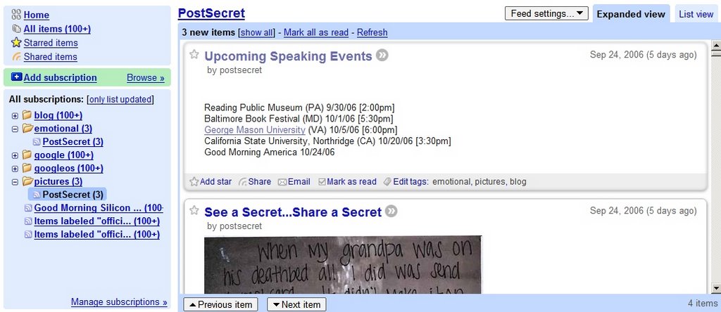
So Google Reader adopted the best way of creating a feed reader: Bloglines. No, they didn't buy it from Ask, they decided to do their own Bloglines. The difference is that Google Reader uses labels, instead of folders.
Other new features:
* Expanded view and list view (similar to Gmail, list view shows only the title and a small snippet, while the expanded view shows the entire post)
* Simplified sharing functionality (just click on the share link, and add snippets from blog posts to a public page. You can share that page with your friends, so they can read your favorite pieces.)
* Infinite scrolling (no upper bound for how many blog posts you can read and instead of clicking to read the next post, you can just scroll)
* Unread counts (can't count more than 100 items)
* Mark all as read
The new interface is much better, and uses more from the screen space. You also have a list of feed packages you can choose and a "Next" bookmarklet you can add to your browser to read blog posts directly from their site. The only questions are why Google Reader is not a part of Gmail yet and where is the search functionality.

Very Nice Upgrade!
ReplyDeleteThis should definitely be integrated into Gmail.
Btw, has anyone tried to subscribe to a Podcast feed? Give it a try , it'll surely put a smile on your face. You'll see what I mean.
Cheers.
GREATTTTTTTT !!!
ReplyDeleteYou'd read my mind, because of that I always wait the best of you (googlers)..
regards
You know, if the Reader team wanted to do Bloglines, they should have done it better. If they phase out the old design completely, I might just go back to Bloglines. Why use a cheap knockoff when you can have the real thing?
ReplyDeleteUnfortunately not a fan. The new UI is bloated and overbearing. The content just bleeds together into one jumbled mess on the page - I appreciate the new functionality (although a keyboard shortcut to jump to the next unread feed automagically instead of shift+N, shift+O) but the design needs to be worked on. Look at the Newshutch UI - simple, concise display of potentially a lot of content - they get it right, IMO. I think the Google standard app pale color scheme is working against them in this regard.
ReplyDeleteHave to say I really like this update. Integration with Gmail would be a great next step.
ReplyDeleteHehe, tried subscribing to a podcast... Works just fine, and you'll get an embedded audioplayer in Google Reader to listen to it. And if you try to listen to it in the embedded audioplayer, the sound will be pitched up, making everyone sound like mice ;)
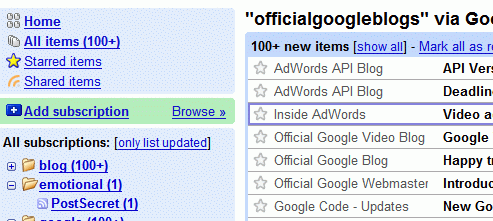
ReplyDeleteOnly for reference, here's the old layout:

ReplyDeletei didn't like the new interface, because the old one was much more clear and easy to use.
ReplyDeleteThe loyout improvement is very reasonable, I think.
ReplyDeleteThe tagging function is my favorite new feature of Google reader.
Now even my fellow picture fetishists can use it, because it is so simple.
Thank you for sharing this story with me !
NOBODY reads news like that?
ReplyDeleteI liked the old interface a lot. It was very, very usable.
I'm trying to get used to the new interface, despite my hatred of bloglines. I'm sure eventually I'll like it.
Even Matt Cutts says he didn't like the old Google Reader.
ReplyDeleteCheck out www.netvibes.com. Beats the pants off google.com/ig
ReplyDelete