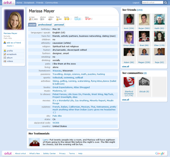
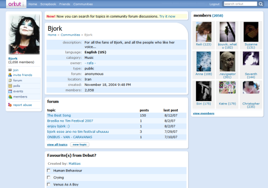
orkut has recently changed the homepage and will launch a revamped interface in the weeks to come. "The change isn't live yet, but starting soon, we will start rolling-out the new look. To start, we will roll it out to a small group of users randomly selected, and will continue to do so until everyone is on the new site."
If you don't see the new interface yet, here's how it looks like: colors are warmer, orkut has rounded corners, the new icons are lovely and there are even touches of AJAX. The conclusion: orkut is not ugly anymore.


I like this screenshot better. :)
ReplyDelete*Laughs* at what engtech said.
ReplyDeleteI think this screenshot, provided by Google, is better. It's definitely clearer and better quality.
ReplyDeletePretty cool.
ReplyDeleteMight start using it after all...
Hm, the problem is, how can I get any of my friends on orkut?
The help center has already been updated.
ReplyDeleteMore screenshots. Rounded corners, warmer colors, a nice Google logo at the bottom, better navigational links.
ReplyDeleteshit owt !!!!!!
ReplyDeleteripp off from the dutch version of Hyves network =_=
ReplyDeletebah...whatever...it looks the same to me, I don't care if it's ugly or not!
ReplyDeleteThe annual yearly fee is about three hundred dollars. The theory is that the listing humans provide will influence web crawlers into giving the website a higher ranking. https://picasaweb.google.com/107332747758663177535/6304162868082361761
ReplyDelete