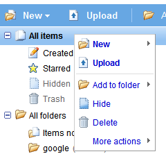
Menu #1: right-click anywhere inside the application. The menu duplicates the existing toolbar.

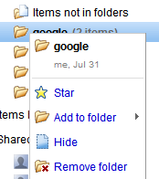
Menu #2: a special case is the menu for folders, which erroneously includes the option "Add to folder".

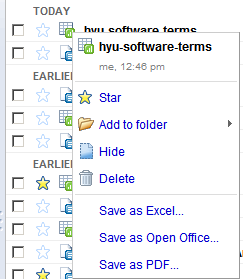
Menu #3: right-click on a file. The menu shows all the actions corresponding to the type of file you selected. The only options left out are: new file/folder and upload.

If you use Firefox and see the standard context menu, go to Tools/Options, select the Content tab, click on the Advanced button next to the JavaScript option and check "(Allow scripts to) disable or replace context menus".
Among the new features that should be included in the next versions are: table of contents, integration of Webster Dictionary and Encyclopedia Britannica, the option to search the web for selected text and exporting documents as MP3 using text-to-speech technology.

I need Offline functionality (like in Google Reader) into Google Docs, GMail and Google Calendar. Thanks ahead!
ReplyDeleteI don't know if you have already noticed but this feature is also available on any map from Google Map.
ReplyDeleteVery nice.
ReplyDeleteMaybe I don't use Google Docs enough, but I find the organisation of main menu items rather counter-intuitive. These new menus will help.
What web standard defines context menus in web pages? Even M$ doesn't use such crap.
ReplyDeleteoncontextmenu is not part of any web standard, but many browsers support it. Here's an example of how to build custom context menus.
ReplyDeleteMicrosoft uses these menus as well, for example in Hotmail.
ReplyDeletethe post mentioned some things that should be coming in newer versions. I think that before they do any of those things, they need to focus on 'Presently' and, as aulo said, integrate with Google Gears.
ReplyDeleteI mentioned some features referenced in the source code. Some of them are already implemented, but not yet released.
ReplyDeletehowever, the new UI still sucks.
ReplyDeleteit has nothing to do with usual Google's look&feel (Gmail, Google Calendar, Google Reader, etc), but looks like some kind of Microsoft production.
Add Folder to Folder?
ReplyDeleteI REALLY HOPE GOOGLE get this working sooner than later - why NOT have folders in folders - it's a pretty - err ... common concept
Maybe because those folders are actually labels.
ReplyDeleteThanks for sharing the info, keep up the good work going.... I really enjoyed exploring your site. good resource...https://www.youtube.com/c/AGNnewsChannel
ReplyDelete