Bloglines, still a popular web-based feed reader, launched a beta version that puts it in line with more recent applications like Google Reader. If Google's feed reader was heavily inspired by Bloglines, it's time for Bloglines to add some features from Google Reader.
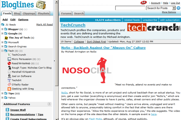
The most important change is that Bloglines doesn't use the old-fashioned frames and loads new data using AJAX. Bloglines offers three views:
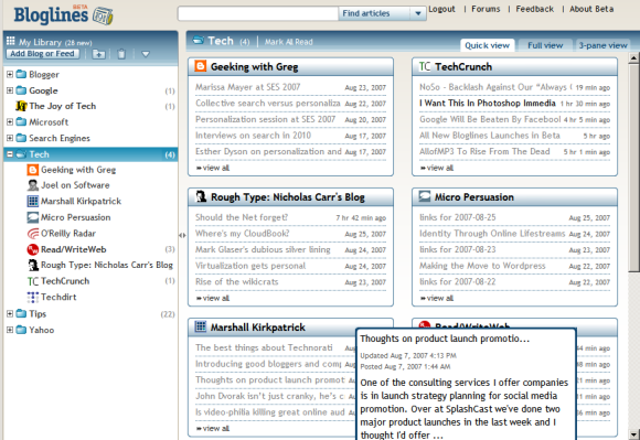
* quick view (similar to Google Reader's list view) that only shows the titles
* full view (corresponding to Google Reader's expanded view) which also displays the content of the feed posts. Unlike the old version of Bloglines, the posts are marked as read only if you scroll down to read them.
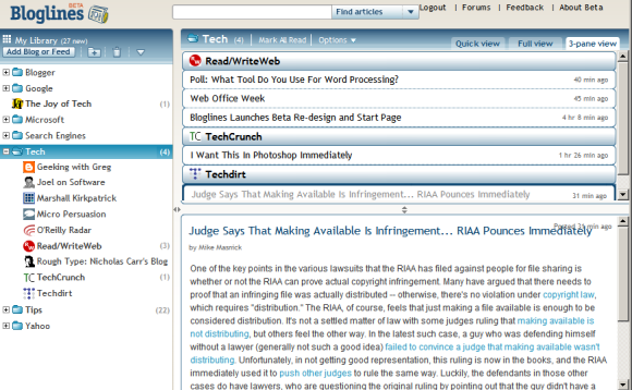
* 3-pane view (screenshot above). This is similar to the way desktop email clients like Outlook or Thunderbird display mail, but it doesn't provide a good experience if you read long posts.
The quick view brings an interesting idea: grouping the feeds from a folder and automatically creating pages like the ones from iGoogle, Netvibes, Pageflakes. Bloglines even lets you create a start page with your favorite feeds.

But the most useful new feature is feed management using drag-and-drop. Now you can easily move feeds from one folder to another one without opening a new page or going to the settings.
Bloglines doesn't want to stop here: they promise to add other features like sharing feeds and the option to create a link blog. "Since this is a Beta, some features and functionality will be missing. Bloglines is very powerful, so it'll take some time to get all your features into the new redesign. The full-featured original Bloglines (considered by many to be the best feed reader on the market) will continue to be available, and Bloglines subscribers can use both sites to access their subscriptions and compare experiences," explains Bloglines.
Bloglines has many features not available in Google Reader (like search, notifier, recommendations, email subscriptions, public profiles), but the main reason people started to migrate to other feed readers was the interface. Here's what Gina Trapani from Lifehacker wrote in a post from last year:
"I'm not exactly an easily-offended aesthete, but Bloglines' design made me wince from the get-go. It's just plain ugly. The color (which I took pains to change with the Bloglines teal-killer Greasemonkey script) , the font, the boxiness of it all - and after awhile a design you don't like starts to drag on you, becomes work to look at and use."


I was once a bloglines fan also, and I credit it to be the first online app (except email) that won me over its desktop counterparts. I tried many desktop rss readers (including full-pledged applications and some firefox extensions) but the problem of synching my feeds and their read status is really one limitation of using a deskop rss reader when you're using more than one computer (which is in my case true). Though i did left bloglines for Google Reader, i still miss its recommendations feature. It's a great feed discovery tool and I hope Google reader implements something similar, or better. As an old fan, and for old time's sake, I'm willing to take the new bloglines for a ride.
ReplyDeleteI could happily use Bloglines if only it would allow you to truly sort by date, rather than feed *then* date in the full view.
ReplyDeleteIt's impossible to get a standard "river of news" view in bloglines as far as I can see, so I can't switch from google reader.