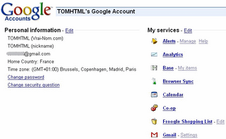
TOMHTML from Zorgloob has found a new design for Google Account page. I don't see any change if I go to my Google Account page, but this will be available soon for everyone. The new design replaces the gray table made in FrontPage with a list of services you use and their logos. For some services, you can change the settings directly from this page. The only problem is that this list will be very big, so I think Google should list only the services you use frequently. This way, you can use this page to go from Google Video to Google Base without typing the URL address.
Related:
Google Passport
Google Links (this feature seems to have been dropped)

https://www.google.com/accounts/EditUserInfo2?hl=en
ReplyDeletehttps://www.google.com/accounts/EditSecureUserInfo2?hl=en
https://www.google.com/accounts/EditPasswd2
All of these show the new design.
I love it, personally. It was such a welcome surprise.
ReplyDeleteGoogle is well-known for its good UIs, but before, looking at the accounts page, you certainly couldn't tell.
And I think it does only show the services you use on the first list, and then some recommended services in a second list at the bottom (though I noticed Sitemaps doesn't seem to be listed as a google service anywhere...)
If you can't see the change yet, try signing out and in again.
ReplyDelete