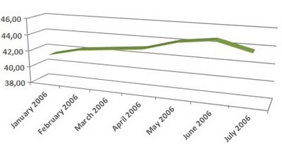
Here's a chart that shows Google's US market share in the first half of this year, as measured by the same source.
We'll see next month if this is a trend, and Google's traffic acquisition deals aren't effective, but, most likely, this is just a transitory decrement in popularity.
Update: Nielsen / Netratings says that Google's US market share in July was 49.2%, down from 49.4% in June.

this graphic is bad done. why do you use three dimensions to show a two-dimensional fact? why don't you give us the full twelve month as referred to in the text (11 months of consecutive gains + 1 month of decline)or even more (when was the last decline before this)? why don't you give us line graphs for yahoo, AOL, Ask.com?
ReplyDeleteanyway if the graph has as few as this to say (only 7 numbers) present the data in a table. this is a waste of space.