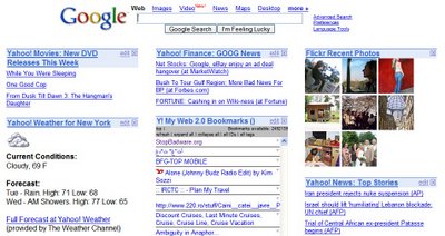
For many users, browser's homepage was a nice page that included news, horoscopes and recipes. The homepage was usually a portal like MSN.com that allowed some customization, but whose content was provided by partners and its own verticals. "Do you want news about cars? We have MSN Cars. We also have weather, classifieds, games, sports, tech and horoscopes. All from MSN."
The new personalized homepages (like IGoogle, Netvibes, Windows Live) give people more choices. You can add a module from your favorite news provider or your favorite weather service. If it doesn't have a module, you can create one. While the Homepage 1.0 was founded on centralized content, the Homepage 2.0 is based on feeds and shared content. If Homepage 1.0 tried to lock-in the consumer, the new personalized homepage wants to be truly yours. When more services will open and create APIs, the personalized homepage will be a mashup of your online life.
ReadWriteWeb asks what will be the business model of the Homepage 2.0. Some ideas are letting businesses create their own branded homepages or affiliate marketing. But I think the answer is delivering ads that are appropriate for your preferred content. You choose what you like and the ads respect that.
In the meanwhile, I'll stick with my Homepage 0.1, that is about:blank.

You forgot pageflakes.com and protopage.com in your list.
ReplyDeleteEllie
yes, the best homepage: about:blank
ReplyDeletemy.yahoo has the best homepage. Change colors, tons of content, easy to read font and colors, and what little advertising it comes with can easily be hidden (with adblock or greasemonkey in Firefox).
ReplyDeleteI think personalized homepages which draw data from other services are impractical for a normal user as they are always going to be slow. IMO the user dont have to look everything on a single view.
ReplyDeleteAs you i prefer about:blank or just a simple page like officialhomepage.org
I tried iGoogle, but is too complicated. Only for tech guys.
ReplyDeleteA easier homepage would be http://www.fav20.com . It doesn't have so many widgets, but it is for less advanced people