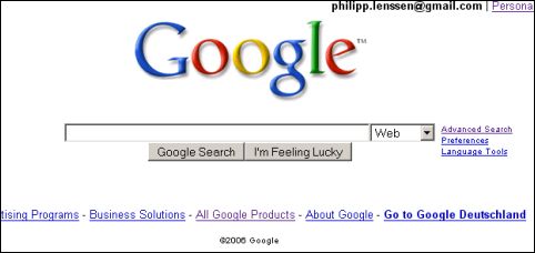
Here are two of the ways Google's search results pages may look in a short while:

First screenshot is from Arjun Prabhu. The services moved to the left, alongside the search results, like a navigation system. But the problem is it shouldn't be a navigation system.

The second screenshot, from Philipp Lenssen, shows a simpler approach: Google services migrated to a combobox. Just like that. I think the problem with this approach is that people will click less to other services.
So I think both possible changes are bad. What if Google included more from their specialized search engines in their main search results? For instance, the first three image results on top, three news or blog results, Froogle for products, Wikipedia for facts in a column.
Many people use only Google Web search and may miss interesting results, so instead of letting the users make more choices, Google should mix the most important results, disregarding the source.

Xxxxx
ReplyDeletehttps://www.google.com/url?q=http%3A%2F%2Fgooglesystem.blogspot.com%2F2006%2F08%2Fanonymous-google-cookie.html&usg=AFQjCNERhRdhJI6MGifGUmJg3MKAkcbEIA
ReplyDelete