What it looks like, really, is a slightly oversized version of Gchat. And that's no accident. Google's actively trying to make email less fussy and formal--or, in other words, to make it a little more like instant messaging. And as Jason Cornwell, Gmail's lead designer, explains, one of the ways to do that is simply to 'give you permission to write shorter messages.' (...) Picture the standard full-screen compose window. The one that gives you a dauntingly huge text box to fill and an array of options for formatting whatever you manage to put in it. What that really looks like, with its button-strewn toolbar, is an empty word processor--and according to Cornwell, what it communicates to users is this: 'Write something long. It was a space that was sort of intimidating, I think, to write a message like "Hey, wanna get lunch?"' he explains. 'We wanted the new compose to facilitate these quicker messages. Or at least make it a space where that felt appropriate.
Gmail's lead designer says that "a very small percentage of emails involve a formatting action," so that's the reason why you need two clicks instead of only one click to make text bold. Once you click the "formatting options" button, the bar stays open, so you can use other features without an additional click.
Co.Design argues that Gmail now competes with SMS, instant messaging and social networks, so Google had to simplify the interface "to keep up with the times".
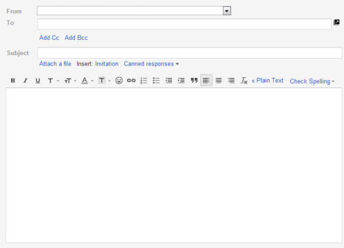
The old interface:
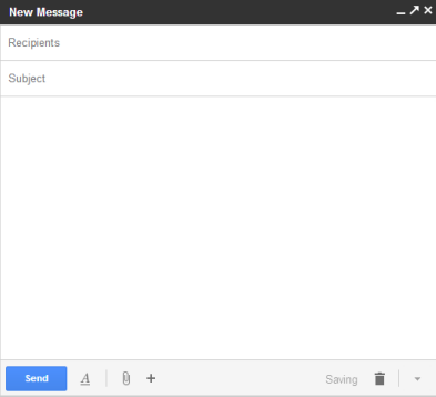
The new interface:

Maybe this fits in with their rumoured Babel messaging system
ReplyDeletei still prefer the old school word type layout. i do use formatting and other html tags on occasion. and i want my emails to look more like letters than a tweet. sorry google, im yer fanboy, but i should be able to switch back to the old style.
ReplyDeleteWhy not let people choose which compose interface they prefer? It shouldn't be a problem to keep both UI's available. Come on you are Big G, aren't you!?
ReplyDeleteIt makes sense. And personally, I prefer the new UI.
ReplyDeleteI prefer the old compose method and I don't agree with the logic. email and IM have co-existed for 15 years. They're different tools for different jobs; there is no competition between them.
ReplyDeleteWith the loss of reader and now this, I feel like google is alienating the more advanced users.
Why don't they make this a choice in the settings? Why do we keep getting forced into these poor design choices?
... It is a fine new format, if you are a person who types with their thumb on a phone.
ReplyDelete... Otherwise, it looks cheap, and takes multiple clicks to get a decent sized page for those who like to express themselves in more than a line or two.
They definitely got that from Sparrow and hopefully an updated version of Sparrow will be available to desktops soon...
ReplyDeleteIf emails are supposed to be short and informal, then what is IM messages supposed to be? IM is supposed to be short and quick because you can get instant responses, while mail is supposed to be long and detailed because they aren't supposed to be instant.
ReplyDeleteIt's like removing trains or bicycles. One is great for long distance traveling and the other for short distance traveling. They aren't competing modes of transportations just like mail and chat isn't competing ways of communication.
Asking about lunch over email probably isn't a very good idea since some people only check their mail a few times a day or less. That's what you have SMS/IM and telephones for.
It still sucks. I use the "change sender email" address too much, and from what I can see, it's not in the new compose, so I've gone back to the old compose. Also, selecting text and finding out that you're blind because it doesn't supply a scroll bar, nor does it scroll the text automatically, is an absolute travesty.
ReplyDeleteAnd popping out into a subwindow is really a waste of time and screen space.
Wasn't there a designer who left Google a few years ago because he was exasperated with how much Google tested changes (even small ones like the shade of a blue line) with real users and made the final decision based on the number of users who actually liked the change? Seems like Google has now gone to the opposite extreme of not doing much of usability tests with real users before forcing such drastic and useless changes on us!
ReplyDeleteI really dislike the new compose and really hate that Google is enforcing all changes on their users. This is a big reason why I've started moving on to non-Google services.
ReplyDeleteAs everyone else has already explained, the new Compose interface sucks. And it's not just that. My Google Chrome on Windows 8 has a scroll bar so narrow you can't see it. And the way the Folders scroll bar doesn't show until you hover over it? Genius--if you are a moron.
ReplyDeleteI am huge fan of Google up until now. I am not a fan of the new Compose interface at all and they need allow users to switch back.
ReplyDelete