An unofficial blog that watches Google's attempts to move your operating system online since 2005. Not affiliated with Google.

Send your tips to gostips@gmail.com.

July 30, 2011

Goodbye, Google Friends!

Google Friends is Google's monthly newsletter that included the latest announcements and product releases. 13 years after the first newsletter issue, Google announced that Google Friends will be retired.
It's hard to believe, but this monthly missive is now 13 years old. We hope you've enjoyed reading it over time, and wanted you to know that we are retiring it in its current form.

As you may know, the Google Friends Newsletter was created by Larry Page in April 1998, when Google was still on Stanford servers. In the early days, the Friends notes offered newsy details like "We are gearing up to do another crawl. We should start within a few weeks" and tips on tweaking your search queries.

Obviously a lot has happened since then, including changes in how we communicate updates to all of you. So this will be our last Google Friends Newsletter. We started the Official Google Blog in 2004 and joined Twitter in 2009, and we've seen dramatic growth on those channels. Meanwhile, the number of subscribers to this newsletter has remained flat, so we've concluded that this format is no longer the best way for us to get the word out about new Google products and services.

Google Friends started as an eGroups mailing list, then it became a Yahoo Group and was later moved to Google Groups. "We used the company eGroups to mass-mail our Google Friends newsletter to users, because Larry's brother, Carl, was one of eGroups founders. Larry had done the configuration for the original eGroups server himself, and for a while the company's computational heart has lived under his desk. The same week we announced our deal with Yahoo, Yahoo announced they were buying eGroups for $428 million (Yahoo has been very kind to the Page family)," remembers the former Google marketing director Douglas Edwards.

The early issues of the newsletter include a geek-friendly changelog of Google's search engine. You'll find about the long-gone operator flink: (forward links), the PageRank bar displayed next to each search result and Google's plans to "have a much bigger index than our current 24 million pages".

"After combining our web server and search engine for better performance, we have been experiencing intermittent problems with our system being down for short amounts of time fairly frequently. If you have trouble getting to the system, try back in a minute or two, and it should be back up." (July 1998)

This is a paragraph you'll never find in a Google blog post, Twitter message or a recent Google Friends issue.

{ Thanks, Tomi. }

Templates for Google Contacts

Gmail added a new feature that makes it easier to add a new contact: templates. If you click "More actions" when you create a contact or edit an existing one, you can select the business template to quickly add fields for the job title, company name, mobile phone and work phone.


The default template is more generic:


Google Contacts lets you add or delete fields, but you can't delete the fields from a template. Hopefully, Google will allow users to create custom templates and import some of the data from Google Profiles.

{ Thanks, Herin. }
Google Related

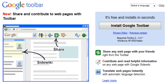
Google Toolbar 7.1 for Internet Explorer has a new feature that shows Web pages, news articles, places, images and videos related to the current page. The feature is called Google Related and it's a bar displayed at the bottom of the page.

"Google Related is a browsing assistant that offers interesting and useful content while you are browsing the web. For instance, if you're browsing a page about a restaurant in San Francisco, Google Related will assist you by displaying useful information about this restaurant such as the location of the restaurant on a map, user reviews, related restaurants in the area, and other webpages related to San Francisco restaurants - all in one place," explains Google.


If you go to the Wikipedia article about Adele, Google Related shows 5 YouTube videos, 5 articles from Google News and 5 pages from Google Search.


Google Related is another feature that requires sending the list of all the pages you visit to Google's servers. To find related pages, Google needs to know the URL of the page you're visiting. The so-called "enhanced features" (PageRank, SideWiki, Google Related) send Google a lot of useful data. One of the most interesting ways to use the data is a feature that shows if a site is slow. Like all the other Google Toolbar "enhanced features", Google Related can be disabled from the "Options" dialog by clicking the "Privacy" tab.


Apparently, Google Related only works if you've configured the toolbar's search site to be Google.com (United States of America - .com), so you may need to change this setting to enable Google Related.

July 29, 2011

Microsoft's Gmail Man Ad

Mary-Jo Foley found a Microsoft ad that tries to convince businesses to choose Office 365 instead of Google Apps because Gmail shows targeted ads. Microsoft created a character called Gmail Man, a postman that doesn't care about people's privacy and reads their messages to find related ads.

The irony is that the paid version of Google Apps doesn't show ads, even though administrators can choose to enable them. I thought that the whole "Gmail reads my mail" myth was debunked back in 2004 and people realized that online email services already used algorithms to index messages and to find spam.


"It was a fascinating angle in 2005 while Gmail was still new and under all kinds of scrutiny, but today, who cares that your emails are automatically scanned, really? Even before Gmail, ISP's already had the ability to read all your emails, but it has never really stopped anyone from using the email service of their choice," thinks Cédric Beust, a former Googler.

{ via Daring Fireball }

New Interface for Google Books

Google Books is the latest Google service with an updated interface that's cleaner and more consistent. Unfortunately, this means there's more white space and less space for books. For example, on a 800x600 resolution almost two thirds of the screen are used for navigation elements. Even if you click the "full screen" button, Google still displays the navigation bar, the search box and the toolbar buttons, while hiding the sidebar and the book's title.


It's clear that the new Google+ interface is not suitable for all Google services and consistency sometimes makes Google's tools less useful. Displaying the navigation bar and the search box takes away valuable space and this is especially noticeable if you use a netbook. The new interface is not flexible or elastic, like Google intended. "The new design will soon allow you to seamlessly transition from one device to another and have a consistent visual experience. We aim to bring you this flexibility without sacrificing style or usefulness," explained Google. It seems that the new design sacrifices usefulness for the sake of consistency.

{ Thanks, Kon Young. }

Gmail's Auto-Forwarding Notice

Google decided to show a pink bar which informs Gmail users that their messages are automatically forwarded to another email address. The annoying "you are forwarding your email to ..." is displayed for about 3 minutes every time you open Gmail this week.


The explanation for this temporary annoyance is that some malicious software or other people who gain access to your account can setup auto-forwarding. "For about a week, this notice will appear for a few minutes each time you sign in to your account. Displaying the notification in this way helps ensure that you have a chance to see the notice, rather than someone who might try to gain unauthorized access to your account and use this setting improperly. The notice will disappear immediately if you choose to disable the forwarding setting, but that decision is up to you," mentions Google.

So that's the reason why there's no "dismiss" link and you're forced to see the pink bar again and again. Maybe it would be more useful to show this message for one week after auto-forwarding has been setup.

If you no longer want to see the message, temporarily disable auto-forwarding, switch to the simplified HTML interface or pin the Gmail tab if you use Chrome, Firefox or Opera. Another option is to add this filter in AdBlock Plus: mail.google.com##.fVKDI (the extension is available for Firefox and Chrome).

Google's Tablet-Optimized Interface

Google's services don't usually have interfaces optimized for tablets. They either use the desktop version (Google Search) or use the mobile version (Google Calendar, Google Docs). An important exception is Gmail, which started to test a tablet UI shortly after iPad's launch.

Google tests a new homepage and a new search interface for tablets. Unlike the standard desktop version, the new UI places the navigation menu and the search options sidebar at the top of the page, so that the search results take up most of the space.


Amit Agarwal, who first spotted the experimental design, says that it's cleaner. "The new Google design uses a single column layout, while the old sidebar options appear between the search box and the search results. There's plenty of whitespace between search results and links to the Cached version of pages have been removed in the new design."

The new layout is more readable and it's also used for specialized search engines like Google Image Search and Google News. Google Image Search for iPad now uses infinite scrolling and shows a lot more results. Unfortunately, the list of missing feature is impressive: no Google Instant or Google Suggest, no links to the cached pages or to the mobile transcoder, no link to the advanced search page.

I've only seen the experimental UI in iPad's mobile Safari, but I'm sure that it should also be available for Android tablets like Motorola Xoom, Samsung Galaxy Tab 10.1 or Asus Eee Pad Transformer. Clearing browser's cookies might help.

Update: Google Mobile blog informs that the new UI "is rolling out in the coming days to iPad and Android 3.1+ tablets across 36 languages."

{ Thanks, Mushaf. }

Google Hotel Finder

Google launched an experimental service that would've been perfect for Google Labs: Hotel Finder. The service lets you find a hotel in US and it has a few clever features that make it stand out.

You can add shapes to the map to restrict the list of results to your favorite areas. Google highlights the most popular areas to help you. By default, Google creates a shape based on the most popular places.

Using shapes to filter results is not an original feature, but it's useful and it's surprising to see that Google Maps didn't add it.


After selecting the location, Google lets you pick the check in and check out dates, choose a price range, a hotel class and restrict the results to hotels that have great user ratings.


Another cool feature is that the results can be expanded inline so you don't have to open a new page to see some photos and read the reviews. Add the hotels you like to a "shortlist" to quickly compare them.


Google Hotel Finder is also useful to find great deals. The "compared to typical" section offers some information that's not easy to find by comparing the current prices with the historical averages.

Unfortunately, you can't book hotels using Google's service, at least not directly. Google Hotel Finder sends you to sites like Booking.com, Priceline, Expedia, Travelocity.

For now, Google Hotel Finder only works for US hotels, but it's a surprisingly strong offering. While there are many features that need to be added to compete with Bing Travel, Google's service is really promising. It's fast, easy to enough and offers helpful information that's not available elsewhere.

July 26, 2011

Updated Code for Google +1 Buttons

As reported last month, the code for Google +1 buttons could be improved so that the buttons load faster and stop blocking other resources. Google updated the code and recommends publishers to generate a new code.

"We're introducing a new asynchronous snippet, allowing you to make the +1 experience even faster. The async snippet allows your web page to continue loading while your browser downloads the +1 JavaScript. By loading these elements in parallel, we're ensuring the HTTP request to get the +1 button JavaScript doesn't lead to an increase in your page load time," explains Google.


Google also optimized the existing code so that the button renders up to 3 times faster. Even if you don't update the code, you'll still benefit from these changes.

The code generator is easy to use and I've noticed that a lot of sites added a +1 button next to Facebook's "Like" button. It's unfortunate that Google didn't optimize the code when it was released.

Design Refresh for Google Web History

Google Web History is a service enabled by default when you create a Google account. It saves all your searches and the search results you click so you can quickly find them later and to help Google personalize results. It's called "Web History" instead of "Search History" because Google Toolbar has a feature that lets you send Google your browsing history.

Google updated the Web History interface to make it more consistent and easier to use. The new interface seems to be optimized for removing searches, not for browsing your history. There's a huge checkbox button at the top of the page and a button for removing "all Web History". While it's nice to see that Google doesn't hide the button for deleting search/browsing history, using a button for such a rare and destructive action feels wrong. It's like placing a button labeled "Delete all your messages" in Gmail's toolbar.

The previous interface included a special mode for removing items. When you clicked "remove items", Google added checkboxes next to the items and a "remove" button. The standard interface included star icons so you can quickly bookmark pages. Now the stars are a lot smaller and more difficult to see. It's likely that most people who visit Google Web History want to remove items or clear the entire history, not to search Web History or to bookmark pages.


{ Thanks, Louis. }

July 23, 2011

Customer Service in the Early Days of Google

Many people complain that Google doesn't offer customer support for most of its services and it's really difficult to receive an email from Google that actually answers your questions. Here's a story from the book "I'm Feeling Lucky", written by the former Google employee Douglas Edwards. Back in 2000, Max Erdstein was Google's sole customer service rep and he could only use a laptop and a copy of Microsoft Outlook.
Max never envisioned customer service becoming an omnivorous blob consuming all his time, but soon he found himself responding robotically to more than a thousand emails a day from users around the world. Crushed under the load, he could do little than succinctly reply, "Thanks! Keep on Googling!" Non-English emails presented the biggest problem. We had no idea if people wanted to praise us or harangue us. We tried using off-the-web translation software, but it left us more confused than when we began.

Meanwhile, there were rumblings from sales VP Omid that supporting advertisers and search-services customers should be a higher priority. Could Max help with that, too? After all, unlike users, these people were actually paying us. Max was emptying an ocean with a teaspoon. As the backlog of unanswered emails began to swell, Sergey offered a useful perspective. "Why do you need to answer user email anyway?" he wanted to know.

To Sergey's thinking, responding to user questions was inefficient. If they wrote us about problems with Google, that was useful information to have. We should note the problems and fix them. That would make the users happier than if we wasted time explaining to them that we were working on the bugs. If users sent us compliments, we didn't need to write back because they already liked us. So really, wouldn't it be better not to respond at all? Or at best, maybe write some code to generate random replies that would be fine in most cases?

Google Image Search Shows More Information About Photos

Google's image search engine started to show additional information about photos after clicking the results. The landing page's sidebar includes EXIF data: camera, settings, focal length, flash usage and exposure bias.

"Additional details are found from within the image file, often saved there by the digital camera that took the picture or the application that generated the image. This data can also be manually added or changed after the image has been created. Google doesn't create or change this data in images created by others. The data is saved using the Exchangeable Image File Format (EXIF) specification and can include details about the type of camera that took the image, the camera settings (like aperture, focal length, exposure length, and flash settings), and the copyright and usage rights associated with the image by the person who created or edited the image," explains Google.

Another change is that you can click "more sizes" for other versions of the image and "similar images" for visually related images. The sidebar also includes the search result's snippet.


The sidebar can also include a list of related searches, which offer a lot of information about the image and help you find similar images:


Google should also add links to the previous and the next search result so that you don't have to go back to the list of results.

Google Maps Removes Third-Party Reviews

Google Places pages have been updated to use the new Google+ interface, but the biggest change is that Google dropped the reviews from third-party sites like Yelp, Menupages or Booking.com, while only relying on the reviews from Google users. "Based on careful thought about the future direction of Place pages, and feedback we've heard over the past few months, review snippets from other web sources have now been removed from Place pages. Rating and review counts reflect only those that've been written by fellow Google users, and as part of our continued commitment to helping you find what you want on the web, we're continuing to provide links to other review sites so you can get a comprehensive view of locations across the globe," explains Google.

To encourage users to share their feedback and improve place pages, Google added a button for uploading photos and made the button for writing reviews more prominent. It's clear that Google Maps will become even more social and will integrate with Google+, so the reviews from your social circles will be more relevant and will help you find a nice restaurant or a fancy hotel.


While Google Hotpot added a lot of new reviews from Google users, there are still many local business that don't have reviews. What's more, the reviews from Google users are usually short, superficial and often they only include a rating.


Search Engine Roundtable speculates that Google removed third-party reviews because of Yelp's complaints. "We are unhappy with the way Google uses our users' review on its Places page. However, there is no solution to the problem… Google's position is that we can take ourselves out of its search index if we don't want them to use our reviews on Places," said Yelp's CEO. After an unsuccessful attempt to acquire Yelp, Google launched Places, Hotpot and made Google Maps results more prominent in the list of Web search results. Yelp felt that its reviews improved a competing service and asked Google to remove Yelp reviews from Google Places. Google decided that it's a good idea to blackmail Yelp and tie the Web search index with the Places reviews (Google News has a different policy and the same goes for Product Search). A such a terrible practice made Google look like a huge company that used its power to crush rising startups.

TechCrunch found that "Yelp made a presentation to a roomful of state attorneys general at the Conference of Western Attorneys General about regulatory issues in search. On that panel was Vince Sollitto, VP of Giverment Affairs for Yelp, along with Dana Wagner, a Google lawyer, and well-known antitrust attorney Gary Reback. Yelp's presentation was titled 'Google Places: A Threat To Innovation and Competition.' The basic argument was that Google strong-armed review websites into providing their content for free, and then gave their own Places product preferential treatment in search."

Instead of removing the reviews from Yelp, Google yanked all third-party reviews and made Google Places less useful. There are still links to other review sites and there's still a small excerpt from a review in the list of search results, but Google Maps is no longer a comprehensive source of reviews, while Bing Maps looks more attractive. Google Maps ratings no longer use data from third-party reviews, but I wouldn't be surprised to see that Google still uses these reviews to rank results.

July 22, 2011

Google Makes Money from Chromebooks

While many people think there's a lot of overlap between Android and Chrome OS, the products don't have a lot in common. Chrome OS is a proprietary operating system based on an open-source project and OEMs can't tweak it or add new features. Just like for Nexus One and Nexus S, you get all of the updates from Google. Another difference is that Chrome OS is constantly updated and you can even switch to the beta or the dev channel to try the latest features. Chrome OS has an automatic update feature, so that Chromebooks run the latest version of the operating system.

Google's CFO, Patrick Pichette, mentioned another difference between Android and Chrome OS: "Google is making some money from companies buying computers that run the Chrome operating system." Google came up with an innovative subscription model for businesses and schools. Instead of paying for the hardware, organizations can pay $20-$33/device/month and get a notebook, enterprise support, new devices every 3 years or even more often, a Web-based central management console, integration with Google Apps. While enterprise Chromebooks are a lot more expensive than the regular Chromebooks available at Amazon or Best Buy, Google says that the total cost of ownership of a notebook can be reduced by up to 70%. "Chromebooks and the management console automate or eliminate many common, time-intensive IT tasks like machine image creation, application distribution, patching, and upgrades. Additionally, there is no need to purchase licenses for anti-virus, data encryption or data back-up software."

Like Android, Chrome OS also encourages people to use Google's services more often. "People search more when they use the Chrome browser or Android phones, which increases Google's core business," says Patrick Pichette. Android will also offer additional revenue opportunities. "Nonsearch revenue will eventually arrive for Android as it combines Google Maps, mobile payments with Google Wallet and daily deals with Google Offers."
When we have products that get resounding user and consumer success and that are growing in the hundreds of millions we don't worry. The only question is when and how will we monetize. Everybody's all nervous about the fact it's been 36 months since Android has launched and you only have search (revenue). That's the criticism I hear. The questions that are asked are so short-termish. That's just not the way that Google thinks.

For now, Chromebooks are the perfect Google Apps "thin clients", while Android devices have so many sensors that help you explore the world and make Web services a lot more useful when you are on the go.

July 21, 2011

Updated Interface for Google News

Google News is the latest Google service that gets a new design consistent with Google+. There's a new color scheme, more white space, a new header and two buttons that replace the customization links.

It's strange to see the label-less blue search button next to the "search the Web" button. Gmail's new interface uses two buttons that are easier to differentiate, instead of confusing users. There's a lot of wasted space at the top of the page and the two new buttons are too prominent, especially if you consider that you'll not use them very often.


In a recent Google+ post, Larry Page said that Google has launched a "beautiful, consistent and simpler design". He continued: "Google+ is also a great example of another focus of mine - beautiful products that are simple and intuitive to use and was actually was one of the first products to contain our new visual redesign." A New York Times blog post quotes Patrick Pichette, Google's CFO, who concludes that "there was just too much clutter. Larry in the last 90 days basically said, 'Hey, it's just time to re-shift. Don't lose any insights into the deep engineering that we drive, but let's make sure we don't lose focus on the ease of use."

{ Thanks, Anthony. }

Google Docs Lets You Upload 10GB Files

Scott Johnston, Product Manager at Google, announced that Google Docs increased the maximum file size from 1GB to 10GB. That's a really good news, but it's surprising to see that Google Docs only offers 1GB of free storage.

After all, Chromebook users are supposed to store their files online and there are many services that offer more free storage than Google Docs: from Dropbox (2GB) and Box.net (5GB) to Amazon Cloud Drive (5GB) and Microsoft SkyDrive (25GB). While you can buy 20GB of storage for $5/year, it's obvious that more people would upload their files to Google Docs if the service offered at least 20GB of storage for free. Releasing a sync software like Music Manager would make it easier to upload files and to access them from any computer.

Another idea would be to separate online storage from Google Docs apps, so that you can upload Microsoft Word documents and open them using Google's word processing app, but without irreversibly associating them with the app. This way, you could upload files and open them using multiple applications, for example: Google Docs, Zoho Writer and Microsoft Word's Web App.


Image by Scott (inspired by Hyperbole and a Half).

July 20, 2011

Google Toolbar for Firefox Has Been Discontinued

Another Google product bites the dust. This time it's a popular add-on: Google Toolbar for Firefox. Many users were surprised to see that Google hasn't updated the toolbar for Firefox 5, even though it wasn't a difficult task. After enabling the Add-on Compatibility Reporter, most of the features worked well in Firefox 5.

It turns out that Google no longer wants to update Google Toolbar for Firefox, but it doesn't admit that the product has been discontinued.

"Google Toolbar for Firefox is compatible with Firefox version 4 or older. If you use Firefox version 5 or newer, you won't be able to use Google Toolbar."


Google suggests a long list of add-ons that could replace Google Toolbar's features, but the suggestions are too generic. For example, Google links to the search results for [bookmarks sync] or [language translate] in the Firefox add-ons gallery.

A Google blog post offers an explanation: "many features that were once offered by Google Toolbar for Firefox are now already built right into the browser" and thanks the loyal users. That's also true for the IE toolbar, but there are many useful features that aren't included in the browser: auto-translation (a built-in Chrome feature), Google Bookmarks integration, using Google Docs to open documents, smart spell-checking using an online service, highlighting search terms, suggestions for navigation errors (another built-in Chrome feature), custom buttons and gadgets.

You probably remember that Google Toolbar for Firefox was released in 2005, five years after the Internet Explorer version. At that time, Firefox users who wanted to install a Google Toolbar with PageRank support could try an unofficial extension called Googlebar. Maybe that extension will be resurrected, now that Google Toolbar for Firefox is no longer available. Releasing some of the source code under an open-source license would be helpful.

For now, Google Toolbar still works in the latest Firefox releases if you install the Add-on Compatibility Reporter first and restart the browser. Here's Google Toolbar in Firefox 7 Alpha 2 (Aurora):


Last year, Microsoft's Bing Bar dropped support for Firefox and became an Internet Explorer-only add-on, just like Google Toolbar. Bing Bar is powered by Silverlight, a software for running rich internet applications. A few months ago, Google tested a new Google Toolbar powered by Chrome, but only for Internet Explorer. It's likely that the new toolbar didn't work well in Firefox, so Google decided to only offer an Internet Explorer version.

{ Thanks, Colar. }

No More Google Labs

Google's blog announced a surprising decision: Google Labs will be closed. It's not April Fools' Day, so it can't be a hoax.

"While we've learned a huge amount by launching very early prototypes in Labs, we believe that greater focus is crucial if we're to make the most of the extraordinary opportunities ahead. In many cases, this will mean ending Labs experiments — in others we'll incorporate Labs products and technologies into different product areas. And many of the Labs products that are Android apps today will continue to be available on Android Market," explains Google.

It's all about focus and prioritization, the same reasons why Google Health and Powermeter were discontinued last month. Google's CEO, Larry Page, says that Google will focus on the core products (search and ads), on the products that "enjoy high consumer success" (YouTube, Chrome, Android) and on some new products (Google+, Commerce, Local).


Google was all about experimentation and launching new projects early to get feedback and iterate. Google Labs was the place where many of the most important Google services started: iGoogle, Google Maps, Personalized Search, Google Docs, Google Reader, Google Groups. Right now, there are 56 Google Labs products and many of them are really useful: Google Body Browser, Google Scribe, Fast Flip, Android App Inventor, Aardvark, Google Goggles, Google Moderator, Google Code Search.

While Gmail Labs, Google Maps Labs, TestTube will continue to exist, it's sad to see that the service that showcased Google's latest innovations will disappear.

Google Directory, No Longer Available

Google Directory was the second Google service launched, after the Web search engine. It was released in 2000 to compete with Yahoo Directory, the most popular Web directory at that time. Google used data from Netscape's Open Directory Project, but it added an innovative feature: automatically ranking results.


Here's an excerpt from an article written by Danny Sullivan back in April 2000. "Google is applying link analysis in a new way, to the human powered information of the Open Directory. All I can say is hurray! I've been chanting for an end to the tyranny of the alphabet when it comes to directory listings for some time. Why should sites that begin with an A appear at the top of list, oppressing better quality sites that may simply begin with a letter further down in the alphabet? In many cases, this offers no help to the searcher."

Directories were useful at that time because there weren't too many high-quality sites and reviewers could keep up with the growth of the Web. Now that the Web has a lot more than a trillion pages, it's impossible to maintain a directory, so algorithmic search engines are the only ones that can scale.

Now Google Directory is no longer available. "We believe that Web Search is the fastest way to find the information you need on the web," says Google.


Google Directory has been irrelevant for many years and very few Google domains still included the service in the navigation bar. Last year, Google dropped the search feature and not many people noticed.

{ via Search Engine Roundtable }

Google+ App for iPhone

Google's iPhone app for Google+ has been finally approved by Apple and it's the top free app in the US App Store. For some reason, the app is not compatible with iPod Touches and iPads, so it only works if you have an iPhone.

Google+ for iPhone has most of the features of the Android app, but it doesn't support instant uploads and lacks the advanced settings from the Android app.


The app has been criticized for the non-standard interface. "Google+ app uses left-right swiping to change views in your 'Stream'. I see three: Incoming, Circles, and Nearby. The idiomatic iOS design for this would be a tab controller at the bottom with three tabs, one for each view," says John Gruber.


Other users complain that they need an invitation to use Google+ and a surprising number of people say that the app doesn't work well in iOS 5, which is still in beta and can only be installed by developers, at least officially. This shows that many of the 18 million Google+ users are developers and tech enthusiasts.

Google's Yellow Malware Warning Box

Google started to show a yellow warning box at the top of the search results pages if the computer is likely to be infected with malware that changes Web pages, inserts ads and sends users to other pages to download more malware.


"Recently, we found some unusual search traffic while performing routine maintenance on one of our data centers. After collaborating with security engineers at several companies that were sending this modified traffic, we determined that the computers exhibiting this behavior were infected with a particular strain of malicious software (...) that causes infected computers to send traffic to Google through a small number of intermediary servers called proxies," explains Google.

Showing a warning message is not a foolproof idea, since malicious software could easily remove it or use it to install more malware. Google links to a page titled "Your computer appears to be infected", which suggests to install an antivirus software and perform a system scan. The page doesn't suggest to install a different operating system or to buy a Chromebook.

"Some forms of malicious software will alter your computer settings to redirect some or all of your traffic through a proxy controlled by the attacker. When you use Google, the proxy forwards your query to the real Google servers to fetch the search results. If our system detects that a search came through one of these proxies, we display the warning," informs Google.

{ Thanks, Herin. }

July 19, 2011

A New Look for Google Translate

Google Translate is the latest Google service with a new design based on Google+. Since Google Translate's interface is simple, there aren't many changes: a new grey header, updated buttons and drop-downs.


"We're working on a project to bring you a new and improved Google experience, and over the next few months, you'll continue to see more updates to our look and feel. The way people use and experience the web is evolving, and our goal is to give you a more seamless and consistent online experience—one that works no matter which Google product you're using or what device you're using it on," explained Google last month.

After launching a new interface for Google Search, Google created two themes that preview Gmail's new design and started to test Google Calendar's new UI and Blogger's new UI. Up next: Google Docs, Google Sites, Picasa Web Albums, Google Reader and probably other services.

{ Thanks, Kon. }

Multiple "Did You Mean" Suggestions

Google's spell checker has always returned a single suggestion when it was very likely that your query was misspelled. In many cases, Google now returns the results for the corrected query and shows a message above the results: "Showing results for [corrected query]. Search instead for [original query]".

Google started to show a "did you mean" message even for queries that are too ambiguous to be corrected automatically. For example, if you search for [efrazin], a query that returns a small number of results, Google suggests four other similar keywords that are more popular, but the list doesn't include [e. frazin].


The new feature is a clever way to combine spell checking with related searches and show additional suggestions for weird queries that are likely to be misspelled. Even if the suggestions aren't always useful, it's a low-risk feature and you won't see too often.

July 18, 2011

Google Music Lyrics

Google Music Lyrics is a Greasemonkey script that adds a lyrics panel to Google Music. It only works in Firefox and there's a single lyrics provider: SongLyrics.com.


The lyrics are cached so that they're displayed instantly the next time you play the same song. You can also edit the lyrics and the changes are saved using HTML5 local storage. To hide the panel, click the title.

Chris Hendry, who developed the script, plans to add other lyrics providers, allow users to import and export lyrics and to make the script work in Google Chrome.

July 17, 2011

Find Recent Images in Google Image Search

Google Image Search added a filter that lets you restrict the results to the pages created in the past week. Just click "past week" in the left sidebar and you'll see a list of recent images that include labels like "20 hours ago" or "5 days ago" to show how recent they are. Google's image search engine shows the same labels even if you don't restrict the results to recent images.


The interface doesn't let you customize the date range, but you can edit the URL and replace "qdr:w" with "qdr:h" (past hour), "qdr:h20" (past 20 hours), "qdr:d" (past 24 hours), "qdr:d2" (past 2 days), "qdr:w2" (past 2 weeks), "qdr:m" (past month), "qdr:y" (past year). Another trick you can try is to type your query in Google Web Search, use the date filters from the sidebar and then click "Images" in the vertical menu. Custom date ranges don't work in Image Search yet.

Here are some examples: Beijing photos from the past year, wedding photos from the past month, Android-related images from the past 2 weeks, Tour de France photos from the past week. It's important to keep in mind that the photos may not be so recent, but they're included in recent articles, blog posts and other Web pages.

The nice thing about the "recent images" filter is that you can combine it with other advanced filters. You can sort the images by subject and restrict the results to recent images, find images that have a certain size or a predominant color and they were uploaded in the past year, find recent Creative Commons images or generate a list of recent images from a site (e.g.: cnn.com).

July 15, 2011

Export Google +1 Pages

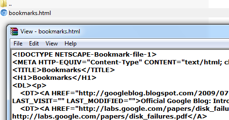
Google's Data Liberation team added a new feature to Google Takeout: exporting the pages you've +1'd. The pages are saved to a bookmarks.html file that can be imported by almost any browser.


Google now offers three ways to bookmark pages: Google Bookmarks and Chrome Bookmarks for private bookmarking, Google +1 for social bookmarking. While Google Bookmarks supports labels and Chrome Bookmarks uses folders, Google +1 doesn't have a way to organize your bookmarks. While Google Bookmarks and +1 have Web interfaces, you can no longer view your Chrome bookmarks online.

Google Docs Viewer Supports ZIP and RAR Archives

One of the complaints you might hear from Chromebooks users is that they can't open archives. While Chrome OS still doesn't let you open archives, Google Docs Viewer added support for two of the most popular archive formats: ZIP and RAR. Gmail also added a "view" link next to ZIP and RAR attachments that opens them in Google Docs Viewer.


Google's interface for archives is quite basic: there's a pane that shows some information about archives (number of files, size) and the list of files. If the file format is supported by Google Docs Viewer, you can open the file and view it in the browser.

"ZIP and RAR archives that are embedded inside other archives also work. For example, if you have a RAR file inside a ZIP file, you can just click on that file to access the embedded archive. This feature extends to Google Docs for mobile, too," informs Google.

For some reason, Google lists all the files from an archive and ignores folders. Google shows the relative path of each file, but that's not very useful. Another strange issue is that Google Docs Viewer doesn't let you open image files and text files without having to download them, even if these formats are supported by most browsers.


Hopefully, Google Docs will add support for other archive formats (7zip, tar, gzip, iso) and allow users to extract the files from an archive.

Google News Badges

Google News added a feature that could encourage users to read more: collectible badges. "The U.S. Edition of Google News now lets you collect private, sharable badges for your favorite topics. The more articles you read on Google News, the more your badges level up: you can reach Bronze, Silver, Gold, Platinum, and finally Ultimate. Keep your badges to yourself, or show them off to your friends," informs Google.


Google created more than 500 badges, so it's very likely that you'll collect at least one of them if you visit Google News frequently. Badges reward people that constantly read articles on a certain topic, so you're more likely to receive a badge if you read 3-4 articles a day about Google than if you read 10 articles about Google every 3-4 days.

While this feature could encourage users to visit Google News more often, the main purpose is to find people that know a lot of things about certain topics. "Your badges are private by default, but if you want, you can share your badges with your friends. Tell them about your news interests, display your expertise, start a conversation or just plain brag about how well-read you are," suggests Google.

Instead of manually adding your favorite topics to your profile, you could add Google News badges. It's one way to show your expertise and it could be useful if Google plans to integrate Aardvark with Google+ and launch a social Q&A service.

Badges also help you find your favorite Google News topics and add customized sections to the homepage. Google News now uses sliders to let you fine tune your personalized hompepage.


If you don't like badges, there's an option in the Google News settings page that lets you disable this feature.

{ Thanks, Jason. }

Google Tests an Interface Optimized for Infinite Scrolling

Alon Laudon spotted a new experimental interface for Google's results pages. The most important change is that most navigation elements continue to be visible even when you scroll down. The navigation bar, the search box and the search options sidebar have a fixed position, which means that you no longer have scroll to the top of the page to edit the query or switch to a specialized search engine.


The new interface seems to set the stage for a fluid design that removes pagination and replaces it with infinite scrolling. In fact, most the changes are already available in Google Image Search, which uses infinite scrolling.


Alon also noticed a new UI for Instant Preview. "Page preview is a little different - the button appears to the side of the result text preview instead of to the side of the result webpage name. The site also doesn't pop up the preview when you simply click something inside the text, you have to hover over the magnifying glass icon."


{ Thanks, Alon. }

July 12, 2011

I'm Feeling Lucky, the Book

You must have seen this message when installing Google Toolbar in Internet Explorer: "Please read this carefully. It's not the usual Yada Yada."


If you've ever used orkut, you probably remember the famous error message: "Bad, bad server. No donut for you."


Remember Mentalplex, Google's first April Fools' Day joke?


What about the "10 things Google has found to be true"?


All of these were written by Doug Edwards, Google's director of consumer marketing and brand management from November 1999 to March 2005. Doug was "the voice of Google", the one who wrote the text for Google's corporate pages and FAQs. He's now the author of the book "I'm Feeling Lucky" (Google Books, Amazon), which tells the story of the five years he spent at Google.


"Google was becoming my own personal publishing platform. (...) We had built a global bully pulpit and my voice rolled forth from it, My thoughts, my ideas, my imprecations would be seen by more people than read the New York Times or watched a network newscast. I was the man behind the curtain giving voice to the all-knowing Oz, and I tried not to let it go to my head," remembers Doug.

He came up with the name "AdWords", a cross between "AdsDirect" and "BuyWords", two other names suggested for Google's online ad service.

Doug was the marketing directer of a company whose founders didn't want to spend too much money on marketing. "Efficiency. Frugality. Integrity." These were Google's most important principles. "Growing by word of mouth suited Larry and Sergey's animosity toward advertising. They scoffed at profligate startups and their Superbowl spots, because TV ads lacked accountability. (...) 'If we can't win on quality', [Larry] said quietly, 'we shouldn't win at all.' In his view, winning by marketing alone would be deceitful, because it would mean people had been tricked into using an inferior service against their own best interests."

Actually, Google created a marketing department because "a board member or a friend from Stanford had insisted the founders needed people to do staff that wasn't engineering."

Douglas shares a lot of interesting things about the early days of Google, when the company struggled to rewrite Google's original code, build a scalable infrastructure, convince major portals like Yahoo and AOL to use Google's search technology and find a way to monetize search. Google started with a great idea, but turning a research project into a successful company wasn't easy. Hiring smart people and creating a flat organization that replaced bureaucracy with meritocracy helped a lot. "Great things would come from packing [engineers] tightly together so that ideas bounced into one another, colliding and recombining in new, more patent ways," remembers Douglas.

Google has always been the anti-corporation, where you could question authority and where engineers were in the driving seat. That's probably the reason why "don't be evil" became Google's mantra. As Google became a bigger company, "don't be evil" helped Google stay true to itself. Even when Google did evil things, like testing ads mixed with search results, the mantra was always there to show the right path.

Douglas had an increasingly important role: from a marketing director that tried to promote Google without spending too much money to the voice of Google, the one who wrote or adjusted most of the text from Google's pages. He questioned many decisions of Google's co-founders, from adding daily doodles to creating an ad service that didn't require moderation, but he later realized that they were great ideas. A former marketing manager at Mercury News, Douglas had to change a lot of habits at Google, while learning a lot in the process.

His decision to leave the company came after he realized that a major Google reorganization made his role unnecessary. "I had started at a small startup as a big-company guy. Now I was leaving a big company as a small-startup guy." Douglas thinks that Google's main flaw is the "impatience with those not quick enough to grasp the obvious truth of Google's vision." After leaving the company, he found himself "impatient with the way the world works" and discovered a lot of problems in everyday life. "Smart people, motivated to make things better, can do almost anything."

That's one of the most important things about Google: the motivation to make things better at a global scale. Creating a better browser, a better mail service, an ad service built around relevant ads, a translation service that constantly improves shows that Google cares a lot about finding the right answers to the important problems.

Gmail's Friend Suggest Algorithm

A recent Google paper [PDF] offers a lot of interesting information about an algorithm used by Gmail to suggest friends and to create contact groups.

Analyzing the outgoing and incoming messages, Gmail creates a social graph for each user. "We call the hypergraph composed of all of the edges leading into or out of a single user node that user's egocentric network. (...) Edges in the implicit social graph have both direction and weight. The direction of an edge is determined by whether it was formed by an outgoing email sent by the user, or an incoming email received by the user. There may be both outgoing and incoming edges joining a user and an implicit group, if the user has both sent and received email from the group. We consider a user to have received mail from a group by joining the sender of the mail and the other co-recipients into an implicit group. (...) The weight of an edge is determined by the recency and frequency of email interactions between the user and the group."

The social graph exists, even if it's not very obvious and not many Gmail features use it. The Friend Suggest algorithm uses the implicit groups to suggest contacts when you send a message to multiple recipients ("Don't forget Bob!") and to find contacts that are added by mistake to a list of recipients ("Got the wrong Bob?"). The two features have recently graduated from Gmail Labs.


"Our algorithm is inspired by the observation that, although users are reluctant to expend the eff ort to create explicit contact groups, they nonetheless implicitly cluster their contacts into groups via their interactions with them."

According to Google, more than 10% of the Gmail messages are sent to more than one recipient and more than 4% of the messages are sent to 5 or more recipients. All of these messages allow Google to automatically cluster contacts into groups that change dynamically.

Google says that Friend Suggest could have many other uses, "such as identifying trusted recommenders for online recommendation systems, or improving content sharing between users in various online contents."

{ via Greg Linden }

An Easy Way to Find Chrome Web Apps

Mihai Parparita, who is now a Chrome engineer, wrote a Chrome extension that lets you find apps from the Chrome Web Store without visiting the store. The extension simply adds a plus icon to the address bar when you visit a site that has a corresponding app in the Chrome Web Store.


"Discovery (i.e., how a user finds apps to install) is an interesting aspect of app stores. In some ways, discovery is not necessary: a significant appeal of the store is that it catalogs all the apps, so if the user is looking for a todo list or Twitter client, it's pretty obvious what to search for. However, that assumes that the user has a specific need in mind already, and is aware that that class of application exists," explains Mihai.

For now, Mihai's extension is just an experiment. The list of supported apps is included in a text file, which is incomplete and has to be updated. One of the advantages of using a static list is that the extension doesn't send your browsing history to a server. Another advantage is that it's much easier to find matches for the sites you've already visited. After installing the extension, a page titled "there's a Web app for that" will suggest some apps for the sites you're visiting frequently.


It's important to mention that the Chrome Web Store only lists official hosted apps. "If your hosted app is listed in the Chrome Web Store, you must prove that you control each domain specified in [the app field]," informs Google. There's a workaround for this, as the unofficial Google Music app shows: linking to a local HTML file that redirects to the app's URL. The Google Music app is a packaged app, not a hosted app, so Mihai's extension doesn't include it.

Right now, most of the apps are just shortcuts and the main benefit is that they're easily accessible from the new tab page. Some apps offer additional features and a small number of apps are actually full-fledged extensions (packaged apps). Google doesn't categorize apps and doesn't inform users if an app works offline.