An unofficial blog that watches Google's attempts to move your operating system online since 2005. Not affiliated with Google.

Send your tips to gostips@gmail.com.

November 28, 2013

Keyboard Shortcuts for Google+ Notifications


The Google+ notifications box has a few keyboard shortcuts you might find helpful. Here are some of them:

* up/down arrow keys help you select a notification from the list. Notice the blue line, which shows the currently selected notification. After opening a notification, use the same arrow keys to scroll.

* Enter (Return for Mac) opens the notification you've selected. You can also use o

* press the down arrow key after the last notification and then press Enter to open the list of previously read notifications

* right/left arrow keys let you go to the next/previous notification. You can also use j/k

* u - go back to the list of notifications or to the main screen

* d - mark as read the notification you've selected

* Esc closes the notifications box.

Unfortunately, there's no shortcut that opens the Google+ Notifications box, so you still need to click the bell icon. How to quickly read your notifications? Press the down arrow key, then press Enter and go to the next notification using the right arrow key.

Sometimes Page Up/Page Down and Space/Shift+Space work, but only after you use the arrow keys. If you find other keyboard shortcuts, please let me know in the comments.

Google+ also has a list of keyboard shortcuts.

Google's Festive Decorations

Google shows a lot of festive doodles, Easter Eggs and special decoration. Here are some of them:

- The Thanksgiving doodle is actually a video


Here's the video:


"Thanksgiving Day is a national holiday celebrated primarily in the United States and Canada as a day of giving thanks for the blessing of the harvest and of the preceding year."

- Mr. Jingles is hungry


Here's the animation:


- Hanukkah search results


Here's the mobile Safari version:


... and the mobile Chrome version:


"Hanukkah, also known as the Festival of Lights and Feast of Dedication, is an eight-day Jewish holiday."

- Festivus search results include the aluminum Festivus pole


"Festivus, a well-celebrated parody, has become a secular holiday celebrated on December 23 which serves as an alternative to participating in the pressures and commercialism of the Christmas and holiday season. Originally a family tradition of a scriptwriter working on the American sitcom Seinfeld, the holiday entered popular culture after it was made the focus of a 1997 episode of the program."

As Google says, "it's all about Thanksgivukkah in 2013. This overlap of Thanksgiving and Hanukkah won't happen again for another 70,000+ years, making it a once-in-a-lifetime event".

Happy Thanksgiving! Happy Hanukkah! Happy Holidays!

{ Thanks, Mukil, Emanuele, Camilo and Florian. }

November 27, 2013

Google Health Cards

When you search for [causes of multiple sclerosis], [causes of hiccups], [symptoms of the flu], [how to treat iron deficiency] and other similar health-related queries, Google shows snippets from authoritative sites like WebMD and MayoClinic. Sometimes Google also shows instant answers, but they're not always accurate.


{ Thanks, Sunite. }

YouTube Tweaks Experimental Center-Aligned UI

YouTube continues to tweak the center-aligned UI experiment. The latest version includes a new upload button, a refined guide sidebar with new icons and "more" drop-downs for playlists and subscriptions, a list of recommended channels and probably other features.


The "guide" sidebar is displayed by default only if there's enough room. If there isn't, the sidebar is hidden and you need to click "guide" to see your playlists, subscriptions, video history and more.


The layout still uses cards and it's center-aligned.


Here's how you can enable the experimental interface. If you use Chrome, Firefox, Opera, Safari or Internet Explorer 8+:

1. open youtube.com in a new tab

2. load your browser's developer console:

* Chrome or Opera 15+ - press Ctrl+Shift+J for Windows/Linux/ChromeOS or Command-Option-J for Mac

* Firefox - press Ctrl+Shift+K for Windows/Linux or Command-Option-K for Mac

* Internet Explorer 8+ - press F12 and select the "Console" tab

* Safari 6 - if you haven't enabled the Develop menu, open Preferences from the Safari menu, go to the Advanced tab and check "Show Develop menu in menu bar". Close Preferences and then press Command-Option-C to show the console.

* Opera 12 - press Ctrl+Shift+I for Windows/Linux or Command-Option-I for Mac, then click "Console".

3. paste the following code which changes a YouTube cookie:

document.cookie="VISITOR_INFO1_LIVE=rkZGzYxfbLQ; path=/; domain=.youtube.com";window.location.reload();

4. press Enter and close the console.

To go back to the regular interface, use the same instructions, but replace the code from step 3 with this one:

document.cookie="VISITOR_INFO1_LIVE=; path=/; domain=.youtube.com";window.location.reload();

{ Thanks, Florian K. }

YouTube's Player, Back to Simple Buttons?

Back in September, YouTube's player grouped controls for annotations, player size and video quality. A few weeks ago, the "large player" button has been removed from the drop-down and brought back to its original position, next to the "full screen" button.


If the video doesn't have annotations and you use the Flash player, you'll even see the video quality drop-down without an additional click:

Chromecast Button in Google Play Store

Sometimes you have to go back to basics, create something simple that works and constantly improve it. That's how Google Search, Gmail, Chrome and other Google products became successful. Google TV tried to solve too many problems and ended up with complicated remote controls, buggy software, browsers with blocked content, unhappy partners and disappointed users.

Google Cast and Chromecast try to solve fewer problems and are much more limited. Apps live on your phone or tablet, the remote control is your phone or tablet and Chromecast is just a way to play content on your TV.

The number of apps that support Google Cast is still very small, but they're some of the most popular apps in their category: YouTube, Google Play Music, Google Play Movies, Netflix, Pandora, Hulu Plus, HBO Go. This is about to change when Google releases the official Cast SDK and allows any app or site to integrate with Chromecast.

For now, Google continues to promote Chromecast. "For a limited time we're giving you an HD movie rental from Google Play with every purchase of a Chromecast device. It's the perfect treat to add to that special someone's stocking. At just $35 each, why not pick one up for both of you?" suggests Google Play's site. The promotion is actually "valid for any movie rental or other content on Google Play valued at $6 or less".

Sterling Alvarez noticed a Chromecast button in the Google Play Store app (landscape mode). It only lists the apps that support Google Chromecast, but it's interesting to notice that the link is prominently placed in the default Play Store section for apps.


{ Thanks, Sterling. }

New Interface for Google's Account Permissions Page

Google's account permissions page has a new interface which does a better job at listing the permissions, shows bigger thumbnails and the date when you authorized a service.

"On the Account Permissions tab of your Google Account, you can see a list of third-party sites and applications. These are sites and applications to which you've granted permission to access your Google Account, and you can see on this list to what parts of your account they have access. For example, you might have downloaded an app that helps you schedule workouts with friends. This application might have requested access to your Google Calendar and Contacts to suggest times and friends for you to meet up with," informs Google's help center.

Google shows your Android and iOS devices at the top of the page. My Nexus 7 tablet was listed 3 times, so I clicked "Revoke access" next to the entries that include: "Inactive - We haven't seen activity from this device for at least 60 days."


If you see some services you no longer use, click "Revoke access". You'll be asked for permission the next time you use them.

{ Thanks, Florian K. }

November 26, 2013

Move Gmail Attachments to Google Drive, Save Space

Mail services are inefficient when it comes to storing files because of the MIME encoding overhead. "This encoded size is the actual size of the message as it travels over the Internet and is always larger than the raw size because of the MIME overhead and because binary attachments are generally encoded using base64 encoding.  Base64-encoded files are usually about 137% the size of the original files," says Erik Kangas.

If you want to use Google's storage more efficiently, you can find some old messages with large attachments, save the attachments to Google Drive and delete the messages. To keep the messages, you can forward them to yourself, remove the attachments, add Google Drive links and remove the original messages.

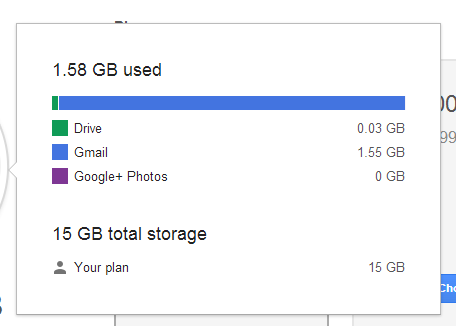
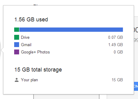
I've tested this by saving 2 FLAC attachments from 2 messages (about 43 MB) to Google Drive and deleting the associated messages from Gmail, including from the trash. Here's what I got:

* 1.58 GB used before moving files to Google Drive:


* 1.56 GB used after moving files to Google Drive:


To find Gmail messages with large attachments, you can use these operators. For example, search for [larger:5M] to find messages larger than 5 MB (that's the total size of the message).

Gmail's Google+ Interstitial

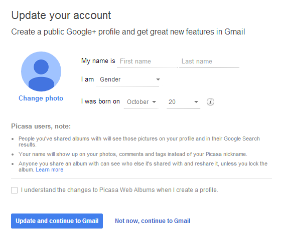
Google works hard to convince people to join Google+. I went to Gmail, signed in using an account that hasn't switched to Google+ and got this interstitial page (the URL starts with "https://plus.google.com/up/accounts/inter"):

"Update your account. Create a public Google+ profile and get great new features in Gmail."


You only have to check "I understand the changes to Picasa Web Albums when I create a profile" and click "Update and continue to Gmail". For now, you can ignore this page and click "not now, continue to Gmail".

Google Image Search's Loading Animation

Google Image Search shows an animation below the search result's thumbnail while the original image is downloaded. As you probably noticed, Google first shows the thumbnail, which is already loaded as part of the search results page, then it replaces the thumbnail with the full-size image when you click a result.

Update: This is not a new feature. Thanks, +Sushubh Mittal.


The animation is especially useful for large images, since you may have to wait a few seconds until the images are downloaded. Here's an example and here's the animation:

OK Google in Desktop Chrome

Google Voice Search works in Chrome for desktop, not only in Android and iOS. Just click the microphone icon from the search box and you can tell Google what do you want to know, assuming that you have a microphone.

Now you can bypass the microphone icon and use the hotword "OK Google" when you're using Google search or the new tab page. You need to install this extension first.


"Chrome will listen for you to say 'Ok Google' and then send the sound of the next thing you say, plus a few seconds before, to Google," informs the options page. By default, Google stops listening after 5 minutes to reduce battery consumption on a laptop.

Hotword detection works offline and doesn't send the recording to Google's servers until you say "OK Google". You need to open a Google search page or go to the new tab page first, assuming that you have the updated new tab page which uses the Google homepage. The extension only works for google.com, not for other Google domains:


You can tell if Google is listening by checking the microphone icon from the search box:


Now Google handles Voice Search queries differently. In addition to providing voice feedback and using the previous query for disambiguation, Google now changes your query and removes unnecessary word. For example, if you tell Google "show me some Brad Pitt movies", Google will show results for [Brad Pitt movies].

November 22, 2013

Google Knowledge Graph Gets Confused

Google has a lot of clever algorithms that detect so many things automatically. Some of these algorithms extract facts from webpages and add them to the Knowledge Graph.

Here's a baffling example which shows that Google's algorithms aren't always so smart. When you search for [Robert Greene], Google shows some information about an American author who was born in 1959 and died in... 1592. Google confused Robert Greene, the American author, with Robert Greene, a 16th-century English writer. The American author is alive and still writes books.


The good news is that you can tell Google when you found an error like this by clicking "Feedback/More info" and then "Wrong?" next to the information that's incorrect. Still, you'd expect Google to check if the date of death is more recent than the date of birth.


Update (November 28): It took a few days, but Google fixed this issue.

Related:
Google and Brandy: a sober mistake
What's the right answer?

{ Thanks, Roie Ambulo. }

November 21, 2013

Chrome's Predictors Page

Chrome has a lot of fascinating features you'll probably never use. Tony Hirst spotted one: open a new tab, type chrome://predictors in the omnibox and press Enter. This page shows some cool stats about the characters you've typed in the omnibox and the URLs you've selected.

For example, if you usually type "y", Chrome autocompletes the URL to youtube.com and you press Enter, you'll find this association in the table. There are also 3 values: hit count (how often you type those characters), miss count (how often you pick a different suggestion) and confidence score = hit_count/(hit_count+miss_count). Check "Filter zero confidences" to remove entries with a 0 confidence score. Green entries have a 1 confidence score, which means that the text is always associated with the URL.


You can find all the internal Chrome pages by going to chrome://chrome-urls/. For example, chrome://view-http-cache/ shows a list of all the URLs requested by the browser, chrome://plugins/ lets you see the plug-ins that are available in Chrome, chrome://components/ shows a list of components like Pepper Flash and Portable Native Client, which can be independently updated, chrome://flags/ shows a list of experimental features you can enable, while chrome://net-internals/ is a very advanced network logging and diagnostic tool.

{ Screenshot licensed as Creative Commons Attribution by Tony Hirst. }

More About Gmail's New Attachment UI

After more than a week of waiting, I got the new interface for Gmail attachments and it's much better than I expected. Most of the features from the old interface are still available, but there are some new Google Drive features that improve the user experience.

Here are some of my favorite features:

1. Thumbnails - they're displayed for many files, not just for photos. They help you distinguish between attachments and they're especially useful for PDF files, presentations and photos.


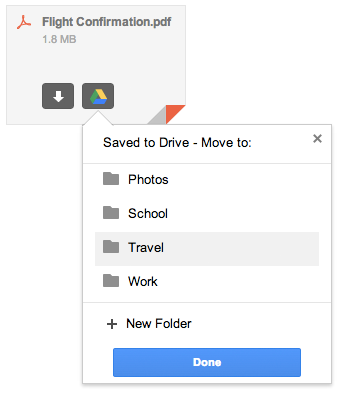
2. Save to Drive - mouse over an attachments, click "save to drive" and you can select the Drive folder where to save the file. You no longer have to visit Google Drive to move the file. Please note that the file is automatically saved to Google Drive and selecting a folder is optional.


3. Save all to Drive - if a message has more than one attachment, you can save all the files to Google Drive with one click. You only need to find the Drive button placed next to the attachments. You can also click "download all" to download a ZIP file with all the attachments.


4. Show in Drive - Gmail is smart to remember when you save a file to Google Drive and replaces "save to Drive" with "show in Drive", which opens the file in Google Drive. "Save all to drive" is disabled after clicking the button once.

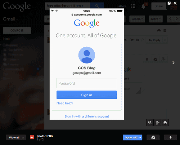
5. Quick preview - just click an attachment and you can preview the file inside Gmail. This works for photos, PDF files, documents, spreadsheets, presentations and more. To scroll down, use the mouse wheel, the down arrow key or Page Down. You can click the "pop out" icon next to "x" to open the preview in a new tab. To close the preview box, press Esc or click the "x" icon.


6. Slideshow - you can quickly go to the next attachment by clicking the arrow icon or by using keyboard shortcuts (right arrow key). Use the left arrow key to go back to the previous attachment. This is only a manual slideshow, there's no support for automatic slideshows.

7. Share photos on Google+ - click the attachment, then click the Google+ button at the bottom of the page. For multiple image attachments, click the Google+ button next to the list of attachments and you can share all the images on Google+.

8. Print files - click the attachment, then click the "print" button at the bottom of the page.

9. Zoom in/zoom out/zoom to fit - use the zoom buttons for a more in-depth look.

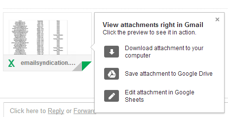
10. Edit files - for files you can import in Google's Drive apps, you'll also see a button like this when you mouse over the attachment: "Edit in Google Sheets", "Edit in Google Docs" or "Edit in Google Slides". Click the button to save the attachment as an editable file.

When you preview the file, you can click "Open with" and select an app that handles your file. This is not limited to Google's apps, so you can select apps like Zoho, DocuSign and more.

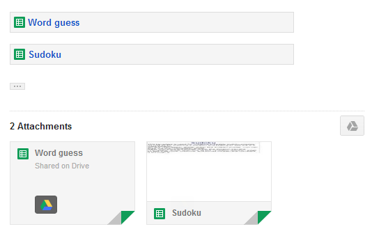
Oh, and one more thing: links to Google Drive files are treated as attachments.


While the new interface is great, I found a some annoyances. There's a cool feature that is no longer available in the new interface: it allowed to see all the image attachments on a single page. Another downside is that you need to mouse over an attachment to see the entire filename and its size.

{ Thanks, Stefan. }

Pegman's Return and the Full-Screen Google Maps

I posted about Pegman's return to Google Maps two weeks ago, but I only got the update today. Sometimes it takes a few weeks until Google rolls out new features, sometimes it takes months (Gmail's pay button is an example).

While Pegman's return is a good news, the most striking thing about the latest Google Maps update is that the black bar has disappeared and the new navigation is placed on top of the map. The settings and help buttons have been moved to the bottom of the page.

Here are some screenshots from the "Welcome back, Pegman!" tour:


{ Thanks, Emanuele Bartolomucci. }

November 20, 2013

YouTube Easter Egg for Doge Meme

"Doge is a slang term for 'dog' that is primarily associated with pictures of Shiba Inus (nicknamed 'Shibe') and internal monologue captions on Tumblr. These photos may be photoshopped to change the dog's face or captioned with interior monologues in Comic Sans font," informs KnowYourMeme.

YouTube has an Easter Egg that changes the search results page for [doge meme]: colorful text, Comic Sans, much wow, so hip, help plz.


{ via Phandroid, thanks Sushubh }

YouTube's Follow Back in Google+

Emanuele Bartolomucci spotted a new YouTube feature: when you're watching a video from a channel associated with a page that follows you in Google+, you get this message: "X added you on Google+. Follow back for exclusive updates!"


I wasn't able to trigger this feature, so it's probably an experiment. It's also a sign that YouTube will integrate more with Google+.

{ Thanks, Emanuele. }

New Interface for Google+ Notifications

Google+ notifications have a new interface: there's a "previously read" section, just like in the Google+ app for Android, and there are some new transitions that mimic scrolling down.

The previously read notifications are no longer displayed below the Jingles icon, so you need to click "previously read" to see them. The notifications box is less cluttered and you can still read all your notifications.


Here's a GIF that shows some of the new animations:


{ Thanks, Mukil. }