An unofficial blog that watches Google's attempts to move your operating system online since 2005. Not affiliated with Google.

Send your tips to gostips@gmail.com.

July 30, 2013

Google's New Navigation Interface in a Google+ Screenshot

Remember the new navigation interface tested by Google a few months ago? It replaces the black bar with a new menu similar to Chrome's app launcher.

A screenshot from a Google+ "learn more" page shows a new Google+ interface that uses the app launcher, an updated share button and a new search box without a search button. The screenshot shows the old Google+ notification button, not the Mr. Jingles bell.


{ via Google Plus Daily, spotted by Gabriel Komarnicki. }

Google Maps Views

There's a new community site for Google Maps and it's called Views. It's a place where you can upload panoramic images created using the Photo Sphere feature, which is limited to Android 4.2 and Nexus devices.

"The photo sphere camera mode on your Android phone makes it easy to capture a series of photos and automatically turn them into a seamless 360º experience. You can also turn your DSLR camera panoramas into photo spheres," explains Google. This page has more information about the photo sphere mode and about creating panoramic images manually.


Google Maps Views has a camera button that lets you add photos from Google+. You can also use Android's share feature and share a photo from the gallery with Google Maps, so that it's quickly uploaded. Google creates a page like this one with all your photo spheres.


Google Maps Views showcases popular photo spheres and some special Street View collections, including landmarks (Eiffel Tower), natural wonders (Grand Canyon), museums, arenas, restaurants and small businesses. You can also use the search box and find a list of popular photos and top photographers for that location.

Photos spheres don't replace Street View, they only complement Street View with a fun, fresh and personal perspective that captures the the world around you.

July 29, 2013

Keyboard Shortcut for Google Voice Search

If you use Chrome, you've probably noticed the small microphone icon from Google's search box. It lets you search Google using your voice and it's now just as good as the voice search feature from Google's mobile apps.

There's even a keyboard shortcut for this feature: Ctrl+Shift+. (or ⌘-Shift-. for Mac). Yes, that's a dot, full stop or period.


"Say your question and hear an answer back on your desktop Chrome browser. All you will need is a built-in or attached microphone. Also, be sure to have the volume up on your computer to hear your answer loud and clear. Please note Voice Search with spoken answers back is available for US English only," informs Google.

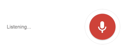
"Open the Chrome browser and go to http://www.google.com/. You'll see a small gray microphone on the right-hand side of the search box. Click the microphone or press Ctrl+Shift+Period (Mac: ⌘-Shift-Period) with your cursor in the search box to start voice search. When the large red microphone icon appears, begin speaking. You can press ESC or click the red button to cancel. As you speak, Google will interpret your voice input. Afterwards, your results show up just as if you had typed the search term," mentions a help center article.

{ via Mike Downes }

Google Image Search Collections

Google works on a new image search feature that lets you create collections, add image search results to your collections and annotate them. The source code includes multiple references to "collections", "notes", "folios", "clips", "groups" and the feature could integrate with Google Profiles.


For some reason, this looks like a standalone feature and notes aren't added to Google Keep.


Bing Image Search used to have a scratchpad, where users could save their images.


Google also had Notebook, a product that worked well for saving image search results. "Google Notebook is a simple way for users to save and organize their thoughts when conducting research online. This personal browser tool permits users to clip text, images, and links from the pages they're browsing, save them to an online notebook that is accessible from any computer, and share them with others," explained Google back in 2006.

{ Thanks, Florian K. }

The Hitchhiker's Guide to the Chromecast

You don't need a teardown to notice that Chromecast's model number is H2G2-42. From iFixit:

"Wasn't 42 the answer to life, the universe, and everything in The Hitchhiker's Guide to the Galaxy? And H2G2 is an abbreviation given to the book, as well as the name of a website dedicated to making a guide to life, the universe, and everything."


If you check YouTube.com's source code, you'll find some references to "hitchhiker".


One of YouTube's sprites has "hitchhiker" in the filename.

July 26, 2013

Google Play Easter Egg: Dancing Robot

Here's a nice Easter Egg from the old Google Play interface. You can still find it in Google Cache: scroll to the bottom of the page, click the colorful bar next to the footer and you'll see the Android mascot. Click the robot and it will start dancing.

I uploaded a video that shows this Easter Egg:


Music: Teddybears - Cole (Zero Gravity Reveal Mix). The song was also used in the Google Music tour and it's available for free here.

{ Thanks, observant tipster. }

YouTube's Geek Week Easter Egg

YouTube has a new Easter Egg: search for [/ geekweek] and the interface changes to look more like a command-line Linux app.


What's Geek Week? "On August 4-10 we'll celebrate this content with a special programming event: our first-ever YouTube Geek Week at YouTube.com/GeekWeek," informs YouTube. "Produced in conjunction with geek powerhouse Nerdist in the U.S. and Channel Flip in the U.K., Geek Week will showcase more than 100 channels that fans love, unveiling new videos, series premieres and creative collaborations, as well as highlighting some of the best geek videos and shows already on YouTube." Sci-fi, fantasy, animation, superheroes, supernatural, video games - an entire week for geeks. "For our 3l33t geeks out there, keep your eyes out for Easter eggs all week, and you'll also be able to collect badges from the eggs and select #geekweek videos when logged in and visiting YouTube.com/GeekWeek."


Update: As Enrico Altavilla noticed, the Easter Egg works for any query that starts with "/ ":


{ via TechRadar. Thanks, Mati. }

July 25, 2013

Google Cast: Cloud AirPlay

AirPlay is one of the greatest iOS features. It lets you wirelessly stream music, videos, send photos and even mirror your device's display on your TV. It's simple to use, it's supported by many apps and devices, but the most important thing is that it just works. Sure, you'll need to buy an Apple TV or an Airport Express and AirPlay is mostly limited to Apple devices and accessories that license AirPlay from Apple. AirPlay works because it's a native feature, has a consistent interface and it's very easy to understand.

Android OEMs tried to solve the problem of sending content to a TV by adding HDMI ports, supporting MHL and adding software for DLNA. It's obvious that people don't like cables and a mobile device shouldn't be restricted by a cable. DLNA has a lot of compatibility issues and doesn't work well for streaming online content. Last year, HTC and Samsung added an AirPlay-like feature to their flagship phones and started to sell companion devices. The issue was that the features were limited to a few apps. This should've been an Android feature, not two different APIs limited to a few HTC and Samsung devices.

Google started to address this issue when it added support for watching YouTube videos on a TV using the mobile YouTube apps. Pair your mobile phone with your TV and you can easily send the video you're currently watching to the TV. You can also your phone as a remote control and pause the video, change the volume or switch to a different video.

YouTube's "send to TV" is the backbone of Google Cast, a feature that can finally compete with AirPlay. Developers can use "the Google Cast SDK to enable mobile and web apps to cast content to the TV". Google Cast is not limited to Android, it works on Google's favorite platforms: Android, iOS and Chrome. There are already a few apps that support Google Cast: YouTube, Google Play Music, Google Play Movies & TV, Netflix. To use this feature, you need to buy Chromecast, a very cheap device that connects to your TV's HDMI port and runs a simplified version of Chrome OS Google TV. It only costs $35 and it's a lot smaller than an Apple TV. You can buy it from Google Play, Amazon and Best Buy, but only if you're in the US.


Google Cast is only the cloud version of AirPlay: it only works with content that's stored online, so you can't send a song that's stored on your tablet or a video you've just recorded. Just like for AirPlay, the mobile device controls what's playing on your TV, but the content is streamed directly to the Chromecast. There are a few differences: Google Cast works on Android, iOS and Chrome and the Chromecast functionality will be integrated in other devices, including Google TV devices. Another difference is that any mobile device from the same network can control an existing Google Cast stream, so you can have multiple remotes.

Here's the Google Cast icon: it's not displayed when there's no device available.


"While content is playing on TV, a user can multitask on their device. For example, a user can search for a video on their phone's YouTube application and then send it to their TV via a Google Cast device. They are able to play, pause, seek, and control volume using their phone and still be able to check their email while the content keeps playing on the TV," according to the developer documentation.


There's also support for mirroring. "In addition to apps like Netflix, you can use Chromecast to bring a broad range of content available on the web to your big screen, thanks to a new feature in the Chrome browser that allows you to project any browser tab to your TV. From sharing your family photos to enjoying a video clip from your favorite news site, it's as simple as pressing a button. This feature is launching in beta, but we're excited for people to try it out and give us their feedback," explains Google.

Here's a video that shows this feature in action:


To use Google Cast, you first need a Chromecast. It's a low-cost device that connects to one of your TV's HDMI ports and uses USB for power. For only $35, you get a lot: the Chromecast dongle (only 34 grams), a USB cable and power adapter and an HDMI extender. To setup the device, you need to visit google.com/chromecast/setup and install an app. It's interesting to notice that Chromecast only supports 2.4GHz WiFi networks and the only Chromebook you can use to setup Chromecast is Chromebook Pixel.

To cast from your computer, you need to install the Google Cast extension for Chrome. There are only 2 Cast-optimized sites: YouTube and Netflix. For all the other sites, you can cast a tab and mirror it on your TV. Unfortunately, casting a tab requires a powerful computer even for standard streaming: at least a Core i3 PC, a Macbook Pro 2010, a Macbook Air 2011 or a Chromebook Pixel. You need a Core i5 PC, a Macbook Pro 2011, a Macbook Air 2012 or a Chromebook Pixel for high-quality streaming. Casting a tab is limited to 720p streaming, so you won't get 1080p mirroring.


For Android devices, you can use a few apps: YouTube, Google Play Music, Google Play Movies & TV and Netflix. "To cast to your TV from your smartphone, tablet or laptop, simply open up a Cast supported app, press the the Cast button and the Cast button will turn blue, letting you know you're connected. Once you are connected, you can Cast videos, movies and TV shows directly to your TV," explains Google. For now, the only iOS apps that support Google Cast are Netflix and YouTube.


I haven't tried Google Cast, so I don't know how well it performs, but these are the early days. Once more apps add support for Google Cast and more devices include Chromecast's functionality, it will be a lot more useful. Chromecast is a Chrome device, so it will constantly improve and add new features.

Android 4.3: Jelly Bean Improvements

After a long wait, Google finally released Android 4.3 yesterday. It's a minor update that has more new APIs and improvements for the existing features than exciting new features.
The third and final Jelly Bean installment brings support for virtual surround sound, OpenGL ES 3.0, wireless display, Bluetooth 4.0 (Bluetooth Low-Energy), Bluetooth AVRCP 1.3 (displays song metadata), restricted profiles, WiFi location detection even when WiFi is disabled. There's also a new tab for disabled apps in the settings and the phone app suggests numbers and names when you enable "Dial pad autocomplete".

"Restricted profiles enable parental controls, so certain family members are prevented from accessing mature content. Likewise, retail stores can use tablets to show off product information, and shops can use tablets as point of sale systems," explains Google. Restricted profiles let you limit access to apps and content.


Many Android devices already support Bluetooth 4.0, but now there's native Android support. Bluetooth 4.0 is great for low-power devices. "Android-powered Bluetooth Smart Ready devices running the latest OS will be compatible with virtually any Bluetooth enabled product — from the keyboards or headphones they already own, to the latest generation of power-efficient Bluetooth Smart appcessories (accessories + companion apps) like Fitbit or the Pebble watch," informs Bluetooth.com. More smart accessories will be able to connect to Android devices, Google Glass will have a better battery life when it will be released, smart watches will have to be recharged less often and there's a long list of medical and fitness devices that become smarter: thermometers, heart rate monitors, blood pressure monitors, pedometers, weight scales and more.

OpenGL ES 3.0 is the latest version of the popular 3D graphics API that enhances the rendering pipeline to accelerate more advanced visual effects, has better support for textures and texture compression. The specs were published last year and Qualcomm's latest Adreno GPUs already support it. You can find them in devices like HTC One, Galaxy S4, Nexus 4 and the latest Nexus 7. ARM's Mali T604 also supports it and you can find it in Nexus 10. The native OpenGL ES 3.0 will mean that you'll be able to play the latest games and see all the enhancements.

The first device that ships with Android 4.3 is the new Nexus 7. All the Nexus devices that were updated to Android 4.2 will be updated to Android 4.3: Galaxy Nexus, Nexus 4, the original Nexus 7 and Nexus 10. You'll probably wait for the OTA updates, but Google also provides the firmware here. Galaxy Nexus is the first Nexus device that gets 3 significant Android updates.

Find Auto Awesome Google+ Images

Google+ has a feature called Auto Awesome, which automatically creates new photos that use the photos you've uploaded. For example, when you upload similar images at different exposures, Google+ will add an image that simulates HDR. When you upload a series of photos in succession, Google+ will create an animated image. "If you've taken a series of photos with overlapping landscape views, Auto Awesome will stitch these photos together into a panoramic image."

Unfortunately, it's not always easy to find these images. Here's a way to find the animated images created by Google: go to Google+ Photos and search for [motion.gif]. This works because all the animated GIFs created by Google+ include "motion" in the filename. You may also find other images that include "motion" in the filename or caption, but they weren't created by Google+. The nice thing is that Google's thumbnails are also animated GIFs, so it's easy to spot Auto Awesome images.

If you can't find Auto Awesome animated GIFs, click "From your circles" below the search box and you'll certainly find some GIFs if you follow the right people.

This post should have an included an animated screenshot, but I decided to add a YouTube video:


If you'd like to find panoramic images, search for pano.jpg. For HDR images, search for hdr.jpg, but you'll probably get a lot of false positives.


To find Auto Awesome images shared by other Google+ users, you can search for #autoawesome in Google+ and restrict the results to photos. There's also a community for Auto Awesome images.

You can also use Google Image Search and search for [site:plus.google.com inurl:motion.gif] for animated images and [site:plus.google.com inurl:pano.jpg inurl:googleusercontent.com] for panoramas.

{ via Jeremy Milo }

Google+ Photos App: Not Just For Chromebooks

Remember the Google+ Photos app for Chromebooks? It was originally launched as a Chromebook Pixel exclusive, but it worked well on my Samsung Series 5 Chromebook.

The app is available in the Chrome Web Store. If you switch to French (or any language other than English), the app's description changes and it reveals something interesting:

Google+ Photos will currently instantly upload all .jpg files from the default pictures folder on your computer every time it is run. These directories include:

Windows XP: C:\Users\yourname\Pictures
Windows 7: C:\My Documents\yourname\My Pictures
Linux: /home/yourname/Pictures
Mac: /Users/yourname/Pictures


This means that the app will also work in Windows, Linux and Mac OS, not just in Chrome OS. Right now, when you install the app in Chrome for Windows, you get this error message:


{ Thanks, Jonathan. }

July 19, 2013

Chrome's App Launcher, Ready for Windows

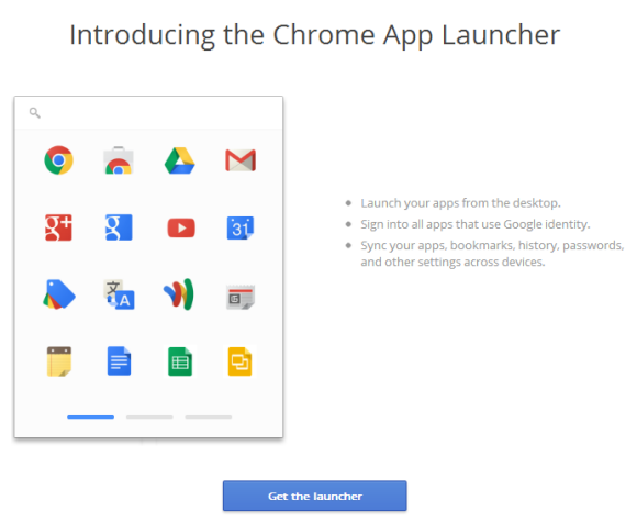
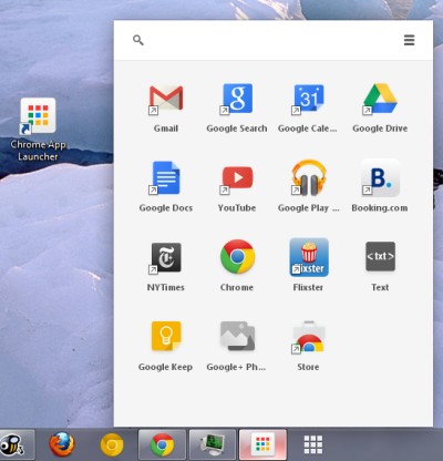
Google has yet to officially launch the Chrome app launcher, but there's a simple way to get the launcher right now if you use Windows: go to this page and click "Get the launcher" (the link only works in Chrome for Windows). If you're not signed in to Chrome, you'll need to do that. Probably Google uses Chrome's sync feature to enable the launcher.

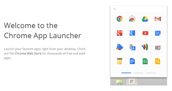
Chrome adds a new icon to the taskbar and a new desktop shortcut, at least in Windows. The launcher shows all the apps that are also displayed in Chrome's new tab page. It also shows a search box that lets you quickly launch an app.


Engadget reports that the app launcher has been automatically added for some users. "On our own PCs, the installation placed the launcher app on the start page, taskbar and desktop for Windows 8 and in Windows 7's menu bar."


Chrome's launcher is connected to the new-style Chrome apps. Google wants to move from the old apps that were mostly bookmarks to some new apps that work offline, use powerful APIs that integrate with web services and devices like USB drives and Bluetooth speakers.

Some examples of new-style Chrome apps: Google Keep and Google+ Photos. Both apps work offline, while Google+ Photos automatically uploads the photos from an SD card. More examples here.

It's interesting that Chrome's Web Store is now all about apps. Extensions and themes are still available, but you need to explicitly click "extensions" or "themes" to find them. They're no longer promoted on the homepage and search results show the apps first.

{ via Engadget. Thanks, Florian K. }

Try the New Google Maps (No Invitation Required)

You can now use the new Google Maps interface without requesting an invite. That's a great news, even though invitations weren't hard to get.

You first need to go to maps.google.com/preview and click "Try Now". Google explains that "the new Google Maps draws you a tailored map for every search and click you make. So whatever you're trying to find or wherever you're trying to go, you'll always have a map highlighting the things that matter most."

So what happens after clicking "Try Now"? You see this message: "Sign in with your Google Account to try the new Google Maps."


While search results are better if you are signed in and you also use Google+, it's strange to see that you need to sign in. After all, the mobile apps for Google Maps work even when you're not signed in.

After signing in, Google shows another message: "Almost there... During this preview, we may email you with product updates or to request your feedback. Please let us know what you think!"


Then you can finally use the new Google Maps.


You can sign out and Google Maps will continue to work.

I hope that the new Google Maps won't require a Google Account (or Google+) when it will replace the existing interface. Just like Google Search, Google Maps works well even when it doesn't return personalized results. Google found a way to personalize search results when you're not logged in, maybe Google Maps will do the same.

Full-screen Gmail Compose Box

There are plenty of shortcuts for opening Gmail's compose box in a new tab or a new window. Not many people use keyboard shortcuts and opening the box in a new page is awkward, so Google decided to add an inline full-screen option.


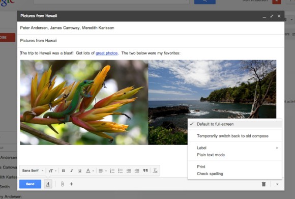
It's not exactly full-screen, it's more like a maximized box that still lets you see your labels and your chat contacts. You can manually enable the "full-screen" mode every time you want to use it or set is as the default option.

"When this option is enabled, the compose window is centered in your inbox and expands to fit on your screen. In addition, the formatting toolbar is on by default. You can click on the expand button in the top right to switch to full-screen or set full-screen as the default by selecting Default to full-screen in the more options menu in the bottom right," informs Google.

There's a help center article that provides more information:

"Compose messages in a window that's right for you. The default is a small compose window that's great for checking other emails as you type and getting things done quickly. If you prefer a larger window, you can switch to full-screen when you need it, or set full-screen as default."

It turns out that the new expand button for the full-screen mode replaces the pop-out button, which opened the compose box in a new window. To open the box in a new window, you now need to shift-click the expand button.

The full-screen mode also works when you reply to a message, but it's more cumbersome to use. "To compose in a larger window, click the Recipient arrow next to the recipient's name and select Pop out reply. Once you've popped out the reply, click the expand icon expand to compose in full-screen."

As usual, this feature is gradually rolling out to all Gmail accounts, so check back later if you don't see it right away. Obviously, this only works in the new compose interface.

Change Chrome's Search Engine to Google.com

Last updated: April 23, 2015.

Two years ago, I wrote a post that explained how to change the domain used by Chrome when performing a Google search from the omnibox. The trick still works (thanks, Peter Kasting!), but there's a much simpler way to change the Google domain used by Chrome's omnibox from google.tld (your local Google domain) to google.com.

This is only useful if you're not in the US and you'd like to use google.com to see the latest Google features. The nice thing is that it works in the desktop Chrome, in Chrome for Android and Chrome for iOS.
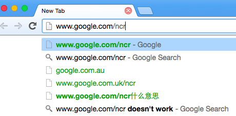
1. Open a new tab and go to google.com/ncr.


2. Close Chrome.

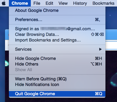
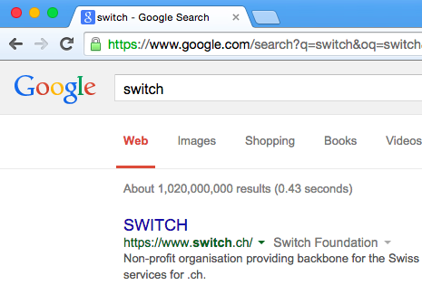
If you're using the desktop Chrome, close all Chrome windows or click "Exit" or "Quit Google Chrome" in the menu. Here's a screenshot from Chrome for Mac:


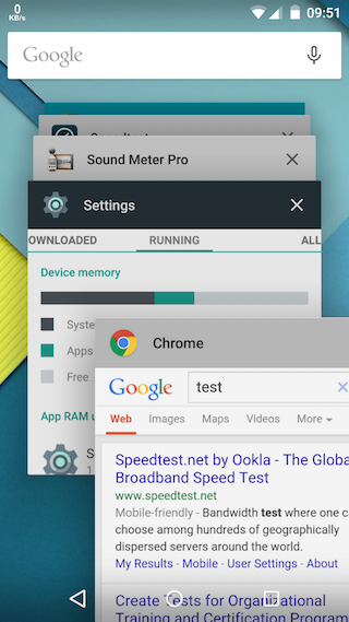
If you're using the mobile Chrome, press the home button and use your operating system's multitasking feature to force close Chrome. Here are the instructions for iOS. Android instructions are different, depending on the device you use, but many Android devices have a button that shows a list of recent apps and you can swipe Chrome's thumbnail or click the "x" icon to force close it. Here's a screenshot from Android 5.1 running on my Nexus 5:


3. Launch Chrome again, open a new tab and search for something using Chrome's omnibox (address bar). You should see google.com in the address bar.


You'll also see google.com instead of your local Google domain in Chrome's settings page (this feature is not available in Chrome for iOS).


To go back to your local Google domain, you can use similar instructions. Visit google.com, click "use google.tld" at the bottom of the page (you should see your local Google domain instead of google.tld), restart the browser and search using Chrome's omnibox.

{ Thanks, Sushubh Mittal, Jérôme Flipo and Michael. }

July 17, 2013

YouTube Tests Center-Aligned Layout

Nedas Petravičius spotted a new YouTube experiment that changes the user interface: there's a bigger sidebar that's now overlaid, the Dashboard/Video Manager/Analytics menu has been moved to the right corner of the page and the Upload button is blue. YouTube now shows the same sidebar from the homepage on video pages, so you no longer see a list of suggested videos.

The biggest change is that the video page is now centered. YouTube's pages used to be centered, but they're now aligned to the left, ever since YouTube redesigned the pages and added the sidebar guide. There are many extensions and scripts that center the pages.


The new sidebar has a lot in common with the Google+ sidebar. There are some differences: you need to click the menu icon to display/hide the sidebar and the sidebar continues to be displayed when you click one of its options.


Since the sidebar is hidden by default, there's more room for your favorite videos:


This drop-down menu is placed next to the upload button in the regular interface:


Here's a video:


Here's how you can enable the experimental feature. If you use Chrome, Firefox, Opera, Safari or Internet Explorer 8+:

1. open youtube.com in a new tab

2. load your browser's developer console:

* Chrome/Opera 15 - press Ctrl+Shift+J for Windows/Linux/ChromeOS or Command-Option-J for Mac

* Firefox - press Ctrl+Shift+K for Windows/Linux or Command-Option-K for Mac

* Opera 12 - press Ctrl+Shift+I for Windows/Linux or Command-Option-I for Mac, then click "Console"

* Safari - check this article

* Internet Explorer - press F12 and select the "Console" tab.

3. paste the following code which changes a YouTube cookie:

document.cookie="VISITOR_INFO1_LIVE=ULHzU8CeVLo; path=/; domain=.youtube.com";window.location.reload();

4. press Enter and close the console.

To go back to the regular interface, use the same instructions, but replace the code from step 3 with this one:

document.cookie="VISITOR_INFO1_LIVE=; path=/; domain=.youtube.com";window.location.reload();

{ Thanks, Nedas. }

Google Maps for iPad

Almost one year after Google Maps was removed from iOS and 7 months after Google released a Maps app for iPhone, you can finally install the Google Maps app on an iPad and actually use it. Installing the iPhone app on an iPad wasn't a good idea, so the web app was a good alternative.

It's interesting to notice that the new Maps UI was first included in the Google Maps for iPhone. After that, Google used it in Google Maps Engine Lite, then in the new desktop Google Maps, in the updated app for Android and now the circle is closed.

The updated Google Maps app for iPhone and iPad looks just like the Android app and has almost the same features: incident reporting, dynamic rerouting, integration with Zagat and Google Offers, Google+ recommendations, the "explore" feature that lets you find great places without searching for them, biking directions and navigation, offline maps (type OK maps in the search box).

To open the "explore" section, tap the search box and select "explore". Then you can tap "eat", "drink", "shop", "play" or "sleep" and find a lot of useful suggestions. Many of them are influenced by the reviews of the people from your Google+ circles.


The full-screen map provides an immersive experience.


There's support for incident reports, although it's not clear if the new feature has anything to do with the Waze acquisition.


Google Maps still supports layers, but not all the layers from the old Android app. There are layers for traffic, public transit, bicycling and satellite maps.


When you first launch the app, Google Maps shows the following screen. The option to improve Google Maps by sharing anonymous location data is enabled by default. This means that Google no longer has to rely on Android devices to get traffic data. A similar option was displayed last year, when Google Maps for iOS was launched, so it's not new.


A year ago, things were very different: Google Maps for Android was a lot more powerful than the built-in Maps app for iOS powered by Google Maps data. Now Google Maps apps for Android and iOS have almost the same features. Can you find some features that are only available in the Android app?
One Password. All of Google

Google Australia continues to promote Google Accounts and now shows a short message and some icons below the search box: "One password. All of Google. Sign in." Google shows the icons for Search, Gmail, Chrome, YouTube, Maps, Play and Google+.


It's a simplified version of Google's sign-in page. "Want to enjoy the best of Google? Just stay signed in. One username and password is all you need to unlock more features from services you use every day, like Gmail, Maps, Google+, and YouTube."


While it's nice to use so many services using a single username and password, it's also dangerous. Using a single account to store your email, your calendar, your contacts, your documents, photos, videos and music, your search history, your bookmarks, your financial information, your location history, your Google+ posts and blogs, the apps you've installed using Google Play and much more? It sounds pretty scary. 2-step verification solves the "one password" issue, but makes things more complicated. Maybe it's time to think beyond passwords.

{ Thanks, Michel. }