An unofficial blog that watches Google's attempts to move your operating system online since 2005. Not affiliated with Google.

Send your tips to gostips@gmail.com.

January 31, 2013

Custom Date Range Tips for Google Search

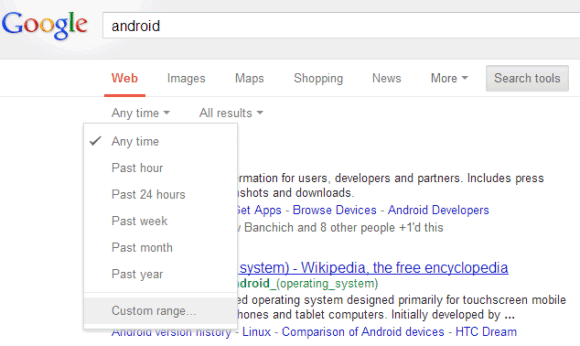
Google's search engine has a cool feature that lets you restrict the results to a certain time range. It's mostly used to find recent results, so the default options are: past hour, past 24 hours, past week/month/year, but you can customize the time range. Just click "search tools" below the search box, then click "any time" and select "custom range" from the list.


You can use Google's calendar widget to pick the dates, but there are some tricks that help you enter dates faster:

1. Enter "2011" in the "from" field, instead of "1/1/2011". Obviously, you can use any other year.

2. Enter "3/2011" or "March 2011" in the "from" field, instead of "3/1/2011" (or "1/3/2011", depending on your country).

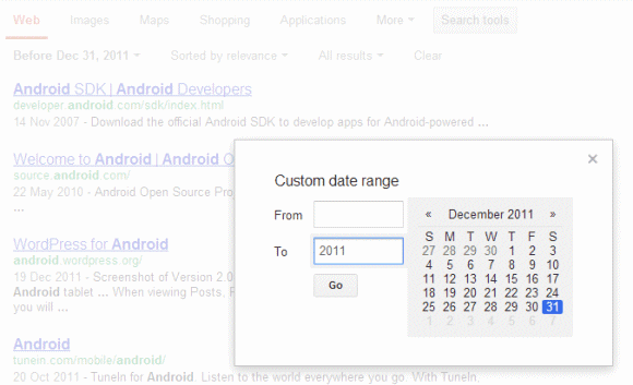
3. Enter "2011" in the "to" field, instead of "12/31/2011" (or "31/12/2011", depending on your country). Obviously, you can use any other year.

4. Enter "3/2011" or "March 2011" in the "to" field, instead of "3/31/2011" (or "31/3/2011", depending on your country).
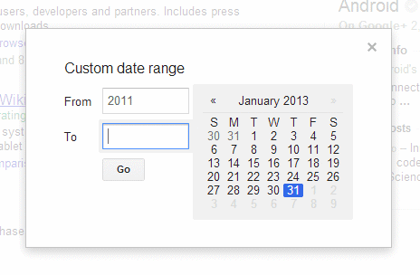

5. To restrict the results to pages from 2011, enter "2011" in the "from" and "to" fields.
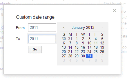

6. To restrict the results to pages from March 2011, enter "3/2011" in the "from" and "to" fields.

7. Leave the "to" field empty instead of entering today's date.

8. Leave the "from" field empty to find pages created before the day entered in the "to" field.
January 28, 2013

Offline Google Slides

Google Slides is just another name for Google Presentations, but that's not actually new. The big news is that you can now use Google Slides offline to create, edit and run presentations. "Any new presentations or changes you make will be automatically updated when you get back online. So you can continue polishing slides on your next flight, and head to your upcoming presentation without worrying about whether there's going to be wifi."


The offline functionality is still limited to Chrome and requires the Google Drive app from the Chrome Web Store. If you've already enabled the offline support and use it for documents and spreadsheets, you don't need to do anything.

This table shows which Google Drive features are available when you're offline and you use Chrome for desktop or the mobile apps for iOS and Android. You can sync any file when you use the mobile apps, but the editing support is better in the desktop Chrome. You can also install the Google Drive app for Windows and Mac to sync the files that can't be edited online using Google Docs, Sheets, Slides and Drawings.

Quickly Switch to the Basic Google Image Search

If you don't like the new Google Image Search interface, you can't go back to the previous interface. Fortunately, Google still includes a link to a much older interface without infinite scrolling, but with useful information like the file size and a page snippet.

Infinite scrolling makes it difficult to get to the bottom of the page because Google continuously loads new image results as you scroll down. The best way to find the link that switches to the old interface is to press "End" on your keyboard (Fn + Right Arrow if you have a Mac) and click "switch to basic version". Google doesn't remember your setting, so the switch is not persistent.


New Google Image Search Interface

Long time, no see. After a long vacation, it's time to get back to the latest news from the Google world. Last month, Google tested a new image search interface and now it's been rolled out. It's the first desktop interface that drops the landing page and no longer loads the web pages that included the image results. The previous interfaces loaded these pages using iframes more like a courtesy to the third-party websites than to improve the user experience.

Google started to make the iframes less important when it moved them to the background. Then the mobile interfaces for smartphones and tablets came out and they didn't even load the original web pages. The new desktop interface is closer to the tablet interface: click an image result and use the left/right keyboard arrows to check the other results.


Here's the old interface (you may still see it):


"Instead of sending you over to a whole new page to preview an image, you'll see a preview of the image in your search results. Once you click on a image, you can quickly flip through the whole set of image previews using your keyboard. Your search results stay in the panel so you don't lose track of what you were doing; if you want to go back to looking at other search results, you can just scroll down and pick up right where you left off. If you want to check out the website where the image is hosted, you can click on the photo or use the tools available," explains Google.

Obviously, the traffic from Google Image Search will drop dramatically and webmasters will complain that Google uses their images and doesn't give anything in return. Google only hosts image thumbnails and loads the original images when you click the thumbnails, so it's now an image leecher that hotlinks to other people's images, using their bandwidth without generating page views or ad revenue. It's better for users, but expect to see many sites that stop displaying images when loaded from Google Image Search or use other anti-leech tricks.

Finding the right balance between user experience and webmasters' interests is a hard thing to do. Google now includes 4 links to the original web page, so you can click the image, the page title, the domain name and the "visit page" button, but I bet most people will click "view original image". Unfortunately, Google no longer displays two very important things: the image title and a short snippet from the page related to the image. Showing only the title of the page and the domain name is not enough to determine if the image is relevant. Other missing information: the EXIF data and the image size.