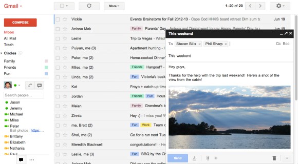
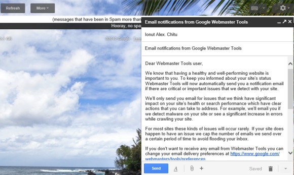
If you've enabled Gmail's new interface for composing messages, there's a simple way to open any Gmail message in the chat-like panels:
1. open the message
2. edit the URL from your browser's address bar. Replace the last slash (/) from the URL with ?compose=
For example, replace:
https://mail.google.com/mail/u/0/?shva=1#inbox/13a111c6f50b9084
with:
https://mail.google.com/mail/u/0/?shva=1#inbox?compose=13a111c6f50b9084
Gmail actually creates a new message with the same content and saves it as a draft. That's the reason why you can edit the message. When you no longer need the message, click the "close" button. You may need to delete the messages from the "drafts" label.
You can open multiple messages using the same trick. After using the instructions above:
3. open a new Gmail message
4. edit the URL from your browser's address bar. Replace ?compose= with & and the last slash (/) from the URL with ?compose=.
October 31, 2012
October 30, 2012
Enhanced Google Voice Search for iOS
Google's search app for iOS has always included voice search. Now iPhone, iPod Touch and iPad users can try Google's updated voice search, 5 months after the Android Jelly Bean launch. Just install the latest version of the Google Search app.
The original voice search feature was just another way to enter a query. The new version shows instant answers and a robotic voice reads them for you. Another improvement is that your words are displayed as you speak, so you don't have to wait so much.
Google's voice search is more interactive and Google does a better job at answering simple questions, but it doesn't integrate with the operating system like Google Search for Android or Siri. You can't use it to launch apps, play music, check your calendar or add an alarm, but it's great for weather forecasts, sports scores, definitions, unit conversions, simple calculations, facts. Try "play Rihanna Diamonds video" and the video starts playing, "cat pics" returns image search results, "directions to Los Angeles" shows Google Maps directions.
It's hard to beat Siri because Apple's iOS feature is easier to access and it integrates with the built-in apps. Siri is also conversational, it remembers things and doesn't require some specific keywords in a certain order. For example, you can ask Siri [is it cold outside?], [will it rain should I get my umbrella tomorrow?] and you get accurate answers. Google doesn't answer the second question and only shows the current temperature for the first question. Google's voice is less robotic, Google supports more languages than Siri, local search results are not limited to a few countries and Knowledge Graph results constantly get better. Still, Siri feels more like a voice assistant, while Google Voice Search is another way to search the Web and get impersonal answers from Google. Understanding the query continues to be a difficult task.
{ via Google Blog }
The original voice search feature was just another way to enter a query. The new version shows instant answers and a robotic voice reads them for you. Another improvement is that your words are displayed as you speak, so you don't have to wait so much.
Google's voice search is more interactive and Google does a better job at answering simple questions, but it doesn't integrate with the operating system like Google Search for Android or Siri. You can't use it to launch apps, play music, check your calendar or add an alarm, but it's great for weather forecasts, sports scores, definitions, unit conversions, simple calculations, facts. Try "play Rihanna Diamonds video" and the video starts playing, "cat pics" returns image search results, "directions to Los Angeles" shows Google Maps directions.
It's hard to beat Siri because Apple's iOS feature is easier to access and it integrates with the built-in apps. Siri is also conversational, it remembers things and doesn't require some specific keywords in a certain order. For example, you can ask Siri [is it cold outside?], [
{ via Google Blog }
Gmail's New Interface for Composing Messages
There are many tricks that let you compose a Gmail message in a new window: you can press "Shift" while clicking the "Compose" button, use the "Shift+c" shortcut or click the "pop-out" icon if you've already started to compose a message. Composing a message in a new window lets you use Gmail's search feature, read other messages and even write multiple messages at a time.
Gmail's engineers spent a lot time improving this feature, minimizing page loading time and making sure that the original message is preserved, but few people use it.
Now Google tries to bring this feature to everyone by opening a chat-like panel inside Gmail's interface when you compose a new message. It's a feature currently tested by Google that will be rolled out in the coming months.
"The new compose pops up in a window, just like chats (only larger). This makes it easy to reference any other emails without ever having to close your draft. You can even do a search or keep an eye on new mail as it comes in. And because the compose window works the same way as chats, you can write multiple messages at once and minimize a message to finish it later."
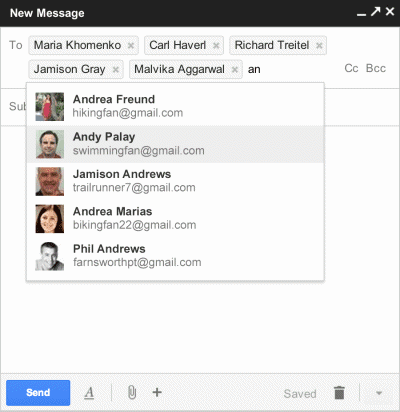
The new interface also brings a feature from Yahoo Mail: recipient boxes that can be removed or dragged and dropped to other fields ("to:", "cc:", "bcc:"). There's a new icon that shows text formatting features, an icon for attachments and a "+" icon for embedding photos, links, emoticons and Google Calendar events.
Google also improved the interface for replying, but it looks like you'll still reply inline by default. "The reply experience has been designed to fit better inline as part of your conversation - replies take up much less vertical height, intelligently expand to fit your content, and always keep the recipients and other controls in view no matter how long your message gets."
To try the new interface, open Gmail, click the "Compose" button and look for the "new compose experience" link right next to the "Labels" button. If you can't find it, you'll have to wait until it's added to your account. For now, you can switch to the old interface if you don't like the changes. Some features are not yet available in the new interface: inserting emoticons and event invitations, adding labels to outgoing messages, canned responses.
Google tried to streamline the "compose" window, so many advanced features will be more difficult to find. You'll have to click different icons to find text formatting options, add events or spell check your text. To send mail from another address, you'll have to "click into the 'To' field, then click the 'From' link to select which address you'd like to send mail from". Gmail is suddenly more difficult to use, but the interface looks better.
{ Thanks, Ben. }
Google Now Cards Use Gmail Data
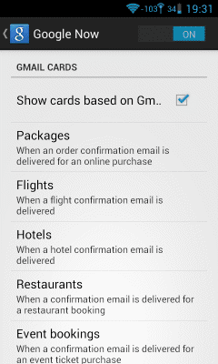
Google Search for Android has been updated and the app includes a lot of new Google Now cards. There are cards that use search history data (developing news stories, stocks, concerts, movies), location data (nearby attractions and popular photo spots), but there's a new source of information: your Gmail messages.
Google Now checks your email and tries to find confirmation messages for restaurant reservations, hotel bookings, flights, events you purchased a ticket for, online orders. This way, Google can show notifications and useful information without having to manually add events to Google Calendar. For example, package tracking is now a lot more convenient and you don't have to use a separate app or subscribe to email notifications.
Gmail's desktop interface shows useful links related to your messages: Google Maps for addresses, package tracking links, "add to calendar" for events. Google Now takes this to a new level: sidebar links become smart cards that trigger notifications.
Obviously, the cards are generated automatically by Google's software and no Google employee reads your email. If you don't like the new cards, you can disable them from the settings (the "Google Now" section).
Google Search for Android also brings new voice actions: you can create new events, check your schedule and launch apps.
At the moment, Google Now requires Android Jelly Bean and the Gmail integration is only available in the English interface.
Labels:
Android,
Gmail,
Google Now,
Mobile
October 26, 2012
Google and Windows 8
Google created a site for Windows 8 users: "Get Your Google Back". The site encourages users to install the new Google Search Metro app and Chrome, which is not available in the Windows Store and can't be installed in Windows 8 RT.
The Google Search app looks just like the iPad app and offers similar features: voice search, a new interface for image search, Google Instant, shortcuts to Google's apps. There's one more thing: "the doodles you enjoy on special occasions will be right there on the homepage and even show up on the Google tile on your start screen".
There's also a video that helps you "get your Google back" and "make Windows 8 more familiar". (I thought that Microsoft was the one that played the familiarity card.)
It's surprising to see how many apps bundled with Windows 8 integrate with Microsoft's online services. There are apps for Bing Maps, Bing News, Bing Travel, Bing Search, Bing Weather, Skydrive. Microsoft didn't include Windows Live Essentials in Windows 7 and one of the reasons was probably the antitrust concern. Microsoft had to remove Windows Media Player in a special Windows version for Europe and add a browser ballot window to help users install other browsers. Now Microsoft still has a dominant position in the operating system, but it's not concerned about bundling antivirus software, apps for online services, an app store that limits user choice (especially for Windows RT tablets). That's quite risky.
Microsoft's Bet Against the Desktop
After trying Windows 8 for a few days, I realized that Microsoft's new operating system is not that bad. The weird dichotomy between the desktop interface and the touch-optimized Metro interface might drive you away, but Windows had to start over again with a new software paradigm: the app software, sandboxed apps, consistent interfaces, integration with online services.
For the first time, security is no longer an after-thought, at least if you're using Metro apps. For the first time, you can find apps, buy them, rate them and update them from a single place. Some might say that this takes away user choice, that Metro apps have nothing to do with Windows and they're too limited, but Windows 8 is actually Microsoft's bet against the desktop. Smartphones and tablets changed the tech industry and made desktop computers and laptops look outdated. Most of the great new apps are developed for mobile devices. For many people, tablets are better than laptops: they have better displays, better battery life, better cameras, a user-friendly interface, they're silent, fun, lightweight, instant on and can be used almost anywhere. They don't require concentration, maintenance and people can focus on their tasks, instead of fighting with a complex computer.
Apple sold 100 million iPads in less than 3 years and smartphones outsold PCs last year. The same will happen with tablets in a few years.
Windows 8 doesn't feel right on a laptop or desktop because it was designed for tablets. The Metro interface encourages users to buy tablets or smartphones and pushes developers to create apps for Windows 8. The desktop interface is still there, but is now a relic for legacy apps. Mystery meat navigation makes people think that their computers aren't cool enough to run Windows 8 well, so they try new computers, like the Surface RT tablet.
The contrast between the Metro interface and classic desktop is striking. It's like switching between two operating systems from different eras. One of them is there to make the other one stand out. Beautiful vs clunky, personal vs unfriendly, simple vs complicated, fun vs boring, secure vs vulnerable.
A New YouTube UI Experiment
YouTube continues to test new user interfaces. The latest experiment doesn't bring a lot of changes: the sidebar has a new color scheme, YouTube shows more subscriptions at a time, some icons have been removed and the default section is called "now playing".
There are new icons for the "like"/"dislike" buttons, there's a new way to show the navigation sidebar and the "more from" section has been removed.
The homepage looks a lot different if you're not signed in. YouTube shows popular videos from topics like entertainment, sports, news, movies. The topic pages are automatically generated by YouTube.
You can check some screenshots from the previous YouTube experiment.
Here's how you can try the new interface. If you use Chrome, Firefox, Opera, Safari or Internet Explorer 8+:
1. open youtube.com in a new tab
2. load your browser's developer console:
* Chrome - press Ctrl+Shift+J for Windows/Linux/ChromeOS or Command-Option-J for Mac
* Firefox - press Ctrl+Shift+K for Windows/Linux or Command-Option-K for Mac
* Opera - press Ctrl+Shift+I for Windows/Linux or Command-Option-I for Mac, then click "Console"
* Safari - check this article
* Internet Explorer - press F12 and select the "Console" tab.
3. paste the following code which changes a YouTube cookie:
4. press Enter and close the console.
Update (December 7, 2012): The new interface is available for everyone and you can no longer go back to the old layout.
{ Thanks, Abhishek and Lukáš. }
There are new icons for the "like"/"dislike" buttons, there's a new way to show the navigation sidebar and the "more from" section has been removed.
The homepage looks a lot different if you're not signed in. YouTube shows popular videos from topics like entertainment, sports, news, movies. The topic pages are automatically generated by YouTube.
You can check some screenshots from the previous YouTube experiment.
Here's how you can try the new interface. If you use Chrome, Firefox, Opera, Safari or Internet Explorer 8+:
1. open youtube.com in a new tab
2. load your browser's developer console:
* Chrome - press Ctrl+Shift+J for Windows/Linux/ChromeOS or Command-Option-J for Mac
* Firefox - press Ctrl+Shift+K for Windows/Linux or Command-Option-K for Mac
* Opera - press Ctrl+Shift+I for Windows/Linux or Command-Option-I for Mac, then click "Console"
* Safari - check this article
* Internet Explorer - press F12 and select the "Console" tab.
3. paste the following code which changes a YouTube cookie:
document.cookie="VISITOR_INFO1_LIVE=jZNC3DCddAk; path=/; domain=.youtube.com";window.location.reload();
4. press Enter and close the console.
Update (December 7, 2012): The new interface is available for everyone and you can no longer go back to the old layout.
{ Thanks, Abhishek and Lukáš. }
October 25, 2012
Google Free Zone
Facebook Zero is a very successful project that increased the number of mobile Facebook users mostly because they could browse for free. Google tries something similar by launching Free Zone, a service that lets you use Google Search, Gmail and Google+ on your mobile phone for free. For now, the service is only available in Philippines and only for Globe users, but that's because Free Zone is still an experiment.
"When you use these Google products through Free Zone on your mobile phone, you won't be charged for data. You can use Free Zone even if you haven't subscribed to a data plan with your operator. You can access Free Zone using any default phone browser. Sign in to your Google Account at http://g.co/freezone with your mobile phone in order to use Google Search, Gmail, and Google+. Free Zone should be accessed using your phone's default browser. Third party browsers (such as QQ, Opera Mini and Bolt) are not supported," informs Google.
"Since using Google+, Gmail, and Google Search is free through Free Zone, there is no limit to the amount of data you use for these Google products. You're also not charged for any links that you click on from the search results page. Important: When using Search, the page you access after clicking on a search result is free. However, if you click on a link within that article — or if a link takes you outside of Google+ or Gmail — you'll be shown a warning page alerting you of any potential charges."
Free Zone is optimized for feature phones, but it also works on smartphones. You only need to change your APN settings. If Google's description is accurate, you can use Free Zone to open almost any web page: just type the URL in Google's search box and select the first result.
{ Thanks, Florian. }
Show Gmail and Google Drive Results in Google Search
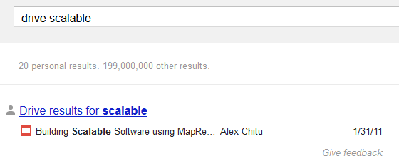
I mentioned last week that you can join an experiment that lets you see results from Gmail and Google Drive in Google Search.
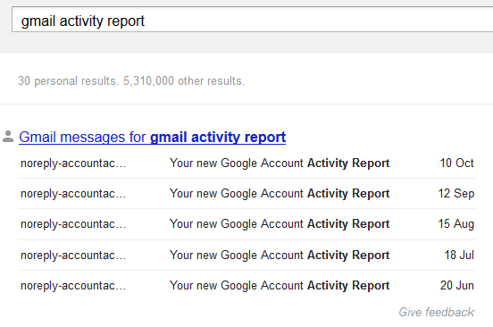
Google shows personal results if they are likely to be relevant to your query, but there's an easy way to trigger the results. Start your query with "gmail" to see Gmail results and "drive" to see results from Google Drive.
Unfortunately, you can't use advanced search operators to restrict results to a Gmail label, to messages from a contact, to starred files or use other features because they're ignored by Google.
Labels:
Gmail,
Google Drive,
Tips,
Web Search
October 24, 2012
Google Instant Shows Suggestions from Web Pages
Google Instant suggestions used to only include popular queries. Last year, Google started to show dynamic suggestions for the last words of your query. Now Google's suggestions seem to include excerpts from web pages.
For example, when you search for [intel solid state drive toolbox], Google's list includes two strange suggestions: [intel solid state drive toolbox(intel ssd toolbox)] and [intel® solid-state drive toolbox download]. It's really unlikely that many people search for [intel®] or include redundant versions of the query.
The real explanation is that a lot of pages include those texts and Google used them to enhance Google Instant.
What about the standard navigation links used by Google or Bing? Obviously, they're included in a lot of pages and few Google users would search for boilerplate text and also use special characters.
Google's help center page for autocomplete informs users that "Google's algorithm predicts and displays search queries based on other users' search activities and the contents of web pages indexed by Google".
Labels:
Google Instant,
Google Suggest,
Web Search
Docs, Sheets, Slides - Short Names for Google Drive Apps
Google Docs meant a lot of things: the service that allowed you to store files online, the online word processing app, the service that included online editors for documents, spreadsheets and presentations. Now Google Drive is the name of the file storage service and Google Docs is only the word processing app. Sheets replaces Google Spreadsheets, while Slides replaces Google Presentations.
The new names are shorter and less generic, so they're better suited for shortcuts. Chrome OS already includes shortcuts to the apps, but you can manually install them in Chrome - Docs, Sheets, Slides. The Chrome apps only create a new document, spreadsheet or presentation. If you're using other browsers, you can simply bookmark: New document, New spreadsheet, New presentation.
Microsoft | Apple | LibreOffice | ||
documents | Docs | Word | Pages | Writer |
spreadsheets | Sheets | Excel | Numbers | Calc |
presentations | Slides | PowerPoint | Keynote | Impress |
Opera Mini Promotes Google's Services
Back in August, Opera and Google extended the revenue-sharing agreement for another two years, which means that Google will continue to be the default search in engine in Opera, Opera Mini and Opera Mobile. The deal included an interesting tidbit: Google's services will be promoted in Opera's desktop and mobile browsers.
Opera Mini's start page now links to Google Search, Gmail and Google+. The search interface is very old and doesn't include the features released in the past 4-5 years. Gmail sends you to the basic mobile interface even if you're using a tablet. The Google+ web app is great and it works well in Opera Mini.
Obviously, Opera Mini is optimized for slow Internet connections and can't handle web apps properly because the rendering engine is in the cloud. Imagine having to reload Gmail every time you tap on a message, check your inbox or label a message.
While you can install Opera Mini on a smartphone, the browser is really popular on feature phones. "More than 168 million people used the Opera Mini browser in March, 117 billion pages were served and more than 19 petabytes of operator data were compressed for Opera Mini users," informs Opera. Back in November 2011, the top handsets that used Opera Mini were Nokia 5130 XpressMusic, Nokia 2700c, Nokia C3, followed by a lot of other Nokia feature phones and Symbian phones.
October 19, 2012
The Trouble With Chromebooks
Chromebooks are stripped-down Linux computers that only run Chrome, so people assume that they must be cheap. After all, you don't need a lot of resources for a single application, right?
It turns out that browsers actually use a lot of resources and include more and more features that used to require plugins, third-party apps or system APIs. Web apps become more advanced, it's easier to install extensions, browsers bundle Flash, file viewers and clever spell checkers, they sync your data and try to anticipate your actions.
Many people complained that the Atom Chromebooks were slow and couldn't display HD videos properly. Google switched to Intel Celeron CPUs, which are more powerful, but still low-end processors. Now Google experiments with premium ARM SoCs, which are cheaper, but still can't compete with Intel Core CPUs when it comes to performance.
The trouble with Chromebooks is that Google can't come up with a powerful ultrabook that costs $700 or $800 because people would think it's too expensive. Why not get an ultrabook that runs a full-fledged operating system and install Chrome?
To solve this issue, Google could try to change people's perception about Chrome OS and show that it's not just a browser. The latest Chrome OS releases made a lot of important changes: the browser can be minimized and resized, it's easier to open multiple windows, there's a desktop and a taskbar, you can change the wallpaper, there are cool applications like the media player, ScratchPad or Calculator that no longer open inside the browser. By including great applications that work offline (a dictionary, some games, a contact manager, a calendar app) and encouraging developers to build standalone apps that work outside the browser, Google could show that Chrome OS is more than just a browser and finally build a computer that can run the Chrome experiments, scroll long documents and still be able to load Google services like Gmail and Google Docs without stuttering.
Unified Google Search
A few months ago, Google launched an experimental feature that allowed to find your Gmail messages and contacts in Google Search. Now there's a new version of the experiment that also includes results from Google Drive.
The experiment also improves Gmail's search results: while you type your query, Gmail shows relevant messages, Google+ posts, Google Calendar events and Google Drive documents.
It's interesting to notice that sometimes the results from Google Search are hidden by default and you need click "show results" to see them. If the results are really relevant, Google expands them automatically. It's also worth mentioning that Google only indexes GDrive filenames and Google Calendar event names, while including both Gmail subject lines and the body content.
Probably Google will also include personal results from other services like Google Maps, Google Play, YouTube, Google Reader, so you can quickly find the maps you've created, the videos you've added to favorites or "liked", the apps you've installed or the books you've recently read. The trouble with including so many different services is that it's hard to determine if the results are actually relevant and to rank them.
The first ARM Chromebook
The most common complaint when it comes to Chromebooks is the price. Google addressed this issue by dropping Intel's expensive CPUs and switching to the ARM architecture in the latest Samsung Chromebook, which only costs $250.
The new Chromebook is thinner and lighter (0.8 inches, 2.5 lbs / 1.1 kg), supports dual band Wi-Fi, USB 3.0 and Bluetooth 3.0, but the screen has been downgraded (11.6" - 1366x768 instead of 12.1" - 1280x800 matte display), the laptop only has 2GB of RAM, a 0.3MP camera (down from 1MP), a 1.5W speaker (down from 2x2W) and no longer includes a 3G modem or an Ethernet port. It's also a lot cheaper than the high-end Chromebook 550, which costs $450.
The Verge says that the build quality is "decent but not inspiring" and the display "offers little in the way of brightness and color representation. Hues are subdued and text can be difficult to read with conflicting light sources."
Samsung's Chromebook is the first device that uses the dual-core Exynos 5250 chip (Cortex A15 with 1.7 GHz clock speed), which will power Samsung's future tablets. The chip has a lot of impressive features, including support for 2560x1600 displays, 1080p 60 FPS video, USB 3.0, 5.1 channel audio, HDMI 1.4, 3D graphics.
Whether you buy the ARM laptop or the Intel-powered laptop, you also get 100GB of free Google Drive storage for 2 years, but this offer is only for the new customers.
"The new Samsung Chromebook is available for pre-order online from Amazon, Best Buy, PC World and other retailers. Next week it will be available for sale from these same online retailers as well as the Google Play store. You can also buy them at over 500 Best Buy stores across the U.S and over 30 PC World and Currys stores in the U.K," informs Google.
October 13, 2012
Chrome Frame, Bundled With Google Toolbar
If you install Google Toolbar for Internet Explorer, you may notice that Google installs an additional software: Chrome Frame. It's a plug-in that renders some pages using Chrome even if you use Internet Explorer. Web developers can add a meta tag that enables Chrome rendering if Chrome Frame is installed and that's especially useful if a page uses technologies that aren't supported by Internet Explorer (for example, HTML5 video in IE6, canvas in IE7, SVG in IE8).
"Google Chrome Frame seamlessly enhances your browsing experience in Internet Explorer. It displays Google Chrome Frame enabled sites using Google Chrome's rendering technology, giving you access to the latest HTML5 features as well as Google Chrome's performance and security features without in any way interrupting your usual browser usage," explains Google.
There are many Google services that use Chrome Frame: Google Calendar, Google Drive/Docs, YouTube and more. Now that Google Apps dropped support for old IE versions (IE6 - 2010, IE7 - 2011, IE8 - November 2012), Chrome Frame is the only way to use Google Apps if you can't update to a new IE release or switch to a different browser.
To see if Chrome Frame is installed, you can go to a site like YouTube or Google Calendar, right-click and see if there's a menu item called "About Chrome Frame". Another option is to type gcf:about:version in the address bar and see if a similar page is displayed.
To uninstall Chrome Frame, "use the standard Add or Remove Programs tool in the Windows Control Panel (called Programs and Features in Windows Vista and Windows 7)". It's not clear if Chrome Frame is only installed for new Google Toolbar or if the future updates will also include Chrome Frame.
October 12, 2012
New Interface for Google Mobile Search
Google's mobile homepage and search results pages have a new interface. The homepage only links to Google Image Search and you have to tap a button to find all the other Google services. The idea is reminiscent of the "hidden" navigation menu launched last year and quickly replaced by the black bar.
Search results pages don't include the menu, so you can no longer open Gmail from a search page and you have to go back to the Google homepage first. The search box has been shrinked, there's a bigger Google logo and the links to specialized search engines are displayed below the search box, just like in the tablet interface.
Here's a screenshot of the old interface:
October 10, 2012
More Funny Directions in Google Maps
Google Maps no longer recommends to swim across the Atlantic Ocean if you want to go from the United States to Europe. Google found a better way: "sail across the Pacific Ocean".
Google's directions from New York to Paris are quite straightforward: go to Seattle, then swim across Pacific to Hawaii, swim again to Asia where you are directed to drive through Asia and Europe to reach France. After only 519 hours you're supposed to reach the destination.
{ Thanks, Anon. }
Google's directions from New York to Paris are quite straightforward: go to Seattle, then swim across Pacific to Hawaii, swim again to Asia where you are directed to drive through Asia and Europe to reach France. After only 519 hours you're supposed to reach the destination.
{ Thanks, Anon. }
Too Many Google Results From a Single Site
I don't know about you, but there's a feature that ruined many of my Google search results pages. It's not that Google can't return relevant results, the problem is that Google tries to be clever and detects keywords that are associated with a site. If it finds one, Google will return a lot of results from that site. In fact, sometimes you'll have a hard time finding results from other domains.
Ever since its launch, Google promoted diversity and used host crowding to show "up to two results from each hostname/subdomain of a domain name". Sometimes Google displayed a link that restricted the results to that domain or subdomain, but users had to click it. Matt Cutts wrote in 2007 that "we did hear complaints that for some types of searches (e.g. esoteric or long-tail searches), Google could return a search page with lots of results all from one domain. In the last few weeks we changed our algorithms to make that less likely to happen".
Then Google introduced sitelinks and started to show more pages from a domain. Two years ago, a Google blog post announced that "for queries that indicate a strong user interest in a particular domain, like [exhibitions at amnh], we'll now show more results from the relevant site". Since that announcement, host crowding was a thing of the past and Google started to include more and more results from a single domain.
I complained about this back in 2010 and mentioned that this feature could become annoying, but now it's much worse. Sometimes you can find queries that return mostly results from a domain. For example, when you search for [apple itunes] Google assumes that you want results from apple.com and starts to return a lot of irellevant pages. Sure, you can still find results from other domains, but 31 of the top 50 results are from apple.com.
If you search for [yahoo mail], Google returns a lot of uninteresting results from Yahoo's international sites, instead of including news articles, blog posts, reviews, tutorials.
Search for [berkeley college] and 26 of the top 50 results are from berkeley.edu. That's just too much. Having to constantly add to the query "-site:dominantresult.com" is annoying, not to mention that most Google users don't even know about search operators and shouldn't have to use them.
And this annoyance is not limited to navigational queries. What if you're not in India, search for [sony led] and Google's top 7 results are from Sony India? That's what happened when I disabled Google Instant and set Google to show 50 results per page.
Showing too many results from a domain is a bad idea because a search engine should offer information from multiple sources, while results should be relevant and comprehensive. Google's mission is to "organize the world's information and make it universally accessible and useful," but Google forgot to make the information accessible.
Query | Domain | Number of results in top 50 |
imdb ratings | imdb.com | 49 |
imdb ratings are broken | imdb.com | 46 |
google play | google.com | 31 |
playstation | playstation.com | 28 |
wordpress | wordpress.org | 28 |
samsung led display | samsung.com | 27 |
October 6, 2012
Google Improves Results for Natural Language Queries
Now that Google's voice search technology has improved and it's used by more and more people, the search engine has to be smart enough to understand natural language queries, which are often verbose.
As you can see from these screenshots, Google can find instant answers for complicated queries like [225 cm + 134 mm plus two times 45 cm minus one and a half meter] or [127 euros times 3 - 15 percent in hungarian money]. You don't even have to know the name of the currency you want to convert and Wolfram Alpha won't help you.
{ via Inside Search Blog }
More Google Results From the Same Author
Google found an interesting way to use the authorship data it has obtained. As you probably noticed, many search results from news sites and blogs include the name of the author and link to the corresponding Google Profile. There's also a link that lets you restrict the results to the pages written by an author: "more by [author name]".
Now Google adds 3 search results from the same author after you visit a page, spend some time reading it (more than 2 minutes?) and then go back to the search results. Google doesn't know if you actually liked the page, but it assumes that you found it useful because you haven't gone back to the search results page after a few seconds.
Here's a screenshot that shows a regular Google search result enhanced with authorship data:
... and this is what happens after visiting the page, reading the article and going back to Google's SERP.
"If a user visits an article by an author and it seems like they'd be interested in finding more articles by this author, when they click the 'Back' button to return to the results page, we'll show more results by that author," explains Google.
The results added by Google aren't always useful and sometimes they aren't even related to your query. For example, the 3 links from this screenshot send you to a search results page from Ars Technica, a page that includes some other articles from the same author and the Google+ profile page.
{ via Search Engine Land }
Subscribe to:
Posts (Atom)