After dropping support for the free Google Apps edition, Google continues to disappoint non-paying users. The sync service powered by Exchange ActiveSync will no longer be available for Gmail users and for free Google Apps users, but the existing connections will continue to work.
"Google Sync was designed to allow access to Google Mail, Calendar and Contacts via the Microsoft Exchange ActiveSync® protocol. With the recent launch of CardDAV, Google now offers similar access via IMAP, CalDAV and CardDAV, making it possible to build a seamless sync experience using open protocols. Starting January 30, 2013, consumers won't be able to set up new devices using Google Sync; however, existing Google Sync connections will continue to function. Google Sync will continue to be fully supported for Google Apps for Business, Government and Education," informs Google.
Three other services and apps will no longer be available: Google Calendar Sync (the download link has been removed, but the app continues to work for existing users), Google Sync for Nokia S60 (no longer supported from January 30, 2013) and SyncML (will stop syncing on January 30, 2013).
While Android owners aren't affected, those who use iPhones, Windows Phones and other mobile devices will have to rely on IMAP, CalDAV and CardDAV. Sure, they are standard protocols, Google doesn't have to pay licensing fees, but Google's implementation doesn't support push. If Apple's iCloud, Yahoo Mail and AOL Mail have push support, why can't Google add it? The Gmail app for iOS has push notifications, but some people might like to use the standard mail client.
If you've already enabled Google Sync on a device, it will continue to work. Unfortunately, you won't be able to enable Google Sync on a new device starting from January 30.
December 14, 2012
Chromebooks, Best-Selling Laptops
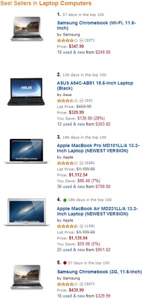
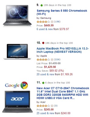
Who said that Chromebooks aren't popular? If you look at Amazon's list of the best sellers in the "Laptop computers" category, you'll find 4 Chromebooks in the top 11:
#1: Samsung Chromebook (57 days in the top 100) - out of stock
#5: Samsung Chromebook 3G (57 days in the top 100) - out of stock
#9: Samsung Series 5 550 Chromebook (199 days in the top 100)
#11: Acer C7 Chromebook (6 days in the top 100)
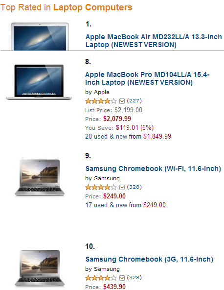
What other notebooks are constantly in the top 10? Apple's MacBook Pro and MacBook Air, which are also the top-rated laptops. Samsung's ARM Chromebooks are the #9 and #10 top-rated laptops, after a long list of MacBook models.
Samsung's ARM Chromebook is also the best-selling laptop at Amazon UK:
What about France, Germany, Spain, Italy? Google says that "Chromebooks are currently sold out. We are working on getting more devices available for you soon."
December 13, 2012
New SafeSearch Settings for Google Image Search
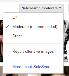
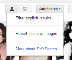
Google tried to simplify a feature using some clever algorithms, but made some people unhappy. Google's SafeSearch settings have always been difficult to understand and Google replaced the three options that were available (strict filtering, moderate filtering - default, no filtering) with only two options (filter explicit results, don't filter explicit results - default).
Here are the old filtering options:
- "Strict filtering filters sexually explicit video and images from Google Search result pages, as well as results that might link to explicit content."
- "Moderate filtering excludes sexually explicit video and images from Google Search result pages, but does not filter results that might link to explicit content. This is the default SafeSearch setting."
- "No filtering turns off SafeSearch filtering completely."
The new filtering options are even more difficult to understand. The default option is supposed to disable filtering, but it's actually a combination of "moderate filtering" and "no filtering", depending of the query. For innocent queries like [sherilyn fenn movies] Google switches to moderate filtering since it's not very likely that you're asking for explicit content. If you add some unambiguous keywords like "xxx" to the query, Google actually disables filtering.
Here's how Google describes the new settings: "In the SafeSearch Filtering section, click the checkbox to filter sexually explicit video and images from Google Search result pages, as well as results that might link to explicit content. If you choose to leave it unchecked, we will provide the most relevant results for your query and may serve explicit content when you search for it." So Google may show explicit images, but only if it's obvious that you're searching for it. No algorithm is perfect, so you'll probably find many examples when this doesn't work as intended.
A Google representative told CNet: "We are not censoring any adult content, and want to show users exactly what they are looking for - but we aim not to show sexually-explicit results unless a user is specifically searching for them. We use algorithms to select the most relevant results for a given query. If you're looking for adult content, you can find it without having to change the default setting - you just may need to be more explicit in your query if your search terms are potentially ambiguous. The image search settings now work the same way as in Web search."
For now, Google only changed how SafeSearch works for google.com, so the old settings are still available at google.co.uk and other country-specific Google sites.
Google Maps App for iPhone
Apple stopped using Google's maps service in iOS6 and switched to other providers. The new application added cool features like turn-by-turn navigation and vector maps, but the coverage isn't that great. There are many countries with incomplete databases of streets and points of interests, a lot of mistakes, poor geocoding accuracy, outdated maps and empty spots. Even Apple admitted that the app is not good enough.
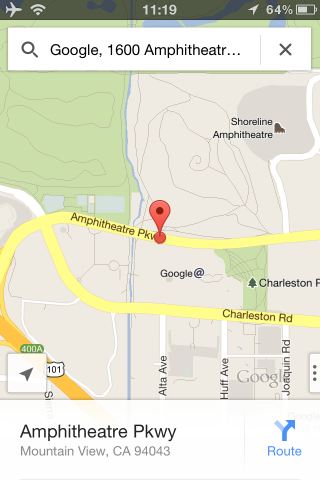
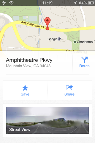
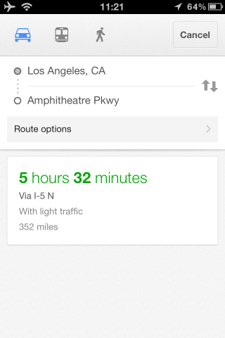
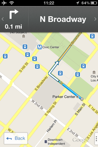
After a few months of waiting, Google finally released a native maps app for iPhone. It requires iOS 5.1 and it's not optimized for iPad yet. The application has all the features of the old maps app and many new features: integration with Google Accounts, vector maps with 3D views, turn-by-turn navigation, Google+ Places integration, search suggestions and online search history. It doesn't have all the features from the Android app, but it's only the first version.
The interface is completely new and you need some time to get used to the new gestures. Google opted for a non-standard interface with few buttons and native controls so that you can see more of the map. "The app shows more map on screen and turns mobile mapping into one intuitive experience. It’s a sharper looking, vector-based map that loads quickly and provides smooth tilting and rotating of 2D and 3D views," explains Google.
Google also released a SDK for iOS apps. "With the Google Maps SDK for iOS, developers can feature Google Maps in their applications on the iPod Touch, iPhone, and iPad. Also, the SDK makes it simple to link to Google Maps for iPhone from inside your app, enabling your users to easily search and get directions."
December 12, 2012
Understanding Google
Fortune has an interview with Larry Page, Google's CEO. There are many questions about Apple, competition, managing the company, but some of the most interesting answers revolve around the word "understand".
"If we're going to do a good job meeting your information needs, we actually need to understand things and we need to understand things pretty deeply," says Larry Page. That's why Google has a single privacy policy for most of its services, that's why Google Search uses SSL when you're logged in, that's why Google experiments with combining data from multiple services, that's why Google+ was built and that's why Google values data so much. To understand things deeply.
"What you should want us to do is to really build amazing products and to really do that with a long-term focus. Just like I mentioned we have to understand apps and we have to understand things you could buy, and we have to understand airline tickets. We have to understand anything you might search for," continues Larry. There's a long list of things Google needs to understand, but your preferences help Google return better results and even anticipate your searches.
"I think in order to make our products really work well, we need to have a good way of sharing. We had 18 different ways of sharing stuff before we did Plus. Now we have one way that works well, and we're improving." If there's an easy way to share things online, this helps Google understand your preferences.
"We see the opportunity to build amazing products that are more than any of those parts. So one of my favorite examples I like to give is if you're vacation planning. It would be really nice to have a system that could basically vacation plan for you. It would know your preferences, it would know the weather, it would know the prices of airline tickets, the hotel prices, understand logistics, combine all those things into one experience. And that's kind of how we think about search," concludes Larry.
The search engine that returned the same results for all users is now a thing of the past. This worked for simple questions, for navigational queries, but it doesn't work for complex questions, for vague queries, for recommendations. Instead of showing the same results for [italian restaurant], Google can personalize them based on your location, your favorite food, your reviews and the reviews written by your friends, your Latitude check-ins.
The new Google tries to understand you and that's the secret behind Google+. Obviously, it's still about search, but it's a deeply personalized search. Google also goes beyond keywords and tries to understand concepts and the relation between them. The Knowledge Graph and the Social Graph define the new Google.
Security Notifications for Google Accounts
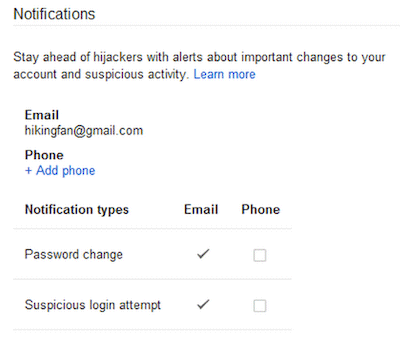
A Google help center page mentions a new feature that will be added to the Google Account settings page: security notifications.
"Google notifies you via email and/or text message when your password is changed, and when we detect a suspicious attempt to sign in to your account. If you receive a notification about a password change you didn't make, or an attempt to sign in to your account that wasn't you, these email and text message notifications will provide details on next steps to help you secure your account," informs Google.
This feature should be available under the "security" tab of the Account Settings page, but I don't see it. Maybe it's enabled in your accounts.
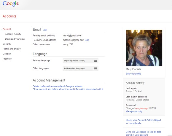
In other related news, the Account Settings page has a new interface and shows information about your account activity, a large photo from your profile, Google Drive storage data.
{ Thanks, Herin. }
Google Zeitgeist 2012
Google's Zeitgeist page for 2012 has a lot of lists of popular searches from different categories and from different countries, so it's easy to find the people, the events, the games, the movies, songs and gadgets that defined the year 2012. It's important to keep in mind that most lists only include the queries with "the highest amount of traffic over a sustained period in 2012 as compared to 2011", so you won't find boring queries like [games] and [music], which are popular every year.
The "movers and shakers" of the year are:
1. Whitney Houston
2. Gangnam style
3. Hurricane Sandy
4. iPad 3
5. Diablo 3
6. Kate Middleton
7. Olympics 2012
8. Amanda Todd
9. Michael Clarke Duncan
10. BBB12 (Big Brother Brasil).
If you look back at the 2011 Zeitgeist list, you'll notice that "Gangnam style" replaces Rebecca Black, iPad 3 replaces both the iPhone 5 and the iPad 2, Diablo 3 replaces Battlefield 3.
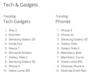
The list of popular gadgets includes 6 tablets (iPad 3, iPad Mini, Nexus 7, iPad 4, Microsoft Surface and Kindle Fire), 3 phones (Galaxy S2, Galaxy Note 2, Nokia Lumia 920) and Sony's PlayStation. With so many interesting tablets released this year, it's hard to choose which one to buy.
Sometimes, Google's lists don't make a lot of sense, so you should take them with a grain of salt. Compare these 2 lists for US tech trends (for example, Note 2 is both more popular and less popular than iPhone 5):
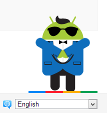
Download the entire Zeitgeist collection [PDF] and don't miss the cool Easter Egg that shows a "Gangnam style" Android animation: mouse over the colorful bar at the bottom of the Zeitgeist page and click the robot.
{ Thanks, Arpit. }
December 8, 2012
Google Reader, "Constantly on the Chopping Block"
Buzzfeed has an interesting article about the evolution of Google Reader. While the article mostly focuses on the social features that were removed from Google Reader a few months after Google+ was launched, there are some thought-provoking insights from former Google Reader engineers that reveal why the service has never been a priority for Google and why it can always be discontinued.
"In the beginning, the best word I can use is that Google tolerated the project. Then, they gave it — support is too strong a word. They gave it some thought," said Chris Wetherell, the Googler who started the project. Jenna Bilotta, a former user experience designer at Google, has a slightly different opinion: "Everyone from Google used Reader, from Larry and Sergey to the newest engineers. It's such a beloved project. Still, it was just in this limbo space. It wasn't really supported, but it wasn't actively being harmed."
iGoogle, a much more popular service, will be discontinued next year and Google Reader's infrastructure is used to show feeds in iGoogle. Hopefully, Google Reader will still be available for some time, but it's mostly wishful thinking.
"In the beginning, the best word I can use is that Google tolerated the project. Then, they gave it — support is too strong a word. They gave it some thought," said Chris Wetherell, the Googler who started the project. Jenna Bilotta, a former user experience designer at Google, has a slightly different opinion: "Everyone from Google used Reader, from Larry and Sergey to the newest engineers. It's such a beloved project. Still, it was just in this limbo space. It wasn't really supported, but it wasn't actively being harmed."
The difficulty was that Reader users, while hyperengaged with the product, never snowballed into the tens or hundreds of millions. Brian Shih became the product manager for Reader in the fall of 2008. "If Reader were its own startup, it's the kind of company that Google would have bought. Because we were at Google, when you stack it up against some of these products, it's tiny and isn't worth the investment," he said. At one point, Shih remembers, engineers were pulled off Reader to work on OpenSocial, a "half-baked" development platform that never amounted to much. "There was always a political fight internally on keeping people staffed on this little project," he recalled. Someone hung a sign in the Reader offices that said "DAYS SINCE LAST THREAT OF CANCELLATION." The number was almost always zero. At the same time, user growth — while small next to Gmail's hundreds of millions — more than doubled under Shih's tenure. But the "senior types," as Bilotta remembers, "would look at absolute user numbers. They wouldn't look at market saturation. So Reader was constantly on the chopping block."
iGoogle, a much more popular service, will be discontinued next year and Google Reader's infrastructure is used to show feeds in iGoogle. Hopefully, Google Reader will still be available for some time, but it's mostly wishful thinking.
Funny Google Flights Messages
Google Flights shows some custom messages after you select your favorite flights. Depending on your destination, Google shows messages like "London, baby!", "Ahh, Paris... bon voyage!", "Have a great time in the Eternal City!" (Rome), "Have a great time in the Emerald Isle!" (Dublin), "Enjoy your trip to the Windy City!" (Chicago), "Have a great time in Music City, USA!" (Nashville), "Have a great time in Baltimore, hon!".
For most destinations, Google shows generic messages like "Hope you have fun in Frankfurt!".
Google's Card-Style OneBoxes
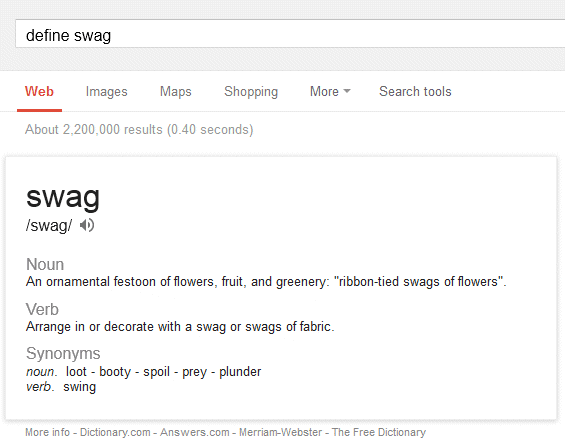
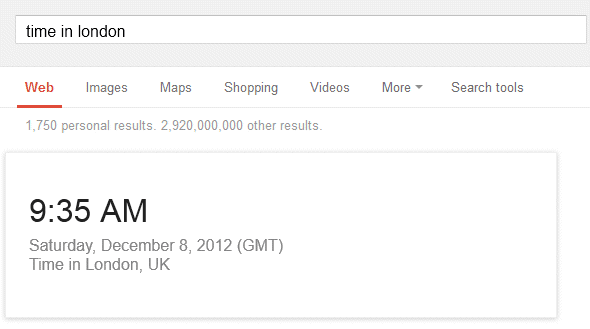
Google updated the desktop OneBoxes for definitions and local time to match the card layout from Google Now. The same layout is also used in the mobile search UI for most Google OneBoxes.
What's unique about the cards? They're much bigger, they include a lot more information, more white space and more distinctive headers. They stand out more and they're harder to ignore.
{ Thanks, Milivella, Arpit, Mikhail. }
What's unique about the cards? They're much bigger, they include a lot more information, more white space and more distinctive headers. They stand out more and they're harder to ignore.
{ Thanks, Milivella, Arpit, Mikhail. }
Labels:
OneBox,
User interface,
Web Search
December 7, 2012
YouTube's New Interface
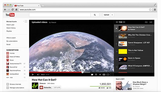
After so many posts about YouTube's experimental interfaces, it's time for the public release. The new interface is rolled out to everyone and you no longer have to change your YouTube cookie to try it.
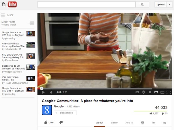
"On YouTube video always comes first, and with this new design the site gets out of the way and lets content truly shine. Videos are now at the top of the page, with title and social actions below. Also, playlists have been moved up, so you can easily browse through videos while you watch. Now when you subscribe to your favorite channels, we will add them to your Guide and make them available on every page of the site, and on your mobile device, tablet, and TV," explains YouTube.
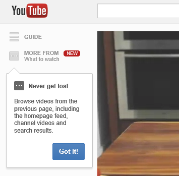
The guide is actually a sidebar that's now available on every YouTube page and lets you check your subscriptions, your playlists and the video history. You can also see a list of other videos from the previous page, so you can quickly watch another search result, a different video from the same channel or another video from the homepage.
Google Apps, No Longer Free For Small Organizations
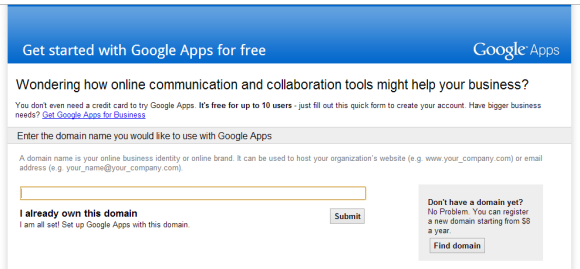
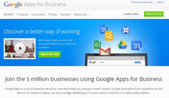
Google Apps started back in 2006 as an experimental feature that allowed you to create Gmail accounts for custom domains. Google added support for other services like Calendar and Google Talk, created a special version for educational institutions, then it launched a "Premier Edition" for enterprises, which included support and a service level agreement for 99.9% Gmail availability. As Google constantly added features to Google Apps and the numbers of paid customers grew to more than 5 million businesses, the free version became more limited, the number of users dropping from 100 to 50 and then to 10.
Now Google announced that the free version of Google Apps is no longer available for new users. Existing users are not affected by this change and Google Apps for Education continues to be available. Google's explanation for dropping the free Google Apps for small organizations is rather vague: "Businesses quickly outgrow the basic version and want things like 24/7 customer support and larger inboxes. Similarly, consumers often have to wait to get new features while we make them business-ready."
Well, not everyone needed customer support, SLAs, migration tools or other business features and Google Apps was a simple way to create email addresses for your domain and use Gmail to manage them. Why pay $50/user/year for features you don't need?
It's obvious that Google wants to focus on paid customers and the free Google Apps was just another thing to support. Now that Google Apps has more than 5 million business customers, Google no longer needs the free Google Apps to attract new users. The free Google Apps was just a burden that made things more complicated.
Update: Apparently, there's a workaround that lets you use the free version of Google Apps for a single account. "If you create a new Apps account going through the App Engine Admin Console you'll still be able to create a Standard Apps account for free but you'll only be able to get 1 user per account rather than the 10 you get today," says Greg D'Alesandre, Senior Product Manager for Google App Engine.
{ Thanks, Arpit. }
December 5, 2012
Google Now's Research Card
The Google Search app for Android 4.1+ has been updated with new cards for events nearby, boarding passes, walking and biking activity, birthdays.
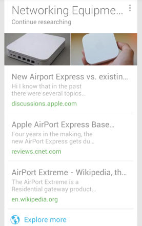
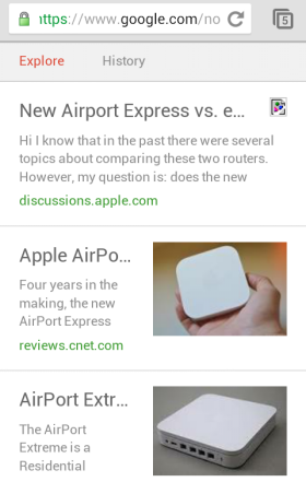
There's also a new card for research topics. Google tries to find in your search history a list of related queries. If you've been researching a topic, it's likely that you've tried different versions of a query and you've clicked many search results. Google Now shows a card with other useful pages from the same topic. It's interesting to notice that Google can find the name of the topic and shows a page that groups results for various queries. Google also includes a "history" section with pages you've already visited.
For some reason, the pages generated by Google return an error messages if you try to open them using a desktop browser. You need to change the user-agent to open pages with URLs like https://www.google.com/now/topics/t/LONGID.
"The research topics card appears when your recent Web History includes several searches related to a single topic – such as a trip you're planning – and Google detects relevant webpages that you may not have found yet. For this card to appear, you must have Web History turned on for the account you use with Google Now. To explore more links that may be relevant to the topic, touch Explore at the bottom of the card. From the list of links, touch the History tab to view a summary of your recent Web History related to this topic," informs Google.
YouTube's App for iPad
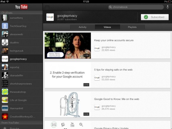
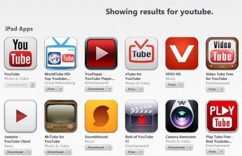
Three months after releasing an app for iPhone, YouTube updated it and added an interface optimized for iPad. The lack of a built-in YouTube app for iPad created an opportunity for other developers to come up with their own YouTube apps and some of them are pretty good.
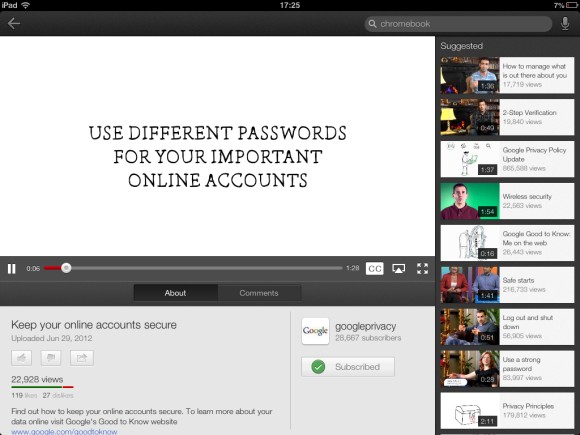
YouTube also updated the app to fill the entire 4-inch display of the iPhone 5 and added AirPlay support. The initial version of the app didn't have AirPlay support and asked users to enable AirPlay mirroring, an inefficient method to play videos on an Apple TV. The new version supports AirPlay, but it uses a non-standard video player and videos stop playing on the Apple TV when you close the app. Another side-effect is that you still can't use the background audio trick that lets you play songs or any other videos while opening another app or after locking the device. Both features are available in Apple's old YouTube app and YouTube's mobile web app.
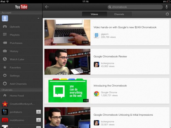
Obviously, YouTube's app has a lot of features that weren't available in the built-in app: recommendations, unified video history, voice search, closed captions, activity feeds. Unfortunately, the iPad app has a pretty low information density and most sections show fewer videos than Apple's YouTube app. For example, the search feature shows only 4 results at a time in the landscape mode, while Apple's app displayed 12 results. YouTube offers some advanced search options: sorting by date, ratings or view count, finding recent videos and filtering by duration, but the interface tries too hard to be consistent with the desktop interface, while ignoring that a tablet has a small screen. Apple's App Store app from iOS 6 made a similar mistake by showing a small number of results at a time.
Subscribe to:
Posts (Atom)