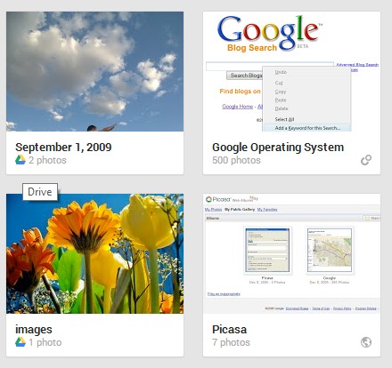
Google's Panoramio service has been redesigned and now looks just like a Google Maps extension. The new interface (codenamed "acrylic") is borrowed from Google Maps Views. You can go back to the old UI by clicking "Return to classic Panoramio".
"We've made photos the hero on the page while still keeping the important features that people enjoy. On the photo page, by far the most popular on the site, we've made the photo over three times bigger! We've also made thumbnails on the profile page and the world map significantly bigger. We know that Panoramio members have used the existing design for years, so the 'classic' version will still be available for a little while," mentions the Panoramio blog.
Panoramio has a lot of great photos from all over the world and it's an important source of high-quality photos for Google Maps and Google Earth. That's the reason why Google acquired the service back in 2007.
Adam Lasnik, a former Google Search Evangelist, is now Program Manager at Panoramio and his team launched Google Maps Views. "Many of the same people (including me!) work on both products, but Views and Panoramio currently serve different purposes: Views is a community for sharing photo spheres, while Panoramio is a community for sharing traditional photos," says Adam.
{ Thanks, Georg. }
August 31, 2013
Google Keyboard Themes
If you use the stock Android keyboard, which is also available in the Play Store, you can change the look and feel of the keyboard. Google Keyboard has a few themes you can choose, but they're not available in the settings.
Here's a quick way to pick a different theme, assuming your device runs Android 4.0 or later:
1. you first need an application that lets you create shortcuts to app activities. Some apps that let you do that: Nova Launcher and Apex Launcher, probably the best Android launchers. The following instructions assume you've installed Nova Launcher or Apex Launcher, but you can also use simple apps like Activity Getter.
2. long press the homescreen and pick "shortcuts" and then "activities".
3. scroll to the Google Keyboard entry, expand the list of activities and pick "Android keyboard debug settings".
4. you'll create a shortcut for this activity. Tap the new shortcut and you should see this settings page:
5. tap "Keyboard theme" and pick one of the themes: Basic, Basic (High Contrast), Stone (normal), Stone (bold), Gingerbread. IceCreamSandwich is the default theme.
Basic:
Stone (normal):
Gingerbread:
6. use the shortcut you've created to change the theme.
{ via Android Police }
August 30, 2013
Google Tests a New Tablet Search Interface
Remember the card-style redesign for Google mobile search? Google tests a similar interface for tablets:
There's more white space, top search results stand out even more, while Knowledge Graph cards and results from specialized Google search engines look like distinct sections of the page.
{ via Techno-Net }
There's more white space, top search results stand out even more, while Knowledge Graph cards and results from specialized Google search engines look like distinct sections of the page.
{ via Techno-Net }
Labels:
Mobile,
User interface,
Web Search
The $199 Phone
It's hard to believe that a high-end smartphone can cost only $199 without contracts and carrier subsidies. Nexus 4 was released last year and its specs don't look that great when you compare it with phones like HTC One or Samsung Galaxy S4, but Nexus 4 runs the latest Android version, it has a smooth interface and many developers use it to test their apps.
From $299 to $199, Nexus 4 managed to become the first high-end smartphone that costs less than $200 off contract. Google's previous Nexus phones used to cost about $529, but Nexus 4 changed all that. Google subsidized the phone in an effort to make the phone more affordable.
It's amazing to see how much has changed since 2010, when Google released the first Nexus device: Nexus One. Hardware has improved a lot, Android has a great interface, Android apps are better, Google built a content store, Android is the leading mobile OS and you can buy powerful phones and tablets for about $200 (full price).
Google Earth Tour Builder
Google has a new experimental service that lets you build Google Earth tours from your browser. It's called Tour Builder and it requires the Google Earth Plugin (you also get the plugin when you install Google Earth).
"Tour Builder is a new way to show people the places you've visited and the experiences you had along the way using Google Earth. It lets you pick the locations right on the map, add in photos, text, and video, and then share your creation. We originally created Tour Builder to give veterans a way to record all the places that military service has taken them, and preserve their stories and memories as a legacy for their families. But we also thought it could be a useful tool for anyone with a story to tell, so we made it available to everyone," explains Google.
Before creating a tour, you can check the gallery:
Tour Builder lets you add images and videos, import KML files, enable or disable some layers, add historical imagery. By default, tours are private, but you can share them with other people.
{ Thanks, Florian K. }
New Google Sign-in Page for Mobile Devices
Google's mobile sign-in page has a new interface that uses the same slogan from the desktop: "One password. All of Google." It's a more crowded page that includes a silhouette icon, a list of icons for Google services like Gmail, YouTube, Google Maps and a small "Create an account" link at the bottom of the page instead of the red "sign up" button.
Here's the old interface:
For some reason, the new sign-in page lacks the "stay signed in" checkbox.
Here's the old interface:
For some reason, the new sign-in page lacks the "stay signed in" checkbox.
Knowledge Graph Reminders
If you search Google for music artists, actors, books, TV shows and you're logged in, you'll see a new "Remind me" button in the Knowledge Graph card. Click the button and "Google Now will remind you about new releases/movies/episodes on your phone or tablet".
Until now, you could add time-based and location-based reminders to Google Now. These new reminders are special and can only be added from Google search. You can manage them from the Google Search app on your mobile device: just go to Settings, My Stuff and select Reminders.
This feature was added last week, when the Google Search app for Android was updated.
Labels:
Google Now,
Knowledge,
Web Search
August 29, 2013
Sites That Integrate With Google Now
There's a long list of sites that integrate with Google Now: Air Berlin, Air Canada, Emirates, Booking.com, Lastminute.com, TicketWeb, Ticketfly, Orbitz, CheapTickets, OpenTable, Fandango, Rotten Tomatoes, Zillow and more.
There's nothing magic about integrating travel sites, hotel booking sites, event-ticketing sites with Google Now. You only need to add some markup to email notifications. "By adding schema.org markup to the emails you send your users, you can make that information available across their Google experience, and make it easy for users to take quick action. Gmail, Google Search and Google Now all already use this structured data. (...) Google Now brings users the right information at just the right time. For example, Google Now already provides updates to restaurant and hotel reservations or flight information received in Gmail. By marking up email notifications to your users, you can use Google Now to bring them similar updates about your services and products."
After an email confirming a hotel reservation, the Google Search app shows this card. Here are some examples of code that needs to be added to email notifications.
Google Now only supports schemas for event reservation, flight reservation, hotel reservation and restaurant reservation.
{ Thanks, Florian Kiersch. }
August 28, 2013
New Layout for Google+ Post Pages
Google+ post pages look different: posts are now moved to the right and there's a huge box that shows the name of the page or author and the number of followers. The new layout encourages people to follow pages and Google+ users, but makes posts more difficult to read.
Here's an example of post from Gmail's Google+ page.
Better Photo Attachments in Gmail's iOS App
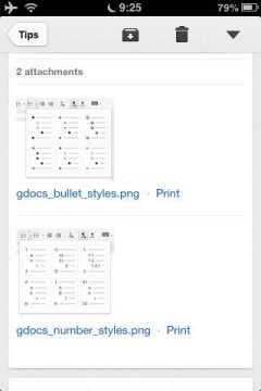
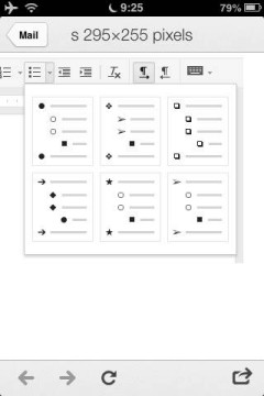
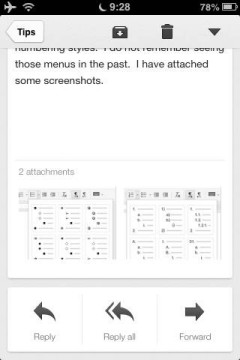
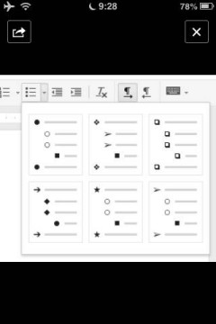
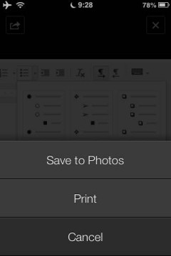
The latest version of the Gmail app for iOS added a better way to open photo attachments. Until now, you had to tap each photo to open it using the app's internal browser and go back to the message.
Now you can tap a photo attachment and use swipes to go to the next or previous image, just like in the built-in Photos app.
The "print" link is no longer displayed next to the thumbnail, but it's still available in the actions menu. For some reason, filenames are no longer included.
Another new feature: "when selecting a Google Drive file or Google+ link you'll now go directly to the app if it's installed. This can be turned off using the in-app settings."
{ via +Gmail }
Use Gmail's New Compose Interface for Replies
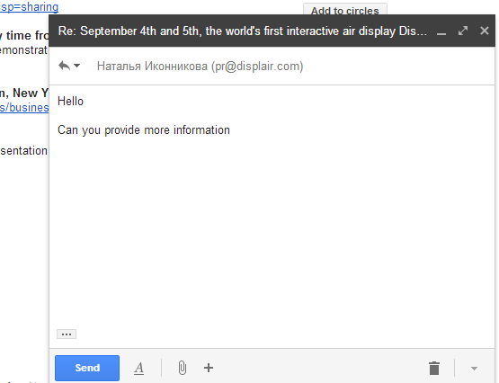
When Gmail launched the new compose interface, I wondered why the interface for replying to other messages is different. By default, when you reply to a message or you forward a message, Gmail shows the rich-text editor below the message, just like before.
There are a few ways to make the reply box look like the compose box, so you can open other messages or use Gmail's search feature while replying to a mail.
1. Shift-click the "reply" link or the entire box that includes the message "Click here to Reply or Forward". You can also Shift+click "forward" to open the forwarded message in a pop-out box.
2. Use keyboard shortcuts: Shift+r to reply in a pop-out box, Shift+a to reply to all, Shift+f to forward in a pop-out box.
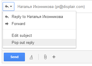
3. If you've already writing the reply, click the arrow above your reply and pick "Pop out reply".
To go back to the regular interface, minimize the compose box, find this message "You are currently editing your reply in a separate window" and click "Show your draft here."
August 23, 2013
No More Notification Ads and Icon Ads in Android Apps
Here's a Google Play policy change that will make a lot of Android users happy: Android apps will no longer be able to install home screen icon for third-party services and show notification ads.
From Google: "Apps and their ads must not add homescreen shortcuts, browser bookmarks, or icons on the user's device as a service to third parties or for advertising purposes. Apps and their ads must not display advertisements through system level notifications on the user's device, unless the notifications derive from an integral feature provided by the installed app. (e.g., an airline app that notifies users of special deals, or a game that notifies users of in-game promotions)."
The Google Search app will be able to show Google Now ads for nearby businesses, but a random game won't be able to show ads for third-party services.
There are a lot of Android apps like TrustGo Ad Detector or Lookout Ad Network Detector that show warnings if you install apps that use ad services like AirPush. "Smartphone usage has skyrocketed, and some advertisers have begun to experiment with aggressive, new techniques to display ads on mobile devices. This includes pushing ads to the standard Android notification bar, dropping generically designed icons on the mobile desktop, and modifying browser settings like bookmarks or the default homepage," explains Lookout.
New Gestures in Chrome for Android
One of the most annoying features in Chrome for Android has been finally removed in the latest beta release: swiping from the edge of the screen to switch tabs. It's very easy to trigger this gesture accidentally when you open desktop sites and some sites use similar gestures (Google Image Search).
Google replaced it with a gesture that's less error-prone: "swipe horizontally across the top toolbar to quickly switch tabs". It's hard to this accidentally when browsing the web. Google added other gestures: "Drag vertically down from the toolbar to enter into the tab switcher view. And drag down from the menu to open the menu and select the item you want without having to lift your finger. Zoom into your preferred magnification on any desktop web site by double tapping on the page and swiping your finger up-down without lifting it."
Chrome 30 for Android brings a lot of other useful features: WebGL support, media source extensions for adaptive streaming and time shifting live streams, DeviceMotion events and reverse image search powered by Google.
Reverse image search (or search by image) is also natively supported in Chrome 30 for desktop: just right-click an image and pick "search Google for this image".
Chrome Beta for Android is available in Google Play, while Chrome Beta for desktop can be downloaded from here.
Which Google Drive Images Are Added to Google+ Photos?
If you're wondering why not all the image files from Google Drive are available in Google+ Photos, here's the explanation. Google+ Photos only imports photos if they meet these criteria:
1. photos MUST be at least 512 x 512
2. JPG photos MUST have 'Date Taken' EXIF metadata
3. supported formats: JPG, GIF, WebP, RAW.
I've tested various image files and these are the rules. Google wants to restrict the feature to photos, but it's not clear why GIF and WebP are allowed, while PNG isn't.
{ Thanks, Martin. }
August 22, 2013
Google Updates the Dictionary OneBox
Google updated the dictionary OneBox with etymological information, a translation box and a graph that shows the use of a word over time. The graph is based on the Google Books Ngram Viewer and it shows the number of mentions of a word over time in a corpus of millions of books. You need to click the arrow icon at the bottom of the box to see the new features.
Here's the expanded definition box for [sophist definition]:
Google offers a lot of useful information about the origin of a word and it shows how it has evolved. Here's a more complex example for "engine".
If you pick a language in the translate box, Google remembers the language and it translates your keywords automatically.
Google now shows synonyms, antonyms and usage examples for each meaning of the word and links to the synonyms, antonyms and some words from the definitions:
Search for [define top] to see a huge list of definitions and 2 distinct dictionary entries. If you search for [define draught], Google shows the definitions for "draft". Search for [define a] to see a long list of prefixes, suffixes and abbreviations.
Sometimes Google also shows a topic like "geometry" next to a definition:
Unfortunately, the dictionary option from the search tools is no longer available. This means that Google's definitions from the web are only displayed if the words can't be found in the dictionary used by Google (Oxford Dictionary).
Another drawback: Google no longer links to Wikipedia, Dictionary.com, Answers.com, Merriam-Webster, The Free Dictionary and other sites that provide definitions.
{ Thanks, James Sacuan. }
Google Tests a New Mobile Search Interface
Google tests a new card-style interface for mobile search results. There are special cards for Knowledge Graph results, results from specialized search engines and for related searches. The new interface only shows Previous/Next buttons.
Many Google web apps and mobile apps use the card-style interface that was first added to Google Now. You can find it in Google Search, Google Play, Google+, the new Google Maps, Google Keep, the new YouTube app. "A lot of use of white space, not a lot of artificial, surface-like divisions. We're really counting on bold typography, white space, and big images to give emphasis, give character and give hierarchy to the cards that we give you," said Matias Duarte, who leads the Android User Experience team.
{ Thanks, Nedas. }
Blogger Bug Hides Old Comments
I don't like to use this blog to report bugs, but sometimes it's important to do that. Blogger no longer shows the old comments imported from the native commenting system. I've switched to Google+ comments and all the comments were properly imported. Now the legacy comments are no longer displayed.
Here's an old post that has 218 comments, but none are displayed:
Disabling Google+ comments fixes this issue, but the comments powered by Google+ are missing. This means that the old comments aren't lost, but there's a bug in the Google+ commenting system.
I checked the Blogger help forum before posting this and I was surprised to see some top contributors claiming that "all the non-Google+ comments disappear when you switch to Google+ comments". I'll link to the official Blogger blog: "older comments will continue to appear in the new widget".
Update (a few hours later): Google fixed the bug, but there's another one. I can't post a new comment and clicking "reply" doesn't have any visible effect. I've seen similar reports in the Blogger help forum.
Update 2: Google acknowledged the second issue and promised to fix it.
Update 3: Apparently, blog owners were the only ones that couldn't post, but this was fixed. Thanks, Yonatan Zunger.
{ Thanks, Kristian. }
August 21, 2013
Google Keep Reminders
Google Keep now allows you to add reminders to your notes. Just like in Google Now, you can add time-based reminders and location-based reminders. "Time reminders work on all devices, but location reminders will only be triggered on mobile devices," mentions the help center.
"To get started, select the 'Remind me' button from the bottom of any note and choose the type of reminder you want to add. You can add time-based reminders for a specific date and time, or a more general time of day, like tomorrow morning. Adding a location reminder is incredibly easy too — as soon as you start typing Google Keep suggests places nearby," explains Google.
Here's the desktop Google Keep site:
The Android app has been updated and now supports reminders. There's a new navigation drawer with separate sections for archived notes and reminders and you can now add photos from the Gallery without using the "share" feature.
Google Keep integrates with Google Now, so all the Keep reminders are added to Google Now. You'll find them in Settings > My Stuff > Reminders. For some reason, the reminders added from Google Now aren't available in Google Keep.
You'll get notifications in Google Now, the Google Keep app for Android, the Google Keep app for Chrome (desktop notification) and the Google Keep desktop site (alert box), but you won't see redundant notifications. If you have both the Google Search app and Google Keep, you'll only get notifications from Google Keep.
When Google Tasks is discontinued (it will happen eventually), Google Keep will be the replacement. It's optimized for mobile and it doesn't integrate with Gmail or Google Calendar, but at least it's constantly improving and it has a cool mobile app.
Subscribe to:
Posts (Atom)