An unofficial blog that watches Google's attempts to move your operating system online since 2005. Not affiliated with Google.

Send your tips to gostips@gmail.com.

August 14, 2012

The "I'm Feeling Lucky" Easter Egg

The "I'm Feeling Lucky" button from Google's homepage is no longer useful when Google Instant is enabled. When you click the button, Google usually sends you to the doodle gallery, but now the button is more special.

Mouse over the "I'm Feeling Lucky" button and you'll see one of these labels: "I'm Feeling Puzzled", "I'm Feeling Artistic", "I'm Feeling Playful", "I'm Feeling Hungry", "I'm Feeling Wonderful", "I'm Feeling Stellar", "I'm Feeling Trendy", "I'm Feeling Doodly". Each button sends you to a different Google site, so you can explore Google Trends, the Google Art Project, the World Wonders Project and more.


{ Thanks, Jérôme Flipo. }

August 13, 2012

Google's New Favicon

Google has a new favicon that looks like the icon from Google's mobile search apps for Android and iOS. The same icon was also used for the Google Search app from the Chrome Web Store.

Most likely, Google wanted to use the same icon irrespective of the platform so that it becomes instantly recognizable.

Here's the new favicon:


... and the old favicon, which was launched back in 2009:


This screenshot shows the first three Google favicons. As you can see, the new favicon has a lot in common with the second favicon used by Google. "We felt the small 'g' had many of the characteristics that best represent our brand: it's simple, playful, and unique. We will be looking to improve and enhance this icon as we move forward," said Google back in 2008, when it changed the favicon for the first time.


If you don't see the new favicon when you visit google.com, try clearing your browser's cache.

{ Thanks, Arpit Kumar. }

August 7, 2012

YouTube App, No Longer Included in Apple's iOS

Starting with iOS 6 beta 4, the YouTube app is no longer bundled with Apple's mobile operating system. Apple "said Monday that its license for YouTube has expired, meaning the app will no longer be included in the next version of its mobile operating system, iOS 6. That version is expected to be released to the public this fall and developers are already using it," reports The Wall Street Journal.
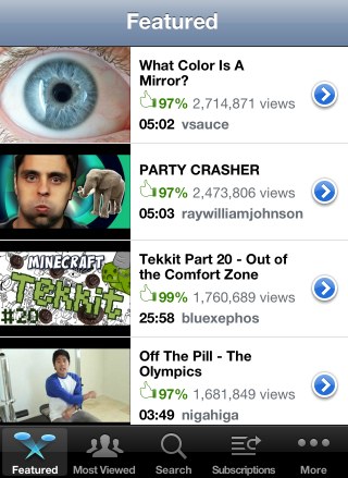

Back in 2007, when Apple launched the iPhone, YouTube's video player required Flash, so YouTube videos couldn't be played without a special application. YouTube, which was acquired by Google in 2006, transcoded some of the videos to H.264 and allowed Apple to build a native YouTube application. "To achieve higher video quality and longer battery life on mobile devices, YouTube has begun encoding their videos in the advanced H.264 format, and iPhone will be the first mobile device to use the H.264-encoded videos. Over 10,000 videos will be available on June 29, and YouTube will be adding more each week until their full catalog of videos is available in the H.264 format this fall," mentioned a press release from 2007.

The app is no longer that useful, now that YouTube's mobile site has a great interface and more features than the native app. YouTube's HTML5 video player lets you play videos from Safari or any other browser, so many iPhone users don't even use the YouTube app. Just like the Maps application, the YouTube app was neglected by Apple, which didn't add many useful features. Google has constantly improved the YouTube app for Android and now will also develop a YouTube app for iOS.

Maybe Apple wanted to release a Google-free version of the iOS and the next step could be switching to Bing as the default search engine in Safari, but things are not that bad for Google. After all, YouTube is the most popular video sharing site and Google Maps is the most popular online mapping service. Google can develop its own apps, update them more often and add new features.

Even if YouTube's mobile site can replace the native app, there are two features that couldn't be added by YouTube: uploading videos and supporting the old embedding code. The good news is that both features are available in iOS 6 beta 4 and it's likely that the final version will continue to include them.

August 6, 2012

Custom Colors in Google Calendar

Last year Google added a new color palette for Google Calendar and many users complained. Some of them thought that the new calendar colors make it difficult to tell events apart, while other people wrote that they're too muted.

Now you can customize calendar colors. Just click the arrow icon next to a calendar in the left sidebar, click "choose custom color" and pick your favorite background color. Select "light text" if the text is hard to read.


"Google Calendar users have had the ability to change the colors of specific events or calendars from a default color palette. Users can now choose a custom color if the default palette does not meet their needs," informs Google. This feature is also available for Google Apps.

August 4, 2012

Create Keyboard Shortcuts for Chrome Extensions

Chrome 22 (currently in the Dev channel) has a cool feature that lets you set keyboard shortcuts for extension buttons.

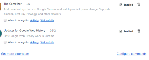
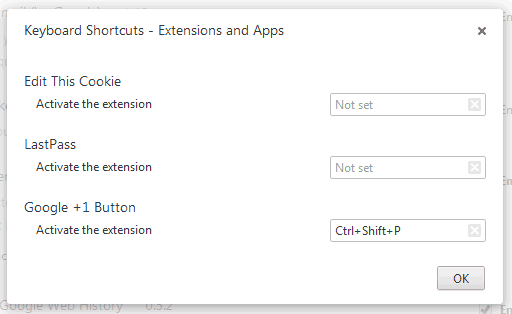
Just open the extensions page (click the wrench icon, then select Tools and Extensions), scroll to the bottom of the page and click "Configure commands". You can enter shortcuts for all the extensions that use browser actions, a fancy name for the buttons displayed next to the Omnibox.


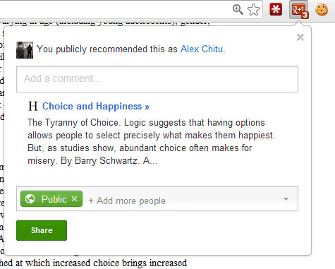
Right now, you can only set shortcuts that simulate clicking the buttons, so they're not useful for all extensions. For example, they're useful for the "Google +1 Button" extension because you can quickly +1 pages, but they're not useful for the LastPass extension because it only displays a long list of options.

There's an experimental Chrome API for extension developers that allows them to add keyboard shortcuts that trigger actions and it's likely that users will be able to customize these shortcuts.

Some shortcuts that work: Ctrl+Letter, Ctrl+Digit, Ctrl+Shift+Letter, Ctrl+Shift+Digit. You can even override standard shortcuts like Ctrl+T, Ctrl+C or Ctrl+P, but you shouldn't do that.

YouTube's Topic-Centric Homepage Experiment

YouTube continues to test new homepage interfaces focused on popular topics. YouTube's topic pages look like channels, but they're automatically generated by YouTube using videos that are related to a topic.

The homepage also shows videos from popular channels. All the links that start with "YouTube -" send you to topic pages for things like "Olympic weightlifting", "Gymnastics", "Driving under the influence", "James Bond Film Series" or "Chick-fil-A". Click "more" to see more videos from the channel or topic page.


The new UI experiment is very similar to the "carousel" interface I've mentioned last month. It only works when you're not logged in and YouTube redirects you to a new page: youtube.com/lohp.

Here's how you can try the latest YouTube experiment. If you use Chrome, Firefox, Opera, Safari or Internet Explorer 8+, open youtube.com in a new tab, sign out, then load:

* Chrome's JavaScript console (Ctrl+Shift+J for Windows/Linux/ChromeOS or Command-Option-J for Mac)
* Firefox's Web Console (Ctrl+Shift+K for Windows/Linux or Command-Option-K for Mac)
* Opera's Dragonfly (Ctrl+Shift+I for Windows/Linux or Command-Option-I for Mac)
* Safari's Web Inspector (how to do that?)
or
* Internet Explorer's Developer Tools (press F12 and select the "console" tab)

and paste the following code, which changes a YouTube cookie:

document.cookie="VISITOR_INFO1_LIVE=9UnXBzJIHDc; path=/; domain=.youtube.com";window.location.reload();

Then press Enter and close the console. Go to youtube.com/lohp to see the experimental interface.

Update: There's also an experiment that redirects users to the "videos" page, which shows popular videos from various categories.


{ via Techno-Net. }

Google's Sidebar-less Search Experiments

Many people noticed the Google search interface experiment I've mentioned back in June. Google tests multiple versions of the interface, but they have one thing in common: the left sidebar is replaced with a horizontal navigation bar.

The new horizontal bar includes Google's specialized search engines and a "search tools" link that displays the advanced search options. The bar is either aligned with the search box or it's aligned with the black bar, depending on the experiment.


It's obvious that Google wants to get rid of the sidebar and make search options more visible, but the new bar might confuse users and the left padding makes the page look unbalanced.

{ Thanks, Ruben, Param, Denis. }

No More Mobile iGoogle

Last month, Google announced that iGoogle will be discontinued next year. Few people noticed a help center article which informed users that "the mobile version will be retired on July 31, 2012".

The mobile iGoogle site no longer works, even if the iGoogle link is still included on the homepage. "As Google announced in early July, iGoogle's mobile version has been retired," mentions a Google employee. Unfortunately, you can't even use the desktop iGoogle site on a mobile device without changing the user agent. You can do that in the mobile Chrome for Android and iOS or in the stock Android 4.0+ browser by visiting www.google.com/ig and selecting "request desktop site" from the menu.


Google suggests users to try mobile apps and add widgets to the home screen if they have an Android device. There are all kinds of apps for weather, news, mail, unit conversion, translation, but the nice thing about iGoogle is that everything is displayed on a single page you can could access from any device. The "Google Now" feature from Android Jelly Bean could replace the mobile iGoogle once Google adds more cards.