An unofficial blog that watches Google's attempts to move your operating system online since 2005. Not affiliated with Google.

Send your tips to gostips@gmail.com.

September 30, 2013

Chrome Font Finder

You're reading a web page and you're suddenly wondering: what font is that?


You can check the source code or select some text, right-click and pick "inspect element". You'll probably find a list of fonts and you won't be able to tell which one is actually used.

Chrome added a feature that tells you the name of the font that's used. This feature is available in Chrome 31+, so you can try it if you've switched to the Dev Channel or you use Chrome Canary. Right-click the text, pick "inspect element", switch to the "computed" tab, scroll down and you'll see "a summary of the typeface(s) used for that element". Paul Irish says that it "works great with Google Webfonts, Typekit, local fonts, @font-face typefaces, unicode glyphs, and all other interesting font sources."


As you can see, it's Helvetica, not Arial. No need to use WhatTheFont or WhatFontIs.

For some reason, this didn't work well for web fonts.


{ via Kristian Serrano. }

Google's Music Carousel

Remember the post about Google's new music video results? They're used by a Knowledge Graph carousel that shows a long list of songs when you search for things like [Moby songs], [Michael Jackson music], [Nina Simone list of songs], [Beatles track list].


Click one of the songs and you'll see the search results for that song's name. The top result is a music video from YouTube, which has a huge thumbnail. The video doesn't play inline, the thumbnail only links to a regular YouTube page.


You'll see the same interface if you search for a music artist and click one of the songs from the Knowledge Graph sidebar. You can also append "albums" to the query, click one of the albums and you'll see a list of all the songs from the album. Search for [Moby Wait for me songs] and you'll find a list of the songs from Moby's Wait for Me album.


It would be nice to play songs from the Google search results page. Even a short Google Play preview would be pretty useful. If that's not possible, then Google could embed YouTube's player, so you can watch music videos without opening a new page. Another improvement would be to automatically generate a YouTube playlist from all the music videos listed in the carousel, like YouTube does.

{ via Search Engine Roundtable }

Google Mobile Image Search Regression

Google has a great mobile interface for image search. It was launched in 2010 and improved multiple times since then. You can use swipes to go to the next image result or to the previous one. It looks like Google changed the image search UI for smartphones and tablets and now sends you to a landing page that shows the image and loads the corresponding page in the background. Intuitive gestures are gone and now you have to use the back button.


This seems to be limited to iPhones and iPads running iOS 7, so it's probably a bug. A lot of people complain about this in the Google Search Forum.

There are many reasons why the new interface is strange: loading the associated page uses more bandwidth and that's not a good idea for mobile devices, it's more difficult to check multiple search results, thumbnails are smaller and even the desktop interface shows a bigger image instead of sending users to a new page.

September 27, 2013

Force YouTube to Use the HTML5 Player

YouTube's HTML5 player is great, but it's not enabled for all the videos. Even if you go to youtube.com/html5 and join the HTML5 trial, you'll find a lot of videos that use the Flash player. "Some videos with ads are not yet supported (they will play in the Flash player)," mentions the site.

There's a simple Greasemonkey script that forces YouTube to use the HTML5 player for almost all the videos you watch at youtube.com. You need to install Greasemonkey if you use Firefox or Tampermonkey if you use Chrome, then click the "Install" button here.

[Update (Octomber 3rd, 2013): For Chrome, use the old version from Sept 23.]

The script works better in Firefox. If you install the script in Chrome, it will disable the new Ajax interface, but everything else seems to work well.


Here's a video you can use to test the script. Please note that the script doesn't work for embedded videos.

Card-Style Interface for Google Mobile Search

As previously anticipated, Google's mobile site has a new layout that uses cards, just like Google Now, Google Maps, Google+ and an increasingly long list of Google services and apps.

"A new look and feel for Google Search and ads on your phones and tablets. It's cleaner and simpler, optimized for touch, with results clustered on cards so you can focus on the answers you're looking for," informs Google's search blog.


Ads stand out a lot more and, depending on your phone's resolution and screen size, you might not even see a regular search result without scrolling down. Google shows up to 2 ads at the top of the page and no longer uses a different background color. There's just a small "Ad" label next to the URL.


Sections are clearly separated and there's more white space, so the information density is lower.


Pagination has been simplified and you can only go to the previous or the next page of results and to the first results page.

September 26, 2013

Google's 15th Birthday Doodle

This year, Google's birthday doodle is interactive: it's a game that asks you to get as many candies as you can from a piñata. "A piñata is a container often made of papier-mâché, pottery, or cloth; it is decorated, and filled with small toys or candy, or both, and then broken as part of a ceremony or celebration."

The game uses HTML5 and you can also try it on your smartphone or tablet. You can share your score on Google+ and generate URLs that remember your high score.


Here's a video that shows the game:


The Google Doodles site has a list of all the other birthday doodles: the first one is from 2002. The doodle from 2007 has a lot in common with this year's doodle.

Happy Birthday, Google!

Filter and Compare Knowledge Graph Results

Google's Knowledge Graph feature gets smarter every day. You've probably noticed the carousel that's displayed when you search for things like [dog breeds], [asian rivers], [swedish bands], [science fiction books], [surrealist painters]. For some queries, you'll now see a drop-down that lets you select other similar categories. If you search for [surrealist painters], you'll see a long list of genres: abstract, cubist, impressionist, rococo, romantic.


Until now, Knowledge Graph displayed information about a single entity. Now you can compare 2 things. For example, you can search for [orange vs tangerine] and find out that oranges contain two times more vitamin C than tangerines.


"You can try this for some other things you might be curious about, such as dog breeds (compare pekingese vs. chihuahua) or celestial objects (compare earth vs. neptune) — and we'll keep adding more," informs Google.

It looks like Google brings back some features from an old Labs project called Google Squared and makes them more usable.

{ via Inside Search }

Google+ Celebrates 15 Years of Google

Mr. Jingles, the Google+ notification mascot, celebrates Google's 15th birthday with a pixelated animation. Just click the bell icon, read all your notifications or click "mark all as read" to see it.


"Friends of mine here at work found this old photo of me from back in 1998, the same year Google started up. Yes, I know I was a bit awkward back then – but so was Google (check out this link for proof). Anyways, enjoy this retro version of me in your Notifications tray for the next day or so. Oh, and Happy Birthday, Google!"

Mr. Jingles also changed its profile photo: "A little change of pace in my profile photo for #throwbackthursday.". The file name is self-explanatory: "1998-jangles-avatar.png".

Google's 15th Birthday Easter Egg

Search Google for [Google in 1998] and you'll see a search results page from 1998, the year when Google was incorporated as a privately held company. It's an Easter Egg that reminds you how much Google has evolved, while preserving a simple user interface.

The old search results includes the original Google logo that had an exclamation mark just like Yahoo!, GoogleScout - another name for the feature that returns similar pages, a drop-down that lets you pick the number of results per page, search within results, the size of the cached pages and a list of links to other search engines. All the search results link to the Wayback Machine, since most of them no longer exist.


Google's birthday is in September, but the date has changed over the years. "Google opened its doors in September 1998. The exact date when we celebrate our birthday has moved around over the years, depending on when people feel like having cake," mentioned a Google page. Google has usually celebrated its birthday on September 27 and this year is special: Google is 15 years old. Happy birthday, Google!


{ via Search Engine Land }

September 25, 2013

A Google Experiment Asks Users to Rank Results

Google has its own search quality raters, but it doesn't hurt asking regular users to improve search results. A recent Google experiment highlights 2 search results and asks users which one is better.


Users don't have the read the search quality guidelines first, they only need to visit the 2 pages and tell Google which one they prefer. There are 4 choices: the first result, the second result, both results are equally good, neither result is good enough.

One of the 2 results was the Amazon page for a book and it already had a high ranking. The second result was the book's homepage, which had a lower ranking, but was placed above the Amazon result for this experiment. Google probably wanted to check if the Amazon result was indeed better.

{ Thanks, Marcus. }

Chrome's New Tab Synergy

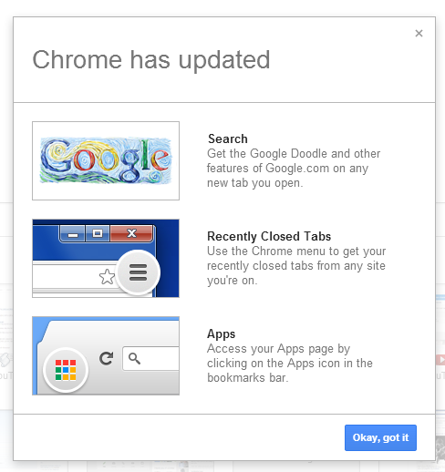
Chrome shows a new version of the welcome screen for the updated new tab page. Instead of "changes to the new tab page", you'll see "Chrome has updated". It looks like Google wanted to synchronize 4 important changes:

1. the new Google navigation interface
2. the updated new tab page
3. Chrome's app launcher
4. the new Chrome apps


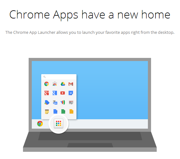
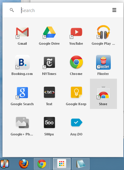
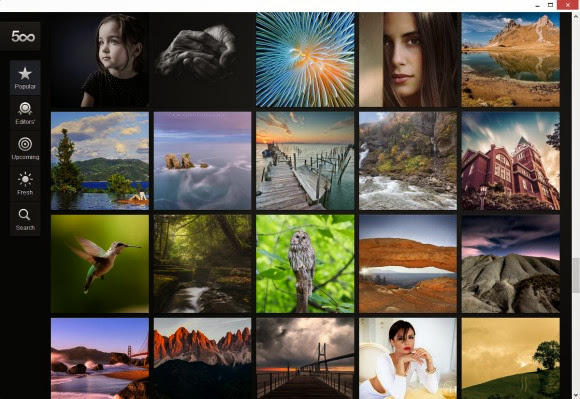
There's an interesting synergy that deserves some explanations. Google's new drop-down menu from the homepage and search results pages looks just like the app launcher, but it only links to Google apps and you can't customize it. Chrome's app launcher was first available in Chrome OS and it's now added to the regular version of Chrome. It includes the apps that were previously available in the new tab page, but it's optimized for a new breed of apps that work offline and look just like native apps. They can be launched from the operating system's taskbar, use APIs that integrate with the hardware, open links in a browser tab. Install any app from this page to enable the app launcher.


The old bookmark apps have a small arrow just like regular Windows shortcuts and open in a new Chrome tab, the new apps don't have the small arrow and open in a new chromeless window.

Chrome's new tab page has a different goal: teach people to use the omnibox (the unified address bar and search box). Many people type google.com and use the search box from Google's homepage to search the web. Google decided to replace the new tab page with a modified Google homepage that uses the omnibox instead of the regular search box. "While you can search straight from the omnibox in Chrome, we've found that many people still navigate to their search engine's home page to initiate a search instead. The goal is to save people time by helping them search and navigate the web faster," explained Google.


To sum up: the new Chrome apps are no longer bookmarks to websites and no longer open in Chrome tabs, so they're moved outside of the browser. There's a new bookmark called Apps that links to chrome://apps, where you can still find the old apps list. The updated new tab page is an educational feature that tries to simplify the search workflow for regular users.

Advanced users probably don't need it, so here are two ways to tweak the updated new tab page (Google might remove them in the future):

1. How to replace the updated new tab page with a local version that doesn't load Google's homepage and doesn't show doodles? Paste this in a new tab:

chrome://flags/#enable-local-only-instant-extended-api

and click "Enabled" in the drop-down below "Enable local-only Instant Extended API", then click the "Relaunch Now" button at the bottom of the page to restart the browser.

2. How to go back to the old new tab page? Paste this in a new tab:

chrome://flags/#enable-instant-extended-api

and click "Disabled" in the drop-down below "Enable Instant Extended API", then click the "Relaunch Now" button at the bottom of the page to restart the browser.

You can read between the lines and notice how Chrome adds more and more operating system features: it has its own apps, a "start menu" replacement, a notification system, a remote printing feature, support for multiple users and a guest mode.

September 24, 2013

Google Encrypted Search for Everyone

It started as an experiment in 2010, then Google encrypted searches for logged-in users, then Firefox, Chrome and Safari switched to Google SSL and now almost all Google search URLs use HTTPS.

"In the past month, Google quietly made a change aimed at encrypting all search activity — except for clicks on ads. Google says this has been done to provide 'extra protection' for searchers," reports Danny Sullivan.


For example, if you type google.com in your browser's address bar, you'll be redirected to https://www.google.com. "SSL encrypts the communication channel between Google and a searcher's computer. When search traffic is encrypted, it can't easily be decoded by third parties between a searcher's computer and Google's servers," informs Google.

Danny Sullivan speculates that this move may be aiming to block NSA spying activity, but I don't think that's the case. Google still logs all the search traffic and it can send that information to the authorities.

A major downside of switching to encrypted searches is that webmasters can no longer obtain a list of the Google search keywords that sent traffic to their sites without relying on Google services. Google Webmaster Tools includes a list of keywords, but this feature is limited and doesn't integrate with analytics software. There's an exception: ads. "Ad search traffic has never been made secure. No encryption stops people from eavesdropping on the terms used when someone searches at Google and clicks on an ad. Google's also never prevented this information from flowing directly to advertisers, in the way it has for non-advertisers," says Danny Sullivan.

Remotely Lock Android Devices

Android Device Manager now lets you lock your Android devices remotely, in addition to ringing devices and erasing data. It's a clever feature: click "Lock" and Google asks you to enter a new password for locking your device. No matter which screen lock feature you use, Google will switch it to "password" and lock your devices using the password you've entered.

This only works if your phone or tablet is online and you've checked "Allow remote lock and factory reset" in the Google Settings app that's installed by Google Play Services. If your device is offline, it'll be locked once it's back online.


It's interesting to see that Android Device Manager doesn't use Google Play branding and it's available at google.com/android/devicemanager. The service has a generic name which suggest that it could add other features not related to finding your phone. For example, it could let you backup your data online, manage your apps or check your notifications. Android Device Manager's codename is Google Nova, while the service name is "androidconsole".

{ via Android Police }

YouTube Comments Powered by Google+

Just like Blogger, YouTube will switch to Google+ comments, but it won't be optional. YouTube already asks users to connect their channels with Google+.

"When it comes to the conversations happening on YouTube, recent does not necessarily mean relevant. So, comments will soon become conversations that matter to you. In the coming months, comments from people you care about will rise up where you can see them, while new tools will help video creators moderate conversations for welcome and unwelcome voices. Starting this week, you'll see the new YouTube comments powered by Google+ on your channel discussion tab. This update will come to comments on all videos later this year, as we bring you more ways to connect with familiar faces on YouTube," informs the YouTube blog.

Here's a screenshot that shows the new commenting interface:


YouTube's comments are rarely insightful or useful. There's a lot of spam, trolling and hate speech. Switching from anonymous aliases to Google+ profiles might improve the quality of comments.

"You'll see posts at the top of the list from the video's creator, popular personalities, engaged discussions about the video, and people in your Google+ Circles. You can choose to start a conversation so that it is seen by everyone on YouTube and Google+, only people in your Circles or just your bestie. Like Gmail, replies are threaded so you can easily follow conversations. You have new tools to review comments before they're posted, block certain words or save time by auto-approving comments from certain fans. These can help you spend less time moderating, and more time sharing videos and connecting with your fans."

Blogger's commenting system powered by Google+ has been disappointing so far. Google doesn't offer comment moderation tools in the Blogger interface and Google doesn't do a good job at detecting spam or at ranking comments. There's a lot of noise and Google even shows a list of people who +1'd the post.

{ Thanks, Adrià. }

September 23, 2013

YouTube Fans

If you have a popular YouTube channels with more than 5,000 subscribers, you'll be able to find more about the people who love your videos. "The Fans page shows a list of some of your most engaged and most influential fans, based on their public interaction with your YouTube channel. By default, the list is sorted by a combination of subscriber count and engagement level, but you can also sort by either factor on its own," informs YouTube.


"For each person on the list, you can see how many subscribers they have, how engaged they are with your channel, an example comment they've left on one of your videos, and how long they've been a subscriber. Engagement is based on that person's public interactions with your channel, such as commenting, liking, subscribing, etc."

You can also create a Google+ circle for your top fans in the insights page. "See what other videos and channels they're into, and reach out via Google+ to ask a question, start a conversation, share behind-the-scenes photos, or upload a private video just for them."

{ Thanks, Stefan. }

Chrome to Gradually Drop Support for NPAPI Plug-ins

10 years ago, browsers were a lot less powerful and you had to install plug-ins to watch videos, play games, open PDF files. Applications like QuickTime, RealPlayer, Windows Media Player, Adobe Reader, Java installed plug-ins that added missing features. Now browsers can play audio files and video files without plug-ins, some of them include PDF viewers, many of them render interactive 3D graphics natively. NPAPI plug-ins are no longer that necessary, they have plenty of security issues and the NPAPI plug-in architecture from the Netscape era is now outdated.


Google addressed some of the NPAPI issues in Pepper and bundled a Pepper version of the Flash plug-in with Chrome. Pepper is also used by Native Client and the PDF viewer.

The next step: Chromium's blog announced that the NPAPI support will be gradually dropped next year. "NPAPI isn't supported on mobile devices, and Mozilla plans to block NPAPI plug-ins in December 2013. Based on anonymous Chrome usage data, we estimate that only six NPAPI plug-ins were used by more than 5% of users in the last month. (...) Starting in January 2014, Chrome will block webpage-instantiated NPAPI plug-ins by default on the Stable channel. To avoid disruption to users, we will temporarily whitelist the most popular NPAPI plug-ins that are not already blocked for security reasons:" Silverlight, Unity, Google Earth, Google Talk and Facebook Video. Java is already blocked by default for security reasons. "In the short term, end users and enterprise administrators will be able to whitelist specific plug-ins. Eventually, however, NPAPI support will be completely removed from Chrome. We expect this to happen before the end of 2014, but the exact timing will depend on usage and user feedback."

A simplified version of Google Earth is now available in the new Google Maps, while the Google Talk plug-in will no longer be necessary in Chrome when Google Hangouts switches to WebRTC. Silverlight is mainly used for streaming premium video by sites like Netflix, but the DRM support for HTML5 video will change this.

Some Chrome extensions include NPAPI plug-ins. Google will no longer accept new Chrome extensions with NPAPI plug-ins starting today and will unpublish these extensions from the Chrome Web Store in September 2014 if developers don't remove the NPAPI plug-ins.

"There are several alternatives to NPAPI. In cases where standard web technologies are not yet sufficient, developers and administrators can use NaCl, Apps, Native Messaging API, and Legacy Browser Support to transition from NPAPI. Moving forward, our goal is to evolve the standards-based web platform to cover the use cases once served by NPAPI," informs Google.

It will be interesting to see if Google will actually drop NPAPI support next year. There are still many sites that rely on plug-ins and some of them are no longer updated.

To see a list of the plug-ins you use in Chrome, open a new tab and paste chrome://plugins/ in the address bar. Click "Details" to see more information about them (including their type: NPAPI or PPAPI - Pepper). You can also disable plug-ins or check "always allowed".


You'll see at least 4 PPAPI (Pepper) plug-ins that are bundled with Chrome: Flash, PDF Viewer, Native Client and Chrome Remote Desktop Viewer. The list also includes a separate NPAPI version of the Flash plugin that's used by Firefox, Opera, Safari, a Google Update NPAPI plug-in and some other NPAPI plug-ins for software you've installed (Google Talk, Java, iTunes Application Detector, Picasa, Google Earth Plugin).

September 19, 2013

Free Quickoffice for Android and iOS

Google announced a new Quickoffice app for Android and iOS that's free and it's optimized for both phones and tablets. The previous paid Quickoffice apps are no longer available, but not all the features from the paid apps are included in the free app. The new Quickoffice application supports a single cloud storage provider (Google Drive) and it requires to log in using a Google account.


Google acquired Quickoffice because it did a better job at handling Microsoft Office files than Google Docs. This was especially important for Google Apps users. Google started to work on porting Quickoffice to Native Client and integrating the application with Chrome OS. Now the mobile apps are free.

There's some overlap between Quickoffice and Google Drive apps, so offering two apps for editing documents, spreadsheets and presentations may seem strange. Quickoffice is a basic office suite that works offline, it lets you create and edit Microsoft Office files and annotate PDFs. You can store these files in Google Drive or on your mobile device. Files uploaded by Quickoffice can't be edited by Google Drive apps without converting them. Google Drive doesn't let you create or edit files when you are offline.

I find the Drive editing interface more intuitive and easier to use, but Quickoffice offers more features. When you open a file in Google Drive for iOS, the application first needs to upload the file to Google Drive. If you try the same thing in Quickoffice, the application opens the file and lets you edit it. I hope that the two apps will merge at some point.

Even if you don't need Quickoffice, it's still a good idea to install the app: you'll get 10GB of free Drive storage for 2 years. "If you sign in to your Google Account from the new Quickoffice app for Android or iOS by September 26, 2013, for two years, an extra 10GB of Google Drive storage will be added to your account in the next few weeks." If you don't get the extra storage, remember that will be added "in the next few weeks".

Here are the download links:

* Quickoffice for Android (phones and tablets, Android 2.2+)
* Quickoffice for iOS (iPhone/iPad - requires iOS 6+)

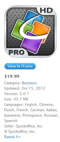
Those who paid for Quickoffice will probably be disappointed: no more updates for their apps, no iOS7 bug fixes. "Quickoffice Pro and Pro HD are not fully compatible with iOS 7 and some features may not work. After March 31, 2014, all cloud storage services will become unavailable on Quickoffice Pro and Quickoffice Pro HD," informs Google. Fortunately, "if you purchased Quickoffice Pro or Pro HD on or after June 17, 2013, you are eligible to receive 50GB of free Google Drive storage (with proof of purchase)."


(Quickoffice Pro and Quickoffice Pro HD used to cost $14.99 and $19.99. Pretty expensive, indeed.)

Google Wallet App for iPhone

When Google released a new version of the Wallet app for Android, it was clear that the features that were available to every Android device in the US didn't require NFC or carriers' approval. The new features are now available for iPhone users.

"The response from users has been great, and we want iOS users to enjoy all of the benefits too. So, today we're introducing the first Google Wallet app for iPhone (iOS v6.0+), which means even more people can easily send money to friends and store all of their loyalty cards and offers in one place," informs Google.


I assume that Google will try to move beyond NFC and find other ways to make Google Wallet useful and widely available. It's not enough to have a good product if most of the people can't use it. Somewhere between security issues, NFC's adoption, carriers' competing services, Google Wallet couldn't find a way to flourish.

Another thing that suggests that Google will move beyond NFC is the Bump acquisition. "Our mission at Bump has always been to build the simplest tools for sharing the information you care about with other people and devices," informed Bump's blog. Bump lets you share photos, videos, contacts without using NFC and it works on Android and iOS. Bump uses your Internet connection to share data with the people nearby.


{ Thanks, Michael. }

Google Tests New Interface for Music Video Results

Google tests a new interface for top search results, but only for music videos. The experimental interface adds a huge 480x360 thumbnail and shows the name of the artist, the album and the year when it was released.


Here's the regular version:


I think the thumbnail is way too big and the top result shouldn't dominate the entire page, especially when it comes to videos.

{ Thanks, Yvo. }

Try Google's New Logo and Navigation Menu

So many iOS developers had to change app icons and make them flat for iOS7. Flat is now fashionable, so you should expect to see some changes even if you don't use Apple's devices.

I've mentioned in a previous post that Google tests a new logo that's flat, minimalist and reduced to its essence, but someone from Google denied that this will replace the traditional logo. This is obviously not true: it's a Google experiment, the logo is hosted on Google's servers, the URL is very similar to the URL of the current Google logo and even Chrome starts to include it.


Here's how you can enable the new logo and the new navigation interface. If you use Chrome, Firefox, Opera or Internet Explorer 8+:

1. open google.com in a new tab

2. load your browser's developer console:

* Chrome or Opera 15+ - press Ctrl+Shift+J for Windows/Linux/ChromeOS or Command-Option-J for Mac

* Firefox - press Ctrl+Shift+K for Windows/Linux or Command-Option-K for Mac

* Opera 12 - press Ctrl+Shift+I for Windows/Linux or Command-Option-I for Mac, then click "Console"

* Internet Explorer - press F12 and select the "Console" tab.

3. paste the following code which changes a Google cookie:

document.cookie="PREF=ID=e66a207a51ceefd8:U=936bafc98b2a9121:FF=0:LD=en:NR=10:CR=2:TM=1378808351:LM=1379592992:SG=1:S=OXyq0fqClYB66VuV ; path=/; domain=google.com";window.location.reload();

4. press Enter and close the console.

To go back to the regular interface, use the same instructions, but replace the code from step 3 with this one:

document.cookie="PREF= ; path=/; domain=google.com";window.location.reload();

{ Thanks, André Zlatin. }

Google Rolls Out New Navigation Interface

After so many posts about Google's new navigation menu, it looks like this feature will roll out to everyone in the coming weeks. It's time to say goodbye to the black navigation bar, which didn't look that great, but it was always at the top of almost any Google service, so you could quickly navigate to other Google sites.

"We'll be rolling out this new feature in the next few weeks...stay tuned," says Justine Rivero, from Google. "The new design has been under testing for over half a year, with reports coming in as early as February 2013 regarding the new grid menu," informs Google+ Daily.


The new grid icon shows a list of 9 popular Google services (Google+, Web Search, YouTube, Maps, Play, News, Gmail, Drive, Calendar) and you can click "more" or scroll down to see 8 other services (Translate, Books, Offers, Wallet, Shopping, Blogger, Finance and Google+ Photos). The services that are missing: Google Image Search, Google Mobile and Google Video Search (they are available in the black navigation bar). The homepage only includes links to Gmail and Image Search next to the grid icon.


Here's the old navbar:


The new navigation menu looks just like the Chrome app launcher or the apps section of the Google Search app for iOS. It includes icons for each Google service, so that they look more like real apps.

For the first time, YouTube will have a Google navigation menu and the interface will be more consistent.

It will be interesting to see if the app launcher will be more successful than a similar interface launched in 2011 and removed after a few months. You had to click a small arrow next to the Google logo to see a huge menu that included a lot of Google services. The menu was hidden by default, so it wasn't easy to find (Google's homepage expanded it, but that didn't save the short-lived menu).


Update: here's how you can enable the new interface.

Update 2: Google's search blog announces the changes. "We're introducing an updated Google bar that streamlines your experience across products and devices. Your Google products are now accessible under a new app launcher, located at the top right of the screen. Just click on the familiar 'Apps' grid, also present on Android devices and Chromebooks. As part of this design, we've also refined the color palette and letter shapes of the Google logo. We'll be rolling out this update across most Google products over the next few weeks, so keep an eye out and let us know your thoughts."

{ via Google+ Daily }