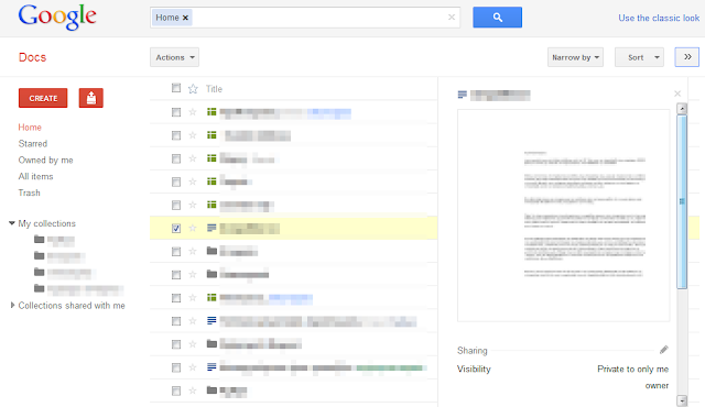
The new interface looks better, but there's a lot of white space that could be used to show more information about the files. The details view is no longer available from the interface, but you can enable it in the old UI and the setting is preserved.
{ Thanks, Petros. }

This and Gmail are the two redesigns I'm not so crazy about. I like the idea, and I'm all for improvement, but this is simply too much white space. When it comes to my inbox and my documents list, I want to see more at a glance, not less.
ReplyDeleteIn Documents settings, it is possible to use a "denser view", to show more documents in the list.
ReplyDeleteThe details view is no longer available from the interface, but you can enable it in the old UI and the setting is preserved.
What do you mean? It has always been there, "enabled". How do you get it to work in the new UI?
With the new design I see a half of my previous list. What's the point? The pervious design is more clear, more informative and looks better.
ReplyDeleteI have to agree. The whitespace is too much even if I'm using the denser view.
ReplyDeleteGmail's dense preview is quite sane now. But this new layout of docs, gosh, too much white space and too light texts. I'll stick to the classic view as long as possible.
ReplyDeleteI agree with Valery: The pervious design is more clear, more informative and looks better.
ReplyDeleteIt doesn't look too bad, but it suffers from the same problem as all of these - there just isn't enough CONTRAST! Light grey buttons and text on a white background makes the eyes strain, and like in Gmail (and all the others for that matter, but _especially_ in Gmail when messages are displayed) there just isn't enough differentiation between the UI and the content.
ReplyDeleteThe excessive whitespace goes without saying, but I really think the contrast issue needs to be getting flagged up more.
Also, a consistency thing - why on Maps, Plus and Gmail do the logos in the top left have the name of the service, while in Calendar, Docs and News the logo is just 'Google'? And of those, why does Calendar's have a white glow behind it, while none of the others do? There are other inconsistencies too - the scrollbars, the case of the letters in the Search The Web buttons, the style of the buttons (red text in News' 'Add a section'?)... in fact the longer I look at it, the more I realise that almost _none_ of the elements shared between the services are actually consistent, which I thought was the whole idea of the redesign? I far preferred the old look, but if they're going to unify them in a new way they could at least make it... unified!
Just my two pennies :)
Yes, this look much simpler. Since these are the initial screens expecting Google to come out with more useful info in the display.
ReplyDeleteAll my documents are in the Cloud (in my case, this is Google Docs; I bought extra space from Google).
ReplyDeleteI am using four levels of collections; there is not enough space to view the fourth level. I cannot move the vertical separator between the left navigation and the list of files.
see http://goo.gl/svl7l
I have to admit that I love the new uniform look they're going for across Google services--and I wish they'd implement it on Google Reader, which now looks like the Dead Sea Scrolls.
ReplyDeleteMy only problem visually is that I can hardly see the highlight when selecting something, whether in the index view or inside a document.
Anyone know of a script or extension that will create a better contrast / visibility here?
hmm... don't like.. Why there isn't a possibilty to sort documents by date created ...
ReplyDeleteSomething I really hope the Docs team fixes before the official launch is the preview pane. I want it to either appear automatically, at the right time (e.g., I select a document - like in the old UI), or maybe when I have a file highlighted (as in I'm hovered over it, using keyboard shortcuts) and I press d.
ReplyDeleteTwo more thoughts:
1. I love finally having some keyboard shortcuts.
2. I wish the preview pane picture would look less like it was taken from 50,000 ft -- both in the old and new UI.
Hopefully we've got the denser view. There's too much white spaces in the default one.
ReplyDeleteI can't wait for the new interface of READER. Its looks so ugly right now...
you see....millions of different users....with millions of different tastes. That will never ever change. So yeachh..keep on whining. Let's make Google crazy which tons of different lay-outs requests and different densities you wish. They only can pick one in the end though. hahaha.
ReplyDeleteI think they need to clearly label the upload button "upload".
ReplyDelete+Anon from August 5, 2011 5:49 AM (two comments ago).
ReplyDeleteThe Docs team specifically said, "make sure to tell us what you think about the new design in this brief feedback form so we can continue to improve your experience."
Yes, in the end, there will be one interface to rule them all. On the other hand, constructive feedback (as opposed to whining) may help form a refined UI experience more of us will enjoy.
I really hate this trend at Google towards wasting my screen space. It seems really obnoxious of them to do this to us.
ReplyDelete+Tom. I can definitely see your point. On the other hand, I'm confident Google's appealing to mobile, tablet, and smaller screen PCs.
ReplyDeleteI think Google is optimizing the interface for tablets, in the end they would probably use one interface for both desktop and tablets. Remember, tablets have higher pixels per inch (ppi) - so less white space would be there, also you need larger separation between text / buttons to use them by thumb or fingers.
ReplyDeleteHi everyone! Yes, we're listening to your feedback through various channels, including blog posts like these. But the best way to ensure that your feedback has an impact is to fill out this feedback form, linked to from the blog post:
ReplyDeletehttp://www.google.com/support/bin/request.py?hl=en&contact_type=surveyk&ctx=go
Thanks all,
Teresa Wu
Google Docs Community Manager
Sure... because double-spacing everything makes it look "better". Is that the "tastes great, less filling" approach to interfaces? (looks "better", less useful) As Google+ approaches I'm finding alternatives to using Google stuff.
ReplyDeletedefinitely see your point.
ReplyDeleteI too think there is way to much white space. How about letting us set the font size and the spacing and store it once for each device we own.
ReplyDeleteI like the consistency Google is doing but I am not a fan of the lack of contrast. The new colors strain my eyes when compared to the old theme.
ReplyDeleteI like the clean look they are going after but there is just too much white.
Thanks for great sharing about this article,Great review,pretty to reading this article,I like very much this article,this type of posting are very interested for me.great and marvelous discussion this .
ReplyDeleteblog hosting review
i don't like the fonts used in the new interface and space is also not justified in interface. Looks like a rookie's webpage. Needs some renovation.
ReplyDeleteHi,
ReplyDeleteas Ian mentionned, the new interface strain my eyes due to the low contrast. Plus I do not like it. Can somebody tell me how to roll back to the old version?
Thank you!
A.
Hi again,
ReplyDeletesorry for the double posting, I found it myself.
The way to roll back the new layout of google documents is under the "help" tab. You can switch between both layouts actually.
Cheers
/a