This month Google didn't release its presentation tool, didn't launch any new version for Google Talk and JotSpot is still outside Google Apps. But what did Google do in August?
Mapping
Google launched a new version of Google Earth that lets you explore the sky and also includes a "hidden" flight simulator. Google Maps made it easier to embed maps into your site without knowing JavaScript. Four new cities from the US were added to Google Street View.
Communication
Gmail added the option to pay for more storage and started to share this additional storage with Picasa Web Albums. Gmail is now the top webmail service with the least amount of free storage. orkut suffered a small redesign and it's not ugly anymore.
Search
Google News had a lot of updates this month: the addition of comments from persons involved in a story, videos hosted by YouTube and articles from news agencies like AP that will be hosted by Google. Google indexes web pages faster than ever and gives more options to find fresh web pages.
Video
Google Video closes the video store and concentrates on advertising-supported solutions. YouTube experiments with overlay video ads for premium content.
This month we also found out that the internationalization of Google search has interesting side-effects, Google Browser is already here, Google Docs has a lot of interesting uses and organizing data is a difficult task.
Tip of the month: use Google Reader to power your blogroll.
August 31, 2007
Google Earth Easter Egg: Flight Simulator
Apparently, the latest version of Google Earth has an easter egg: a flight simulator. It's not quite like Microsoft Flight Simulator, but it's a promising start.
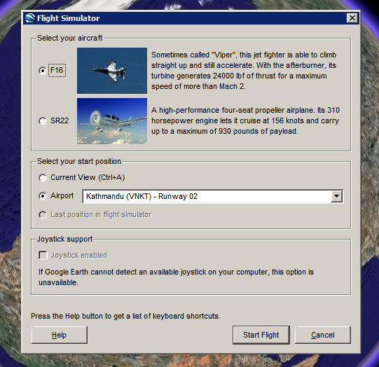
How to see this feature. Make sure you have Google Earth 4.2. Open the application, click on the globe and then press Ctrl+Alt+A. You should see this dialog that lets you choose one of the two aircrafts (F16 "Viper" and SR22) and an airport.
Here's the initial view from London Heathrow Airport:

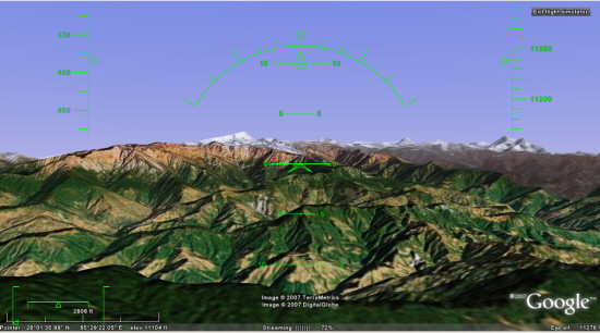
... and here's a nice view from Kathmandu:
To fly, you need to read this list of keyboard shortcuts, but you can also use a mouse or a joystick. "To disable or enable mouse controls, left click (single click on a Mac). Once mouse controls are active, the pointer shape changes to a cross on your screen."
Marco Gallotta, who found this feature, has some tricks: "Moving on though, you can get a quick start by holding Page Up for a few seconds to increase to maximum thrust (thrust meter is the left bar of the lower-left meters). Once you've accelerated to a sufficient velocity use the arrow keys to take-off. The keys are in reverse as one would expect with any flight simulator, so use the down arrow to take-off. When you've gained enough altitude then stabalise the aircraft to a straight flight path. It can be rather tricky to get the hang of as the controls are quite sensitive."
This easter egg could become a standard feature in the next versions of Google Earth and it will bring even more fun to the application.
How to see this feature. Make sure you have Google Earth 4.2. Open the application, click on the globe and then press Ctrl+Alt+A. You should see this dialog that lets you choose one of the two aircrafts (F16 "Viper" and SR22) and an airport.

Here's the initial view from London Heathrow Airport:

... and here's a nice view from Kathmandu:

To fly, you need to read this list of keyboard shortcuts, but you can also use a mouse or a joystick. "To disable or enable mouse controls, left click (single click on a Mac). Once mouse controls are active, the pointer shape changes to a cross on your screen."
Marco Gallotta, who found this feature, has some tricks: "Moving on though, you can get a quick start by holding Page Up for a few seconds to increase to maximum thrust (thrust meter is the left bar of the lower-left meters). Once you've accelerated to a sufficient velocity use the arrow keys to take-off. The keys are in reverse as one would expect with any flight simulator, so use the down arrow to take-off. When you've gained enough altitude then stabalise the aircraft to a straight flight path. It can be rather tricky to get the hang of as the controls are quite sensitive."
This easter egg could become a standard feature in the next versions of Google Earth and it will bring even more fun to the application.
Google News Starts to Host Content
Adding comments and videos hosted by YouTube were a clear signal that Google News starts to become more aggressive and wants to go beyond the comfortable status of being a news aggregator.

As a results of its partnerships with important news agencies like AFP and Associated Press, Google News will host original content from these sources.
"Our goal has always been to offer users as many different perspectives on a story from as many different sources as possible, which is why we include thousands of sources from around the world in Google News. However, if many of those stories are actually the exact same article, it can end up burying those different perspectives. (...) By removing duplicate articles from our results, we'll be able to surface even more stories and viewpoints from journalists and publishers from around the world. (...) Because the Associated Press, Agence France-Presse, UK Press Association and the Canadian Press don't have a consumer website where they publish their content, they have not been able to benefit from the traffic that Google News drives to other publishers. As a result, we're hosting it on Google News," explains the Google News Blog.
It's unclear whether Google will monetize the hosted content or will add new features that let users interact with news. What's clear is that today is a turning point for Google News that could bring more users and less friends from the press.
Google News was created as a tool that clusters related stories so you can read different perspectives on the same event. Unlike Yahoo News, Google News doesn't have editors: the homepage and all the other sections are generated algorithmically. Until this month, the site didn't host original content, so you could only find headlines, snippets and thumbnails from articles. To read the entire article, you had to go to a different site. Google was sued by many news organizations, including AFP, for copyright infringement and some of them won.
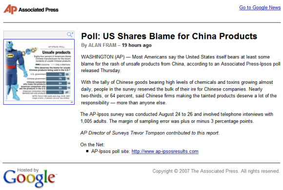
Example of article hosted by Google News:
Related:
The history of Google News

(source: Hitwise. The market share for news & media sites, based on US Internet usage for the the week ending August 25, 2007)
As a results of its partnerships with important news agencies like AFP and Associated Press, Google News will host original content from these sources.
"Our goal has always been to offer users as many different perspectives on a story from as many different sources as possible, which is why we include thousands of sources from around the world in Google News. However, if many of those stories are actually the exact same article, it can end up burying those different perspectives. (...) By removing duplicate articles from our results, we'll be able to surface even more stories and viewpoints from journalists and publishers from around the world. (...) Because the Associated Press, Agence France-Presse, UK Press Association and the Canadian Press don't have a consumer website where they publish their content, they have not been able to benefit from the traffic that Google News drives to other publishers. As a result, we're hosting it on Google News," explains the Google News Blog.
It's unclear whether Google will monetize the hosted content or will add new features that let users interact with news. What's clear is that today is a turning point for Google News that could bring more users and less friends from the press.
Google News was created as a tool that clusters related stories so you can read different perspectives on the same event. Unlike Yahoo News, Google News doesn't have editors: the homepage and all the other sections are generated algorithmically. Until this month, the site didn't host original content, so you could only find headlines, snippets and thumbnails from articles. To read the entire article, you had to go to a different site. Google was sued by many news organizations, including AFP, for copyright infringement and some of them won.
Example of article hosted by Google News:

Related:
The history of Google News
Google as a Bank
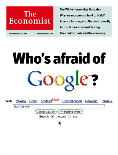
 The Economist compares Google with a bank that stores and manages a lot of information (some of it, personal information).
"Google is often compared to Microsoft (another enemy, incidentally); but its evolution is actually closer to that of the banking industry. Just as financial institutions grew to become repositories of people's money, and thus guardians of private information about their finances, Google is now turning into a custodian of a far wider and more intimate range of information about individuals. Yes, this applies also to rivals such as Yahoo! and Microsoft. But Google, through the sheer speed with which it accumulates the treasure of information, will be the one to test the limits of what society can tolerate." (my emphasis)
As with any bank, you need to trust it, to make sure it has transparent policies, that it serves your interests and it doesn't have "hidden costs". Your ISP, your doctor, your employee, your bank - all have a lot of personal information about you and some of it could migrate to online services like Google Health, Google Checkout, Google Web History or Google Web Accelerator. The worst thing that can happen to Google is losing the trust of its users, so Google has another incentive to not betray peoples, besides the mythical "Don't be evil" corporate motto.
The Economist thinks that Google should find the right balance between users' privacy and storing personal data indefinitely. Google already does a good job at explaining the consequences of your actions and how could some options affect your privacy, but it would be nice to expand the Web History to a big personal center that shows all the information Google has about you and provides ways to remove or export some of the information.
"Google in effect controls a dial that, as it sells ever more services to you, could move in two directions. Set to one side, Google could voluntarily destroy very quickly any user data that it collects. That would assure privacy, but it would limit Google's profits from selling to advertisers information about what you are doing, and make those services less useful. If the dial is set to the other side and Google hangs on to the information, the services will be more useful, but some dreadful intrusions into privacy could occur. The answer, as with banks in the past, must lie somewhere in the middle; and the right point for the dial is likely to change, as circumstances change."
{ The second photo illustration: "At last!", licensed as Creative Commons. }
Related:
Google as a personal assistant
Google, Behind the Screen (documentary)
Embed Multiple Google Calendars
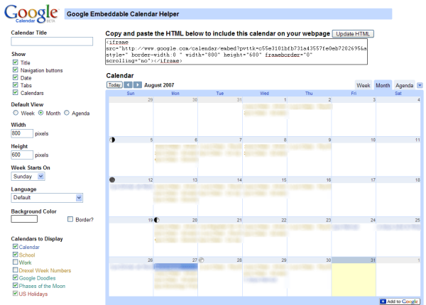
Google Calendar will improve the feature that lets you embed calendars in a site, by adding the option to include multiple calendars, giving you more control regarding the display and the size and adding a week view.
You can embed a calendar by clicking on the small arrow next to its name in the left sidebar, selecting "Calendar settings" and then clicking on the blue "HTML" button. A configuration tool will generate the code.
Google slowly rolls out this update, so you may still see the old version that lets you embed only a single calendar at a time.
{ Thank you, Nick Chirchirillo. }
Update (Sept. 6): the feature is live.
You can embed a calendar by clicking on the small arrow next to its name in the left sidebar, selecting "Calendar settings" and then clicking on the blue "HTML" button. A configuration tool will generate the code.
Google slowly rolls out this update, so you may still see the old version that lets you embed only a single calendar at a time.

{ Thank you, Nick Chirchirillo. }
Update (Sept. 6): the feature is live.
August 30, 2007
Easy Way to Find Recent Web Pages
Now that Google indexes pages extremely fast and saves the date of the first indexing, it would be nice to have more options for restricting search results to a date range. Google only provided three options in the advanced search: see all the pages last updated in the past 3, 6 or 12 months and a difficult-to-use operator (daterange).
The advanced search page has been updated and it shows four more options: find the web pages first indexed in the past day, week, month or in the past 2 months.
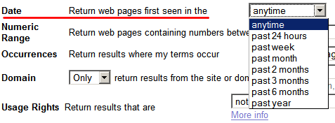
If you remove all the uninteresting parameters from the search URL, you'll find that as_qdr is responsible for date restrictions. For example, here's how to restrict a search for [China] to pages first seen by Google's crawler in the past 24 hours:
http://www.google.com/search?q=china&as_qdr=d
Note that you'll only find new web pages and not pages that were updated in the past 24 hours. That means you won't find homepages from popular sites or other frequently-updated pages. If the date range is small, you'll mostly find news and blog posts.
The nice thing is that you can change the value of as_qdr to custom intervals. Here are all the possible values of the as_qdr parameter:
d[number] - past number of days (e.g.: d10)
w[number] - past number of weeks
y[number] - past number of years
For example, http://www.google.com/search?q=china&as_qdr=d10 lets you search for pages that contain "China" and were created in the past 10 days.
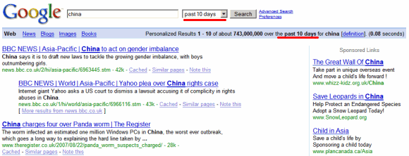
A finer control (hours) and an option to sort the results by date would make this feature almost perfect.
The advanced search page has been updated and it shows four more options: find the web pages first indexed in the past day, week, month or in the past 2 months.

If you remove all the uninteresting parameters from the search URL, you'll find that as_qdr is responsible for date restrictions. For example, here's how to restrict a search for [China] to pages first seen by Google's crawler in the past 24 hours:
http://www.google.com/search?q=china&as_qdr=d
Note that you'll only find new web pages and not pages that were updated in the past 24 hours. That means you won't find homepages from popular sites or other frequently-updated pages. If the date range is small, you'll mostly find news and blog posts.
The nice thing is that you can change the value of as_qdr to custom intervals. Here are all the possible values of the as_qdr parameter:
d[number] - past number of days (e.g.: d10)
w[number] - past number of weeks
y[number] - past number of years
For example, http://www.google.com/search?q=china&as_qdr=d10 lets you search for pages that contain "China" and were created in the past 10 days.

A finer control (hours) and an option to sort the results by date would make this feature almost perfect.
Google Gadgets that Talk to Each Other
You could say that widgets (or gadgets, as Google likes to call them) are small applications that bring together a lot of information relevant to you. Now what if these gadgets would communicate with each other by sending small messages? PubSub is a new beta feature available at iGoogle. You won't find too many gadgets that use this feature, at least for now.
"PubSub allows multiple gadgets on the same page to send and receive data from each other. In other words, you can now build a gadget that communicates back and forth with one another. This introduces a brand new concept and strategy involved when writing gadgets. Information is no longer constrained to fit inside a single gadget. Instead, you can now split up various pieces of information amongst multiple gadgets and allow them to communicate with each other to paint a bigger picture. Gadgets now have the ability to be more closely integrated with one another and present a network of information to users."
This works if you add at least two gadgets, so it makes sense to create an entire tab with interactive gadgets (here's a sample tab). For example, you could have a gadget that includes a search box and other gadgets that show search results from different sources. Or another gadget could collect events (new email, new event, breaking news) and cleverly organize them based on your preferences.
"PubSub is a new framework which allows 'publisher' gadgets on iGoogle to communicate changes to 'subscriber' gadgets that have declared interest in those changes. This is currently available only on iGoogle and publisher/subscriber gadgets must be on the same page."
If you intend to write gadgets that use this new feature, read the documentation. How would you this framework?
Two Ways to Watch the Same YouTube Video
It's very interesting to see the differences between two (almost) identical videos available on YouTube. The first one was uploaded by Universal Music, the owner of the distribution rights, and is displayed using a new YouTube player in the new interface, available as an option for most other videos. Next to the video there's an AdSense banner and the video can't be embedded ("embedding disabled by request).
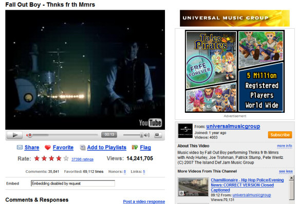
The second video was uploaded by a normal YouTube user, is displayed using the old player, the new interface is an option, there's no ad next to the video and you're able to embed the video into your site.
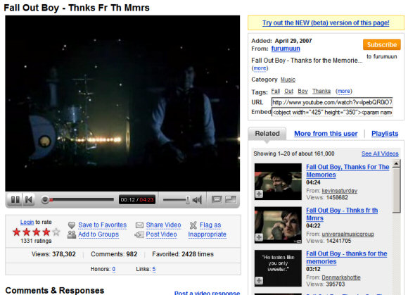
The first video has more than 14 million views, while the second one only has 378,000. I'll leave the comments to you.

The second video was uploaded by a normal YouTube user, is displayed using the old player, the new interface is an option, there's no ad next to the video and you're able to embed the video into your site.

The first video has more than 14 million views, while the second one only has 378,000. I'll leave the comments to you.
New Context Menus in Google Docs
Google Docs added context menus to the document manager. Now you can right-click on a file or anywhere else inside the application and choose one of the appropriate actions. The new menu has an artificial look and is extremely long if you right-click on a document. Maybe Google Docs will add other views that allow easier selection of multiple documents.
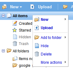
Menu #1: right-click anywhere inside the application. The menu duplicates the existing toolbar.
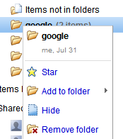
Menu #2: a special case is the menu for folders, which erroneously includes the option "Add to folder".
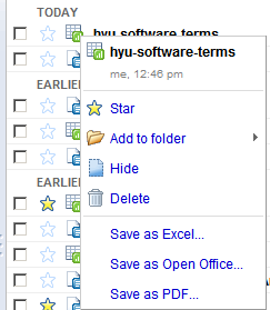
Menu #3: right-click on a file. The menu shows all the actions corresponding to the type of file you selected. The only options left out are: new file/folder and upload.
If you use Firefox and see the standard context menu, go to Tools/Options, select the Content tab, click on the Advanced button next to the JavaScript option and check "(Allow scripts to) disable or replace context menus".
Among the new features that should be included in the next versions are: table of contents, integration of Webster Dictionary and Encyclopedia Britannica, the option to search the web for selected text and exporting documents as MP3 using text-to-speech technology.
Menu #1: right-click anywhere inside the application. The menu duplicates the existing toolbar.

Menu #2: a special case is the menu for folders, which erroneously includes the option "Add to folder".

Menu #3: right-click on a file. The menu shows all the actions corresponding to the type of file you selected. The only options left out are: new file/folder and upload.

If you use Firefox and see the standard context menu, go to Tools/Options, select the Content tab, click on the Advanced button next to the JavaScript option and check "(Allow scripts to) disable or replace context menus".
Among the new features that should be included in the next versions are: table of contents, integration of Webster Dictionary and Encyclopedia Britannica, the option to search the web for selected text and exporting documents as MP3 using text-to-speech technology.
August 29, 2007
The Quality of Google Book Search

Paul Duguid wrote an interesting article about Google Book Search in which he analyzed the quality of the indexed editions and the search results by doing a search for Lawrence Sterne's "Tristram Shandy", a novel from the 18th century. Mr. Duguid noticed that the Harvard edition of the book had many quality problems and some text wasn't scanned properly. Google Book Search doesn't distinguish between the volumes of a book, so it's difficult to realize that the Stanford edition is actually the second volume of the book.
Google may or may not be sucking the air out of other digitization projects, but like Project Gutenberg before, it is certainly sucking better–forgotten versions of classic texts from justified oblivion and presenting them as the first choice to readers. (...) The Google Books Project is no doubt an important, in many ways invaluable, project. It is also, on the brief evidence given here, a highly problematic one. Relying on the power of its search tools, Google has ignored elemental metadata, such as volume numbers. The quality of its scanning (and so we may presume its searching) is at times completely inadequate. The editions offered (by search or by sale) are, at best, regrettable. Curiously, this suggests to me that it may be Google's technicians, and not librarians, who are the great romanticisers of the book. Google Books takes books as a storehouse of wisdom to be opened up with new tools. They fail to see what librarians know: books can be obtuse, obdurate, even obnoxious things. As a group, they don't submit equally to a standard shelf, a standard scanner, or a standard ontology.
Patrick Leary, the author of the article Googling the Victorians (PDF), has a pragmatical response, as seen on O'Reilly Radar:
Mass digitization is all about trade-offs. All mass digitizing programs compromise textual accuracy and bibliographical meta-data so that they can afford to include many more texts at a reasonable cost in money and time. All texts in mass digitization collections are corrupt to some degree. Everything else being equal, the more limited the number of texts included in a digital collection, the more care can be lavished on each text. Assessing the balance of value involved in this trade-off, I think, is one of the main places where we part company. You conclude, on the basis of your inspection of these two volumes, that the corruption of texts like Tristram Shandy makes Google Books a "highly problematic" way of getting at the meanings of the books it includes. By contrast, while acknowledging how unfortunate are some of the problems you mention, I believe that the sheer scale of the project and the power of its search function together far outweigh these "problematic" elements.
When scanning and indexing millions of books, it's difficult to assess the quality of each edition. Google Book Search's main goal is to let you discover books you can borrow or buy later on. But Google could add an option to rate the quality of each digitized book or build algorithms that detect flaws or differences between editions. So the next time you do a search for Tristram Shandy, all the editions are clustered and the best one comes up first.
Internationalization and Google Search Results
Google has always tried to be accessible: the search interface is available in more than 100 languages, the results are modified based on your location, the interface is simple and universally accessible.
If you don't live in the United States, you noticed that google.com automatically redirects to your local domain, that shows messages in your language and custom-tailored results for your location. This is especially noticeable if you live in a country that doesn't have an important Internet presence and you see unimportant pages getting high rankings just because they happen to be written in your language.
Monomo Blog compares two local versions: the British Google and the German Google and notices important differences:
"Let’s say you search for something technical, like a certain Javascript Library - the pattern that the German portal displays more sites in German persists - but from a quality point of view the differences can be stark (the number of German speaking sites against English speaking ones surprisingly matters!). It seems that the priority of the guessed native language, overrules other aspects like relevance in quite a dramatic fashion. It is quite possible that you’ll never find a particular reference on the German Portal which features on the first result page on the British portal."
Google offers options to translate search results in your language, but only for a small number of languages. The cross-language search interface, which lets you search web pages written in foreign languages, is still an experiment. But until Google manages to translate all the web pages to a universal language and let you find any information available on the web, regardless of the language it was written in, Google could at least ask you the languages you know or you are comfortable with.
Meanwhile, if you want to use the standard version of Google, click on "Google.com in English" at the bottom of any Google homepage or type google.com/ncr in your address bar. Google's cookie will save your preference, so the next time you go to google.com you won't be redirected to the local version. Google also offers the option to search for web pages written in a certain language or from a certain country (advanced search) and you can see the search results from another location by adding the gl parameter to the URL (for example: http://google.com/search?q=bank&gl=us shows the results from the US).
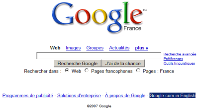
I don't use Google's localized versions because they're often not in sync with the original version, the translation is not very good and sometimes difficult to understand, the product is not fully localized (the help center is still in English) and the overall quality is significantly inferior. But in the case of search results, you also miss important information and find more spammy or irrelevant search results.
Monomo also thinks about the cultural implications:
"Now of course there is a whole bunch of well meant arguments which make the case for regionally optimised search results, but what are the implications? Surely if a whole culture or an language area (...) are constantly servedfairly reduced differing information by the quasi monopolist, the knowledge base of that area will start to differ."
So even if it's important to tailor some search results to the user's location, language or interests, that doesn't mean you should sacrifice the quality of the results and lower user's expectations.
If you don't live in the United States, you noticed that google.com automatically redirects to your local domain, that shows messages in your language and custom-tailored results for your location. This is especially noticeable if you live in a country that doesn't have an important Internet presence and you see unimportant pages getting high rankings just because they happen to be written in your language.
Monomo Blog compares two local versions: the British Google and the German Google and notices important differences:
"Let’s say you search for something technical, like a certain Javascript Library - the pattern that the German portal displays more sites in German persists - but from a quality point of view the differences can be stark (the number of German speaking sites against English speaking ones surprisingly matters!). It seems that the priority of the guessed native language, overrules other aspects like relevance in quite a dramatic fashion. It is quite possible that you’ll never find a particular reference on the German Portal which features on the first result page on the British portal."
Google offers options to translate search results in your language, but only for a small number of languages. The cross-language search interface, which lets you search web pages written in foreign languages, is still an experiment. But until Google manages to translate all the web pages to a universal language and let you find any information available on the web, regardless of the language it was written in, Google could at least ask you the languages you know or you are comfortable with.
Meanwhile, if you want to use the standard version of Google, click on "Google.com in English" at the bottom of any Google homepage or type google.com/ncr in your address bar. Google's cookie will save your preference, so the next time you go to google.com you won't be redirected to the local version. Google also offers the option to search for web pages written in a certain language or from a certain country (advanced search) and you can see the search results from another location by adding the gl parameter to the URL (for example: http://google.com/search?q=bank&gl=us shows the results from the US).

I don't use Google's localized versions because they're often not in sync with the original version, the translation is not very good and sometimes difficult to understand, the product is not fully localized (the help center is still in English) and the overall quality is significantly inferior. But in the case of search results, you also miss important information and find more spammy or irrelevant search results.
Monomo also thinks about the cultural implications:
"Now of course there is a whole bunch of well meant arguments which make the case for regionally optimised search results, but what are the implications? Surely if a whole culture or an language area (...) are constantly served
So even if it's important to tailor some search results to the user's location, language or interests, that doesn't mean you should sacrifice the quality of the results and lower user's expectations.
YouTube Launches New API
YouTube migrated its API from REST/XML-RPC to Google Data so you can use the same package for accessing different Google services. The new API provides read-only access to user profiles, videos uploaded or bookmarked by a user, subscriptions, video comments, related videos, playlists, search results. And because the default output is Atom feeds, you can use the API to subscribe to a lot interesting data. Here are some examples of feeds that help you track a user's activity:
http://gdata.youtube.com/feeds/users/username/uploads - videos uploaded by username
http://gdata.youtube.com/feeds/users/username/favorites - videos bookmarked by username
http://gdata.youtube.com/feeds/users/username/playlists - playlists created by username
http://gdata.youtube.com/feeds/users/username/subscriptions - username's subscriptions
Some useful parameters for the feeds:
?max-results=50: the maximum number of items from a feed (by default, a feed includes only 25 items).
?alt=rss or ?alt=json: change the output format to RSS feeds or to JavaScript code (JSON) that can be easily used from web applications.
?vq=query: use this parameter to create a filter for a feed. Obtain only the videos that contain your query in the metadata (title, tags, description).
?orderby={updated, viewCount, rating, relevance}: sort the items from feed by upload date, number of views, rating or relevance.
Example of a feed:
http://gdata.youtube.com/feeds/users/google/uploads?
vq="google+maps"&orderby=viewCount (the videos about Google Maps uploaded by Google, sorted by popularity)
These feeds can also be used in applications like Miro to export your videos from YouTube.
{via YouTube API Blog}
FlashEarth Comes to Google Earth
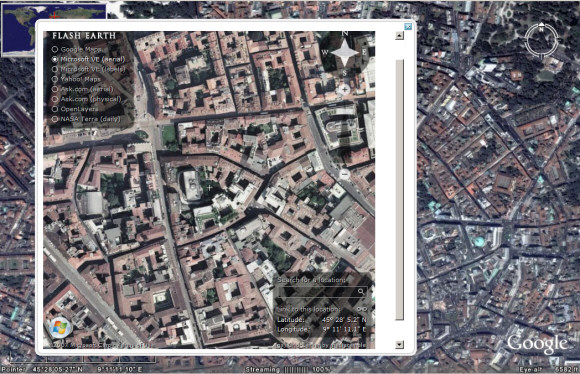
You've probably heard about FlashEarth, the site that lets you compare the satellite imagery offered by Google Maps, Yahoo Maps, Microsoft Virtual Earth, Ask.com and more. Now you can use FlashEarth directly from Google Earth thanks to a layer created by Barry Hunter. "As you move around the globe a little white arrow follows you around, simple click it to get an approximation of the current view in FlashEarth in a popup balloon."
This could be useful if Google Earth doesn't have a very good coverage of a certain area or you just want to see the same image from a different perspective.
This could be useful if Google Earth doesn't have a very good coverage of a certain area or you just want to see the same image from a different perspective.

August 28, 2007
Gmail's Collaborative Video
The wait is over. Google launched an interesting challenge last month: "Help us imagine how an email message travels around the world."
"A few of us on the Gmail team came up with an idea to stitch together a bunch of video clips that all share one element: someone hands the Gmail M-velope in from the left of the screen, and hands it off to the right. Put them all together, and they form one long chain of hand-offs," detailed the Gmail Blog. The number of responses was impressive: more than 1,000 videos that included Gmail's M-velope logo. Google selected some of the best videos, edited them and created a final video that showcases some of the most important values behind Gmail: creativity, collaboration and fun.
"A few of us on the Gmail team came up with an idea to stitch together a bunch of video clips that all share one element: someone hands the Gmail M-velope in from the left of the screen, and hands it off to the right. Put them all together, and they form one long chain of hand-offs," detailed the Gmail Blog. The number of responses was impressive: more than 1,000 videos that included Gmail's M-velope logo. Google selected some of the best videos, edited them and created a final video that showcases some of the most important values behind Gmail: creativity, collaboration and fun.
Connect to Google Talk on Your Mobile Phone
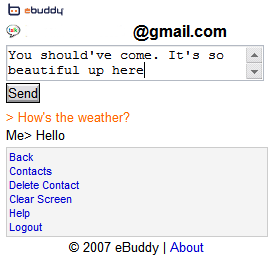
Until Google Talk releases a mobile version (or anything else), there's a simple way to chat with your friends from the mobile phone. eBuddy, an all-in-one web messenger similar to meebo, has recently started to support Google Talk. eBuddy has a mobile version available at m.ebuddy.com that can be used to chat with your contacts from Yahoo, MSN, AOL, Google and MySpace.
The interface is very simple, but it's optimized for the small mobile screens by displaying the messages in the reverse order. The web page refreshes every 20 seconds to automatically display the new messages.
While eBuddy promises it doesn't store your usernames and passwords, you should only use the service if you think it's trustworthy. There are many other ways to access Google Talk on your mobile phone, but this one doesn't require to install an application. iPhone users should rejoice.

August 27, 2007
Google Facebook App
Google made a lovely app for Facebook that lets you search the web and share the results with your friends. Your queries are automatically included in Facebook's mini-feed, so your web history can be shared with your friends. There's also a page that showcases popular results found by other Facebook users.
The application has been created using Google's AJAX Search API, the only search API still supported by Google.
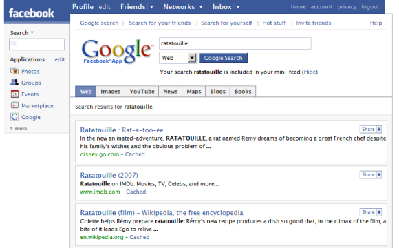
At the moment, Google only uses your web history to personalize search results. Maybe in the future you'll be able to share some parts of your logs with your friends (for example, your bookmarks) and obtain better search results by using information from the profiles of your contacts. Yahoo tried to do this with MyWeb 2.0, but failed.
The application has been created using Google's AJAX Search API, the only search API still supported by Google.

At the moment, Google only uses your web history to personalize search results. Maybe in the future you'll be able to share some parts of your logs with your friends (for example, your bookmarks) and obtain better search results by using information from the profiles of your contacts. Yahoo tried to do this with MyWeb 2.0, but failed.
With the release of MyWeb 2.0, Yahoo has added an extensive array of new features focused on community-based searching and sharing of information. "It basically enables people to tap into each other's personal web by searching their trust network of friends," said Eckart Walther, vice president, product management, Yahoo. (...)
Yahoo has also developed a new relevance algorithm called "MyRank" for MyWeb 2.0. "It's a new search engine that we wrote that can search across thousands of nodes and millions of pages in a trust network," said Walther. Unlike PageRank and other link analysis techniques used by general-purpose search engines, MyRank is designed to ferret out clues to relevance based on the pages you and your community have saved to MyWeb 2.0.
Find This Place in Google Maps
PlaceSpotting is a site that lets you create and solve riddles using Google Maps. Your task is to find a certain location on the map with the help of a satellite image and some hints. The problem is that you can only drag and zoom the map, there's no search box that lets you enter the name of a country or an address. Fortunately, you don't need to find the exact location: the latitude and longitude can be partial matches.
If you have no idea how to solve the riddle, the copyright information from the satellite image is sometimes pretty useful. For example, in the screenshot below one of the companies that provided the imagery is Dütschler, from Switzerland. You can also use the information from the three hints to find the city. The source code of the page also contains some interesting data from Google Maps API, but that's usually called cheating.
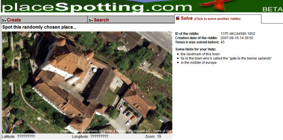
If you have no idea how to solve the riddle, the copyright information from the satellite image is sometimes pretty useful. For example, in the screenshot below one of the companies that provided the imagery is Dütschler, from Switzerland. You can also use the information from the three hints to find the city. The source code of the page also contains some interesting data from Google Maps API, but that's usually called cheating.

Bloglines Upgrades to Stay in the Game
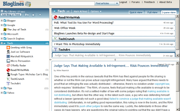
Bloglines, still a popular web-based feed reader, launched a beta version that puts it in line with more recent applications like Google Reader. If Google's feed reader was heavily inspired by Bloglines, it's time for Bloglines to add some features from Google Reader.
The most important change is that Bloglines doesn't use the old-fashioned frames and loads new data using AJAX. Bloglines offers three views:
* quick view (similar to Google Reader's list view) that only shows the titles
* full view (corresponding to Google Reader's expanded view) which also displays the content of the feed posts. Unlike the old version of Bloglines, the posts are marked as read only if you scroll down to read them.
* 3-pane view (screenshot above). This is similar to the way desktop email clients like Outlook or Thunderbird display mail, but it doesn't provide a good experience if you read long posts.
The quick view brings an interesting idea: grouping the feeds from a folder and automatically creating pages like the ones from iGoogle, Netvibes, Pageflakes. Bloglines even lets you create a start page with your favorite feeds.
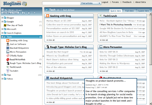
But the most useful new feature is feed management using drag-and-drop. Now you can easily move feeds from one folder to another one without opening a new page or going to the settings.
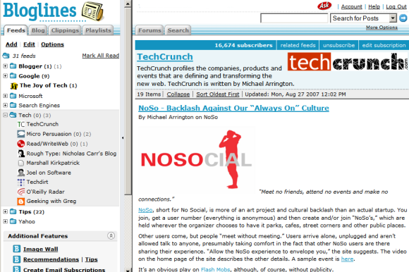
Bloglines doesn't want to stop here: they promise to add other features like sharing feeds and the option to create a link blog. "Since this is a Beta, some features and functionality will be missing. Bloglines is very powerful, so it'll take some time to get all your features into the new redesign. The full-featured original Bloglines (considered by many to be the best feed reader on the market) will continue to be available, and Bloglines subscribers can use both sites to access their subscriptions and compare experiences," explains Bloglines.
Bloglines has many features not available in Google Reader (like search, notifier, recommendations, email subscriptions, public profiles), but the main reason people started to migrate to other feed readers was the interface. Here's what Gina Trapani from Lifehacker wrote in a post from last year:
"I'm not exactly an easily-offended aesthete, but Bloglines' design made me wince from the get-go. It's just plain ugly. The color (which I took pains to change with the Bloglines teal-killer Greasemonkey script) , the font, the boxiness of it all - and after awhile a design you don't like starts to drag on you, becomes work to look at and use."
August 26, 2007
Google Lets You Remove People from Street View
Because of the potential privacy problems, Google decided to change the policy for removing faces and license plate numbers from the Google Maps Street View imagery. According to CNET, "anyone can alert the company and have an image of a license plate or a recognizable face removed, not just the owner of the face or car".
Marissa Mayer said that Google changed the policy 10 days after the product's launch, but didn't announce it. "We looked at it and we thought that's really silly because that's not the point of this product. The purpose is to show what the stores look like, what houses look like. If someone says, 'Hey, there's a face here,' ... it doesn't matter whose face it is."
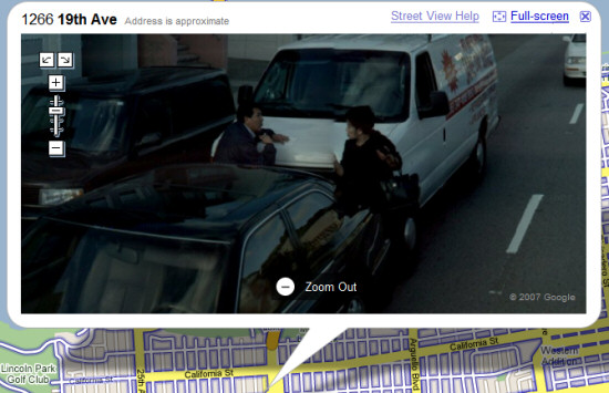
Google Maps help center continous to be vague about this: "Street View contains imagery of public property, which is no different than what you might see driving down the street. Imagery of this kind is available in a wide variety of formats for cities all around the world. That said, we understand that Street View imagery may contain objectionable content. If you've seen content like this, please see our help article on how to report inappropriate images." Basically, you have to click on "Street view help" link next to the image, select "Report inappropriate image" and fill out a form.
The street view images could be even more useful if they didn't contain people, cars or other transient objects. People passing by don't define a place, they just happen to be there. Because Google and Immersive Media take a lot of photos from a single place, it's not very difficult to detect the overlays. There's even a free software that allows you to remove tourists from photos.
So one should expect that Google will automatically remove people and cars from the images. Maybe, at some point, Google will also offer an API that lets you add objects created with SketchUp or other 3D modeling software and integrate the imagery in Google Earth.
Marissa Mayer said that Google changed the policy 10 days after the product's launch, but didn't announce it. "We looked at it and we thought that's really silly because that's not the point of this product. The purpose is to show what the stores look like, what houses look like. If someone says, 'Hey, there's a face here,' ... it doesn't matter whose face it is."

A car accident in San Bruno, California, via Street View Sightings.
Google Maps help center continous to be vague about this: "Street View contains imagery of public property, which is no different than what you might see driving down the street. Imagery of this kind is available in a wide variety of formats for cities all around the world. That said, we understand that Street View imagery may contain objectionable content. If you've seen content like this, please see our help article on how to report inappropriate images." Basically, you have to click on "Street view help" link next to the image, select "Report inappropriate image" and fill out a form.
The street view images could be even more useful if they didn't contain people, cars or other transient objects. People passing by don't define a place, they just happen to be there. Because Google and Immersive Media take a lot of photos from a single place, it's not very difficult to detect the overlays. There's even a free software that allows you to remove tourists from photos.
So one should expect that Google will automatically remove people and cars from the images. Maybe, at some point, Google will also offer an API that lets you add objects created with SketchUp or other 3D modeling software and integrate the imagery in Google Earth.
August 25, 2007
Google Apps, Not Yet a Mature Enterprise Solution
An interesting report from Burton Group titled "Google Apps in the Enterprise: A Promotion-Enhancing or Career-Limiting Move for Enterprise Architects?" (it's available as a PDF, but requires free registration) analyzes if the business edition of Google Apps is a good solution for the corporate environment.
The report starts with a short description of Google's offering: "Google Apps Premier Edition (GAPE) is a SaaS-based solution; a member of the Google Apps family; a collection of applications, application programming interfaces (APIs), third-party applications, and support; and supplied by a company where historically selling to the enterprise has been a corporate sideline." Google doesn't make too much money from enterprise products and it tries to adapt consumer-oriented applications to the corporate needs. "Only if and when the enterprise division stands architecturally on its own will Google be able to compete head-to-head with competitors who have focused on the enterprise from the beginning," suggests the report.
Google Apps is presented as a "lite" replacement for Microsoft Office and a basic option for an enterprise content management system or a collaboration suite. Google Apps can't address the needs of Microsoft Office power users, doesn't offer tools for document archiving, records management, stats, content policies. It also lacks collaboration tools like video chat, web conferencing, workspaces for collaboration, wikis, forums, although some of these will be added in the near future.
Google "has a history of releasing incomplete products, calling them beta software, and issuing updates on a known only to Google schedule. Furthermore, some companies are leery of entrusting their corporate documents to a company that makes its living from analyzing content and displaying it to the world. To these companies, keeping information secure seems at odds with Google's emphasis on information sharing."
Here are the product strengths, according to the report:
... and here are the weaknesses:
To be fair, the text from the service agreement is very similar to Microsoft Office's terms: "In no event will Google or its licensors be liable for any indirect, special, incidental, consequential, exemplary or punitive damages, including but not limited to damages for lost data, lost profits, lost revenue or costs of procurement of substitute goods or services, however caused and under any theory of liability."
The conclusion is that Google Apps is not yet a mature solution and companies should wait until Google or other competing software-as-a-service suites become more powerful:
The report starts with a short description of Google's offering: "Google Apps Premier Edition (GAPE) is a SaaS-based solution; a member of the Google Apps family; a collection of applications, application programming interfaces (APIs), third-party applications, and support; and supplied by a company where historically selling to the enterprise has been a corporate sideline." Google doesn't make too much money from enterprise products and it tries to adapt consumer-oriented applications to the corporate needs. "Only if and when the enterprise division stands architecturally on its own will Google be able to compete head-to-head with competitors who have focused on the enterprise from the beginning," suggests the report.
Google Apps is presented as a "lite" replacement for Microsoft Office and a basic option for an enterprise content management system or a collaboration suite. Google Apps can't address the needs of Microsoft Office power users, doesn't offer tools for document archiving, records management, stats, content policies. It also lacks collaboration tools like video chat, web conferencing, workspaces for collaboration, wikis, forums, although some of these will be added in the near future.
Google "has a history of releasing incomplete products, calling them beta software, and issuing updates on a known only to Google schedule. Furthermore, some companies are leery of entrusting their corporate documents to a company that makes its living from analyzing content and displaying it to the world. To these companies, keeping information secure seems at odds with Google's emphasis on information sharing."
Here are the product strengths, according to the report:
* Don't need to pay for unnecessary power user licenses
* No software to install, and no continual updates
* Minimal, if any, training required
* Relatively easy to include workers outside the enterprise
* Online documents are not scattered on C drives or fileshares
* Integration of past application silos
... and here are the weaknesses:
* Power users and sophisticated documents are not supported
* Records management is difficult and requires extra work
* 99.9% uptime guarantee is for Gmail only
* Google is not liable for lost data, profits, or revenue
* Live telephone support is 17/5
* Difficult to plan for product capabilities and rollouts
To be fair, the text from the service agreement is very similar to Microsoft Office's terms: "In no event will Google or its licensors be liable for any indirect, special, incidental, consequential, exemplary or punitive damages, including but not limited to damages for lost data, lost profits, lost revenue or costs of procurement of substitute goods or services, however caused and under any theory of liability."
The conclusion is that Google Apps is not yet a mature solution and companies should wait until Google or other competing software-as-a-service suites become more powerful:
Google has caught the attention of enterprises with its inexpensive Google Apps Premier Edition (GAPE) product: available at $50 per user per year. However, the seductive price can spell trouble for enterprise architects and their companies if they don't do their homework: the solution's rudimentary feature set means that enterprises need to pick carefully and implement slowly.
While Google's entrance is adding momentum to using software as a service (SaaS) for communication, collaboration, and content management, it's unclear at this point whether Google will be able to capitalize on the trends that it's accelerating.
August 24, 2007
Explore the Sky in Google Earth
Google Earth goes beyond its initial purpose and has a new feature that lets you explore the sky. The latest version (Google Earth 4.2) brings what could've been a separate program for rendering the sky, like Stellarium.
After launching the application, click on the black rounded icon from the toolbar and switch to the sky mode. Google Earth shows the sky from the current location and becomes a virtual telescope for amateur stargazers.
"This easy-to-use tool enables all Earth users to view and navigate through 100 million individual stars and 200 million galaxies. High resolution imagery and informative overlays create a unique playground for visualizing and learning about space," explains the press release.
The layers include a lot of interesting information about stars, constellations, galaxies, images from the Hubble Space Telescope.
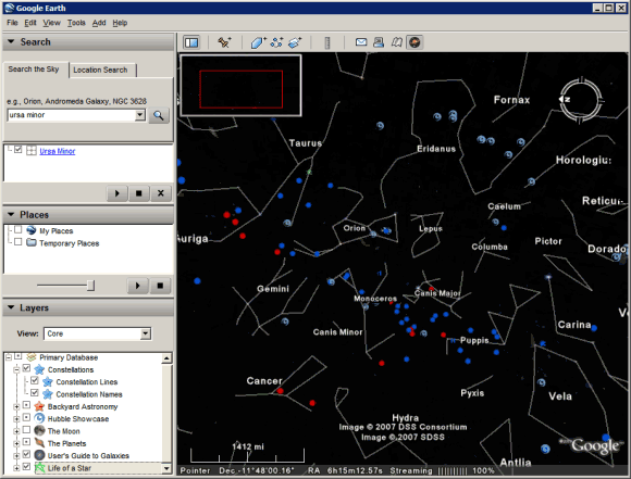
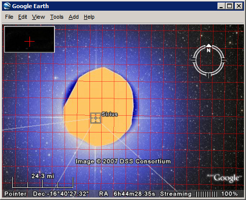
"Never before has a roadmap of the entire sky been made so readily available. Anyone interested in exploring the wonders of our universe can quickly see where the stunning objects photographed by Hubble actually dwell in the heavens. Sky in Google Earth will foster and initiate new understanding of the universe by bringing it to everyone's home computer," said Dr. Carol Christian from the Space Telescope Science Institute.
After launching the application, click on the black rounded icon from the toolbar and switch to the sky mode. Google Earth shows the sky from the current location and becomes a virtual telescope for amateur stargazers.
"This easy-to-use tool enables all Earth users to view and navigate through 100 million individual stars and 200 million galaxies. High resolution imagery and informative overlays create a unique playground for visualizing and learning about space," explains the press release.
The layers include a lot of interesting information about stars, constellations, galaxies, images from the Hubble Space Telescope.


"Never before has a roadmap of the entire sky been made so readily available. Anyone interested in exploring the wonders of our universe can quickly see where the stunning objects photographed by Hubble actually dwell in the heavens. Sky in Google Earth will foster and initiate new understanding of the universe by bringing it to everyone's home computer," said Dr. Carol Christian from the Space Telescope Science Institute.
Add Google Maps to Your Site
As promised last week, Google Maps lets you embed interactive maps and other geographical content without using the API. You just go to Google Maps, find the desired location, click on "Link to this page" and copy the code from the second box. The only customization option lets you change the size of your map and preview it.
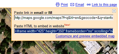
What you can embed: maps (normal view, satellite, hybrid mode), local search results, driving directions and personalized maps. You can't embed: street view imagery, information about traffic and mapplets.
This feature is useful if you want to place a map with driving directions next to the address of your business or to showcase some interesting places using a KML file. For example, the map below shows the most important colleges and universities from the US. If you click on the placemark, you can see the name of the institution. The map was generated from a KML file found using Google Maps.
August 23, 2007
New orkut Interface
orkut's blog promises a new interface for Google's ugly social network. "The one comment we always hear is how orkut's simplicity keeps long-time users coming back and new people signing up. So as we work away planning improvements to the site, we always keep this in mind."
orkut has recently changed the homepage and will launch a revamped interface in the weeks to come. "The change isn't live yet, but starting soon, we will start rolling-out the new look. To start, we will roll it out to a small group of users randomly selected, and will continue to do so until everyone is on the new site."
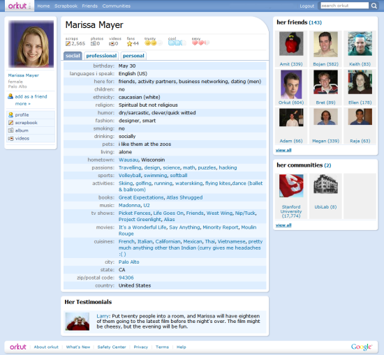
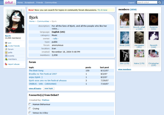
If you don't see the new interface yet, here's how it looks like: colors are warmer, orkut has rounded corners, the new icons are lovely and there are even touches of AJAX. The conclusion: orkut is not ugly anymore.


YouTube Experiments with Video Ads

It was obvious for everyone that Google payed $1.65 billion for YouTube to gain access to a great platform for testing and distributing video ads. The problem is that many YouTube users hate ads and if they had to watch a 15 second commercial before every video, they'd leave YouTube for another video site.
Google's solution, very similar to VideoEgg's ticker ads, is to overlay a small ad at the bottom of a video for about 10 seconds. If you click on the ad, a new video will open in the same player and show you more information about the offer. Once the video ad ends, you can continue to watch your video. The beauty is you can simply ignore the ad, although it takes some time to get used to the small animation.
A comment from YouTube's blog brings an interesting point:
I have a problem with the in video ads for one reason, and that is that they would disrupt and obstruct content. As an artist who sometimes works with digital video, I realize that the choices made in framing a shot are very important. Everything in the frame at any given moment during a video is important to that video's composition and appeal. For this reason I feel that InVideo ads would be a disruptive and negative addition to the Youtube experience. I would suggest instead that adds could be placed at the end of the video, instead of the rolling related video reels.
The ads are still an experiment and won't be added to user-generated videos.
"For now, Google will place the ads only on video clips of its content partners — the more than 1,000 small and large media companies that have licensed their videos to YouTube. By doing so, YouTube will avoid the potential liability of having ads appear on copyrighted clips it is not authorized to display. And it will also prevent ads from playing on clips generated by users whose message may not be to the liking of advertisers. The revenue from the ads will be split between the media partner and YouTube. Ms. Naughton said Google would charge advertisers $20 for every 1,000 times the ads were displayed. Google said the ads would begin appearing today throughout the site. Ms. Naughton also said advertisers would be able to take aim at specific channels and genres, as well as demographic profiles, geography and hour of the day," reports The New York Times.
You might be able to spot the overlay ads in this video. Here's a short demo from Reuters:
The ads were also spotted last month:
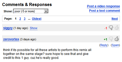
YouTube also added new community features: now you can display on your profile page the latest videos you've rated and the comments have a Digg flavor: you can rate them and see only the top-rated comments.
Google News Shows Videos
Google News becomes more interactive by adding video content from important news sources like: CBS News, Reuters, BBC News, but also from smaller sources. If there's a video related to a story, you'll see a link that lets you play the video without leaving the page. All the videos are hosted by YouTube and Google's explanation is that "it can often be difficult to play videos on the Web due to a wide variety of video players and downloads required," while YouTube videos are more accessible.
Videos are treated the same way as articles, even if they have less information readily-available. "We crawl any information included with each video, and then group and rank each of them as we rank an article."

After months without any new feature, Google News had many small upgrades this year: an image version, comments from people involved in a story, information from Google Finance that will make Google News more useful.
Videos are treated the same way as articles, even if they have less information readily-available. "We crawl any information included with each video, and then group and rank each of them as we rank an article."

After months without any new feature, Google News had many small upgrades this year: an image version, comments from people involved in a story, information from Google Finance that will make Google News more useful.
August 16, 2007
Customer Satisfaction and the Swiss Army Knife
A lot of blogs and newspapers discuss a rather boring news: "for the first time, Google has lost its crown to Yahoo as the highest-rated search and portal site in a key customer satisfaction survey", namely ACSI. The scores are so close that it's difficult to draw some conclusions (Yahoo: 79, Google: 78, MSN: 75, Ask.com: 75), but Google is the only one that lost some points.
So why aren't customers satisfied with Google? "The average consumer that goes to Google today doesn't see anything different than from three years ago," thinks Larry Freed, president of Foresee Results, and he's right. Google's sparse homepage continues to stand out from the rest of the crowd and it has a lot of admirers: it loads fast, it shows exactly what you want (a search box) and it's not intimidating.
But Google users have many opportunities to find out about Google products: from the new menu bar to the OneBox results, from the extended snippets to Google Toolbar, from the personalized homepage to the impressive press coverage Google gets. For example, you can discover Google Docs in many ways: you may see a link next to a Gmail attachment, receive an invitation to collaborate on a document, click on the link from Google's homepage or find an option in Google Toolbar. People should discover a product naturally.
Google's main problem is to make people realize that it's more than a search engine and that could be solved by packaging all its non-search services in Google Apps, integrating them and distributing them as a suite of online communication tools.
"Google falls by 4% from a year ago to a score of 78. Its year-to-date stock returns have been about market average - a far cry from the explosive growth after going public in 2004. Google also missed its most recent earnings forecast. For a company that has introduced so many new products and made so many changes, it may be surprising that its homepage has changed so little. It is almost the same as it was in the 1990s. Some users say it looks stale compared to Ask.com, which has a very different display of search results," says Professor Claes Fornell from the University of Michigan.
And here's a nice quote from a 2002 interview with Google's Marissa Mayer:

Google's difficult task is to make people aware of the tools that are available in the Swiss Army Knife.
{ The image, which shows a Victorinox Swiss Army Knife, is licensed as Creative Commons by Martin. }
So why aren't customers satisfied with Google? "The average consumer that goes to Google today doesn't see anything different than from three years ago," thinks Larry Freed, president of Foresee Results, and he's right. Google's sparse homepage continues to stand out from the rest of the crowd and it has a lot of admirers: it loads fast, it shows exactly what you want (a search box) and it's not intimidating.
But Google users have many opportunities to find out about Google products: from the new menu bar to the OneBox results, from the extended snippets to Google Toolbar, from the personalized homepage to the impressive press coverage Google gets. For example, you can discover Google Docs in many ways: you may see a link next to a Gmail attachment, receive an invitation to collaborate on a document, click on the link from Google's homepage or find an option in Google Toolbar. People should discover a product naturally.
Google's main problem is to make people realize that it's more than a search engine and that could be solved by packaging all its non-search services in Google Apps, integrating them and distributing them as a suite of online communication tools.
"Google falls by 4% from a year ago to a score of 78. Its year-to-date stock returns have been about market average - a far cry from the explosive growth after going public in 2004. Google also missed its most recent earnings forecast. For a company that has introduced so many new products and made so many changes, it may be surprising that its homepage has changed so little. It is almost the same as it was in the 1990s. Some users say it looks stale compared to Ask.com, which has a very different display of search results," says Professor Claes Fornell from the University of Michigan.
And here's a nice quote from a 2002 interview with Google's Marissa Mayer:

I think Google should be like a Swiss Army knife: clean, simple, the tool you want to take everywhere. When you need a certain tool, you can pull these lovely doodads out of it and get what you want. So on Google, rather than showing you upfront that we can do all these things, we give you tips to encourage you to do things these ways. We get you to put your query in the search field, rather than have all these links up front. That's worked well for us. Like when you see a knife with all 681 functions opened up, you're terrified. That's how other sites are - you're scared to use them. Google has that same level of complexity, but we have a simple and functional interface on it, like the Swiss Army knife closed.
Google's difficult task is to make people aware of the tools that are available in the Swiss Army Knife.
{ The image, which shows a Victorinox Swiss Army Knife, is licensed as Creative Commons by Martin. }
August 15, 2007
Dancing Around the World
Where the hell is Matt? The truth is that Matt is everywhere he wants to be. "For the past few years, video game designer Matt Harding has pursued an unlikely avocation as a worldwide wanderer. His videos of himself dancing (rather badly) at various exotic locales turned into the "Where the Hell Is Matt?" website and a hit video series on YouTube."
Here's his most popular video, from 2006:
... and a very interesting interview with Matt, in which he explains why he chose to travel around the world instead of spending 12 hours a day designing video games:
You can see the places he visited on a Google Map or in Google Earth and find more about him at WhereTheHellIsMatt.com.
Gmail, the Top Web Mail Service with the Least Amount of Free Storage
Now that Microsoft upgraded its horrifically-named Windows Live Hotmail from 2GB of storage to 5GB, Gmail is officially the major webmail service with the least amount of free storage. Here's a comparison between the top 4 mail services (*the green text reflects the storage for premium accounts that typically cost $20 a year).
Three years ago, when Gmail was launched, it offered 250 times more storage than Yahoo Mail and 500 times more storage than Hotmail.
"Google believes people should be able to hold onto their mail forever. That's why Gmail comes with 1,000 megabytes (1 gigabyte) of free storage – more than 100 times what most other free webmail services offer." (from the press release)
The competing services quickly adjusted and increased their offerings. At that time, Gmail was invite-only so it couldn't capture too many users. Gmail started to be available to everyone in February, when Yahoo Mail and Hotmail already had many of Gmail features.
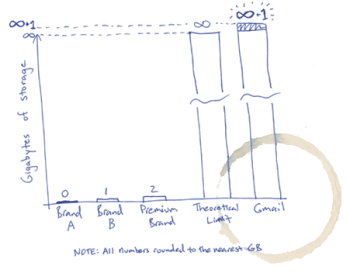
While Gmail still has unique features (conversations, labels, POP3, mail fetcher, unobtrusive ads, advanced search, attachment preview), it's difficult to understand why Google intentionally lost the battle of mail storage, after starting it three years ago. Maybe 2.8 GB is enough for most people or maybe the storage space isn't a distinctive feature anymore.
In a Wall Street Journal article about Yahoo's "unlimited" storage, "one Yahoo executive conceded that a main reason for the move to no limits was to eliminate the perception that Gmail still offered more storage, even though Yahoo had long since caught up."
So all these announcements about "unlimited" storage are just some marketing schemes (there's no such thing as unlimited storage). As very few people use more than 1 GB of mail storage, any webmail provider could easily replace 1 GB or 2 GB with infinite storage. But Google decided to stop playing this game and to let others implement the "Infinity+1 storage plan" (explanation: Gmail's homepage on April 1st, 2005).
| | Yahoo Mail | Windows Live Hotmail | AOL Mail | Gmail |
| Storage | "unlimited" | 5GB (10GB)* | "unlimited" | 2.8GB+ (8.8GB+)* |
| Maximum attachment size | 10MB (20MB)* | 10MB (20MB)* | 16MB | 20MB |
Three years ago, when Gmail was launched, it offered 250 times more storage than Yahoo Mail and 500 times more storage than Hotmail.
"Google believes people should be able to hold onto their mail forever. That's why Gmail comes with 1,000 megabytes (1 gigabyte) of free storage – more than 100 times what most other free webmail services offer." (from the press release)
The competing services quickly adjusted and increased their offerings. At that time, Gmail was invite-only so it couldn't capture too many users. Gmail started to be available to everyone in February, when Yahoo Mail and Hotmail already had many of Gmail features.
While Gmail still has unique features (conversations, labels, POP3, mail fetcher, unobtrusive ads, advanced search, attachment preview), it's difficult to understand why Google intentionally lost the battle of mail storage, after starting it three years ago. Maybe 2.8 GB is enough for most people or maybe the storage space isn't a distinctive feature anymore.
In a Wall Street Journal article about Yahoo's "unlimited" storage, "one Yahoo executive conceded that a main reason for the move to no limits was to eliminate the perception that Gmail still offered more storage, even though Yahoo had long since caught up."

So all these announcements about "unlimited" storage are just some marketing schemes (there's no such thing as unlimited storage). As very few people use more than 1 GB of mail storage, any webmail provider could easily replace 1 GB or 2 GB with infinite storage. But Google decided to stop playing this game and to let others implement the "Infinity+1 storage plan" (explanation: Gmail's homepage on April 1st, 2005).

August 14, 2007
The Building Blocks of Google Browser
Google doesn't intend to develop a browser: they'll just integrate the most important features of a browser in Google Toolbar, which is already available for Internet Explorer and Firefox. Instead of marketing a new browser, Google only has to make deals with hardware and software companies like Dell, Sun, Adobe and bundle its small plug-in. While Google Toolbar's most important role is to make it easier to search using Google and to increase user's loyalty, it's also a simple way to promote new products and to facilitate the transition to storing data online.
Bookmarks - if you store your bookmarks online, they're fully searchable and available from any computer connected to the Internet. That's the idea behind Google Bookmarks.
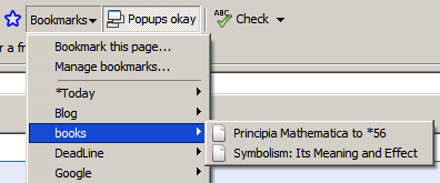
History - your browser keeps the pages you visit for a small number of days and you can only search their titles. Google Web History stores all your Google searches and all the pages you visit from any computer. You get personalized search results, recommendations and a searchable database of your online activity.
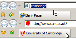
Address bar - you no longer have to remember URLs. Browse by Name lets you enter the name of a company, an organization, a product or a service and go straight to its homepage. If the query is not navigational (there's no perfect answer), Google will send you to the search results page. Some people say this is an even better idea than AOL keywords.
Cookies, passwords - in addition to sessions, bookmarks and local history. This isn't yet a Google Toolbar feature, but Google Browser Sync could be integrated in the next versions. Google Browser Sync is a Firefox extension that synchronizes your browser settings across your computers and makes the transition between two computers seamless.
Opening files - if you have Microsoft Office, Adobe Reader, you can read documents from your browser. Google Toolbar for Firefox has a feature that lets you open documents and spreadsheets in Google Docs.
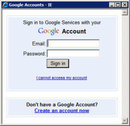
Any browser could be a Google Browser if you would just log in to your Google Account and all your settings would follow you: your bookmarks, the most recent visited pages, the passwords for all the other accounts, your plug-ins and their settings. And as more and more web applications become decent replacements for software, Google Browser slowly morphs into a web desktop - let's call it Google Operating System.
Bookmarks - if you store your bookmarks online, they're fully searchable and available from any computer connected to the Internet. That's the idea behind Google Bookmarks.

History - your browser keeps the pages you visit for a small number of days and you can only search their titles. Google Web History stores all your Google searches and all the pages you visit from any computer. You get personalized search results, recommendations and a searchable database of your online activity.
Address bar - you no longer have to remember URLs. Browse by Name lets you enter the name of a company, an organization, a product or a service and go straight to its homepage. If the query is not navigational (there's no perfect answer), Google will send you to the search results page. Some people say this is an even better idea than AOL keywords.

Cookies, passwords - in addition to sessions, bookmarks and local history. This isn't yet a Google Toolbar feature, but Google Browser Sync could be integrated in the next versions. Google Browser Sync is a Firefox extension that synchronizes your browser settings across your computers and makes the transition between two computers seamless.
Opening files - if you have Microsoft Office, Adobe Reader, you can read documents from your browser. Google Toolbar for Firefox has a feature that lets you open documents and spreadsheets in Google Docs.

Any browser could be a Google Browser if you would just log in to your Google Account and all your settings would follow you: your bookmarks, the most recent visited pages, the passwords for all the other accounts, your plug-ins and their settings. And as more and more web applications become decent replacements for software, Google Browser slowly morphs into a web desktop - let's call it Google Operating System.
Embedding Google Maps
While made online mapping more accessible and easy to integrate with your data, it's still not trivial to include a simple map in your site. You could make a screenshot, but your map wouldn't be interactive, or you could use Google Maps API, but that's too complicated if you don't know JavaScript.
Fortunately, there are sites that solve this problem and provide you some code you can paste in your site. Map Generator is very easy to use: enter the address, the type of map (street-level, satellite or hybrid), its dimensions and you could build a map like this:
My Maps Plus lets you embed personalized Google Maps by entering the address of the KML file generated by Google Maps. This way, you can showcase more than one location.
According to APCMAG, Google Maps will launch next week an option to easily embed maps. "First up, if you know how to embed a YouTube video in your blog, you'll be able to embed Google Maps in your website, Google promises. It'll be as simple as cutting and pasting a bit of HTML code into your website, just like a YouTube video. The embedded maps have the full functionality of Google Maps -- they provide satellite view, map view or hybrid view, and users can click and drag the maps around." They'll probably look the iframe included above and you'll see them in a lot of pages that provide contact information.
{ via Mashable }
Google Health Prototype
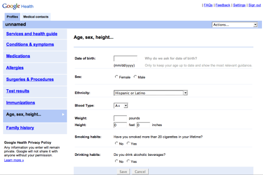
New York Times reports that Google's plans for a service that puts you in control of your health information start to take shape. This service could help you make more informed decisions about your health, get personalized recommendations from specialists and share this information with other people.
A prototype of Google Health, which the company has shown to health professionals and advisers, embodies the consumer-centered philosophy. The welcome page reads, "At Google, we feel patients should be in charge of their health information, and they should be able to grant their healthcare providers, family members, or whomever they choose, access to this information. Google Health was developed to meet this need."
A presentation of screen images from the prototype - which two people who received it showed to a reporter - then has 17 other Web pages including a "health profile" for medications, conditions and allergies; a personalized "health guide" for suggested treatments, drug interactions and diet and exercise regimens; pages for sharing information, receiving reminder messages to get prescription refills or visit a doctor, and pages to access directories for nearby physicians and specialists.
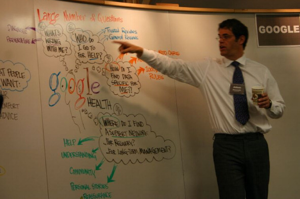
More about Google Health straight from the horse's mouth:
* Health care information matters - "Health information should be easier to access and organize, especially in ways that make it as simple as possible to find the information that is most relevant to a specific patient's needs."
* How do you know you're getting the best care possible? - "There is a lot of material out there about drugs, diseases, procedures and treatments. How do you know what is trustworthy and what isn't? Search is great at finding us places with relevant information, but it is hard to know which links are reliable and which are less so."
* Is there a doctor in the family? - "We have been talking to many medical experts to understand what the best guidelines are, and how we can determine which ones apply in different circumstances. If such guidelines were more available to patients, they might be able to, by inputting information such as age, gender or medications, learn about recommended screening tests and other preventive measures, or about harmful drug interactions."
* Some screenshots of the prototype.
{ The first screenshot is licensed as Creative Commons by Philipp Lenssen. The second image, where you can see Adam Bosworth (VP at Google and Google Health's architect), is licensed as Creative Commons by AlphachimpStudio. }
August 13, 2007
The History of Your Book Searches
Google Web History is more useful starting from today because it has support for a new Google service: Book Search. All your queries, all the books you've opened and a list of the pages you've read are available, sorted chronologically. You can also search the books, but only the title is searchable, which is rather weird.
Web History is a service that lets you "view and search across web pages you've visited in the past". The standard version only logs your Google queries and the associated search results you click on, but if you enable web history, Google can track all the pages you visit. This makes your web history persistent (browsers usually keep your history for about 7 days), fully searchable and always available.
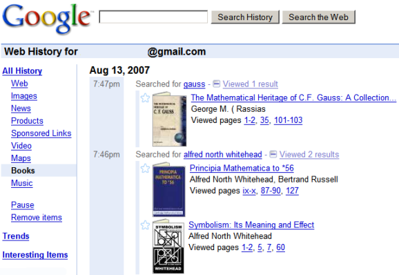
Web History is a service that lets you "view and search across web pages you've visited in the past". The standard version only logs your Google queries and the associated search results you click on, but if you enable web history, Google can track all the pages you visit. This makes your web history persistent (browsers usually keep your history for about 7 days), fully searchable and always available.

Google Earth, a Personal Journey
When you open Google Earth, there's no guide that suggests you where to go. You only have a search box and an entire planet to discover.
In an interesting paper titled "Google's Geospatial Organizing Principle" [PDF], Michael Jones from Google describes the philosophy behind Google Earth and Google Maps, two products that try to find the answer to an important question: "where?".
{ via Google Earth Blog }
In an interesting paper titled "Google's Geospatial Organizing Principle" [PDF], Michael Jones from Google describes the philosophy behind Google Earth and Google Maps, two products that try to find the answer to an important question: "where?".
Whitehead saw education as a cyclical process of stages - romance, precision, and generalization - with a reverent emphasis on romance, the emotional involvement on the part of the learner that initiates rewarding educational experiences. Just as children play with building blocks in simple wonder for years before noting patterns in their gravity- and friction-driven behavior and decades before learning an engineers appreciation for stress and strain, Whiteheads romance is the play and wonder in our initial steps toward precisions deeper understanding and generalizations broader insights.
Leveraging the role in learning played by interest and curiosity, our user experience is meant to enhance the romance of unguided personal exploration, thereby enticing users toward a journey of understanding.
Our ultimate expression of the roles of romance and context in answering where? is Google Earth, a network-based browser for searching and displaying information in situ. It lets users navigate a geospatial Web of places in a planetary application metaphor with where and when as the organizing principles.
The vision for Google Earth inverts the roles of Web browser as application and map as content, resulting in an experience where the planet itself is the browser. Three-dimensional navigation lets users fly and swoop down to the Earth, where they search by looking, clicking, and typing. (...)
Our geospatial products create an information landscape spanning global and human scales using visual context, direct manipulation, and Alfred North Whitehead's insights to advance Google's mission. We trust the sense of place to entice romance, facilitate precision, and encourage generalization as users search and explore our maps and globes.
{ via Google Earth Blog }
August 11, 2007
What Do You Use Google Docs for?
It may be a better blog editor than the one included in Blogger or other blogging platforms. You may use it to read an OpenOffice document (OpenDocument) or a Microsoft Word document on a computer that doesn't have a compatible software. Or maybe it's nice to know that your documents are always available even if you use a different computer. You could a keep a simple ToDo list, write a book, brainstorm ideas or collaborate on a school project. You may even use it a wiki, like did when I invited you to define Google collaboratively.
"I used Google Docs exclusively to teach my daughter her senior Civics/Gov't course. In a course we put together she had to analyze and summarize various aspects of each state government's branches. So, there was a doc for each state then a final paper discussing what she found and her supported opinion on what works best. Sharing the docs saved lots of paper and printing and hassle. It was as close to paperless as possible," argues Lynn.
"Teachers are publishing announcements about upcoming assignments and monitoring student progress via the revision history. In the revision history, you can see clearly who contributed to what assignment and when; if a student says he or she worked on a given project for five hours, it will be documented (no more "dog ate my homework" excuses). Additionally, faculty are using GDS to keep track of grades, attendance, student projects and assignments. Students are using GDS to stay organized and work more effectively. Google Docs & Spreadsheets helps promote group work and editing skills, and encourages multiple revisions and peer editing. Students can go online to collaborate with other students, teachers, parents, relatives and tutors, and enter updates anytime from anywhere. And through their revisions history, kids can check how they've revised a document and who has helped. Not to be outdone, Google spreadsheets allows students to track their grades, assignments, semester goals, baseball statistics, car expenses, or anything else that interests them," thinks Gordon F. Snyder Jr.
"I love Google Documents. I'm a journalist and it allows me to work on stories without transfering everything back and forth across devices," says Steven Allen Adams.
"Our daily shopping list was written on scrap paper in the kitchen. If my wife was able to go shopping during her lunch break at work, but did not have the list it took a phone call to clarify what was on the list. Items could not be added at the last minute, again without a phone call to the other. The solution was a shared spreadsheet designed to print on one sheet of A4. The items are categorised in the same order as the layout at the local supermarket. Each of us can add items at any time without having to contact the other, and each of us can go shopping in confidence that we have the latest list. After printing out the spreadsheet, the cell contents are deleted and the list starts again," confesses Mick.
What do you use Google Docs & Spreadsheets for?
Google Pack Adds StarOffice
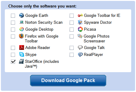
Google Pack, the collection of applications recommended by Google, includes a new software: StarOffice, an office suite developed by Sun. In 2000 Sun released StarOffice's source code, which became the foundation of OpenOffice.org, an open source project sponsored by Sun.

StarOffice 8 is a full-featured office suite that contains a word processor, a spreadsheet tool, applications for presentations, databases, math formulas and drawing. It has support for most Microsoft Office formats (except for the formats introduced in Office 2007), but it can also export documents as PDF out of the box. The software normally costs $70, but it's available for free in Google Pack. It's worth noting that StarOffice has a huge installer (more than 140 MB), so you should download it only if you have a fast Internet connection.
It will be interesting to see why Google didn't choose to include OpenOffice.org, the primary difference between StarOffice and OpenOffice.org being that StarOffice includes some proprietary components like clip-art graphics, fonts, templates and tools for Microsoft Office migration.
The next step would probably be the addition of a plug-in that lets you synchronize local documents with Google Docs & Spreadsheets, so you can have the best of the both worlds: edit complicated documents offline, collaborate and store files securely online. For now, StarOffice is integrated with Google Search and Google Desktop.
{ Thank you, Dan. }
Subscribe to:
Comments (Atom)
