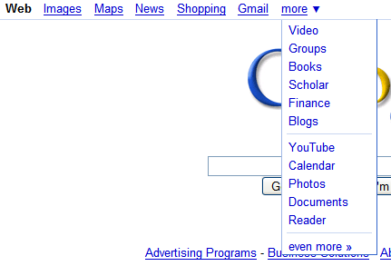
To separate the search and the non-search properties, Google added two dividing lines in the More menu. Another change is that the services are no longer sorted alphabetically, but probably by usage. The order for non-search services is: YouTube, Google Calendar, Picasa Web, Google Docs and Google Reader, while in the search area: Google Video, Google Groups, Book Search, Google Scholar, Google Finance, Blog Search.
It's still difficult to understand why Google doesn't let you customize
the navigation bar, the same way you can customize it in the
new iPhone interface. This will probably encourage more people to use the menu and to go to their favorite services more often.

{ Thanks, Kevin. }


It's funny, I had seen that as well... and yet, convinced myself it was not new. As far as customization, outside of iGoogle, Google hasn't been all that interested in user-generated modifications.
ReplyDeleteThis comment has been removed by the author.
ReplyDeleteI'd like to be able to customize the links. Now it has some services that I don't often use and doesn't have the services that I use a lot everyday.
ReplyDelete@mustafa: I still see the Invite in Gmail.
I think an alphabetical list would be easier to use.
ReplyDeleteNot sure about the "search vs non-search" distinction, as Calendar lets you search for public events (and Photos finds photos from Picasa -- arguably, that's only a single service it searches, but Google Calendar is more of a general event search).
ReplyDeleteWhat's interesting is that the menu options differ country by country. The .com versions gets the most option, followed by the .uk version, while the French and Italians get considerably smaller selections. (Detailed at http://tinyurl.com/27og2x )
ReplyDeletetry this: open firefox start page in opera. the gmail link is not shown!
ReplyDeleteI would like to customize it - once I leave google/ig, there is no way to go back (except the back button - crazy thing).
ReplyDeleteA customized search menu would be nice. I mean, I can't say that I've used "Shopping," "Maps" (I use Google Earth), "Gmail" (I have Gmail as a search in IE7) and would love to remove them.
ReplyDeleteGreat blog! :-)
Even more interesting is that these menus are not standard across their offerings. Reader offers a different drop down menu than Gmail for instance.
ReplyDeleteThe update disappeared here in Germany
ReplyDelete@Justin: Make sure your using the new version.
ReplyDeleteDisapeared here too :S
ReplyDeleteMy biggest gripe with the navigation is that some links open in new tabs and others don't. I really don't care either way but it's maddening when you don't know what to expect. I click gmail and I get a new window. I click reader and I don't. ARRGGGHHH!
ReplyDelete