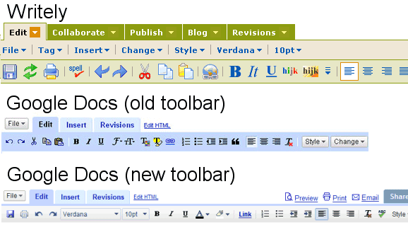
Some explanations directly from the source:
There is no longer "Save", "Save & close" and "Discard changes" on the far right of your doc. We've removed "Save & close" and "Discard changes" and moved "Save" to the far left on the editor toolbar as an icon. The icon is a floppy disk. Writely does auto save, so it's not necessary to save manually.
Spell check is now located on the right side of your toolbar as an "abc" icon with a check mark through it. Also, when you're spell checking a doc and you want to stop, you can just simply click on the icon.
As you create your docs, you may use different text sizes, fonts and colors as well as different highlight colors throughout. You'll notice now that when navigating to different parts of your doc, you'll be shown exactly which text size, etc. that particular part of the doc is in, by referring to the different menus on the toolbar. This functionality allows you to easily identify the properties of the text within your doc.
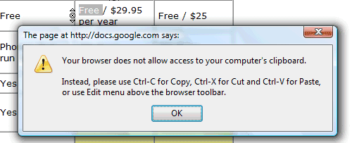
It's strange to see Google removing the buttons for some of the most frequently used commands (copy/cut/paste). Due to some security restrictions, Firefox doesn't allow web sites to read your system's clipboard or to overwrite it, so you had to make an exception for Google Docs.

Hopefully, the new toolbar will be added to all the apps that use a rich text editor (Gmail, Google Spreadsheets etc.) to create a consistent user interface.
{ Thank you, Robin and Hernan. }

Interesting to see that "Writely" is still in use at Google Docs. Guess it's more catchy than the official name.
ReplyDeleteA new version is published and there goes Safari support. Its really awful to be a minority in this monopoly world. Microsoft only developed for IE. Google is a IE/Firefox fan. Rats.
ReplyDeleteI really like the new toolbar. It'll be nice to see if they add it to the other parts.
ReplyDeleteSeems that not every Google Account see the new toolbar - mine is the same blue one as always.
ReplyDeleteI love old Writely toolbar. Any chance to get thim back? E.g. thrue GreaseMonkey script?
ReplyDeleteThe new toolbar is more intuitive than its predecessor and looks better.
ReplyDeleteBut I still think Writely toolbar is better than the newer toolbars.
I'm not thrilled. I really liked the Save & Close button.
ReplyDeleteClick on "Docs Home". It has the same effect as Save & Close.
ReplyDeleteHmm. That's actually true. Not too obvious though.
ReplyDeleteI'm only getting the new toolbar on new documents. I tested regular and apps for you domain accounts in Safari and FireFox2.
ReplyDeleteI realize the new interface the day before. More simpler and nice :)
ReplyDeleteI only use Google Docs a fraction of what I would like to do mainly because there is no "What you see is what you get" interface - there is too much guess work with page layout etc - Zoho has a much more polished interface - and is therefore more practical to use as a word / Open Office substitute particularly when you are using collaboration and people adjusting the document are used to a "WYSIWYG" screen interface
ReplyDeleteI would like to see that toolbar but I have tried already so many things and it won't show. Could you let me now how I put that toolbar back in place when I open een google doc? Thanx
ReplyDelete