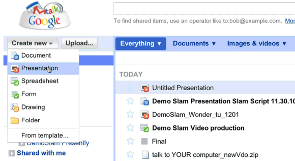
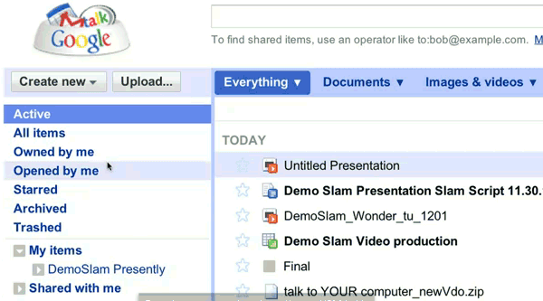
A recent Demo Slam video shows a new Google Docs interface that has separate sections for documents, images & videos and other files, new menu items for active and archived documents, a new navigation bar. Most likely, the new interface is tested internally at Google.
Here's the video:
{ spotted by
Andrew }


Setting aside the interface for a moment, that video was pure awesome.
ReplyDeleteImage and video icon? I though we were suppose to use Picasa for images and YouTube for video...
ReplyDeleteYes, that's the internal Google interface. (Note the "dogfood" Google logo -- the dogfood theme is common to Google projects that are used internally. Such as the first Chrome OS prototype hardware, which wasn't the Cr-48; those machines are platform name "dogfood" in the chromium-os source code repository.)
ReplyDelete@jaduncan. Amen.
ReplyDelete@Brozufil. I'm pretty sure it's for storage and images/docs would still run using Picasa/YouTube.
@extremeparkmx. Por que me cansas con el spam? Bueno, tal vez te doy "props" por hacerlo en espanol, aunque seas un robot!
I'm stoked for the change: I feel like the folder view (or whatever it's called) could use some serious resuscitation. I'm glad to see it looks like docs is taking some pointers from Gmail (archiving). And, please, let there be keyboard shortcuts and about 10x faster/more intuitive labeling!
Just need some syncing ability and as a cloud storage system it will be almost perfect. I have a lot of documents, editable word docs, PDFs, mp3s etc, and at the moment its differcult to create a copy on the cloud because of the way it all has to be uploaded.
ReplyDeleteI'd heard rumours of possible syncing in docs in the future. Maybe this revamp may be the start of some serious upgrades including this.
Looks like one more step towards gdrive.
ReplyDeleteYou can actually watch the presentation itself at http://goo.gl/6MJwH (copied from the youtube site) but it fails on me the whole time =/
ReplyDeleteThe video is promising on the future of online presentation without the need of plugins. It seems they're going to 'punch' others out of the water.
ReplyDeleteLooks promising.
ReplyDeleteImage and video icon? I though we were suppose to use Picasa for images and YouTube for video...
Probably part of Google integrating all the product togeather an getting them all running on boardly the same code base, it make sense to enable the user to controle all of there content on Google sites an resource from a single location for those that want to.
Just notice the screen shots, also show a other sighting of Google +1 or google new social netowrking tool bar. Nothing new shown, but
ReplyDeletethey areally are deploying it acrss all there site.
I wish I was not stuck at work so I can watch video for anymore clues.
The presentation was really incredible.
ReplyDeleteBut, I think a Slide editing tool, must help you (to reduce time), and if i'm not wrong, everything from that slide were build from scratch (animation). Ok, it's great that doesn't use extra plugins.
I really doubt that Google Docs will make a difference unless they develop sort kind of animation interface using nothing but the web.
Cool. I wonder if they have day jobs. :)
ReplyDeleteI mean, don't get me wrong, cool presentation but I don't think a client will hire them based on their ability to pull together something you could do in Flash or PowerPoint years ago.
have Google changed this video? the new Google docs UI isn't present. watch it again and see, or is just my eyes.
ReplyDelete@Ben. I think it's just your eyes, chief. I see it right at the beginning.
ReplyDelete@Ben you are right. The video was pulled and replaced by the same video except without the testing interface.
ReplyDeleteI agree with Ben , new Google docs UI is not present.
ReplyDeleteThey edited the video after I posted about the new UI. That's the only plausible explanation.
ReplyDeleteHow are we supposed to do all of this multi-media storage and use on a single gig of space in Google Docs? Will everyone be buying extra storage?
ReplyDeleteSeems like the spirit of Google wave is bouncing back, but without having to create a new account (which, in my view, was the one overwhelming reason why it goofed)
ReplyDeleteBuying space on Google Docs is my way of saying thanks for all Google does for me. I have gobs of space for mere pennies a day.
ReplyDelete