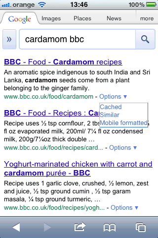
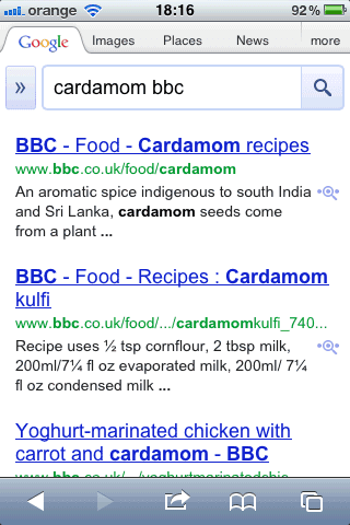
Google Mobile Search increased the text size for search results and reduced the number of words from the snippets. While this change made search results more legible, it also reduced the number of results that are displayed before you start scrolling.
On an iPhone, Google only displays two results in their entirety, instead of three results, and the snippets are way too short.
Old UI:
New UI:


On the other hand, some of us with 51 year old eyes may now be able to read the results. I wonder why they don't make this a user controlled setting?
ReplyDelete"it also reduced the number of results that are displayed before you start scrolling. "
ReplyDeleteI never click past 3rd link :) Google search is so perfect. :)
I wish there is a proper version for Symbian... Symbian version sucks, big time.
ReplyDeleteIndeed an optional setting would be nice, as it's most certainly impossible to please everyone with one single setting. This new look is way too big for me as well, I'd rather have more details in a smaller font.
ReplyDeleteIt depends on the age of your eyes! I can read two results in larger font and scroll down to the next ones faster than I can squint through reading three in smaller font. I agree with Paul. A user-controlled setting would be best for everyone.
ReplyDeleteAahhh that's better for my old and tired eyes!
ReplyDeletei definitely agree with you Lynn, the user should be the one to determine the font size...
ReplyDelete