Unlike Gmail's app for Android, the iPhone app is just a wrapper for the mobile site with a few extra features. Until now, Gmail's app for iPhone used a different interface than the mobile site. Mobile Gmail had an old interface that predated the Google-wide redesign efforts.
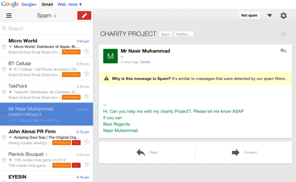
New interface (iPhone 4S) vs the old interface (iPhone 3GS):
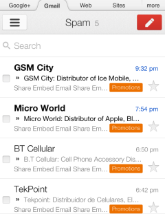
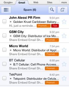
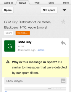
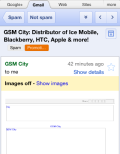
Unfortunately, the new mobile site lacks the previous/next buttons, just like the iPhone app. The good news is that you can now upload photos from the mobile site if you have an iPhone or iPod. Until now, the feature was only available in the Android interface and the "native" iOS app.

Getting it on desktop but not on mobile. But still. .. this was much needed. Was sick of the previous interface.
ReplyDeleteI like it! It looks better than the previous version and the app too.
ReplyDeleteOh I hope they work on Calendars now!!!
ReplyDeleteThis interface is AWFUL on the iPad. Far less functionality and can't even find a delete button.
ReplyDeleteYuk yuk yuk.
This interface is AWFUL on the iPad. Far less functionality and can't even find a delete button.
ReplyDeleteYuk yuk yuk.