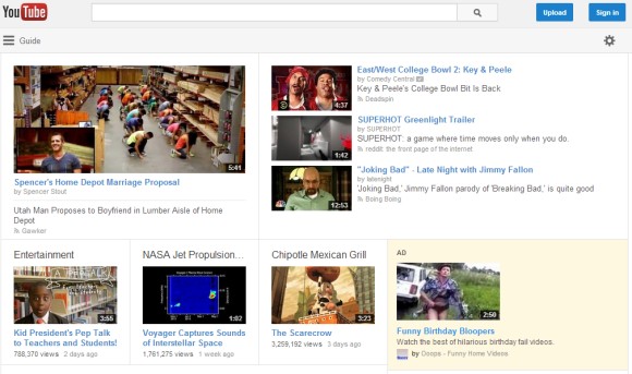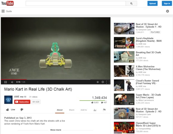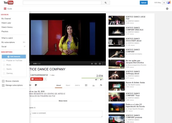


Here's a video that shows a slightly different version of the experiment:
Here's how you can enable the experimental feature. If you use Chrome, Firefox, Opera, Safari or Internet Explorer 8+:
1. open youtube.com in a new tab
2. load your browser's developer console:
* Chrome or Opera 15+ - press Ctrl+Shift+J for Windows/Linux/ChromeOS or Command-Option-J for Mac
* Firefox - press Ctrl+Shift+K for Windows/Linux or Command-Option-K for Mac
* Opera 12 - press Ctrl+Shift+I for Windows/Linux or Command-Option-I for Mac, then click "Console"
* Safari - check this article
* Internet Explorer - press F12 and select the "Console" tab.
3. paste the following code which changes a YouTube cookie:
document.cookie="VISITOR_INFO1_LIVE=Gapj9bz_H8M; path=/; domain=.youtube.com";window.location.reload();4. press Enter and close the console.
To go back to the regular interface, use the same instructions, but replace the code from step 3 with this one:
document.cookie="VISITOR_INFO1_LIVE=; path=/; domain=.youtube.com";window.location.reload();{ Thanks, Sushubh and Rubén. }

No comments:
Post a Comment
Note: Only a member of this blog may post a comment.