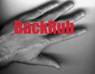
 Google's first name was BackRub, back when the search engine lived on Stanford's servers and could be found at backrub.stanford.edu. BackRub's logo was a scan of Larry Page's hand.
From BackRub's FAQ:
Your logo is upside down: Why is the light source obviously below the image? It looks quite unnatural...
The logo is simply a scan of my hand, from a flatbed scanner converted to black and white. The back in the picture is the scanner cover, and the shadows are from the scanner light.

"Nothing ventured nothing gained " is a useful phrase to describe Google's startup...
ReplyDeleteGoogle has had several logos since its renaming from BackRub. The current official Google logo was designed by Ruth Kedar, and is a wordmark based on the Catull typeface.
ReplyDeleteI don't see Google making much changes to its evergreen logo design. It has been just making slight amendments to its logo over all these years. However, I think Google has the best and most simple logo.
ReplyDeleteI don't see Google making much changes to its evergreen logo design. It has been just making slight amendments to its logo over all these years. However, I think Google has the best and most simple logo.
ReplyDelete