There's a sidebar that shows a small thumbnail and some useful information about the selected file. Google added new filters for images and videos, for public and private files, but dropped the advanced search form, which was more difficult to use. The drawback is that there are many search features that are no longer available in the interface and you need to use operators to get them back.
The slideshow feature borrowed from Google Wave is one of the most useful additions:
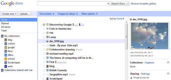
For some reason, Google Docs has a new name for folders: they're now called collections. "Collections are designed to combine the best features of labels and folders. A file can live in multiple collections, just like with Gmail labels. Collections can also be stored hierarchically, just like folders on your desktop. And of course, collections can be shared, just like you can share docs," explains Google. Technically speaking, none of these features is new, but it's much easier to add a file to multiple
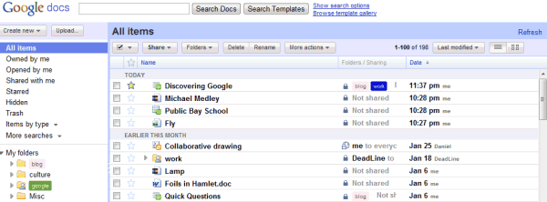
Google also dropped checkboxes, so now it's much more difficult to select multiple files: you need to use Shift for contiguous selections or Control for scattered files (Cmd if you're using a Mac).
Another new feature is priority sorting, which orders files based on importance. For example, a starred document that has been last updated 5 hours ago is likely to rank higher than a more recent document that hasn't been starred. Google says that it's like Gmail's Priority Inbox, but there's an important difference: Gmail always sorts conversations by date.
Overall, the new Google Docs homepage is a mixed bag. Google tries to morph Google Docs into an online storage service, while moving away from the initial goal of the service: editing documents online. Suddenly Google Docs is no longer an appropriate name for the service, 1 GB of free storage is not enough, the APIs are no longer useful because they're limited to editable documents and Google's applications seem limited because they can't handle all the files that can be uploaded. The new homepage can't address these issues, but it manages to make the interface more complicated: now it's a lot easier to open a file when you want to select it and to select the file when you want to open it.
Tip: If you don't like the new interface, there's an option at the top of the page that lets you temporarily switch to the old version. You should bookmark the URL: https://docs.google.com/?ui=1, since there's no option to permanently switch to the old UI.
{ Thanks, Karol and Ben. }

NO, disabling check boxes doesn't make it more difficult. The universal and easier way to select multiple files is with keyboard commands, get your facts straight. And keep your mediocrity in your articles that I will contact Google to shut it down. Keep your non-sense for your self and don't dare to keep feeding us with that sort of BS; In fact, that's why I don't read YOUR or anyone else articles. And I know some noob with no critical thinking will say "Then why are you here?" TO SEE the latest images from Google products. Okay thanks.
ReplyDeleteWe can't yet hide collections, hopefully if we keep telling Google about this problem, they will finally fix this.
ReplyDeleteOh and other thing: Documents DO NOT PRINT as made (so be careful with important documentation you may need to print, DO NOT use Docs for that sadly) So let's raise our voice and let Google know they need to fix that as soon as possible; many students from college can't do their school work in Docs because of this reason.
There seems to be a lot of overlap between the idea of starring a document and marking it to show on the home page. Perhaps they could have simplified things and just said that starred documents will show up on the home page?
ReplyDeleteI'm just concerned that Google tends to make things a little to complicated for the average end user.
Speaking of complicated, it is interesting to see them come up with yet another word for labels/tags. The functionality of 'collections' seems no different then labels (note that Gmail does support nested labels via a lab). I understand that they had to stop using the word 'folders' but I'm surprised they didn't just use labels.
A mixed bag for sure. They seem to be going toward a DropBox model where anything can be dumped into Google Docs, but I really wish they had done the Gdrive thing instead. The limited storage here is a problem as is the dropping of the checkboxes.
ReplyDeleteThat said, if this is a test drive for a music storage service, that would be cool. I just uploaded an mp3 and tried to play it, but no go. That's what I want. A place to leave that stuff and a player on the web. And I wouldn't mind if it was totally separate from Google Docs.
Not sure what they're doing with this video thing...
Labels, folders, albums (in Picasa), tags (in Google Reader) and now "collections". Why can't they decide on a terminology and stick to it?
ReplyDeleteI'm also confused by the introduction of the photo viewer. Is this intended to complement Picasa Web Albums, or eventually to replace it? Can I make "collections" of photos publicly visible from Google Docs?
"They seem to be going toward a DropBox model where anything can be dumped into Google Docs..."
ReplyDeleteThe DropBox guys are working on a solution to synchronize a Google Docs account and a DropBox. This would solve a lot of concerns I think.
"That said, if this is a test drive for a music storage service, that would be cool."
I wouldn't mind a music storage, but I don't think they will be able to handle the average user music collection with the kind of space they currently offer.
i want ask Google a Question about Google Picasa
ReplyDeleteWhen Will Be Google Picasa part of Google Docs ??
KeepDoom Developing Forum
ReplyDelete"i want ask Google a Question about Google Picasa
When Will Be Google Picasa part of Google Docs ??"
I was surprise it was not already part of Google Doc, but I take a guess an say it will happen some time this year.
We will also get a storage solution from google sometime this year to or google buys dropbox.
As to the label, collections, Albums, tags, I think it the part where UI team from each department needs to sit around the table an decide on the term they want to use an stick to it. Collections sound like a good term alround but then people tend to use Albums only when talking about photographs.
May be photos should keep Albums, an collections should take over everything else.
I see the logic of 'collection' - they like labels, but some folk are wedded to folders - but don't Google own a thesaurus? All these PHD Geeks, and the best word they can find is *collection* ?
ReplyDeletenew feature anymore...hohohoho
ReplyDeletego...go...google....
Beben si bloglang anu ganteng kalem tea \m/
Well, neither 'tag'/'labels' nor 'folder' are adequate words (tags/labels are not supposed to be themselves tagged/labeled, and files are not supposed to be stored in multiple folders).
ReplyDeleteSo I don't know. But if they could merge that with Gmail system and vocabulary, it'd be nice.
I can no longer select multiple files. When I try to Shift+select, any file I click on just opens. When I use Ctl+select, the file immediately opens in a new tab. Is there some way around this? I'm using Chrome.
ReplyDeleteThe old Google Docs used to allow you read-only access to your Google Chrome bookmarks. The new interface has removed that. Anyone know if that removal was temporary or permanent? If permanent, anyone know any other way of viewing your Chrome bookmarks without using extensions or toolbars?
ReplyDelete@G: Don't click on the file name, click on the white space in the same row as your target file.
ReplyDeleteused to older version, I have clicked to old version.
ReplyDeletehttp://publicitymonster.com.au
While its a refreshing look in some aspects it also displays the inconsistency within google. As a company that sells this service to companies that is not very professional.
ReplyDeleteThe absence of the checkbox, date modified and which user modified makes this a worse interface imo. I dont want to have to select a file to see all that info. I share files within my company and need to see quickly if the latest update is my own or which users it is. The lack of the checkbox has been mentioned in previous comments.
One promising thing though is that they might allow users to be able to select cells that are scattered up and down the spreadsheet ie a1, a3, a5 etc.
Just to add. they can easily fix my main concerns by allowing users to decide what info is displayed in all that white space.
ReplyDeleteDisaster. We use google docs heavily at our company and are electing for the old version.
ReplyDeleteFor starters, there's now a huge gaping waste of space in the middle, instead of using this space for columns showing file details. Three MAJOR losses in functionality from this:
1 - used to be able to glance down and get a birds-eye view of most recent edited docs, who is working on what and when. As CEO (30 staff all using it), this was a great feature that is now lost.
2 - can no longer do something as simple as sort by title descending, for example our transaction list (scanned invoices/etc) starts at 0 and goes up, can no longer sort by the latest transactions (which is not necessarily last modified).
3 - can't get rid of that waste of space on the right side (preview/details column) - ok if it could be minimized, otherwise i really don't see how this helps.
And "collections"? Do they expect us to start calling them collections? Are you kidding me? Are they targeting an office environment?
DEAR SIR !!!
ReplyDeleteI see they removed they refresh button as well
ReplyDeleteAs compare to the earlier version of Google docs, there are lots of changes they have made to google doc either we talk about doc or spreadsheet.
ReplyDeleteWe're still having massive access issues since the update -- see the help center thread:
ReplyDeletehttp://www.google.com/support/forum/p/Google+Docs/thread?fid=72594efedc1dd24b00049b38875bc44d&hl=en
Any help/ideas?
To be honest, I see absolutely no improvement in this version.
ReplyDeleteI understand that some people might like to use a preview pane, but I hate it and I want my "click-row-to-go-to-document" functionality back. I definitely miss the checkboxes.
They've rolled out this new interface to Google Apps, but we're still using the same old UI in Gmail.
ReplyDeleteStill no offline editing :(
ReplyDeleteAwfull.
ReplyDeleteWord "Folder" changed with "Collections". Who has chosen such word? And folder icons changed with something grey and terrible.
Wow, anon at January 31, 2011 1:43 PM has some serious personal issues. I think these articles are great, keep it up.
ReplyDeleteI just want the feature to share folder/collections with "Anyone with the link" back. They removed it a few months ago, and I thought they would add it back with this new version. That was really useful, and I miss it a lot.
Support for the old document format -- the good one with the document settings panel -- has also gone. It is now no longer possible to default a new document to the old format (and hence to open a document with user-defined settings).
ReplyDelete(NOTE: To create a new document in the old format, enter https://docs.google.com/?action=newdoc).
Google seem to have forgotten that this is fundamentally an office package. What a mess they've made of a great product that I've written in most days for two years. I just hope that they continue to allow the old document format.
Once again, Google takes a useful service and mucks it up. Think Google Notebook or adding stupid things to Google Books. Get a grip Google. Change isn't always a good thing just because it is change.
ReplyDeleteI like the new layout, it's crisp and Collections make sense to me. I think "Docs" is still a fine name - Gmail also handles Tasks and Chat, but it's primary purpose is still evident and this is in the same vein.
ReplyDeleteThose complaining about change might want to think that if company's don't innovate, innovation doesn't come. Apple and Google are where they are today because they invent how we use the web / digital devices.
I think it's decent, but it is going to take some time to get used to. Although I am actually kind of annoyed that they got rid of the ability to save your search. I thought that was actually kind of cool.
ReplyDeleteAlso, like you mentioned, the "Organize" option is confusing. Especially if you use this option on a Collection which sort of moves it.
Speedo
ReplyDeleteI am confused by the sorting mechanisms - when I choose to sort by title, the new Gdocs does not use a strictly alphabetical rule, rather some combination of alphabet and recency. Is this a bug? Given that there is a "priority" option you'd think that sorting by title really means . . .by title.
Anyone had the same on their Gdocs listings?
there are some nice additions here, i was look forward to Docs upgrades, would like to see more on mobile though
ReplyDeleteI don't like the new version of google docs. Three things in particular is almost completely destroying my usage of it:
ReplyDelete1) the downloaded html version is now broken, I have to edit it extensively by hand before I am able to use it
2) I can no longer get the wide view, but have to use a narrow version with lots of wasted space on the sides. It makes it much more difficult to work
3) Various stats and such is now gone
Yes, I know I can get the old version docs through a link, but I have to use that each time, it cannot be set permanently - and the downloaded html is still screwed up for that one now!
Now there is also the new collections/overview of all you docs - yes you can temporarily go back, but you need to click 'old version' every time you open it! Why can't you just leave an option for letting me chose what I want to use?
I think this new version is a complete disaster from a usability point of view.
ReplyDeleteSee my blog at http://pcnuts.blogspot.com/ for my reasons.
I like the new layout, the GUI is more coherent. Two improvements: the preview panel should be optional and optional file properties (date, ...) should be added. The default sort order should be changeable.
ReplyDeleteHow do I know now how many docs I have? I can't find this option. The older version had.
ReplyDeleteGoogle:
ReplyDelete............................................________
....................................,.-'"...................``~.,
.............................,.-"..................................."-.,
.........................,/...............................................":,
.....................,?......................................................,
.................../...........................................................,}
................./......................................................,:`^`..}
.............../...................................................,:"........./
..............?.....__.........................................:`.........../
............./__.(....."~-,_..............................,:`........../
.........../(_...."~,_........"~,_....................,:`........_/
..........{.._$;_......"=,_......."-,_.......,.-~-,},.~";/....}
...........((.....*~_......."=-._......";,,./`..../"............../
...,,,___.`~,......"~.,....................`.....}............../
............(....`=-,,.......`........................(......;_,,-"
............/.`~,......`-...................................../
.............`~.*-,.....................................|,./.....,__
,,_..........}.>-._...................................|..............`=~-,
.....`=~-,__......`,.................................
...................`=~-,,.,...............................
................................`:,,...........................`..............__
.....................................`=-,...................,%`>--==``
........................................_..........._,-%.......`
...................................,
Would be quite usable as a general purpose doc/pdf store if I could just see nested collections using the mobile view. Can't even workaround this by selecting the desktop view on my smartphone... doesn't work.
ReplyDeleteneed tree like view of folders like in the older UI.
ReplyDeletedid not expect such frustration from google