The new UI is a lot simpler and focuses on managing alerts and creating alerts with one click. The old Google Alerts homepage exposed a lot of advanced options, which are now hidden. There's a long list of alert suggestions: companies, people, countries, musical artists, industries, places, athletes, as well as your name and email address (the "me on the web" section).
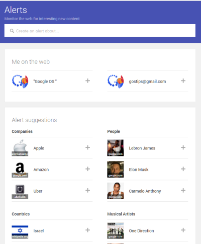
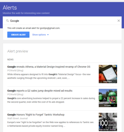
For example, you can type "Google" in the huge input box at the top of the page, click "Create alert" and that's it. Google shows a preview, so you can see what results you may get.
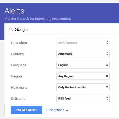
There's a "show options" link that shows the advanced options, so you can choose sources, language and region, how often to send alerts, how many results to include and the delivery option: email or feed. The nice thing is that Google remembers your options and it uses them the next time you create a new alert.
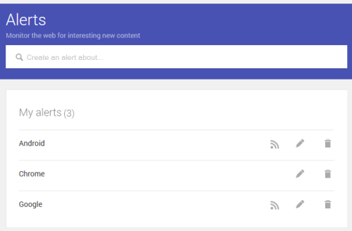
Google Alerts lets you edit or delete alerts and shows a special icon for feed alerts.
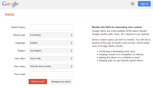
Here's the old Google Alerts:

No comments:
Post a Comment
Note: Only a member of this blog may post a comment.