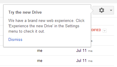
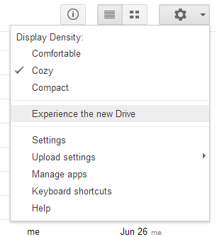
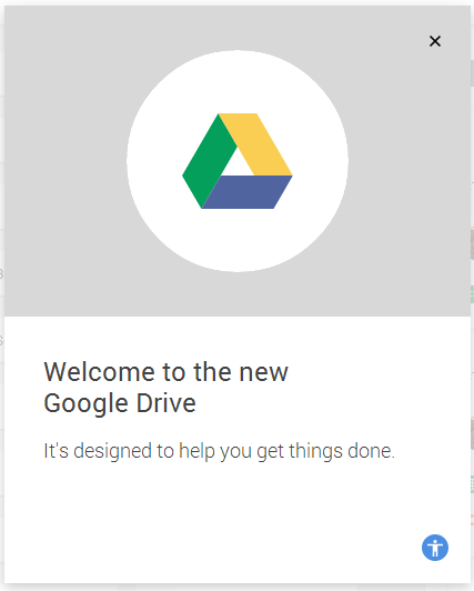
Here's the welcome page with a small accessibility icon:
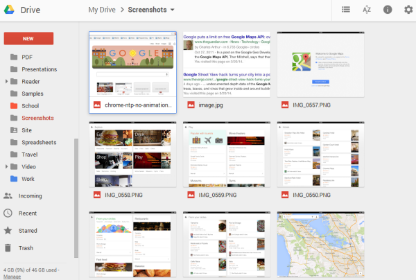
The new interface has a lot in common with the new desktop home screens for Docs, Slides and Sheets. All of them use the new Material Design.
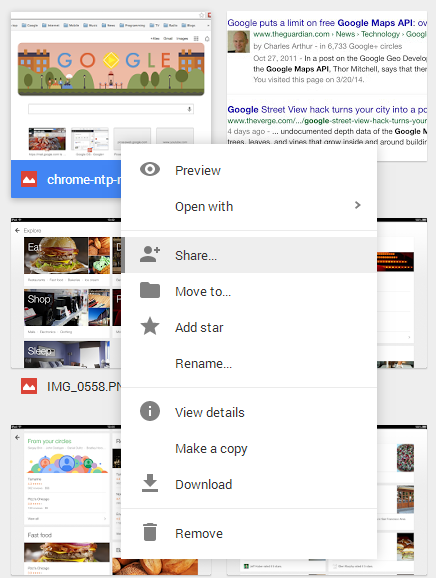
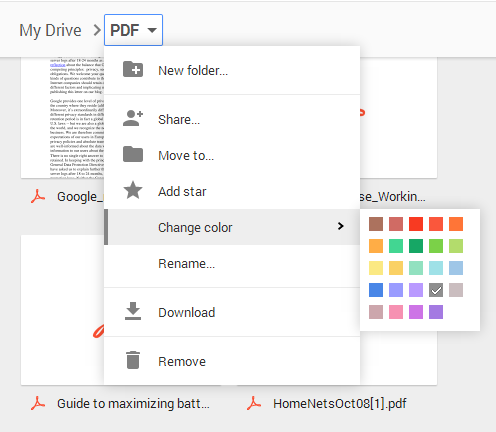
Here's the contextual menu:
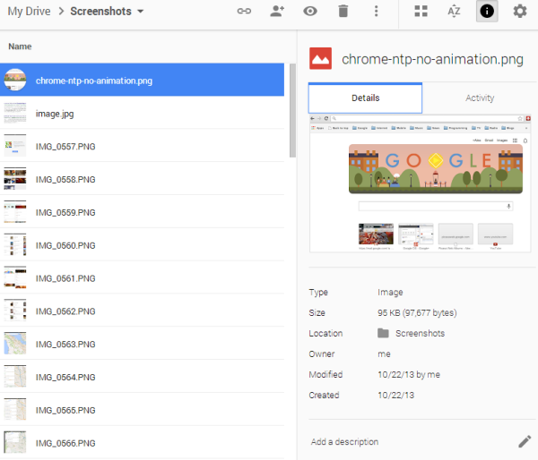
When you click a file, it's selected and the info pane shows more information about the file. There are no more checkboxes: click to select, double click to open.
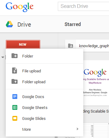
There's an updated "new" button that lets you upload files and files, but also create new documents.
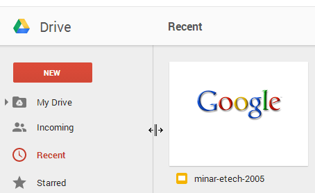
You can now resize the sidebar:
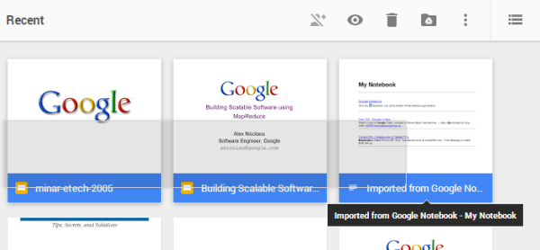
It's easier to select files: click and drag your mouse over several files or press Shift to select a range of files or press Ctrl to select non-consecutive files.

when will it get material design?
ReplyDeleteVery nice post and this post is very best for laptop repair i really this post.
ReplyDeleteสูตรบาคาร่า
goldenslot