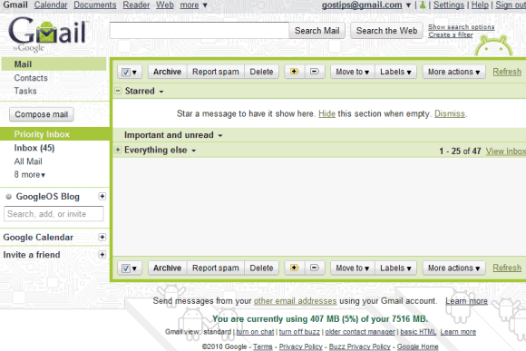
Even if you're not an Android fan or you don't have an Android phone, you should really try the Android theme. It's simple, stylish and you can still read your messages.

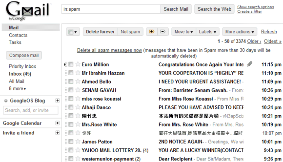
If you're looking for a minimalist theme, Basic White is a good alternative to Minimalist, an already existing theme. It looks a little bit unfinished, but Google says it's the Gmail interface stripped "to the bare bones".

What's your favorite Gmail theme?

Android!!
ReplyDeletehi! i want change my gmail look or lastest thems to insert in my gmails but i have some problems for inserting lastest google download gmail thems pls give the solution
DeleteFinally new themes! I wish they keep making more of these; especially the ones that change depending on time, location, etc.
ReplyDeleteI really liked Night Shade for a while, but I'm back to Basic Blue now.
ReplyDeleteWhat good are these themes if they're providing degraded experience to the users?
ReplyDeletehttp://webwanderings.wordpress.com/2010/11/05/gmail-is-slow-lately-my-curated-post-to-show-how-microsoft-is-jumping-on-the-opportunity-and-how-times-have-changed/
High Score is my current favorite. I'm a little bummed out that some of its features got lost with the latest Gmail revamp, though. E.g., the arcade contact section.
ReplyDeleteI do like the Android theme, but most of them are totally usable. The sidebars on "Marker" made my brain bleed. I am sticking with Shiny.
ReplyDeleteCrap, by "usable" I meant "UNusable."
ReplyDeleteI am a moron.
Take heart, Paul, I think I've committed much more grievous slips in my few trips around the sun.
ReplyDeleteAndroid theme looks the cleanest among them all. It will be nice to have a Gmail Android T-Shirt :-)
ReplyDeleteThe ninja theme
ReplyDeleteI'm turned off by the disabled-looking buttons in basic white. Instead, I'm drawn to Marker (ha ha ha).
ReplyDeleteThe Gmail team definitely needs to fix the size of the logo in Marker, though.
ReplyDeleteI like the "Basic White" theme a lot better with the "Back to Beta" logo enabled in Labs than without.
ReplyDeleteyay Android theme! already set it :D
ReplyDeleteAndroid!
ReplyDeleteWhy can't I make my own?
ReplyDeleteI would really love the Marker theme if it weren't for that obnoxious blue!
ReplyDeleteThe others are nice, the basic ones being my favorite. But I'll still continue to use the Minimalist theme. I don't have a Mac but I think it's look really nice on one.
I was so excited to hear about the new themes, but I was really disappointed when I actually saw them. Another white one? Another black one? Already have them.
ReplyDeleteTree Tops looks like Turf. Marker looks, well, childish. The Android one is, quite frankly, boring.
I agree with El Foncho. More themes that mimic the weather and sunlight in your area would be great. I switch around themes all the time but I almost always go back to Tree. It's simple, clean and it mimics the weather in my town. Second place is Tea House for the same reasons, and it reflects the daylight/night time of my town.
Themes with non repeating photographic backgrounds such as treetops, mountains and orcas island should be redone so they still look good on high resolutions. They look awful when the photo covers only a portion of the screen width.
ReplyDeleteThis could be so much easier if gmail allowed custom backgrounds like web search does.
I make my own theme with solid colors.
ReplyDeleteI cannot think of any other theme than 'Shiny'
ReplyDeleteI've 'upgraded' from the Ninja theme to the Marker theme, and I'm loving it!
ReplyDeleteGoogle Redesigned.
ReplyDeleteNinja is my favorite :D
ReplyDeleteAndroid is nice, but kind of too white (thought that might be my monitor's brightness setting), but I still prefer Tea House.
ReplyDeleteAndroid!
ReplyDeleteShiny!
ReplyDeleteGmail got Android theme but Gmail rich text editor still without Droid Sans font http://imgur.com/m4XQA.png but why not?
ReplyDeletegod google sucks at design. seriously none of these themes look close to good. its pretty embarassing that a company like google can't design anything that doesnt look like a mess from the 90s.
ReplyDelete@alexsupra: What's that blue star in Chrome toolbar? Looks like a bookmarks extension, which?
ReplyDeleteNeat Bookmark is the best out there, but it doesn't really blend in to Chrome (IMHO).
i ♥ the android 1! i love the lime green color, with the very detailed background design, perfect for my ♥ of color and style! thx gmail ☺
ReplyDelete"Marker" is great. The highlighter pen effect really stands out when you select messages.
ReplyDeleteGmail themes is OK
ReplyDeleteI like black Gmail Themes
Marvelous themes in Gmail
ReplyDeleteMarker is outstanding
ReplyDeleteanother vote for 'shiny', still by far the best.
ReplyDeleteGmail has provided many themes but I like to use Desk, Zoozimps and Tea house. I am really happy by hearing that google have invented new themes and I just hope that google will create more themes that changes based on location, Atmosphere and time.
ReplyDeleteI Love marker , much better than candy!
ReplyDeleteYou know, I really think you should be able to upload your own photo as a theme. I have "MARKER" and it's soo COOL!!!
ReplyDeletehow to apply this theme to my gmail
ReplyDeletei think you should come up with more colorful themes for teens and kids
ReplyDeleteuncustomized theme...
ReplyDeleteThese are pretty cool. I especially like the nature scence themes, like the tree one. By the way, design your own has too few options.
ReplyDeleteAnyway, i ♥ gmail! :)
I think Google should have animal themes like cats or dogs. My favorites now are high score,ninja and desk but I wish google would update with more themes.
ReplyDeleteI want new gmail themes to my gmail
ReplyDeleteI want new gmail Themes, as i got fed up with existing themes..
ReplyDeleteThe first time I like the theme graffiti but in new gmail themes I like android
ReplyDeletei love bus stop, but i hate how they moved the whole inbox, etc. way over to the right! so now i am just sticking to candy and beach. I think they should come out with more like those. and not so much just plain colors. because i get bored of it after a few months, since i am constantly on my email.
ReplyDeleteUp until now I've been using Planets since it was made available--heavily customized, though, to give it more color highlighting. I like it dark but not monotone. But now I'm switching to Tree Tops--also heavily customized, though not as much (don't need it--defaults are pretty good... plenty "readable"). It's not as dark, but it's still plenty dark enough.
ReplyDeleteI'm still not sure witch one!
ReplyDeleteOkay, if you are complaining about the lighting, this is all due to your computers light.Also laptop users, if your battery is running low,you need to find the power supply and plug it in to see the full possibilities of your lighting. Otherwise or always plugged in computers, you can look in the control panel and see if lighting is there, if not then you just will have't to stick with your lighting... or you might want a new computer. If you plug in your laptops, you can see the lighting become lighter. If you take the power supply out while the battery is a good percent, (enough to run) you can take it out and see the lighting become dimmer. :) Thanks for letting me share!
ReplyDeleteAndroid is nice, but...too white I prefer Basic Blue.
ReplyDeleteI wanna make my new themes
ReplyDeleteI wish the Android theme for the revamped Gmail was much more prominent.
ReplyDelete