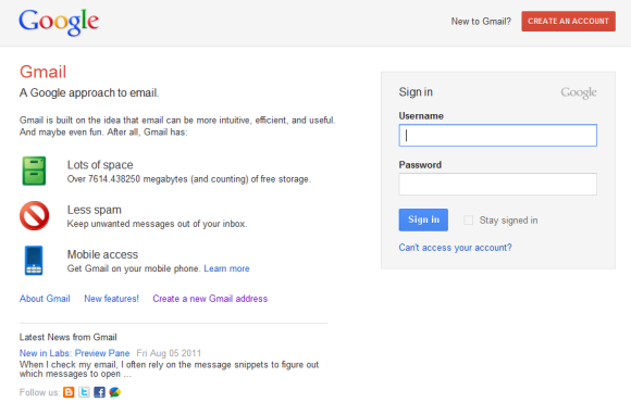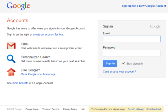
If you opt-in to the new interface, the sign-in pages for Google Docs, Google Reader and all the other Google services will also change. "For a limited time, you can switch back to the old version of the sign-in page by clicking the link at the bottom of the page. However, eventually this change will be permanent and you will not be able to switch to the old look," informs Google.

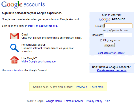
For reference, here's the soon-to-be-deprecated interface:

The new input boxes are a lot bigger: you can type 31 characters in the username box and they're still visible. In the old interface, only 20 characters from the username were visible at a time.
{ Thanks, Herin and Evan. }

i like it :)
ReplyDeleteI don't have a message at the bottom of the page: "Coming soon: A new sign-in page! Preview it." When you click "Preview it".
ReplyDelete=(
I hate the red buttons in gmail, and in every other product of google, It is intrusive.
ReplyDeleteThe terminology used in this article is incorrect. It says "soon-to-be-deprecated interface", however it is already deprecated. Perhaps the author meant "soon-to-be-replaced".
ReplyDeletehttp://en.wikipedia.org/wiki/Deprecated
This has to be the most anti-climactic change ever. whoopity-freakin-doo.
ReplyDeleteAnd for those that don't like the red buttons, you are entitled to your opinion, but "intrusive'? really? perhaps you should consider getting a grip. It's just a button in one of the three primary colours. Methinks people are a little too sensitive these days.
@Robert:
ReplyDeleteI disagree. The new UI is opt-in, so it's not enabled by default. I wouldn't call the existing interface deprecated as long as it's still the default interface and you need to click a link to preview the upcoming UI.
Google is also testing an experimental account chooser page that you can opt-in to. It will keep a list if the different accounts you use and list them on the sign in page.
ReplyDeletehttps://sites.google.com/site/gitooldocs/experiment---account-chooser
Here's the link to the 'preview' sign-in page:
ReplyDeletehttps://www.google.com/accounts/OptInToNewSignInUI?continue=https%3A%2F%2Fwww.google.com%2Faccounts%2FServiceLogin%3Fservice%3Dmail%26passive%3Dtrue%26rm%3Dfalse%26continue%3Dhttps%253A%252F%252Fmail.google.com%252Fmail%252F%253Fui%253Dhtml%2526zy%253Dl%26bsv%3Dllya694le36z%26ss%3D1%26scc%3D1%26ltmpl%3Ddefault%26ltmplcache%3D2%26from%3Dlogin
If you follow the link from @Dave it turns the new page on for you until you turn it off.
ReplyDeleteI like it! I can't say that I see any "must-have" feature, but in terms of looks I think it's nice.
ReplyDeleteThanks for the tip Alex!
It's nice but I prefer the traditional Gmail logo instead of Gmail written.
ReplyDeleteWhen Google asks you to relogin, and presents you with a page with your email address already filled in, then it ALWAYS asks me to re-enter that address after I type in my password and hit Submit.
ReplyDeleteThat field is not editable, so I just reenter my password and it works the second time. It's been like this for months. Doesn't anyone at Google every use their own software?
Anonymous August 13, 2011 12:41 PM: "it ALWAYS asks me to re-enter that address"
ReplyDeleteI don't know, but maybe this will help you?
https://mail.google.com/support/bin/answer.py?answer=14257
Thanks for the link...Love it..
ReplyDeleteYou have similar links to the experimental search ?
hi mashida,
ReplyDeleteme too.. i don't even have that message... but from what this article show, i totally like it...
before this, when i type my username , i have to scroll to left to check my username whether it is rightly spelled or not if the username is too long, now i didn't have too.. good move Google
this has caused me no end of frustration as i manage a dozen or so google apps account, switching accounts on one service logged me out of others and so on
ReplyDeleteAnonymous said...
ReplyDeleteI don't know, but maybe this will help you?
https://mail.google.com/support/bin/answer.py?answer=14257
It doesn't address the issue I described. My correct email address is already visible and uneditable. There are no captcha fields.