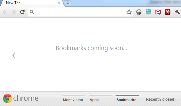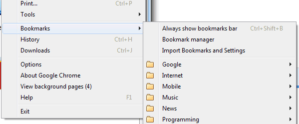
Until the bookmarks section is created, you can find your bookmarks in Chrome's menu.

There's also the bookmarks manager and the Omnibox, which suggests relevant bookmarks when you start typing a URL or some words from the title. You can still enable the bookmarks bar (Ctrl+Shift+B), but it will always be visible until you disable it.
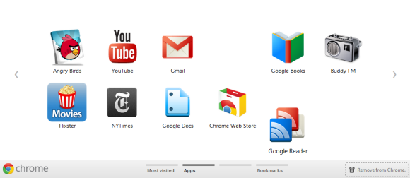
Chrome's updated new tab page is inspired by mobile operating systems like iOS and Android. You can create multiple screens for apps and the most visited sites, remove sites and apps by dragging them to the trash and transform sites into apps using drag and drop. The new tab page uses dynamic icons that are resized to match the window's size.

{ Thanks, Cougar. }

This is the only thing I hate Firefox for. At least someone's developing the age old bookmarks manager.
ReplyDeleteI just discovered that a few minutes before reading this post when I used the new Profile switcher. Pretty nice. I've turned off the replacement start page extension I was running, this is much slicker.
ReplyDeleteI mainly use this extension https://chrome.google.com/webstore/detail/nnancliccjabjjmipbpjkfbijifaainp
ReplyDeletethis is mainly for those who like to organize the bookmarks
At first, this left me scratching my head about the difference between Apps and bookmarks. But thinking about this from a chrome os perspective, I can see apps launching specific sites or tools and bookmarks being used to link to various organized documents on the web.
ReplyDeleteIndeed, I very much like the direction this is going. The New Tab page is basically becoming a desktop all its own.
ReplyDeleteChrome's bookmarks management isn't the best, but it's getting better. It's one of the features I follow on the Chromium issues tracker site.
ReplyDeleteOne thing that I think was fixed recently was that the Omnibox would not show bookmarks if a user typed a URL instead of the page title.
The bookmarks sub-menu debuted a version or two ago (in Chrome 13) but the NTP4 bookmarks pane is new, at least in the beta channel, as of the release a day or two ago. I'm hoping it won't just be the Bookmarks bar, like it appears in the current new tab version (NTP4).
I'm still hoping that Chrome won't close bookmark folders when opening a bookmark using right-click button or the middle button (scowl wheel, which is what I use). I would also like to sort bookmarks right from the right-click menu instead of opening the bookmarks manager.
I'm still waiting for my Chromium browser bookmarks to integrate with my Google Bookmarks. Grr.
ReplyDeleteI also seen this on Beta channel (in about:flags)
ReplyDeleteThis cool, it been like this for a few weeks in canary. The new tab page is nice. Through I am still hoping that one day that Google will let us choose which pages we want on new tab. An may be even let them pre render in the back ground so that we do not have to wait for them to load. At least for the first page.
ReplyDeleteI clicked on 'About Google Chrome' in the options but it says my update (13.0.782.112 m) is the latest but why can't I see the new tap page?
ReplyDelete@Bradley Kelly: Type about:flags in the Omnibox (address bar) and enable "Experimental New Tab" page.
ReplyDeleteYou're using the stable channel. The new tab page is available in Chrome 15, which is now in the dev channel, so it's still a work in progress.
ReplyDeleteBut why is the omnibox still so bad at finding bookmarks? I often type a word which exactly matches something in the title or URL of one of my bookmarks, but the bookmarks do not appear - instead I get results from my browsing history or general search results. If bookmarks appear at all, it's after after a longer delay than the general search results. Surely it should be quicker and easier to find my bookmarks, since they are stored locally?
ReplyDeleteHey, has anyone replied to you about this problem? It's frustrating isn't it? It's the only thing that makes me miss Firefox..
DeleteCan't wait for it to be released in the stable version.
ReplyDeleteAm i missing something? This article says that the bookmark bar has been removed? It's just hidden by default. Ctrl + shft + B brings it back like it always has.
ReplyDeleteIt's been removed from the updated new tab page, which has a new section for bookmarks.
ReplyDeleteThis may have been mentioned already: Something else I dislike about the page, currently, is that when I right-click on a folder of bookmarks, I fail to see the same options I get if I use the bookmark manager or ctrl+shift+b (e.g.,"Open all bookmarks").
ReplyDeleteAlso, I'm confused why the intuitive keyboard shortcut of left/right arrow to switch between sections is missing . . .