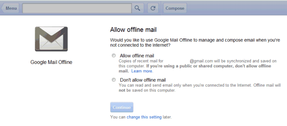
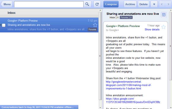
For Gmail, Google chose the easy way out and tweaked the tablet interface. You can only use it in Google Chrome after installing this app from the Chrome Web Store. The app lets you archive and label email, compose new messages and read the messages you've received, but it doesn't have all the features from the standard version. The interface is more suitable for tablets, so this is more like a temporary workaround instead of a definitive solution.


Offline Google Calendar and offline Google Docs aren't yet available to everyone and will be rolled out in the coming days. Google says that the offline mode is built into the apps, just like the Gears version. "Google Calendar and Google Docs let you seamlessly transition between on- and offline modes. When you're offline in Google Calendar, you can view events from your calendars and RSVP to appointments. With Google Docs you can view documents and spreadsheets when you don't have a connection. Offline editing isn't ready yet, but we know it's important to many of you, and we're working hard to make it a reality. To get started using Google Calendar or Google Docs offline, just click the gear icon at the top right corner of the web app and select the option for offline access," explains Google.
I don't see the offline settings for Google Calendar and Google Docs in my account, but offline Gmail is disappointing. It only works in Chrome, it has a different URL (https://mail.google.com/mail/mu/), the interface is optimized for iPad and Android tablets and it's very limited. Hopefully, Google will add support for offline access to the regular interface.


Just as Google starts to get UI consistency (although in general the lack of colour icons, and the huge whitespace, and the variation of whitespace and element's position between apps is complete shit) the give the offline version of gmail a completely different UI (for a desktop user). Their designers should be fired, and they should steal some from Apple, who barring iCal in Lion get the design spot on pretty much always.
ReplyDeleteI think that move was an emergency one: They promised an offline version by Q3, and Q3 is ending soon. So they prefer to go all-in with a beta / yet to be finished apps rather than complaints from Chromebook users.
ReplyDeleteYou seem disappointed with just about everything Google does these days. I like your blog but I'm surprised at how negative it's getting.
ReplyDelete@Thomas:
ReplyDeleteIf something doesn't seem right, I can't lie and pretend it's OK. Many of the recent Google moves (closing Google Labs, buying Motorola, today's offline Gmail app) seem out of place and I've got the feeling that a new Google is born and it's very different from the old Google.
@Alex:
ReplyDeleteOkay, fair play I agree that things do have a different feel. Whilst I don't necessarily think that's a bad thing, I can appreciate that we don't all see the changes in the same way. It would be really interesting to read a post dedicated to your misgivings; it would dispel any notion that the posts are at all cynical (which I now know that they are not). Thanks for responding!
@Thomas
ReplyDeleteI'm feeling pretty negative too - seems like Google is making docs worse with each step. First they switched to the 'print friendly' version of docs which made docs worse for many users, then they removed offline, and now they are moving towards the 'wasted whitespace' theme.
In each case I think they should have waited until an alternative was available. For the whitespace problem I'm still hoping they provide a theme for those who care about their screen real-estate.
@Anonymous
ReplyDeleteI know what you mean. I haven't found the white space at the top of documents too bad because I tend to use docs in compact view, but I did wonder why it was there in the first place :)
Alex, The motorola deal is a work of genious. With Motorola have a little in under 8 billion in tax credits, because of all the losses it made in the past. 3.2 billion of cash in the bank.
ReplyDeleteThe long term costs of the deal at just over 400 million dollars. How much did those amateurs at Microsoft and gang pay per patent in the Nortel deal. Essentially if this deal work out Google paid 400 million for 20,000 plus patents, which is way less that the consortium led by Mircosoft paid anyway you look at it.
With the possibility for Google to off load large parts of Motorola for around the 3 to 4 billion dollars to the Chinese or even Samsung, HTC. The parts it does not really need and I suspect do not really want. Netting them billions in profits.
Google has the potential to make billions from the deal, and that without taking into account all those lovely patents which give its Android platform protection.
.
Man, if it was not idiotic to see this UI in iGoogle, we now have it as the official Offline Gmail edition. :|
ReplyDeleteHow long back does it sync emails? Thanks
ReplyDeletei got excited thinking WOW! offline is finally back! Yay!
ReplyDeleteThen after I installed it and read the fine print in the help system i see that it only sync's a very tiny amount of current email, everything else is still lost in space with Will Roberstson and that robot..
I don't mind the tablet layout, but the extremely limited functionality (e.g. no keyboard shortcuts) and very small amount of email stored locally are both big disappointments.
ReplyDeleteOffline with gears seemed better overall.
looking forward to the offline Docs version.
ReplyDeletei browse it through my Samsung galaxy tab and it work wonder :-)
ReplyDeleteI preferred the Gears version as well. I don't see why they cannot make a Gears version that encompasses Gmail, Calendar, Contacts (still hate that you can't open contacts in a new tab) and Docs/Drive (for offline editing). I mean seriously. With all that Google can do, would this really be that hard? Think of what this could mean for Outlook users/sufferers :)
ReplyDelete