If you want to try it, copy this code:
javascript:document.cookie="PREF= ID=ad93daafaa747f70:TM=1158373640:LM=1158374016:GM=1:S=wNuiLiKHrkRnMZtf; path=/; domain=.google.com"
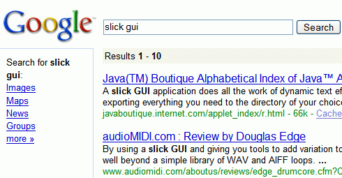
go to google.com, paste it in the address bar, then go to the preferences and click "Save preferences".
If you want to go back to the original design, just delete your Google cookie.

{ Via Googlified. }
Related:
Other design experiments
User experience at Google

hmm, i'm not sure... I prefer the old way
ReplyDeleteEh...
ReplyDeleteYour screenshot looks pretty good, but the results I have on my 1400x1050 LCD panel look messy. I assume you're using your WM device to view those results.
Why can't it work in Chinese!(Still www.google.com)
ReplyDeleteIt looks good to me (on my notebook). It should work for localized Google domains, but you have to replace google.com with google.--- in the JS code.
ReplyDeletehmmm that's weird... about a month or so ago i was getting Google search results exactly like that experiment one, but only when i search it while I'm logged on to my Google Account. I know it wasn't a firefox extension and I didn't put any codes or anything. Could it be possible that they were already experimenting this on some users?
ReplyDeleteI don't like the experimental design. I love the old way. It is easy to use, and is a better use of space.
ReplyDeletei have also experienced that arif, and it annoyed me. the different layout appears seemingly randomly for me, but a refresh puts it back to the old way.
ReplyDeletethe old way is much better. in the new way, you are wasting space down the left side of the screen. i cant see what you are gaining. its also bad having your search rewritten in such a narrow column
I don't like it at all. I like my definition links and query data up the top.
ReplyDeleteHow do i revert?
Haha... Never mind.
ReplyDeleteI didn't read the last line of the post.
My $0.02: English is read from left to right. I tend to like having the most relevant content occupy the left-most, top-most position of the page so that it can be scanned quickly. In an RTL language, the right side might be better.
ReplyDelete